The network for creativity
Join 1.25M professional creatives like you
Connect with clients, get discovered, and run your business 100% commission-free
Creatives on Contra have earned over $150M and we are just getting started
Back to feedPost
Taste Test

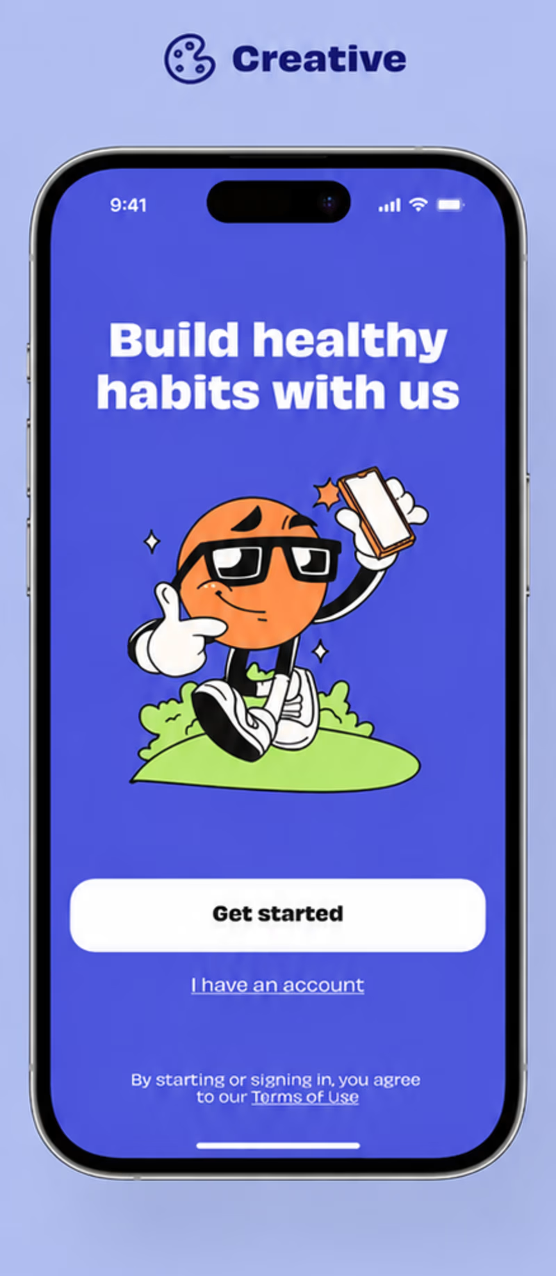
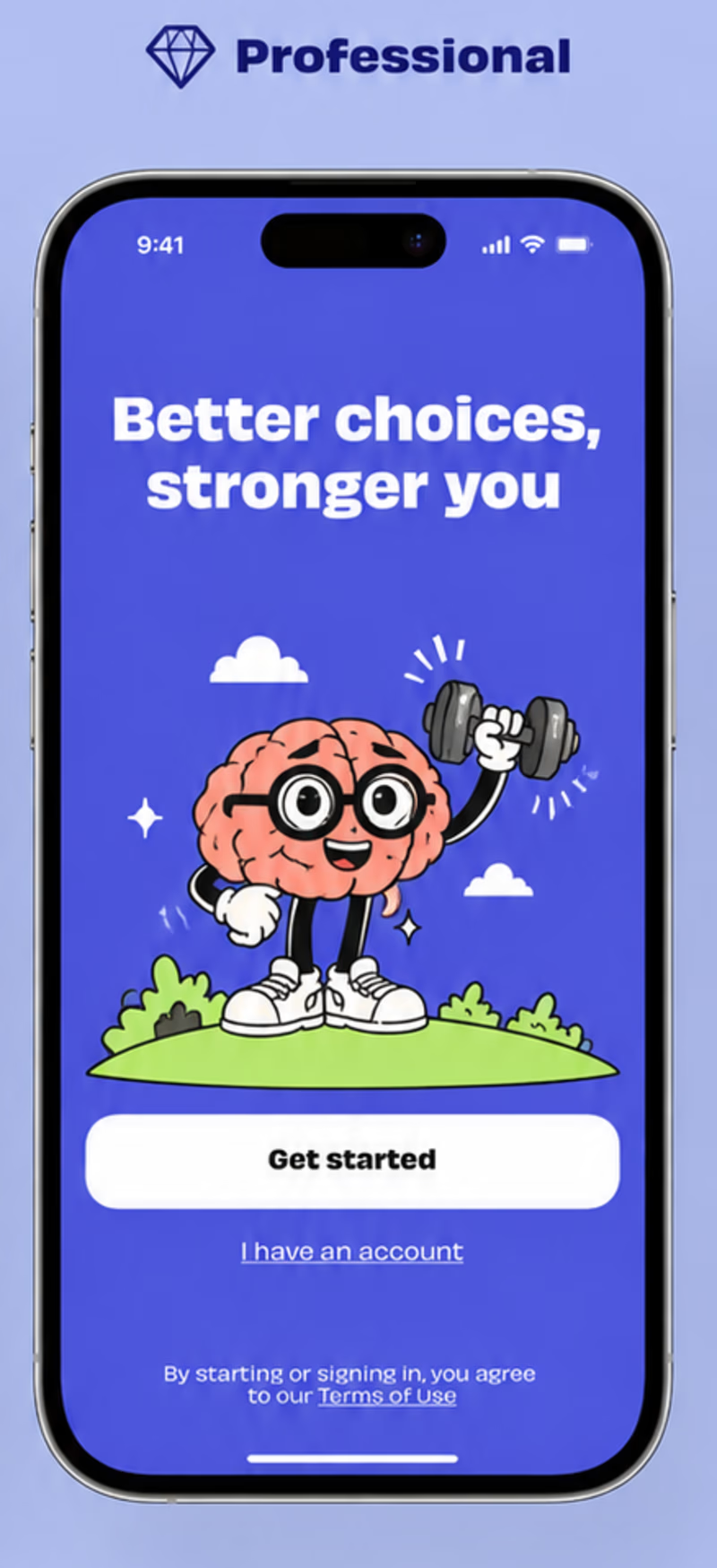

Character-led for me. For a health app, that character mascot does the emotional heavy lifting on the first screen. The "Build healthy habits with us" framing feels like an invitation rather than a pitch, which tends to drive better early retention.

Well said buddy!

Nice work as usual
Thank you so much!!!
The network for creativity
Join 1.25M professional creatives like you
Connect with clients, get discovered, and run your business 100% commission-free
Creatives on Contra have earned over $150M and we are just getting started







Related posts

Designing for therapists means prioritizing what matters in the next few minutes, not just what looks good on a dashboard.
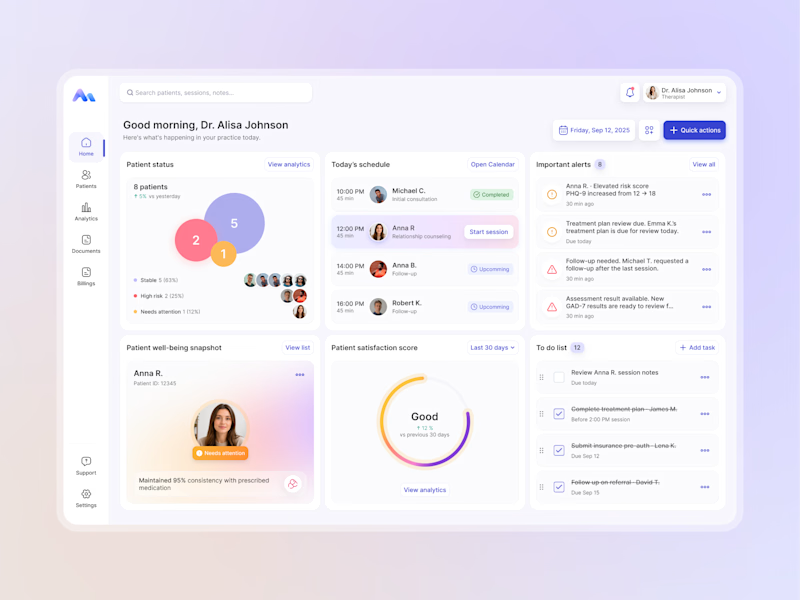
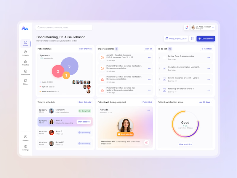
I explored two layout directions for a mental health practice management web app that helps psychologists manage sessions, patients, documentation, tasks, and follow-ups.
Both concepts use the same core widgets, but with different positioning and visual hierarchy. The goal was to make daily priorities easier to scan and act on.
Which option feels more intuitive - A or B? 🤔
17 voted
68%
8 voted
32%
25 votes
Closed


Top 1% of creatives on Contra with a 195 score 🎉 What I'm most excited about is who's showing up because of it: new clients, designers, new conversations, projects I wouldn't have found on my own. Grateful, and ready for more.

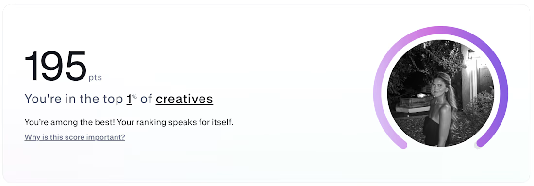

Huge congrats! 🎉 Top 1% is an incredible milestone.


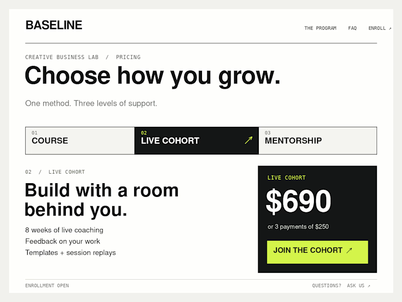
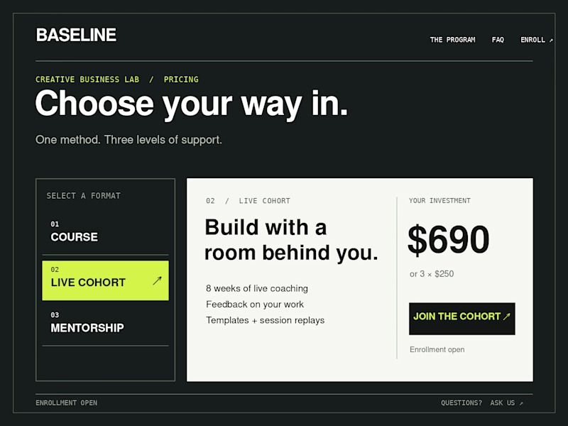
Which Kajabi pricing section would you ship?
Creative Business Lab has three paths: Course, Live Cohort, and Mentorship. Both designs show the same $690 Live Cohort with the same benefits. Only the presentation changes.
Vote Horizontal tabs or Side tabs, then tell me the one thing you’d improve before launch. Have a stronger third approach? Show it in the replies.

21 voted
50%
21 voted
50%
42 votes
Closed

Horizontal. side tabs read as nav, people skip them. though the stronger third option is no tabs at all, three cards side by side. both of these hide two prices behind a click and comparison is the one job a pricing section has.