The network for creativity
Join 1.25M professional creatives like you
Connect with clients, get discovered, and run your business 100% commission-free
Creatives on Contra have earned over $150M and we are just getting started
Back to feedPost

Workbench + Cycles 🔥🔥
Funny how I just found out about the cubic interpolation in the graph editor, @blender.official.
This is just me experimenting.


The network for creativity
Join 1.25M professional creatives like you
Connect with clients, get discovered, and run your business 100% commission-free
Creatives on Contra have earned over $150M and we are just getting started







Related posts

Two directions. One product. Which one would you choose? 👀
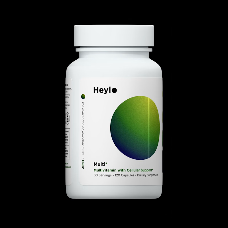
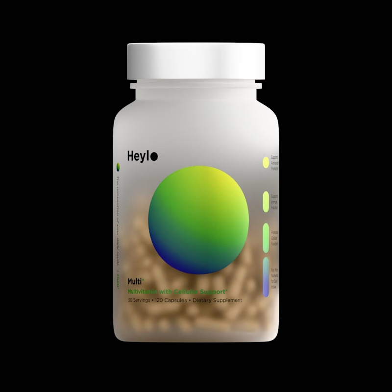
I created these 3D model for a Heylo supplement product, while exploring two different ways to present the same product.
For Image A,
Minimal background, controlled lighting, strong focus on the packaging.
For Image B, I
Added depth, atmosphere and visual context to make the product feel more like a campaign shot.
The buyer ended up going with A.
But I'm curious...
Which direction would you choose for a supplement brand?
A or B? 👇
7 voted
64%
4 voted
36%
11 votes
Closed


Inspiration design of the day 🔥

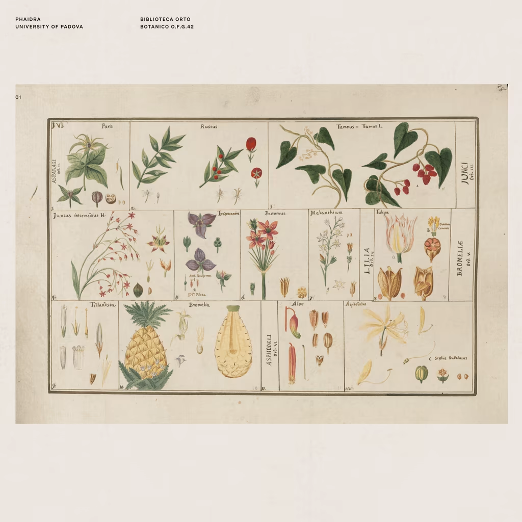
There's a shop in Barcelona that sells vintage prints from artists long gone.
On one of my visits, I found myself completely drawn to the way they used to illustrate flowers, fruits, objects, animals. A real exercise in consistent observation, one that's been lost in a generation...


My new portfolio, shown in dark mode.
I designed and built it end to end in a strict monochrome style. It opens with a block-letter SAIF wordmark that bulges under the cursor, over a live particle field. Further down, a dotted globe pins where I work from in Turin, Italy.
My projects play on their own in a device-style showcase that tilts into place as you scroll. Next, 3D letters spelling motivational words fall toward the footer, where they turn into a small slicing game you can play.
Built with React, TypeScript, GSAP, Three.js and WebGL, with a light/dark toggle, smooth scrolling and a custom cursor.
