The network for creativity
Join 1.25M professional creatives like you
Connect with clients, get discovered, and run your business 100% commission-free
Creatives on Contra have earned over $150M and we are just getting started
Back to feedPost


Arguing about your homepage headline and it's come down to taste? Write the explanation first. The headline's easier to judge once that exists.
The network for creativity
Join 1.25M professional creatives like you
Connect with clients, get discovered, and run your business 100% commission-free
Creatives on Contra have earned over $150M and we are just getting started



Related posts

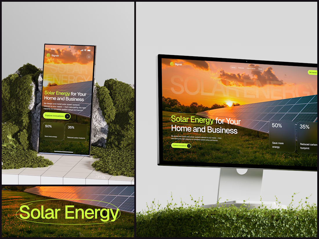
Solar Energy Website
A thin lime circle tells you which two words this page is about.
The headline sits over a sunset photo of a panel field. The "Get started" and "Explore innovations" buttons share the circle's lime, so the eye moves from the circled words straight to the next step.
Large faded capitals repeat those two words across the sky, faint enough to stay inside the photo. On mobile they break onto two lines, and the headline and button stack above two frosted cards.
Only two words of "Solar Energy for Your Home and Business" are lime, and the whole page follows them.
Designed by the Hue & Machine team.
#SolarEnergy #RenewableEnergy #CleanTech #WebDesign #LandingPage #HeroSection #UIDesign #ResponsiveDesign #MobileDesign #FigmaDesign



This is really cool, Nice job Dmytro

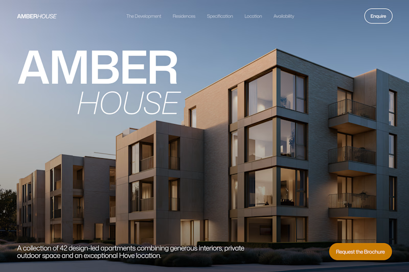
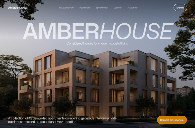
Which hero would you choose — 1 or 2?
Two directions for Amber House, my real estate website template. The first pairs a closer architectural crop with an asymmetric layout. The second gives the building more breathing room, with a wide view and a centered headline.
Same template, two different first impressions. Which feels stronger to you, and why?
24 voted
59%
17 voted
41%
41 votes
Closed

I will go with Bold & Asymmetric!

Watch this website build itself.
The Milemarker homepage, replayed in about 9 seconds from the live site: wireframe, layout, content, live.
Milemarker connects every system a wealth management firm runs, so data turns into context, action and automation. I built their site in Framer with a calm, editorial feel.
• A serif headline that reads like a promise, not a slogan
• A warm off-white page, so the orange buttons carry the actions
• The product shown right under the headline
Serif or sans headline for a fintech site?
Live: milemarker.co
Follow for more videos: instagram.com/sellwrightstudio · youtube.com/@sellwrightstudio

Serif for this one.