The network for creativity
Join 1.25M professional creatives like you
Connect with clients, get discovered, and run your business 100% commission-free
Creatives on Contra have earned over $150M and we are just getting started
Back to feedPost


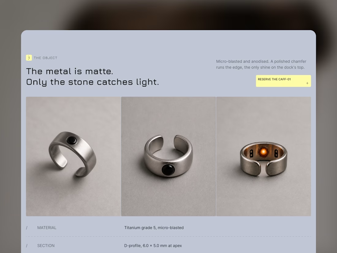
Three product views from Mote, with the specifications below. Each angle has its own space.
Framer template: https://startfrom.co/templates/mote

Amazing!!

The copy carrying equal weight to the product shots is what makes this read premium. Matte metal, stone catches light, it sets up exactly what you see a beat later.

Creative work

The matte-versus-stone contrast is doing a lot of work here—the three angles feel like a tight product system, not just a gallery. The spec-led framing is a great touch for a Framer template.


The product presentation feels really refined. Giving each angle its own space makes the specs easier to scan while keeping the focus on the product.


Simple and Elegant without any cluttering


"Only the stone catches light" is such a restrained line, most product copy would over-explain that detail instead of trusting the image. Since it's also sold as a Framer template, did you design those spec callouts to be easy for buyers to re-skin, or is that layout pretty locked in?

Great visual hierarchy.

Love these

Really like how each angle gets its own space. It makes the product feel more dimensional without adding unnecessary visual noise. The presentation feels very intentional.


The dedicated spatial layout for each spec angle gives the template a remarkably clean, high-end product feel. Framer is such a powerhouse for modern minimal e-commerce layouts. Great work on this, Alex!


Amazing 😻


Excellent Work

The three-angle layout works really well here. It feels less like a product gallery and more like a proper design study, especially with the material specs underneath. The “only the stone catches light” detail is a nice touch too.

The metal is matte, only the stone catches light is doing more selling than any spec sheet ever could. Three angles with the callouts reads like a product study, not a gallery. Makes a ring feel engineered.
The network for creativity
Join 1.25M professional creatives like you
Connect with clients, get discovered, and run your business 100% commission-free
Creatives on Contra have earned over $150M and we are just getting started

Challenges
View all


Related posts

Areal – Now available in Framer.
A minimal template for creative studios and independent creatives.
Built around strong typography, considered layouts, and subtle interactions with enough flexibility to make it your own.


Strong typography and subtle interactions are a solid foundation for a portfolio.

I kept asking myself one question while building Veriq:
What makes a digital agency website feel premium before you even read a word?
It’s not just typography.
It’s not just animation.
And it’s definitely not adding more sections.
It’s the feeling of clarity — knowing where to look, what to focus on, and why the work matters.
So I built Veriq, a Framer template for digital agencies and creative studios around that idea.
Clean structure. Bold visuals. Smooth interactions. Flexible CMS. Every detail designed to make great work feel even better.
After countless small decisions, iterations, and refinements, Veriq is finally ready.
I’d love to know: what’s the first thing you look for when judging an agency website?
Now live. ↓
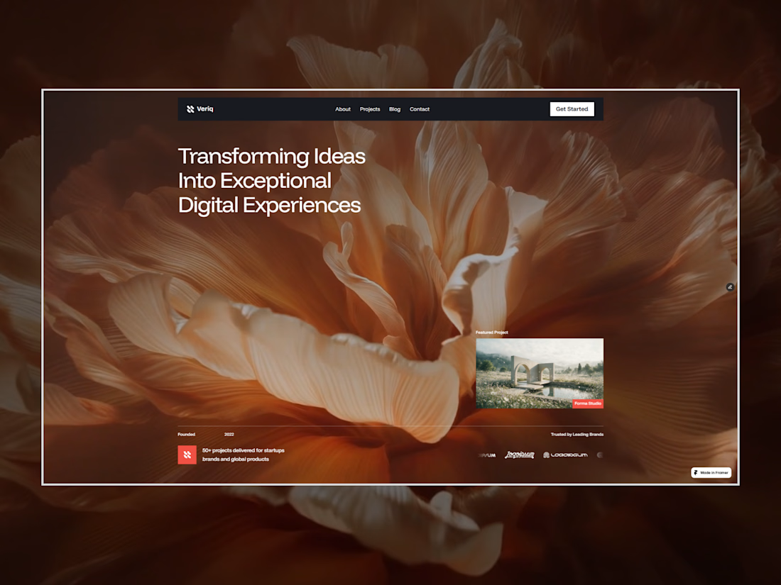
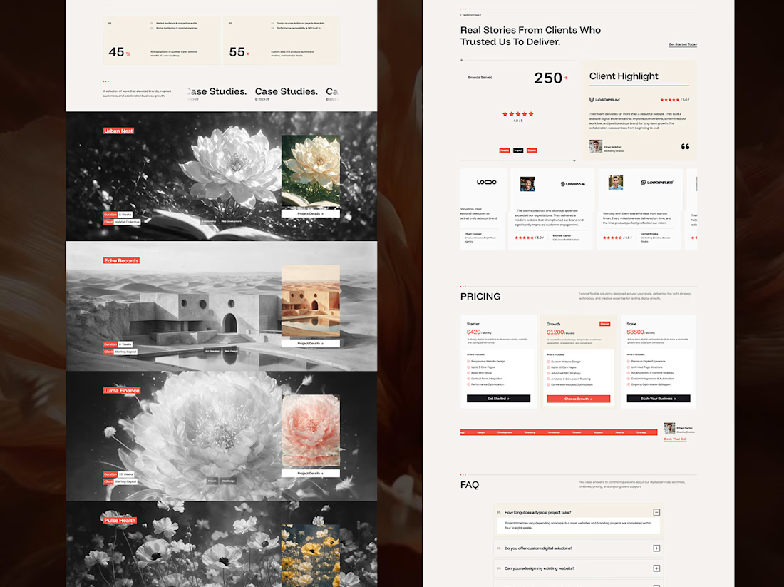
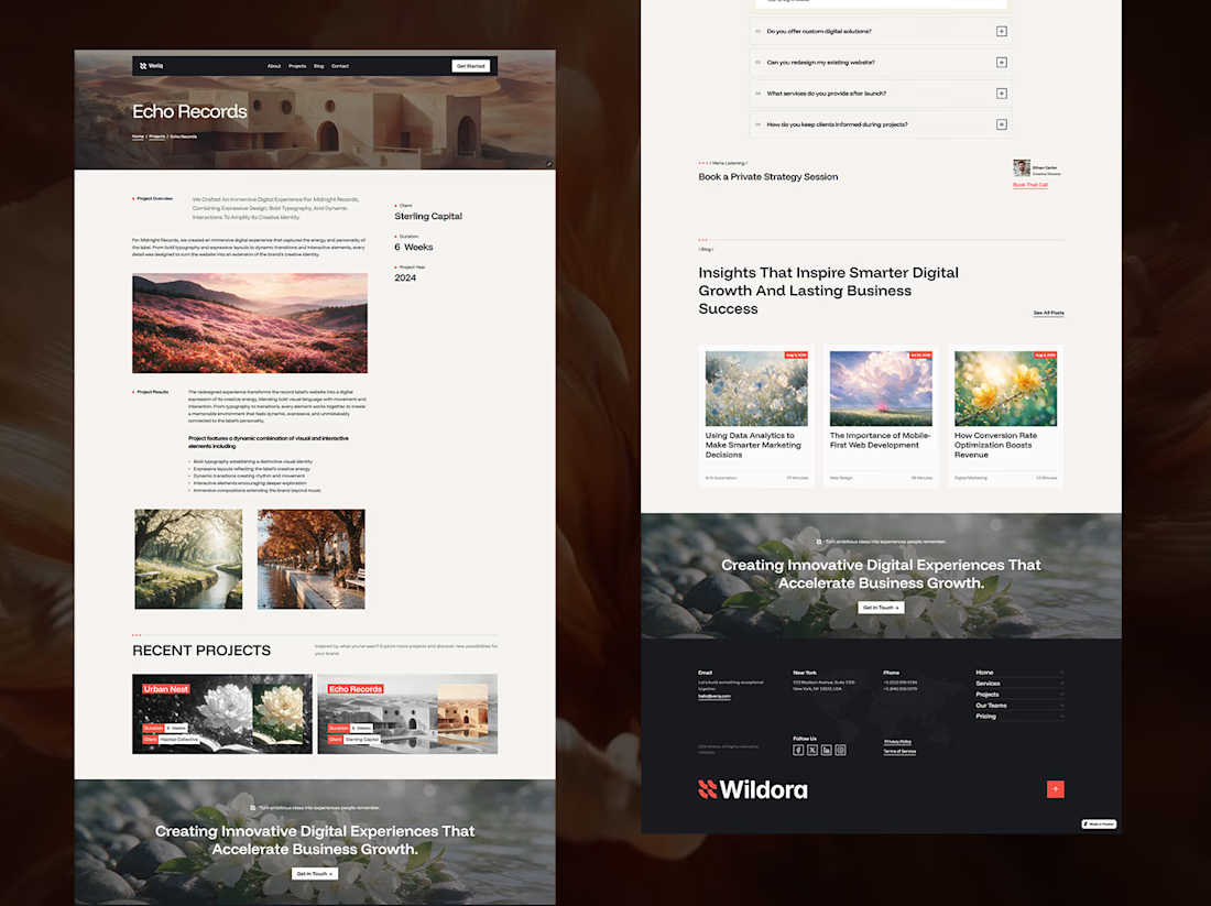
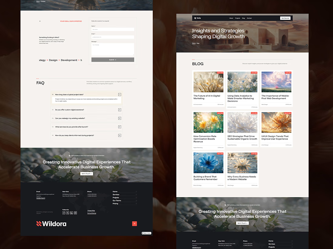

The four project pages all keep the same dense grid rhythm even though the imagery ranges from architecture to abstract macro shots — that consistency is probably what reads as clarity more than any single layout choice.
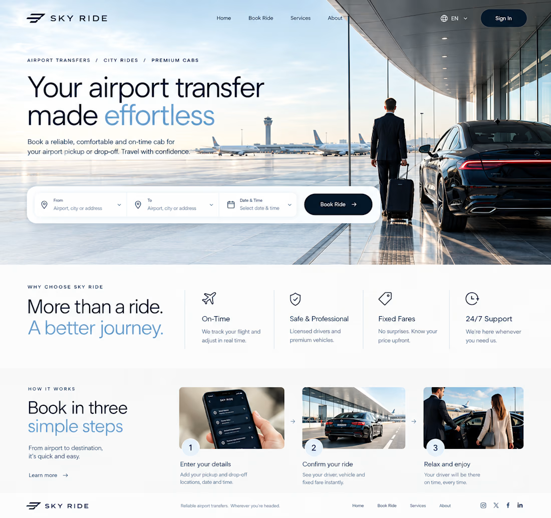
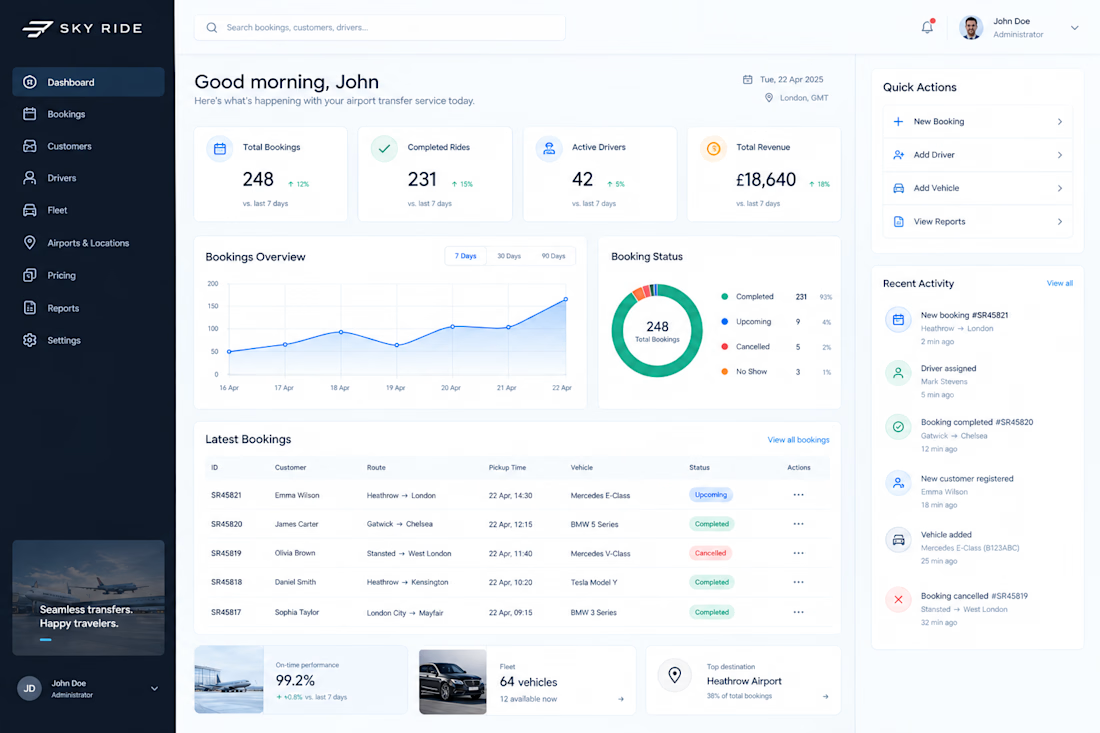
Currently working on a clean, futuristic airport transfer booking experience
Designing the UI in Figma with a focus on simple booking flows, premium visuals, and a smooth user experience.
Bringing the concept to life with Framer next.