
Bilal Kherif
Independent designer crafting premium Framer templates.
- 1
- Followers


Most digital agency websites tell you what they do. Veriq is designed to make you want to work with them.
When I built Veriq, I wasn't thinking about how to fill a homepage with sections. I was thinking about the feeling a potential client should get while scrolling.
First: “These people know what they're doing.”
Then: “Their work looks different.”
Finally: “I should talk to them.”
That’s why the experience relies heavily on motion, spacing, typography, and carefully timed reveals.
The animations aren't there just to look impressive. They guide attention.
Create rhythm. Build perceived quality.
And most importantly — keep the visitor moving toward the next step.
This is Veriq — A Modern Home for Digital Teams, a Framer template built by ValleyDev.
If you're building a digital agency, creative studio, SaaS team, or modern service business, you can use it as a starting point instead of staring at a blank Framer canvas.
Watch the execution. Then imagine it with your brand : https://framer.link/478WkkJ
1
2
53
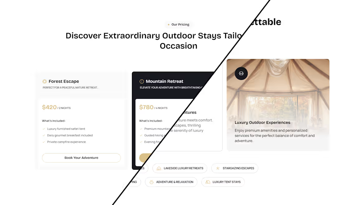
Good design gets attention. Great structure guides the next step.
That’s the idea behind Nomadix:
Curiosity → Desire → Confidence → Action.
Responsive About + Pricing sections built to feel premium—and keep the CTA clear.
Free to remix in : https://framer.link/EF6yNwG
0
8
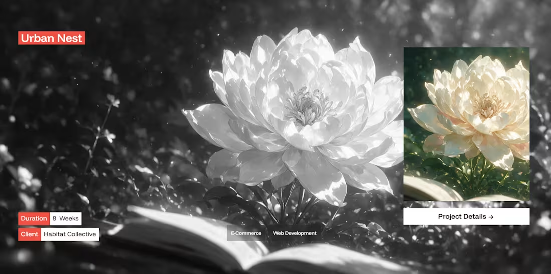
Here's a trick most portfolios miss: curiosity converts better than clarity.
Show someone the full picture right away, and their brain files it as "seen, done." Show them almost the full picture, and their brain won't let go until they see the rest.
That's exactly what happens in the Projects section of Veriq.
Each project starts in grayscale. Muted, quiet, holding something back. The second you engage, color floods in, like the project is revealing itself to you rather than just sitting there.
It's a small detail. But it changes the whole interaction:
→ Grayscale creates the gap ("what does this actually look like?")
→ Color closes it, but only after you've leaned in
→ The "Project Details" button turns that curiosity into a click, instead of leaving it to fade
Most portfolio grids say "here's my work." This one says "come see what happened." That one-word shift, from presenting to inviting, is the difference between a visitor who scrolls past and one who clicks through.
If you're building a portfolio, creative studio, agency, or lifestyle brand, this section alone is worth stealing : Veriq - A Modern Home for Digital Teams (https://framer.link/478WkkJ)
1
58
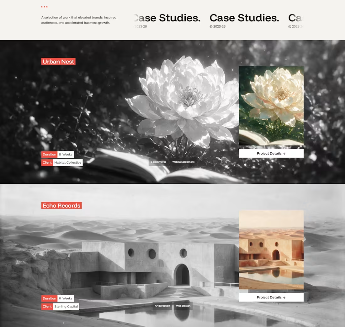
You don't need a $20k custom web build to win 5-figure clients.
You just need a frame that makes your case studies impossible to scroll past.
Meet Veriq—the minimalist, narrative-driven Framer/Webflow template designed for modern digital agencies and creative directors.
Available here : https://framer.link/478WkkJ
1
53