The network for creativity
Join 1.25M professional creatives like you
Connect with clients, get discovered, and run your business 100% commission-free
Creatives on Contra have earned over $150M and we are just getting started
Back to feedPost
Mobile was treated as its own design problem rather than a responsive afterthought.
The scroll journey had to survive a vertical frame and much shorter scroll distances, so the sequence was re-timed and each scene reframed for portrait. Motion budgets were reduced to protect performance on mid-range devices without dropping the parts of the sequence that carry the story.
Given that the majority of traffic arrives on mobile, this version had to stand on its own rather than gesture at what the desktop experience does.


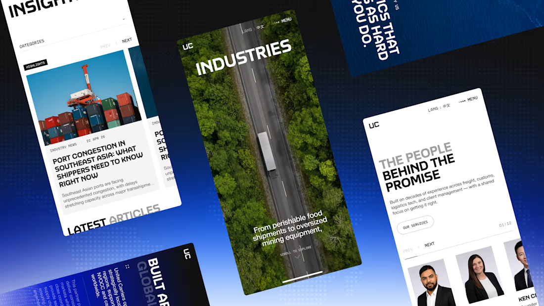

Reframing each scene for portrait instead of just squeezing the desktop version down is the part most teams skip. How do you decide what to cut when trimming the motion budget for mid-range devices?

We cut what doesn’t add to the core experience.
The network for creativity
Join 1.25M professional creatives like you
Connect with clients, get discovered, and run your business 100% commission-free
Creatives on Contra have earned over $150M and we are just getting started











Related posts

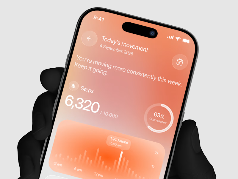
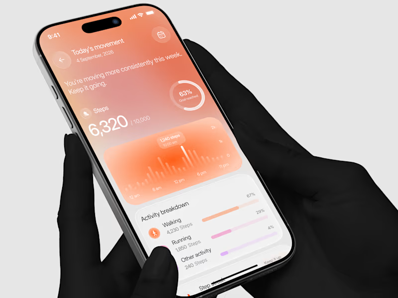
Designed a step tracking screen where you can see your daily progress and weekly trend in one glance.
Same screen, two shots. Which one would stop your scroll? 👀


11 voted
73%
4 voted
27%
15 votes
Closed

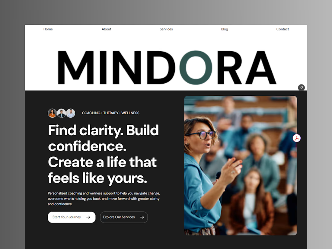
Introducing Mindora — a Life Coaching & Wellness Framer Template.
I designed Mindora for life coaches, wellness professionals, and personal growth brands looking for a calm, modern, and welcoming online presence.
Inspired by clarity, confidence, and meaningful growth, Mindora features a thoughtful layout, dedicated service sections, a blog for sharing valuable insights, and a clean visual style designed to help brands connect with their audience.
Built with Framer, it's a customizable starting point for creating a professional coaching or wellness website.
Explore Mindora and bring your next website idea to life.
Kindly check it out the template: https://www.framer.com/marketplace/templates/mindora-life-coach/



Great work

AI Automation SaaS Website Design
AUTONIX is a modern AI automation SaaS website concept designed to help businesses streamline workflows, automate repetitive tasks, and manage AI agents more efficiently.
The design combines a clean, minimal interface with bold typography, futuristic visuals, interactive UI elements, and a seamless user experience. From AI-powered task automation to real-time productivity insights, every section is designed to communicate the value of intelligent automation in a clear and engaging way.
This project explores how thoughtful UI/UX design can make complex AI technology feel intuitive, accessible, and easy to use for modern businesses.
Services: SaaS Website Design, UI/UX Design, Landing Page Design, AI Product Design.