The network for creativity
Join 1.25M professional creatives like you
Connect with clients, get discovered, and run your business 100% commission-free
Creatives on Contra have earned over $150M and we are just getting started
Back to feedPost
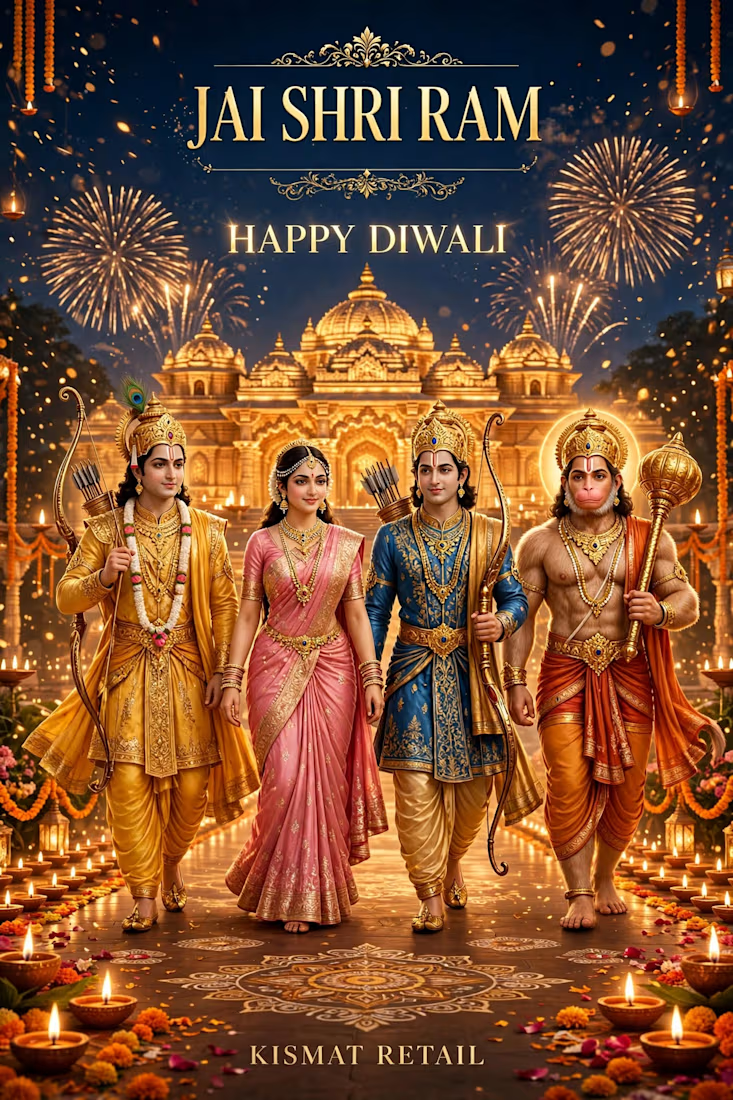
🪔 JAI SHRI RAM - HAPPY DIWALI 🪔
SUPER NEW STYLE - Festival Poster - KISMAT RETAIL
Ram Aaye Hain Ayodhya - Light over Darkness - Good over Evil!
Wishing you and your family - Happy Diwali - Health, Wealth & Happiness!
🙏 Shubh Deepavali 🪔
What I created:
JAI SHRI RAM - Divine golden scene - Rama, Sita, Lakshman, Hanuman
Golden Ayodhya Temple - Fireworks - Diyas - Rangoli - Marigold
Luxury Gold + Deep Blue - Premium festival look - 8K Super HD
What I do:
Festival Posters - Diwali, Holi, Eid, Christmas, New Year - Custom brand posters
Brand Design - Logo, Packaging, Social Content - Luxury + Modern
Portfolio: contra.com/nagdakiya_m
Service: $299 Luxury Brand - https://contra.[STRIPPED 72 bytes]
DM for your festival poster - Ready in 24 hrs!
KISMAT RETAIL - LET'S BRING YOUR VISION TO LIFE!




Thank you so much Hesty Kay! 🙏🪔
Really glad you liked the gold + deep blue combination - I wanted that premium festive feel with the temple glow and diya lighting.
I tried to keep the whole composition divine yet modern - Rama, Sita, 【entity-Lakshman¦canonical_name=Lakshman】,...
The network for creativity
Join 1.25M professional creatives like you
Connect with clients, get discovered, and run your business 100% commission-free
Creatives on Contra have earned over $150M and we are just getting started



Related posts

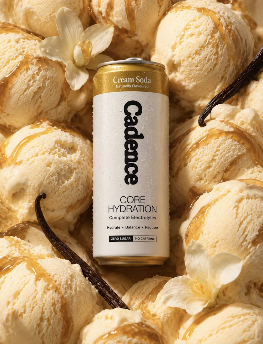
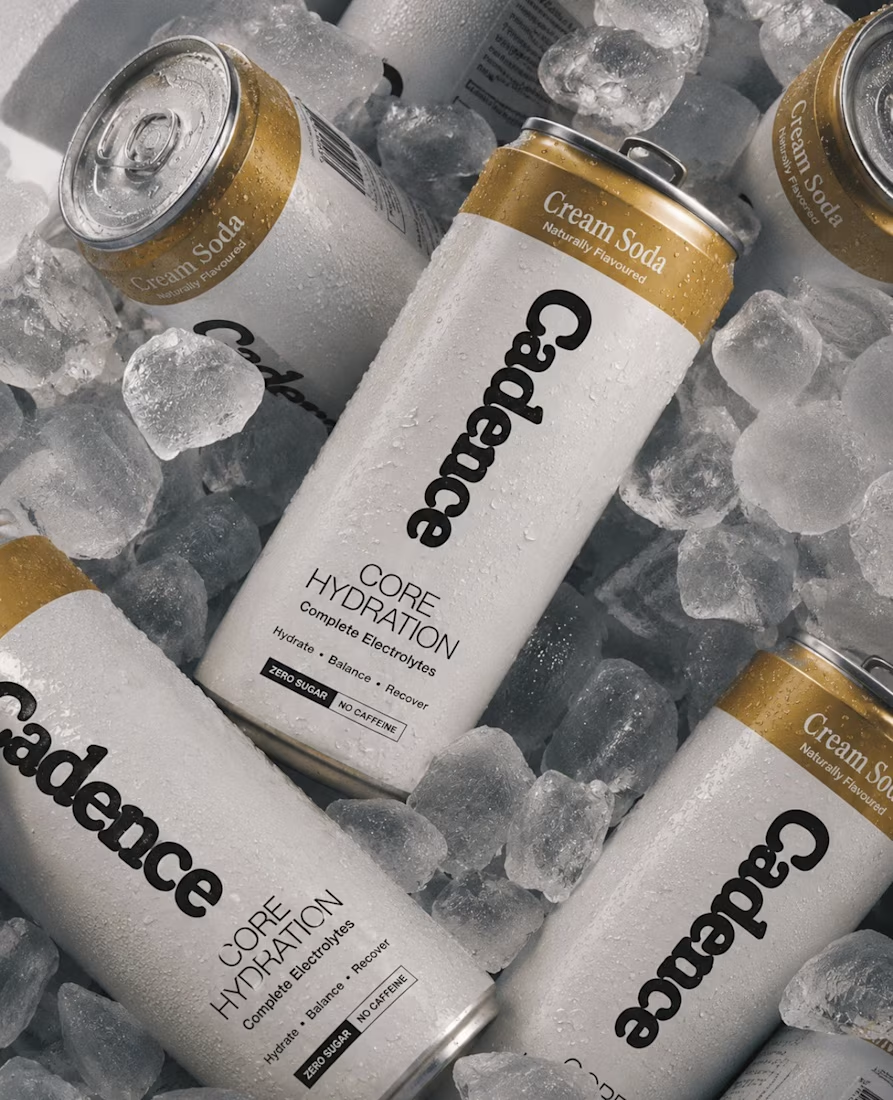

Looks 100% real

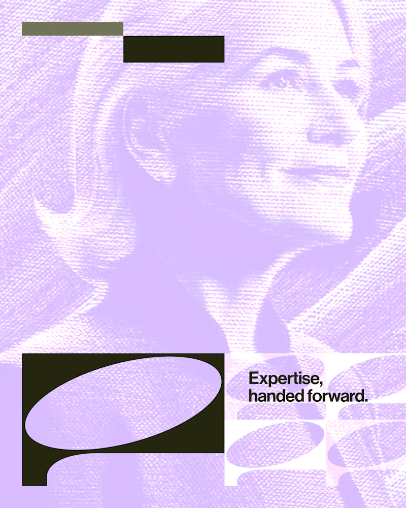
Experimental layouts for Pace. Which one do you like?
23 voted
52%
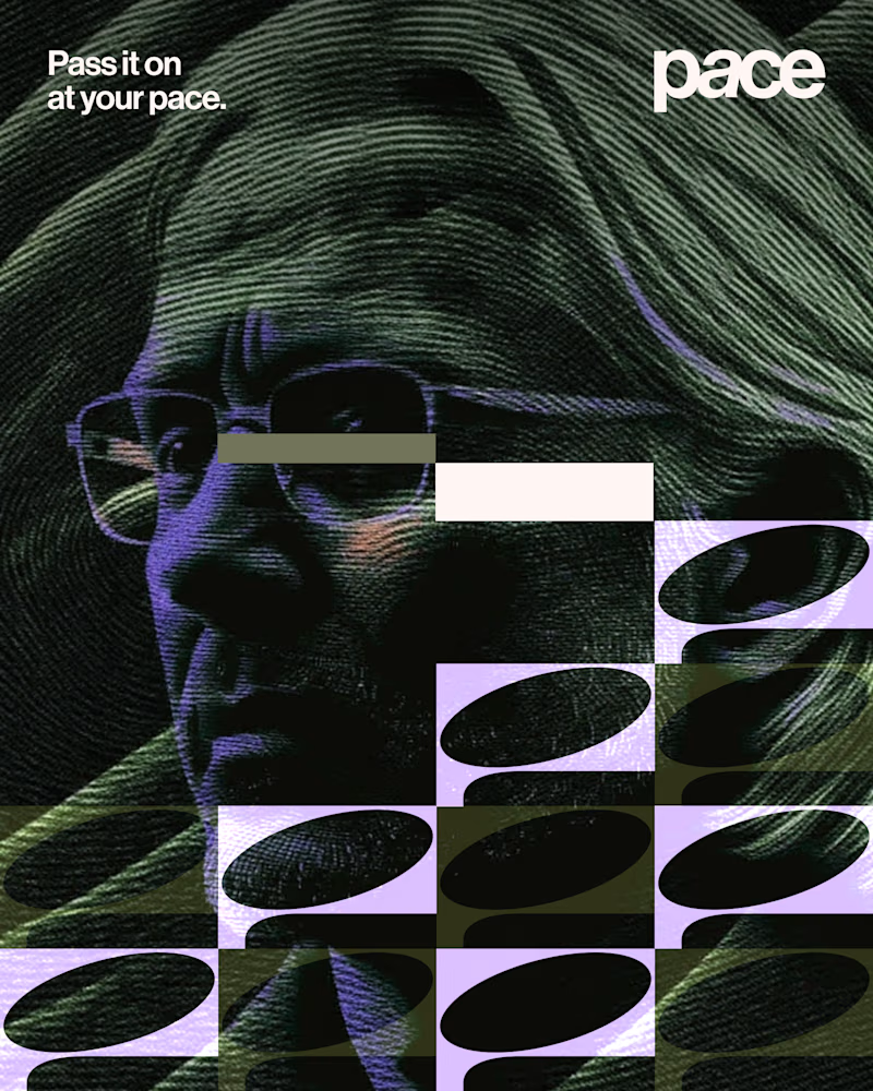
21 voted
48%
44 votes
Closed

Looks cool.

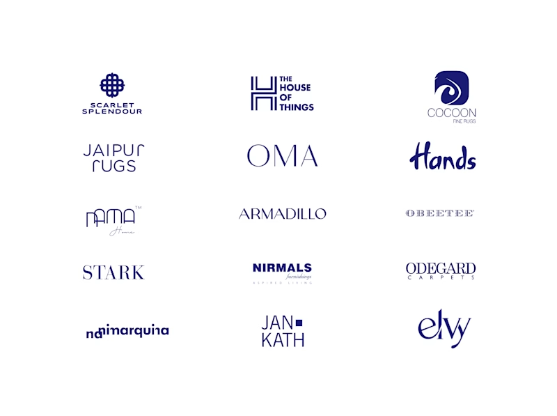
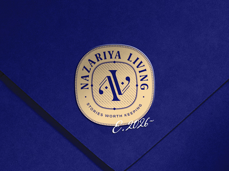
A little look at how Nazariya Living stands apart from its category.
On one side, familiar visual conventions. On the other, an identity with its own character, rooted in stories worth keeping.
We chose not to blend in. :)
Which side catches your eye?


3 voted
30%
7 voted
70%
10 votes
Closed

That side with all the competitor logos in one grid is the slide I'd steal for a client presentation. Nothing explains "why this direction" faster than showing the sea of sameness first. The navy seal wins easily after that.