The network for creativity
Join 1.25M professional creatives like you
Connect with clients, get discovered, and run your business 100% commission-free
Creatives on Contra have earned over $150M and we are just getting started
Back to feedPost
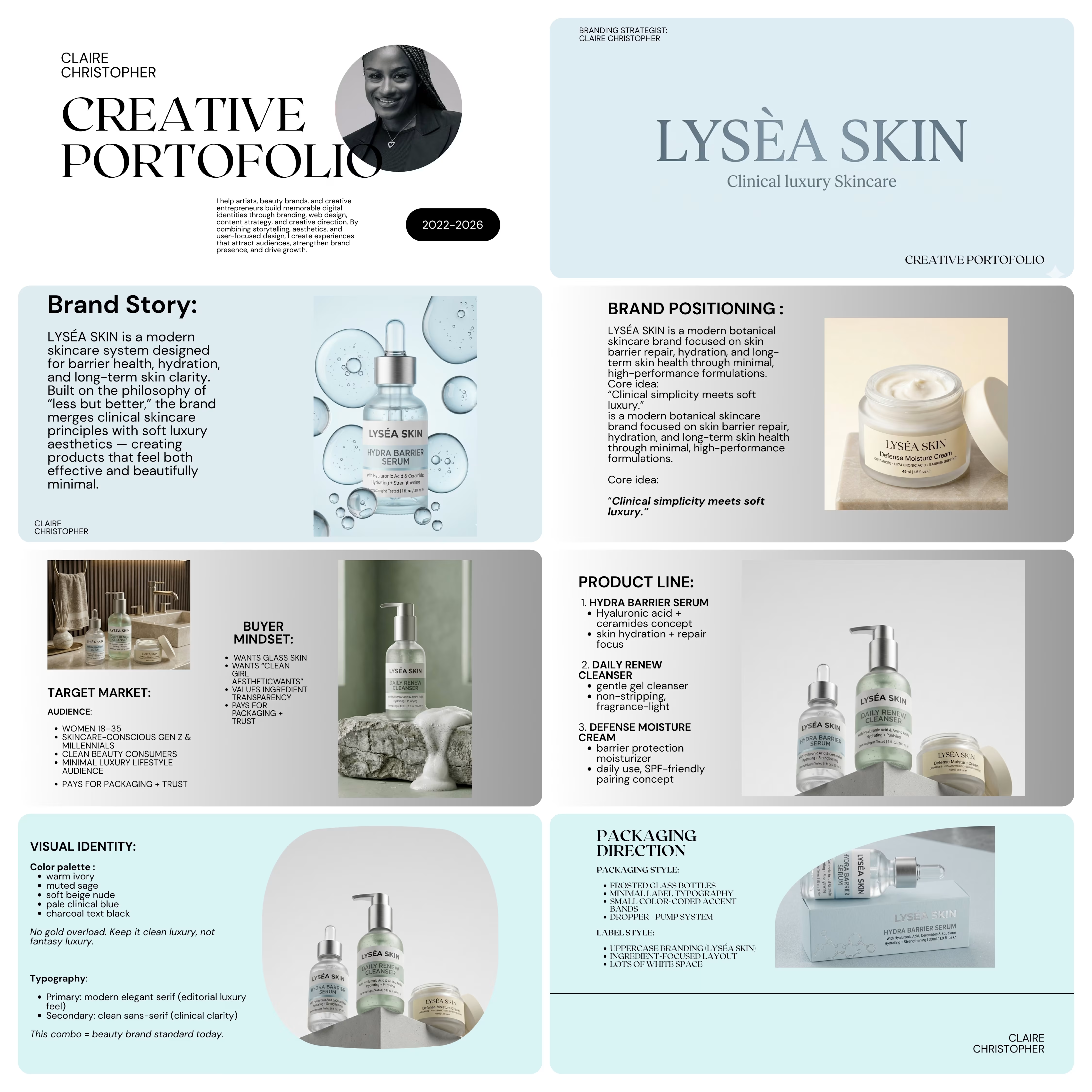
Lysea Skin is a clinical-luxury skincare brand concept that blends science-backed skincare with refined elegance. This project focused on creating a sophisticated brand identity and digital experience that communicates trust, expertise, and premium care while delivering a seamless, modern user journey.



Great!

Appreciate it.
The network for creativity
Join 1.25M professional creatives like you
Connect with clients, get discovered, and run your business 100% commission-free
Creatives on Contra have earned over $150M and we are just getting started





Related posts


Ambrosia - Bodycare Brand Identity & Packaging
My favorite part of this branding and packaging project was working with the different materials. The dark glass, aluminum, and soft paper each bring something different, so I kept the typography and labels simple to help everything sit together.

Amazinnnggg

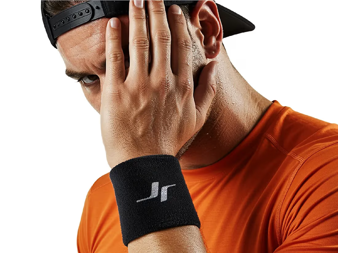
Jordan Reid - Sportswear Brand Identity






Like the logo direction




Wow, I love the colors 😍