
Oyindamola Evelyn
I help authors, marketer in cookbook design, book formatting
New to Contra
Oyindamola is building their profile!
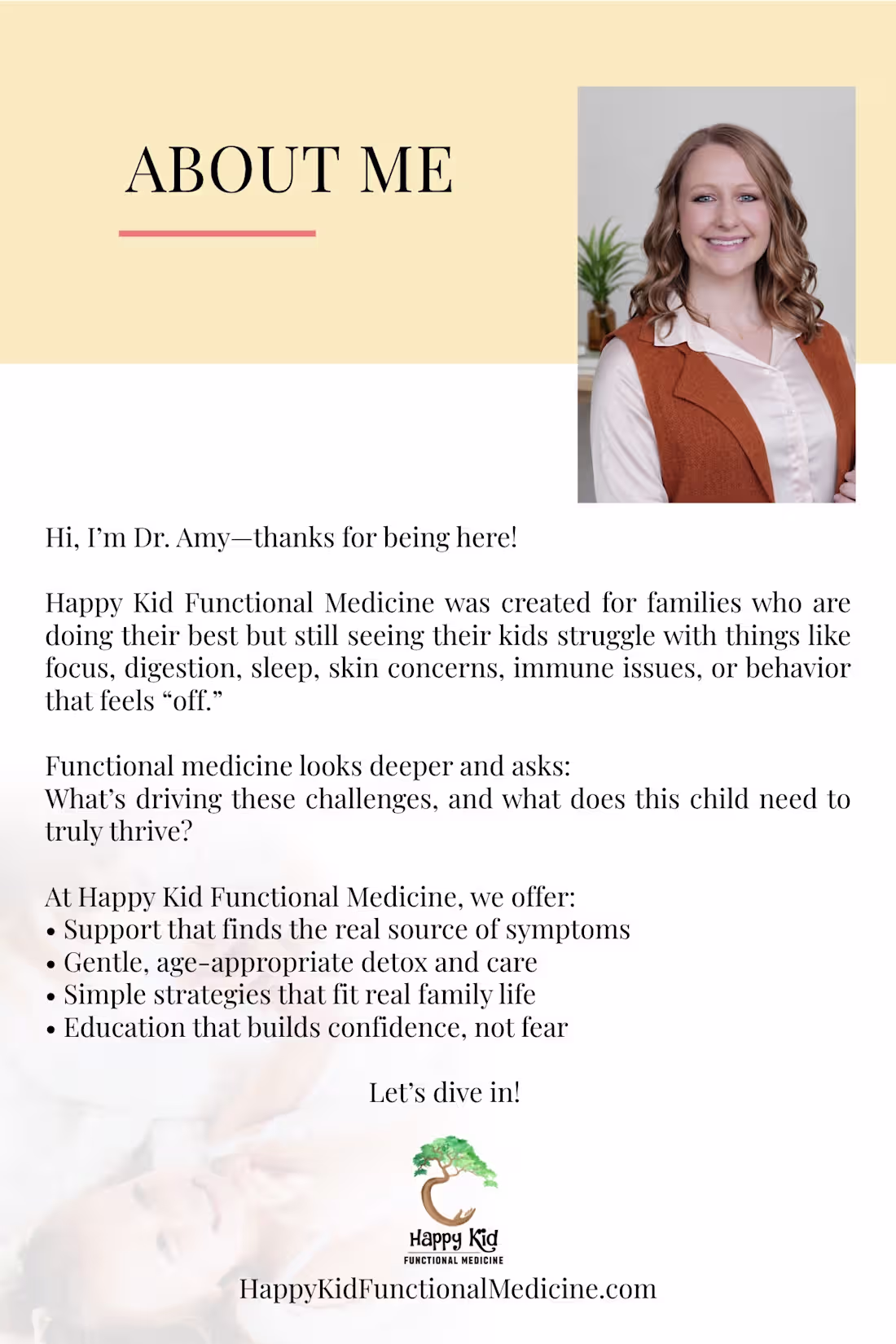
Project Spotlight: About Me Page Design for a Functional Medicine Brand
For this project, I designed a clean and welcoming "About Me" page for a pediatric functional medicine practice. The objective was to create a layout that builds trust, introduces the practitioner professionally, and communicates the brand's mission in a clear and engaging way.
The design features a balanced combination of professional imagery, elegant typography, and organized content sections to improve readability. I used a soft, calming color palette that aligns with the healthcare and wellness industry while maintaining a warm and approachable feel for parents and families.
Special attention was given to visual hierarchy, spacing, and content flow, ensuring visitors can easily understand the practitioner's background, services, and values. The final design strengthens brand credibility, enhances user engagement, and provides a polished experience suitable for both digital and print use.
2
2
69
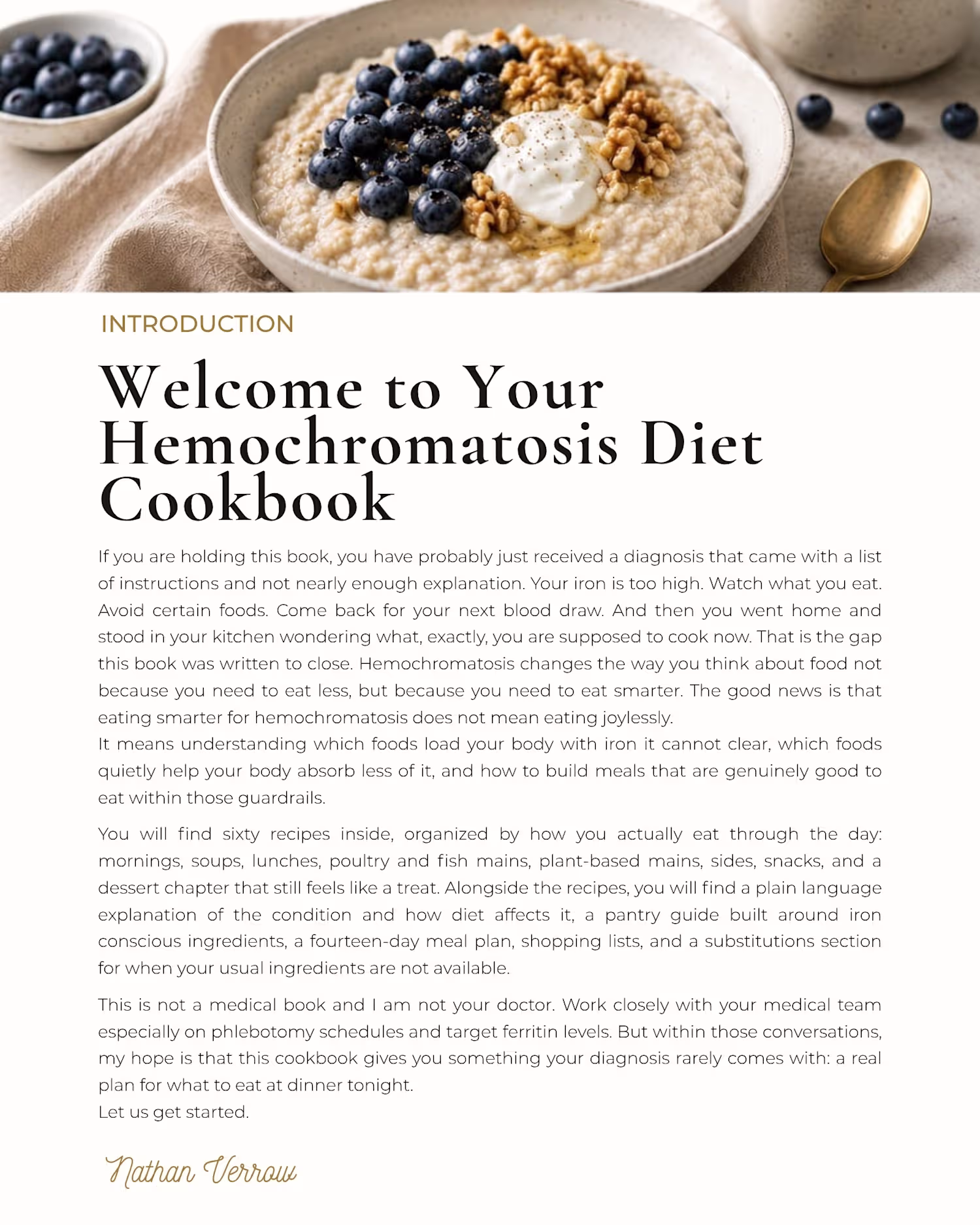
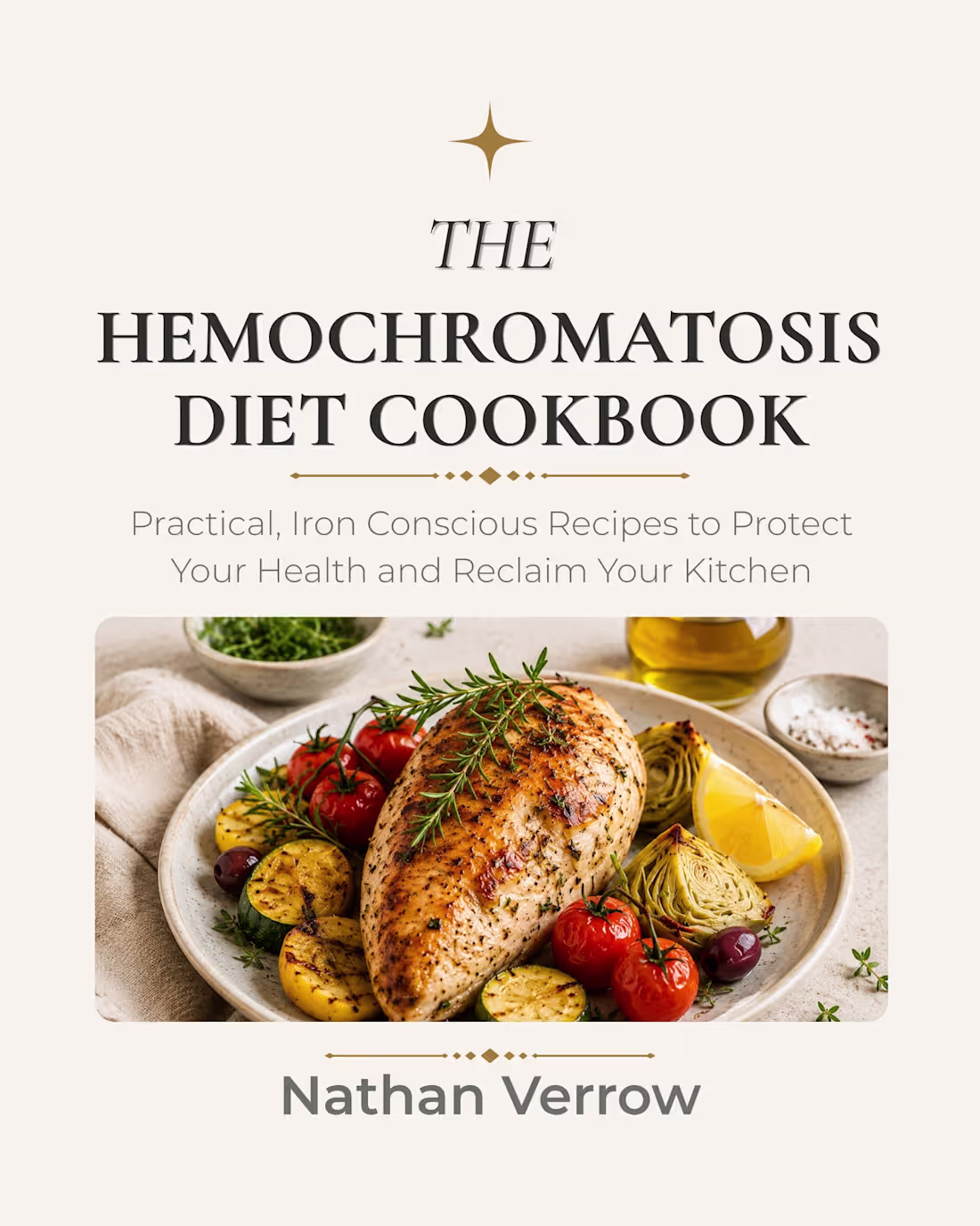
For this project, I created a clean, modern, and reader-friendly cookbook cover designed to immediately communicate the book's purpose and appeal to its target audience. I carefully selected a high quality food image that reflects healthy, iron-conscious eating while maintaining a premium and professional look.
The typography was strategically arranged to establish a clear visual hierarchy, ensuring the title stands out while keeping the subtitle easy to read. I also incorporated elegant decorative elements and a balanced color palette to create a sophisticated design that aligns with the health and wellness niche.
The final result is a polished cookbook cover that combines functionality, visual appeal, and marketability helping the book attract readers while maintaining a professional publishing standard.
0
26
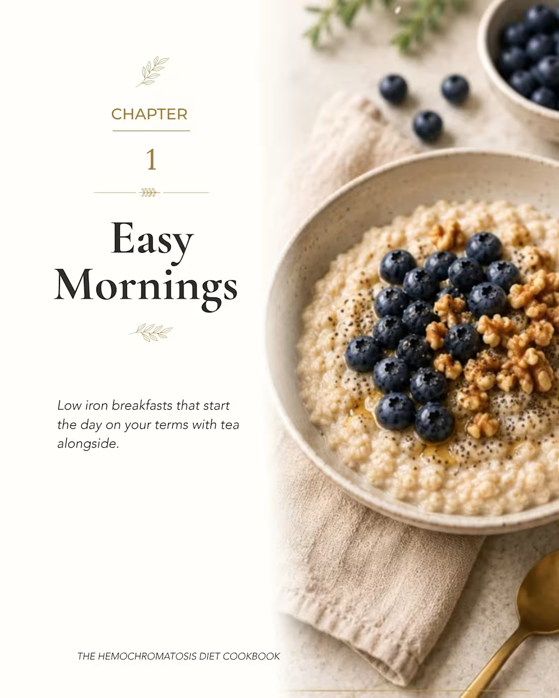
For this project, I created a clean, modern, and reader-friendly cookbook cover designed to immediately communicate the book's purpose and appeal to its target audience. I carefully selected a high quality food image that reflects healthy, iron conscious eating while maintaining a premium and professional look.
The typography was strategically arranged to establish a clear visual hierarchy, ensuring the title stands out while keeping the subtitle easy to read. I also incorporated elegant decorative elements and a balanced color palette to create a sophisticated design that aligns with the health and wellness niche.
The final result is a polished cookbook cover that combines functionality, visual appeal, and marketability helping the book attract readers while maintaining a professional publishing standard.
0
21
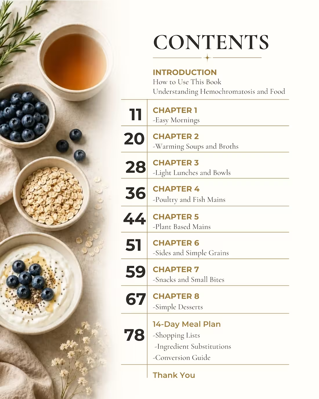
For this project, I created a clean, modern, and reader-friendly cookbook cover designed to immediately communicate the book's purpose and appeal to its target audience. I carefully selected a high quality food image that reflects healthy, iron-conscious eating while maintaining a premium and professional look.
The typography was strategically arranged to establish a clear visual hierarchy, ensuring the title stands out while keeping the subtitle easy to read. I also incorporated elegant decorative elements and a balanced color palette to create a sophisticated design that aligns with the health and wellness niche.
The final result is a polished cookbook cover that combines functionality, visual appeal, and marketability helping the book attract readers while maintaining a professional publishing standard.
0
23