The network for creativity
Join 1.25M professional creatives like you
Connect with clients, get discovered, and run your business 100% commission-free
Creatives on Contra have earned over $150M and we are just getting started
Back to feedPost

Working with AI startups usually comes down to solving one major visual problem.
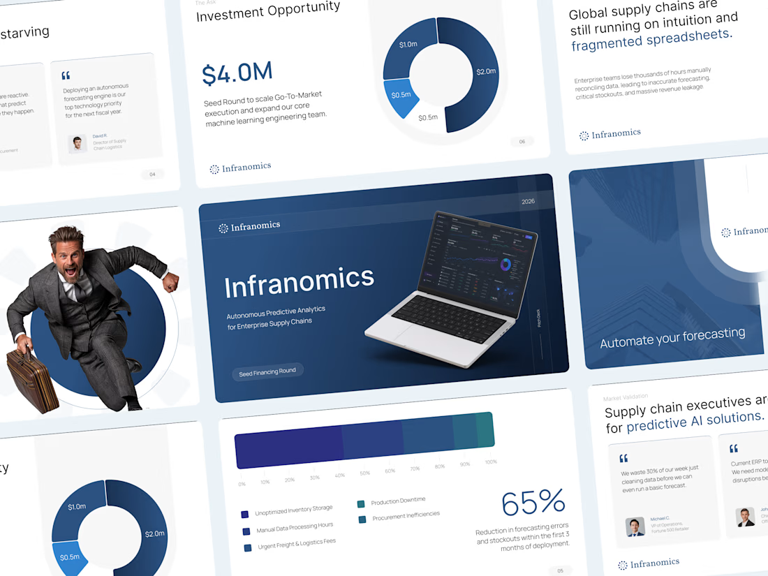
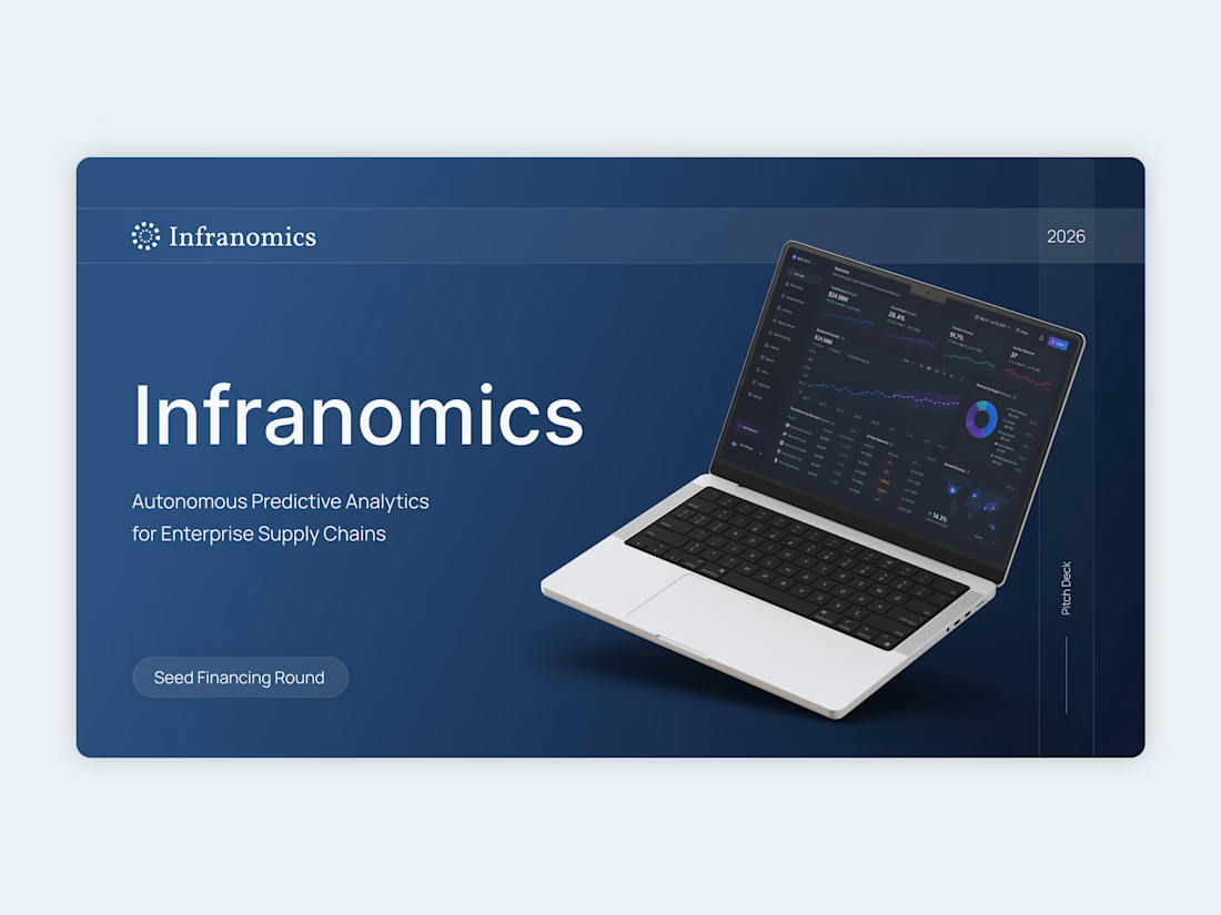
For this Infranomics project, the founders had built an incredibly powerful machine learning tool for supply chain analytics. The challenge was that their original materials looked like a dense technical manual rather than a compelling business narrative for venture capital funds. We needed to translate that heavy data into a clear and persuasive story.
The solution was to cut the noise and focus on pure clarity.
I moved the entire workflow into Figma to architect a highly customized design system from scratch. By using a minimalist aesthetic, clean typography, and very intentional custom data visualization, we managed to take their complex metrics and make them instantly understandable. Once the layouts were perfectly polished, everything was carefully rebuilt as a fully editable native PowerPoint file so the team could easily update numbers in the future.
The final result completely changed how their pitch was received.
Instead of forcing investors to suffer through cognitive overload and confusing charts, the new presentation gave the data room to breathe. It built institutional trust right from the first slide and ultimately helped the founders successfully secure their seed capital.
Sometimes the most advanced technology requires the simplest design.



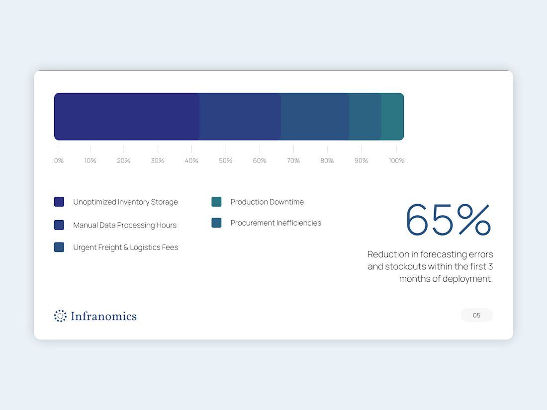

Rebuilding the Figma layouts as a native, editable PowerPoint is the step that usually gets skipped, and it decides whether the deck survives the next round of number updates. Did you keep the custom data visuals as live charts, or as shapes the team adjusts by hand?
That is exactly the hardest part! I always build them as live, data-driven native PowerPoint charts so the founders can easily update their metrics. It takes a bit more effort to style native charts to match the exact Figma concept, but it is the only way the deck survives long-term without breaking the visual hierarchy.
The network for creativity
Join 1.25M professional creatives like you
Connect with clients, get discovered, and run your business 100% commission-free
Creatives on Contra have earned over $150M and we are just getting started

Challenges
View all


Related posts

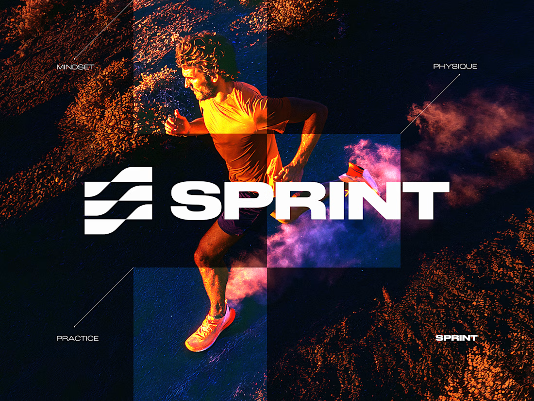
SPRINT — Experimental Brand Visual
A visual experiment built around an unused logo concept from a recent branding project.
The design was created manually, while exploring how AI-driven aesthetics are increasingly influencing contemporary visual language, even when AI itself isn’t part of the design process.
Logo design, art direction and visual exploration.



Turning a SaaS product into a visual story.
For this SaaS motion concept for Vastly, I focused on clean typography, smooth transitions, and visual pacing to make the message feel simple and easy to follow.
The goal wasn’t to add more effects — it was to make every movement communicate something.
Motion Design
✦ Typography Animation
✦ SaaS / Product Animation
✦ Adobe After Effects
Built in After Effects with a focus on clarity, pacing, and clean motion.


Really relate to this, Chethan. For my luxury product films I follow the same rule — goal isn't more effects, it's making every movement intentional. Your focus on clean typography + smooth transitions for Vastly makes the complex SaaS message feel simple. How did you handle the...

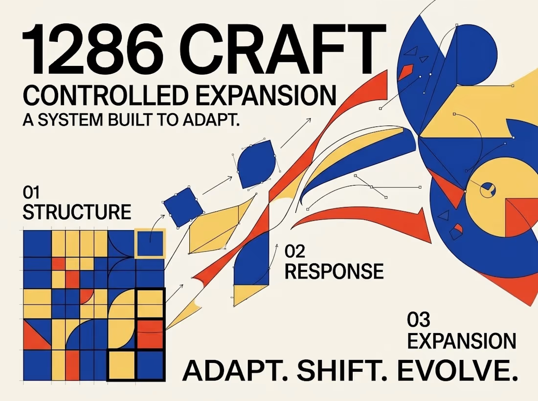
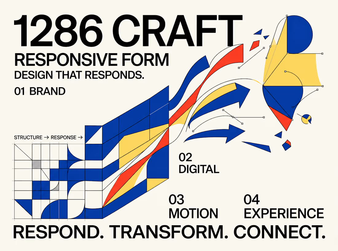
SYSTEM IN MOTION — Exploring Responsive Graphic Design
What happens when a visual identity moves beyond static composition and becomes a dynamic, responsive design system?
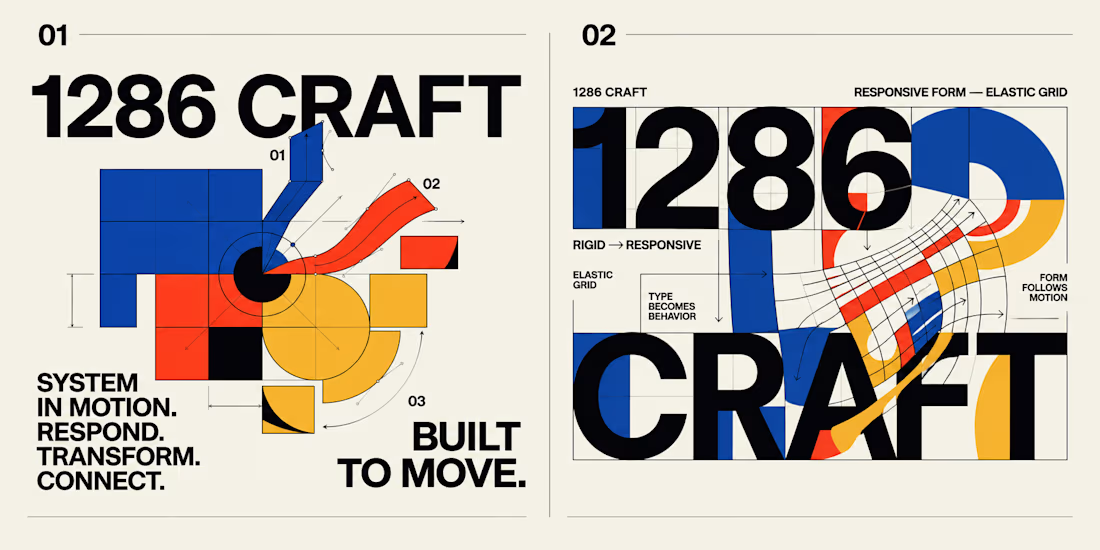
This experimental graphic design project for 1286 CRAFT explores the relationship between bold typography, geometric structures, elastic grids, and kinetic motion.
Built around a distinctive visual language of cobalt blue, vibrant red-orange, warm yellow, and high-contrast black, the project transforms rigid graphic elements into expressive, adaptable compositions.
The Creative Direction
The concept begins with structured grids, modular geometry, and strong typographic hierarchy. These foundational elements gradually evolve into fluid forms, curved pathways, directional movements, and interconnected visual systems.
Each composition investigates a different aspect of transformation, demonstrating how consistent design principles can support both precision and creative flexibility.
From Static Design to Motion
The project extends beyond traditional poster design through a short motion sequence that brings the visual system to life.
Geometric forms expand, intersect, rotate, and transition into flowing compositions, creating a seamless relationship between static graphic design and motion-driven storytelling.
The Design Philosophy
Great visual systems should do more than look consistent. They should communicate, respond, evolve, and create meaningful connections across different formats and experiences.
This exploration brings together experimental typography, editorial composition, modular design, and motion principles to demonstrate how a single creative direction can become a cohesive visual language.
RESPOND. TRANSFORM. CONNECT.
BUILT TO MOVE. DESIGNED TO EVOLVE.
Creative Direction & Visual Design — 1286 CRAFT
#GraphicDesign #BrandIdentity #MotionDesign #VisualSystems #Typography #CreativeDirection #1286CRAFT


When the grid starts bending into those curved pathways, what keeps it reading as 1286 CRAFT, the palette or the type? Curious which one you treated as the non-negotiable.