The network for creativity
Join 1.25M professional creatives like you
Connect with clients, get discovered, and run your business 100% commission-free
Creatives on Contra have earned over $150M and we are just getting started
Back to feedPost

SYSTEM IN MOTION — Exploring Responsive Graphic Design
What happens when a visual identity moves beyond static composition and becomes a dynamic, responsive design system?
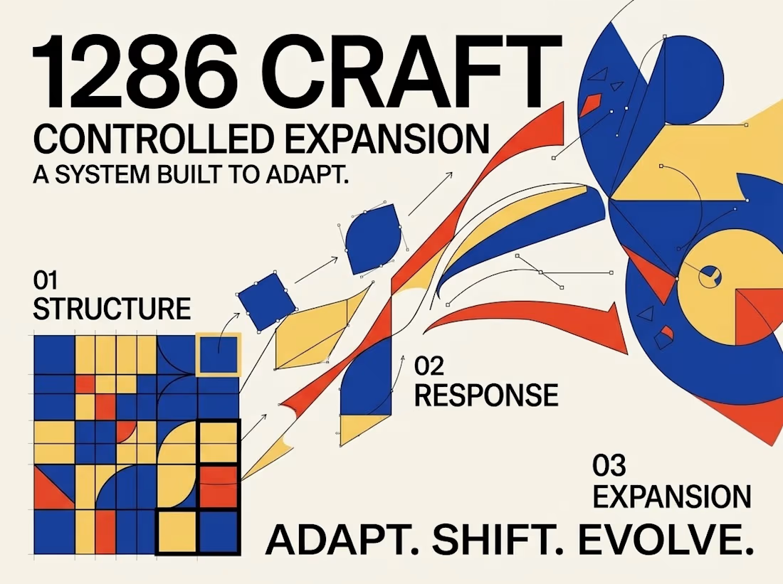
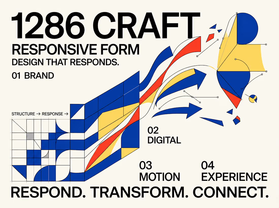
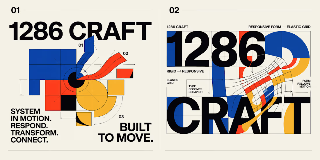
This experimental graphic design project for 1286 CRAFT explores the relationship between bold typography, geometric structures, elastic grids, and kinetic motion.
Built around a distinctive visual language of cobalt blue, vibrant red-orange, warm yellow, and high-contrast black, the project transforms rigid graphic elements into expressive, adaptable compositions.
The Creative Direction
The concept begins with structured grids, modular geometry, and strong typographic hierarchy. These foundational elements gradually evolve into fluid forms, curved pathways, directional movements, and interconnected visual systems.
Each composition investigates a different aspect of transformation, demonstrating how consistent design principles can support both precision and creative flexibility.
From Static Design to Motion
The project extends beyond traditional poster design through a short motion sequence that brings the visual system to life.
Geometric forms expand, intersect, rotate, and transition into flowing compositions, creating a seamless relationship between static graphic design and motion-driven storytelling.
The Design Philosophy
Great visual systems should do more than look consistent. They should communicate, respond, evolve, and create meaningful connections across different formats and experiences.
This exploration brings together experimental typography, editorial composition, modular design, and motion principles to demonstrate how a single creative direction can become a cohesive visual language.
RESPOND. TRANSFORM. CONNECT.
BUILT TO MOVE. DESIGNED TO EVOLVE.
Creative Direction & Visual Design — 1286 CRAFT
#GraphicDesign #BrandIdentity #MotionDesign #VisualSystems #Typography #CreativeDirection #1286CRAFT



When the grid starts bending into those curved pathways, what keeps it reading as 1286 CRAFT, the palette or the type? Curious which one you treated as the non-negotiable.
Great question, Artur! Typography is the primary anchor of the 1286 CRAFT identity, while the color palette reinforces recognition across the system.
Type as the constant makes sense, it leaves the palette room to flex per format. Did you set any limits on how far the colors can drift once the pieces start moving?
Absolutely, Artur! I kept the core color palette consistent to maintain brand recognition. The motion introduces variation through layering, transparency, and movement rather than changing the actual brand colors. This allows the system to feel dynamic while preserving its visual identity.

Great animation it was really unique and vibrant it has great emotion🎉🎉❤️❤️
Thank you so much 😊
Pardon ❤️
The network for creativity
Join 1.25M professional creatives like you
Connect with clients, get discovered, and run your business 100% commission-free
Creatives on Contra have earned over $150M and we are just getting started





Related posts

Most creative brands try to say everything at once.
More colour.
More shapes.
More visual noise.
But for this identity exploration, the idea was simpler:
Make creativity feel meaningful.
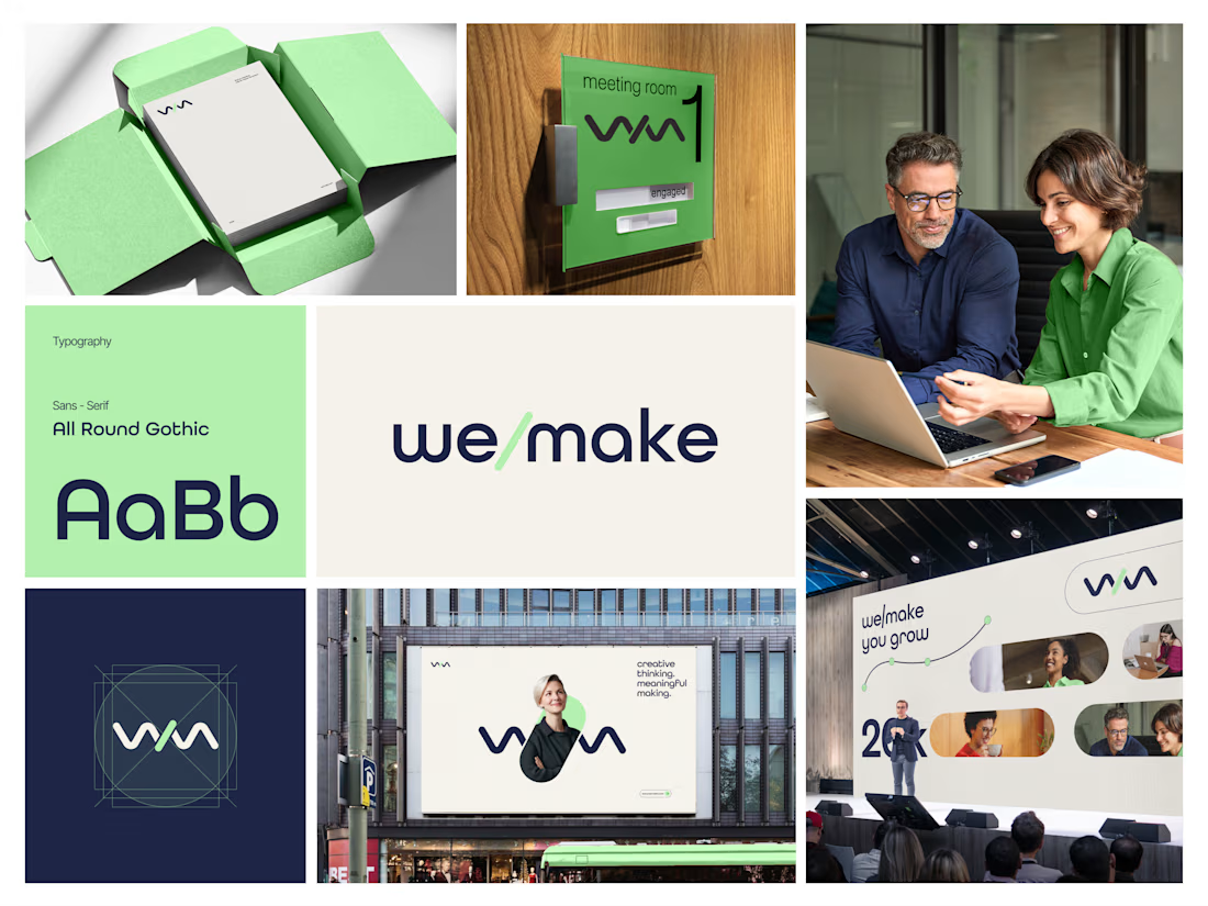
Introducing we/make, a bold, human-centred visual identity built around collaboration, growth, and purposeful making.
The mark is designed as a flexible expression of “we” and “make” coming together.
It represents:
• Ideas turning into action
• People creating together
• Growth through meaningful work
• A creative process that stays clear, warm, and confident
The visual system pairs a deep navy foundation with a fresh green accent, bringing together trust, focus, energy, and optimism.
Rounded typography and soft graphic elements keep the brand approachable, while the structured layouts give it a modern, professional feel.
From stationery and meeting-room signage to campaigns, billboards, and event spaces, the identity is built to work wherever creativity needs to show up.
Creative thinking. Meaningful making.
Would love to hear your thoughts on the visual direction.
What stands out to you first, the logo, colour palette, or overall brand feel?
#BrandIdentity #BrandDesign #CreativeDirection #VisualIdentity #GraphicDesign #LogoDesign




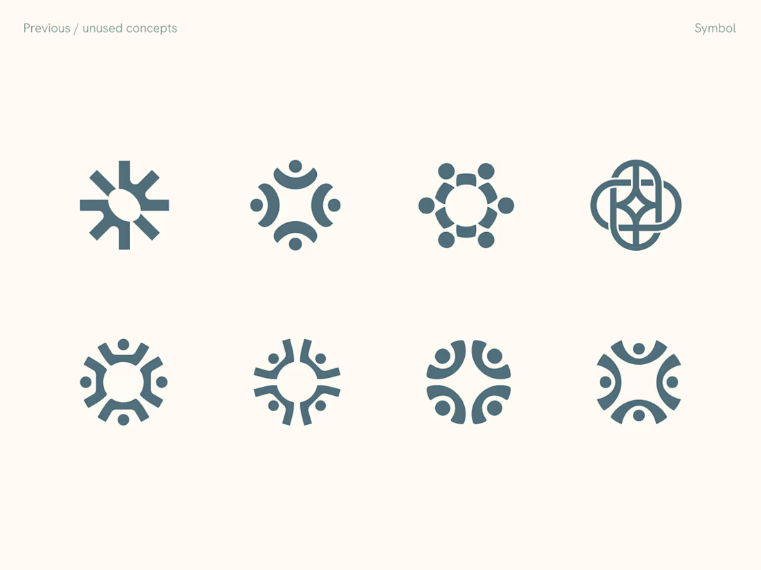
Rejected logo concepts exploring collaboration, shared expertise & working side by side

Two cuts of the same Outlier promo. 24 seconds each, one framed wide, one framed for the phone. 1 or 2. Why?🤔
8 voted
50%
8 voted
50%
16 votes
Closed

Going with 2. Most people will watch it on their phone anyway and the tighter framing feels punchier. 1 looks more cinematic though.