The network for creativity
Join 1.25M professional creatives like you
Connect with clients, get discovered, and run your business 100% commission-free
Creatives on Contra have earned over $150M and we are just getting started
Back to feedPost


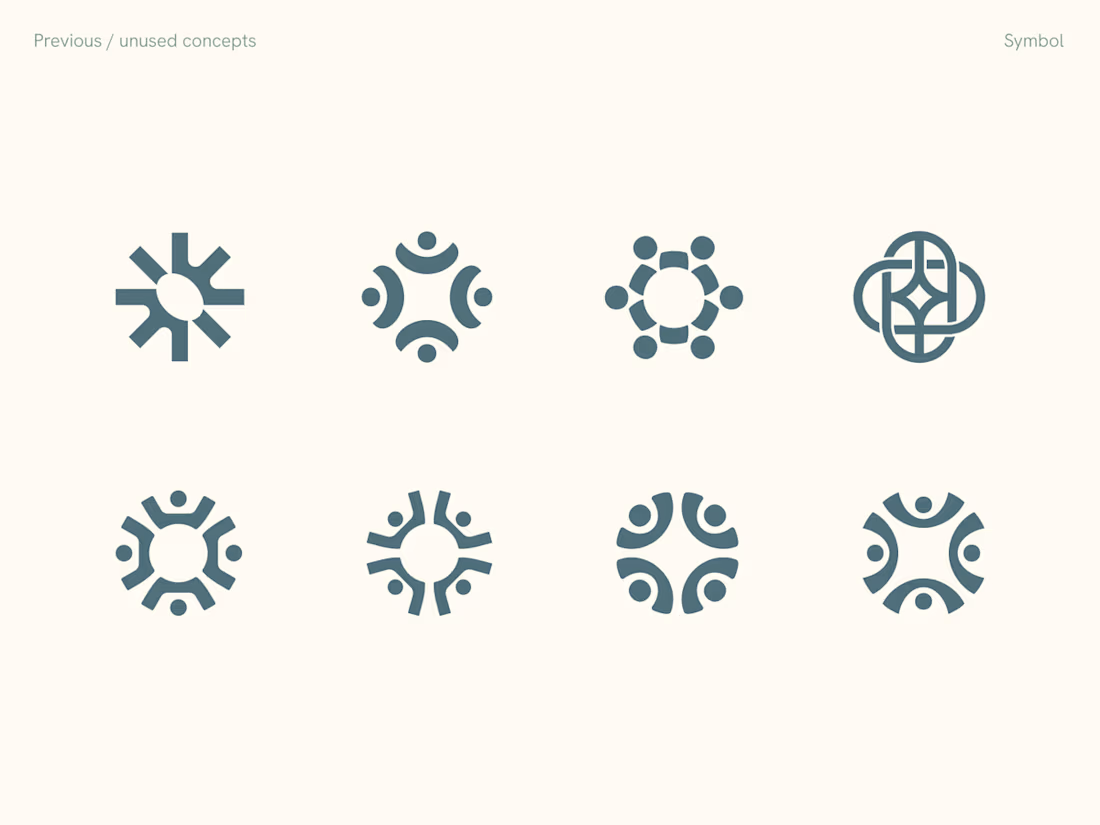
Rejected logo concepts exploring collaboration, shared expertise & working side by side


Weldone, Aryna

Good

Need more context about the design and the reason for rejection, but the fourth one is looking very meaningful logo. I would like to share ideas and explore more.

Good work

Rejected concepts are always my favorite to see. Some of these are really strong, the side by side idea comes through nicely.

Rare to see rejected concepts shared. Those figures around the circle read as teamwork right away. What made the chosen one win?

Nice concept

The bottom-right concept feels the most resolved to me. It communicates people working around a shared center without becoming too literal, and the negative space gives it a stronger sense of balance than the others.

so good!
The network for creativity
Join 1.25M professional creatives like you
Connect with clients, get discovered, and run your business 100% commission-free
Creatives on Contra have earned over $150M and we are just getting started











Related posts
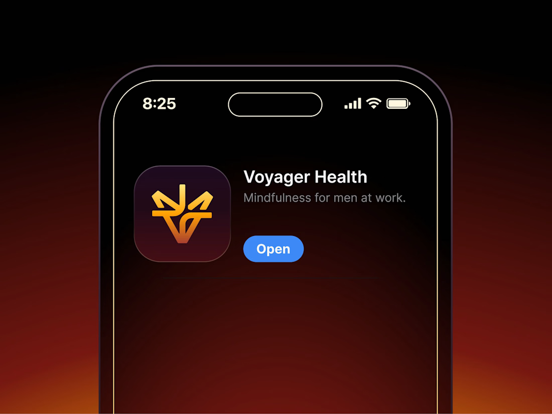

Aryna, that golden symbol pops so nicely against the plum background ✨

It’s been a minute since my last post here on Contra.
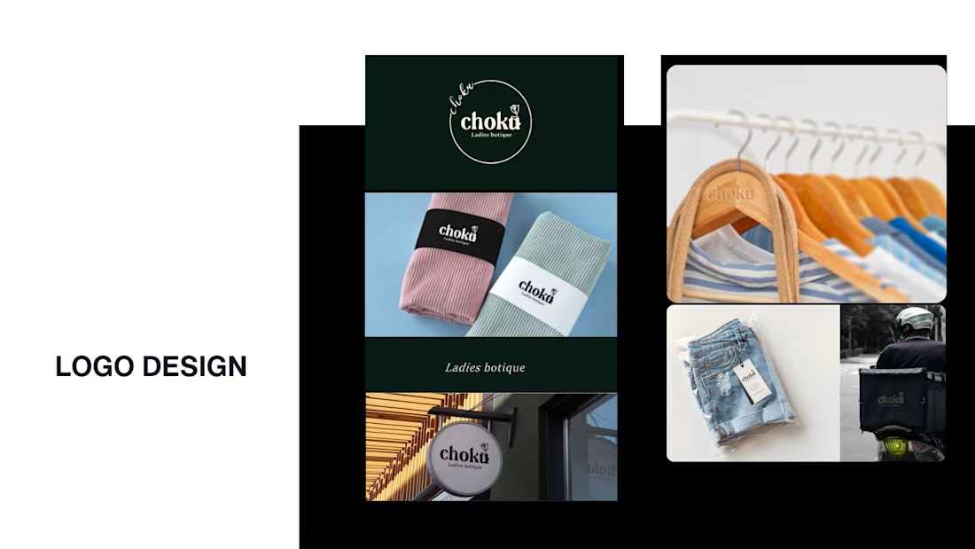
While my main focus usually lives in photo editing and digital design, I was digging through the archive recently and thought it’d be fun to share a couple of branding projects from the past:
Slide 1: Seart Visuals apparel & merchandise branding (1 year ago)
Slide 2: Choku Ladies Boutique identity and mockups (2 years ago)
Brand identity isn't my everyday lane, but tackling projects like these taught me a lot about visual consistency across different mediums. I’d love to hear your thoughts or see any feedback from fellow designers. Great to connect with the community again.


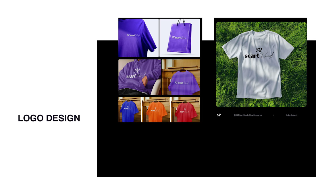

That's really great typography logo design❤️❤️

A flower that inflates arrives in the mail.
Next month, a phone made of shell.
STILL LIFE SERVICE. Case study dropping soon.
Which object earns your shelf? Reply below.
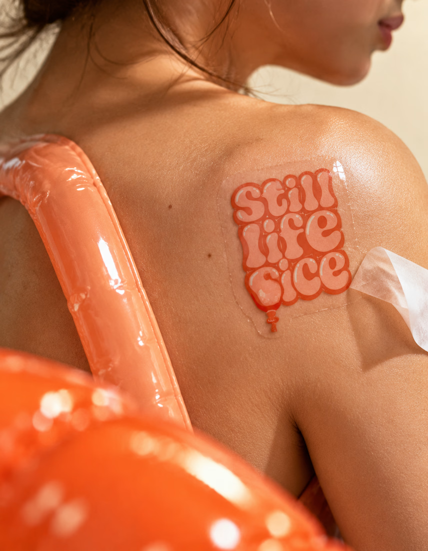
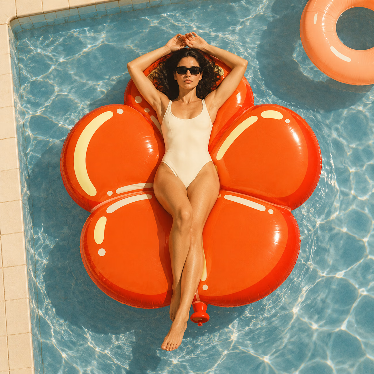
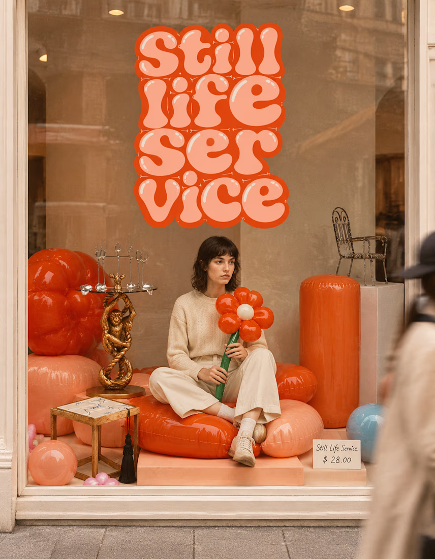

The inflatable flower. Only houseplant I'm guaranteed not to kill. Also, a new object every month is a sneaky good retention hook, people will stay subscribed just to see what's next.