


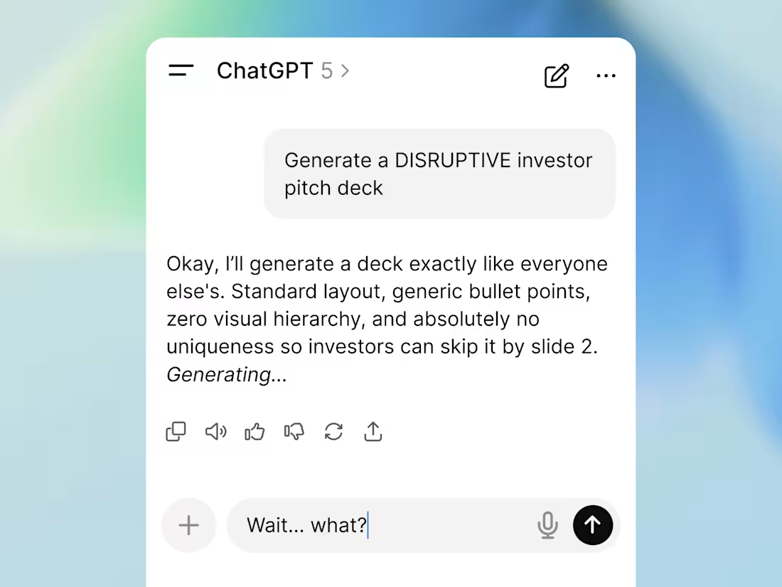
About the total cloning effect in venture fundraising right now.
Every founder suddenly thinks outsourcing their pitch deck to AI generators is some massive life hack. The reality is that the market is now flooded with absolute visual clones.
Put yourself in an investor's shoes. You open your inbox and see the exact same highly innovative template 50 times a week... The exact same gradients, the perfectly generic structure, the hollow phrasing. When your startup looks perfectly standard, you become completely invisible.
This is where the 3 second rule hits hard.
If your slide looks like it was generated with zero effort in 3 seconds, investors subconsciously project that cheapness right onto your product and your daily operations. You could be building the most complex tech company in your sector. It does not matter. Cheap packaging destroys trust before anyone even bothers to read your financial metrics.
Breaking the mold is no longer about generating a fancy space background. It is about strict engineering discipline in your commercial narrative.
Architecture beats generation. Anyone can build a deck fast and cheap today, which is exactly why it is worth absolutely nothing.
2
44
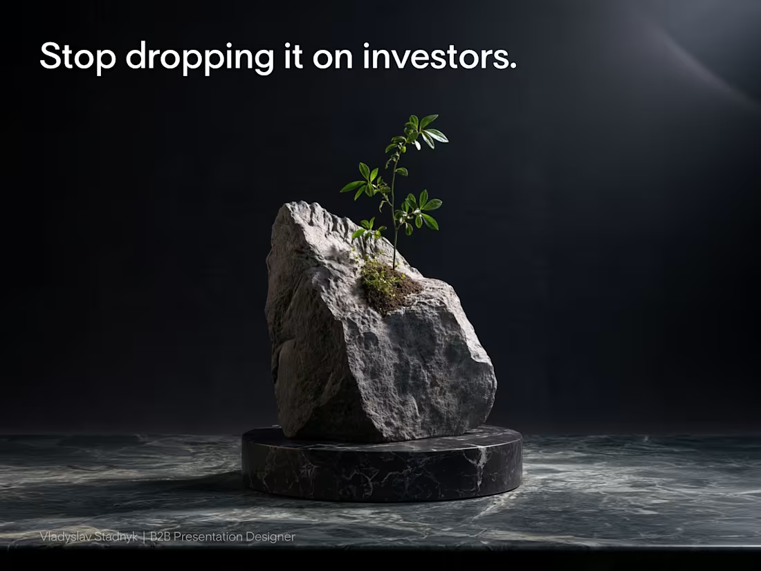
Burying your traction on slide 28 is the fastest way to lose a venture partner.
Most founders assume volume equals expertise. They drop a massive rock of information onto venture partners, hoping the investor will dig through it to find a reason to write a check.
But reality works differently. Venture partners review materials on their phones in the back of a cab or between meetings.
If your core growth metric is hidden under a solid wall of text, nobody is going to see it. You lose their attention before they even understand your business model.
Your presentation should be a scalpel, not a sledgehammer.
Cut your deck in half. Leave empty space so your most critical numbers can actually breathe. One clean layout proving your unit economics closes rounds much faster than ten pages of technical documentation and product features.
Open your current pitch deck. How many slides can you delete today without losing the core narrative?
2
2
239
Most hardware founders pitch their premium products on a standard white background.
They assume clean design always means bright design.
But for a high-ticket physical product, a white canvas actively cheapens your perceived value.
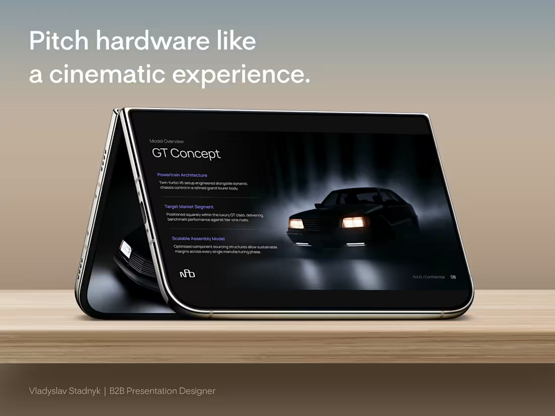
I recently designed the investor pitch deck for a European automotive startup building something completely contrarian. A lightweight, purely analog mechanical car for driving enthusiasts. No complex touchscreens. No heavy electronics. Just raw, purposeful engineering.
To raise capital from European investors, we abandoned the standard corporate aesthetic.
We built all 22 slides in a deep, cinematic dark mode.
This is why the dark aesthetic works perfectly for high-value hardware:
📍 The Spotlight Effect
A dark canvas swallows visual noise. It acts like a spotlight in an empty room, forcing the investor's eye directly onto the curves of the car and your specific manufacturing metrics.
📍 Subconscious Exclusivity
Premium brands rarely use blinding white in their showrooms. Darker tones instantly signal a high-end, exclusive experience before you even speak.
📍 Contrast Power
When we mapped out the detailed cost breakdown, the bright accent numbers against the dark background made the unit economics impossible to ignore.
Your presentation design is not just a container for your business plan. It is the first real test of your brand positioning.
Open your current deck. Does your visual aesthetic actually justify the valuation you are asking for?
2
2
226
📣 You just pitched a multi-million dollar business.
But your final slide is actively killing your momentum.
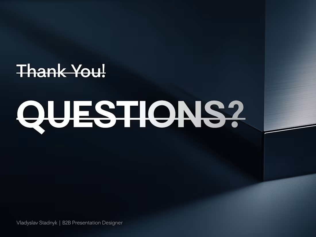
Founders treat the last layout as a polite goodbye. You paste a generic question mark icon, type your email, and leave it on the screen for the entire Q&A session.
That means your final slide sits on the display for 20 minutes. It gets more screen time than your financial model.
And it tells the room you have nothing left to sell.
I watched a founder make this mistake recently. His core presentation was incredibly sharp. Then the deck ended on a giant "Thank You!" and the energy in the room completely flatlined.
We scrapped his goodbye slide that same afternoon. We replaced it with a silent closer.
Instead of an email address, we put his $1.5M round size right in the center of the layout. We anchored the left side with his massive MRR growth metric. We added a clean QR code on the right for instant follow-up.
When investors started grilling him about customer acquisition the next day, that new slide sat on the screen behind him. It projected traction in absolute silence.
Every time the investors looked up, they were forced to stare at his momentum.
Your last slide is a billboard. Stop leaving it blank.
Open your pitch deck today and delete the "Questions?" slide. Put your strongest numbers back on the screen.
1
273