The network for creativity
Join 1.25M professional creatives like you
Connect with clients, get discovered, and run your business 100% commission-free
Creatives on Contra have earned over $150M and we are just getting started
Back to feedPost

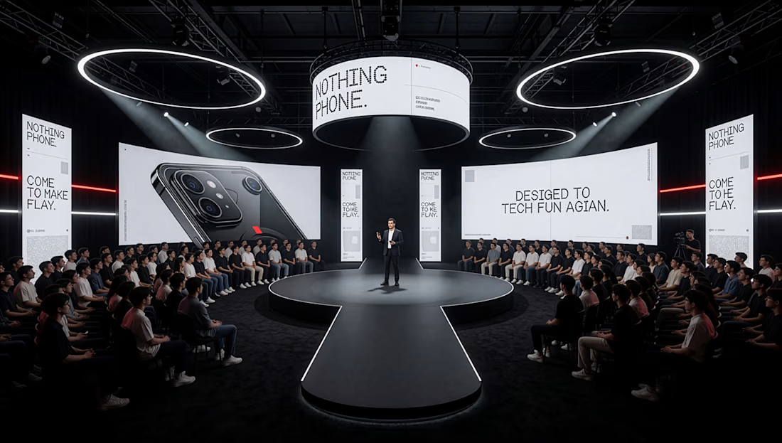
A strong event visualization is not simply about making a dark space look dramatic.
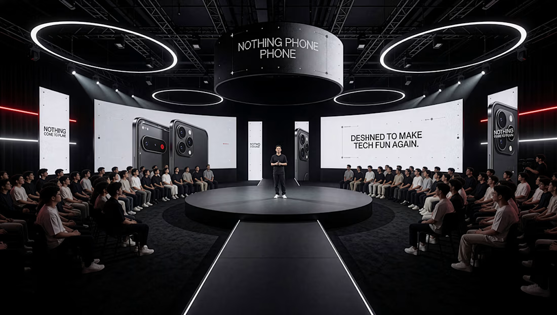
For this product-launch stage concept, I focused on how the stage, audience, presentation screens and lighting work together as one experience.
The central walkway creates a clear visual axis toward the presenter, while the symmetrical audience arrangement gives the composition balance. The large screens provide the product focus, and the circular ceiling lights add scale and structure to the upper part of the space.
The main challenge was controlling contrast. The environment is intentionally dark, so the lighting had to define the stage and circulation path without competing with the presentation content.
This project reinforced an important part of my visualization process: every camera angle and lighting decision should help communicate how a space is experienced, not simply make the image look impressive.
#architecturalvisualization #3dvisualization #eventdesign #productvisualization #3dstagedesign #giftolayinka_

The network for creativity
Join 1.25M professional creatives like you
Connect with clients, get discovered, and run your business 100% commission-free
Creatives on Contra have earned over $150M and we are just getting started
Related posts

IPO Gateway landing page web design 3D animation website


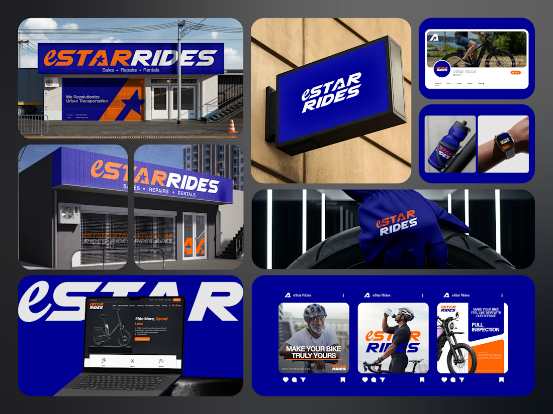
If you sell e-bikes, repairs and rentals, your brand should feel energetic before the customer even walks into the shop.
That was the challenge behind eStar Rides.
The brand needed to feel modern, confident and instantly recognizable across both physical locations and digital touchpoints.
So the identity was built around:
🟠 High-energy orange for visibility and impact
🔵 Deep electric blue for trust and technology
⭐ A bold star-led symbol for direction and recall
🔤 Custom typography with a strong, performance-driven feel
📱 A visual system designed to stay consistent everywhere
Then the identity was carried across:
Storefront signage
Retail environments
Website
Social media
Merchandise
Water bottles
Wearables
Campaign graphics
Digital applications
The goal was not just to make eStar Rides look modern.
It was to make the brand feel established, distinctive and ready to compete.
Because strong mobility branding should communicate:
Energy.
Freedom.
Confidence.
Reliability.
Before a customer even starts comparing options.
eStar Rides
Built for the ride.
What gives the brand the strongest presence?
A. The orange + blue palette
B. The custom wordmark
C. The storefront applications
D. The complete visual system
Drop A, B, C or D below.
If you are building a mobility, automotive, e-bike, transportation or tech-driven service brand and your visuals still feel generic, send me a message.
I help businesses build identities that feel more recognizable, credible and commercially ready.
#BrandIdentity #MobilityBranding #AutomotiveBranding #VisualIdentity #LogoDesign #RetailBranding #CreativeDirection #TransportationBranding



e bikes need branding with this kind of energy,, most of them look like appliance brands