The network for creativity
Join 1.25M professional creatives like you
Connect with clients, get discovered, and run your business 100% commission-free
Creatives on Contra have earned over $150M and we are just getting started
Back to feedPost

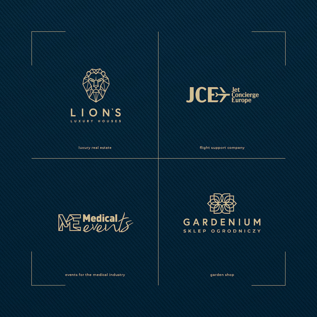
I create professional, memorable brand identities that help businesses look established, build customer trust and stand out from competitors while keeping the project affordable and accessible.
Whether you are launching a new business or refreshing an existing brand, I turn your ideas into a clear and consistent visual identity that works across digital and print.
What I deliver:
• Professional logo design and variations
• Complete color palette
• Typography and font selection
• Brand style and visual direction
• Business card and stationery design
• Social media brand assets
• Packaging or marketing applications where required
• Brand guidelines for consistent use
• High-resolution print and digital files
• Editable source files
I don't just create a logo. I build a complete visual system that gives your business a professional and consistent presence across every customer touchpoint.
I keep my pricing affordable while maintaining strong attention to detail and professional-quality design.
You receive unlimited revisions until you are happy with the final direction, plus a 100% money-back guarantee if you are not satisfied with the completed work.
For larger branding projects, rebrands, packaging systems or additional brand applications, I can provide a tailored quote based on your requirements.


The network for creativity
Join 1.25M professional creatives like you
Connect with clients, get discovered, and run your business 100% commission-free
Creatives on Contra have earned over $150M and we are just getting started





Related posts

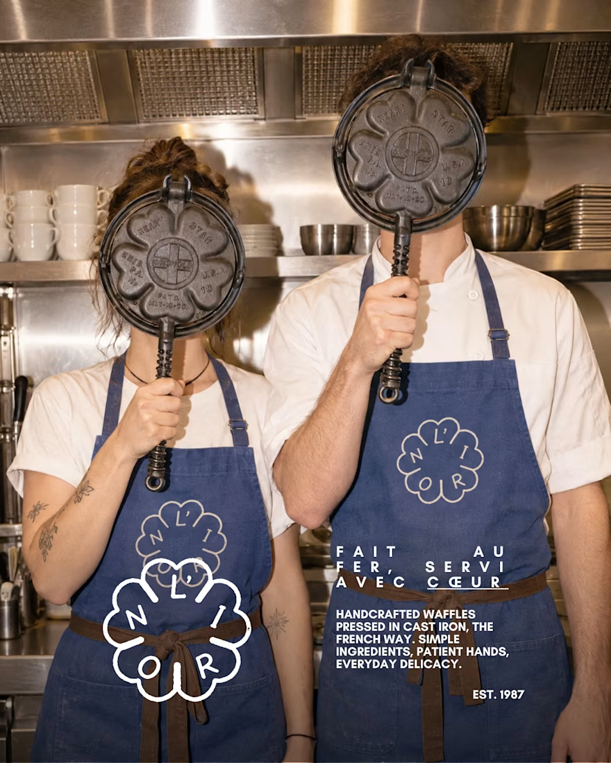
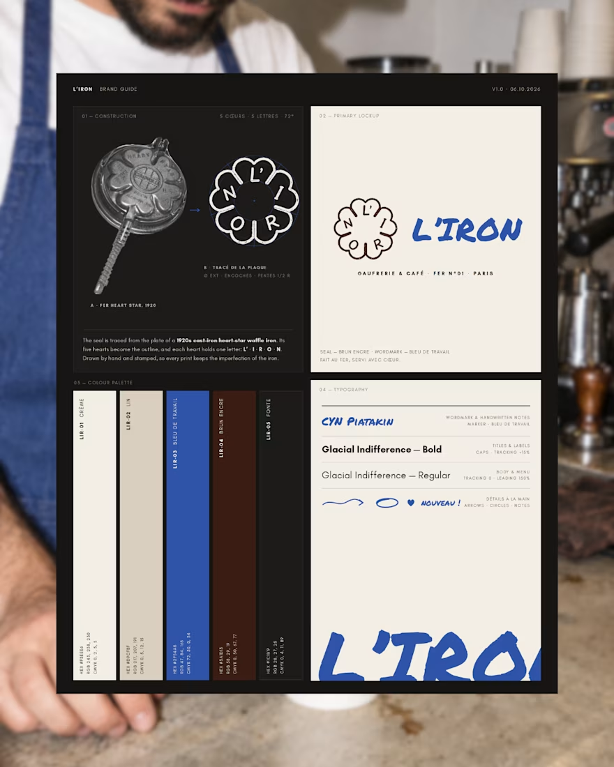
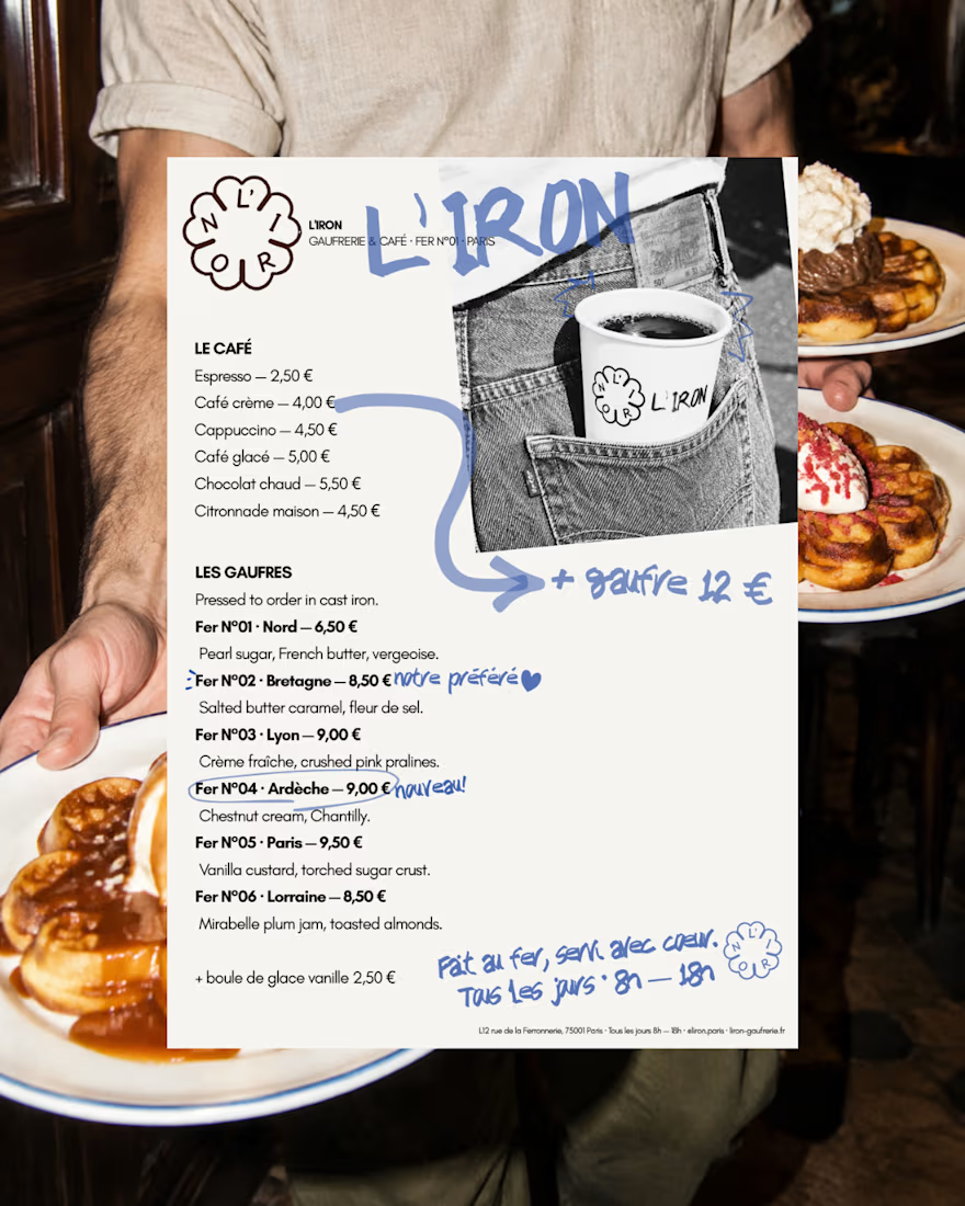
L'IRON is a brand identity for a modern French waffle house, created for the Designerbriefs weekly challenge (Brief 181). The logo is traced from the plate of a 1920s heart-star waffle iron: five hearts, five letters, L' · I · R · O · N. It works as a hand-stamped seal paired with loose blue marker notes, bringing an old iron craft into a café that feels young, warm and a little cheeky.
The project covers the logo, menu, packaging and a flash-lit, analog-style photo series.
Would you order a waffle from L'IRON? I'd love to know what you think of the logo and if it fits the brand.
See the full project on Instagram: https://www.instagram.com/p/Dd63blwDh7M/?utm_source=ig_web_copy_link&stkn=MzRlODBiNWFlZA==



So, so gooood!

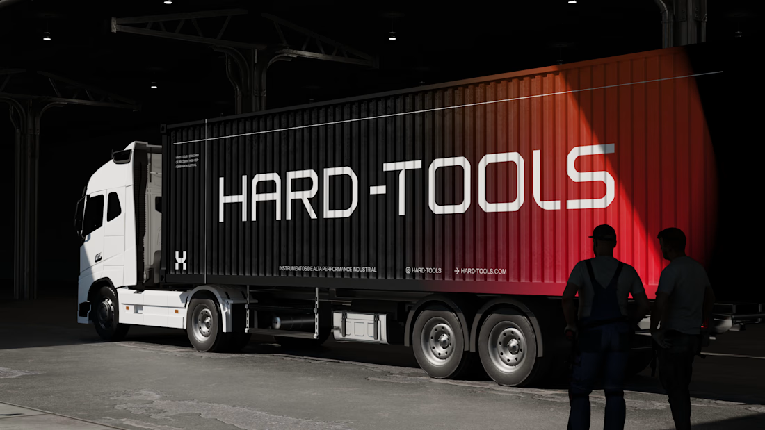
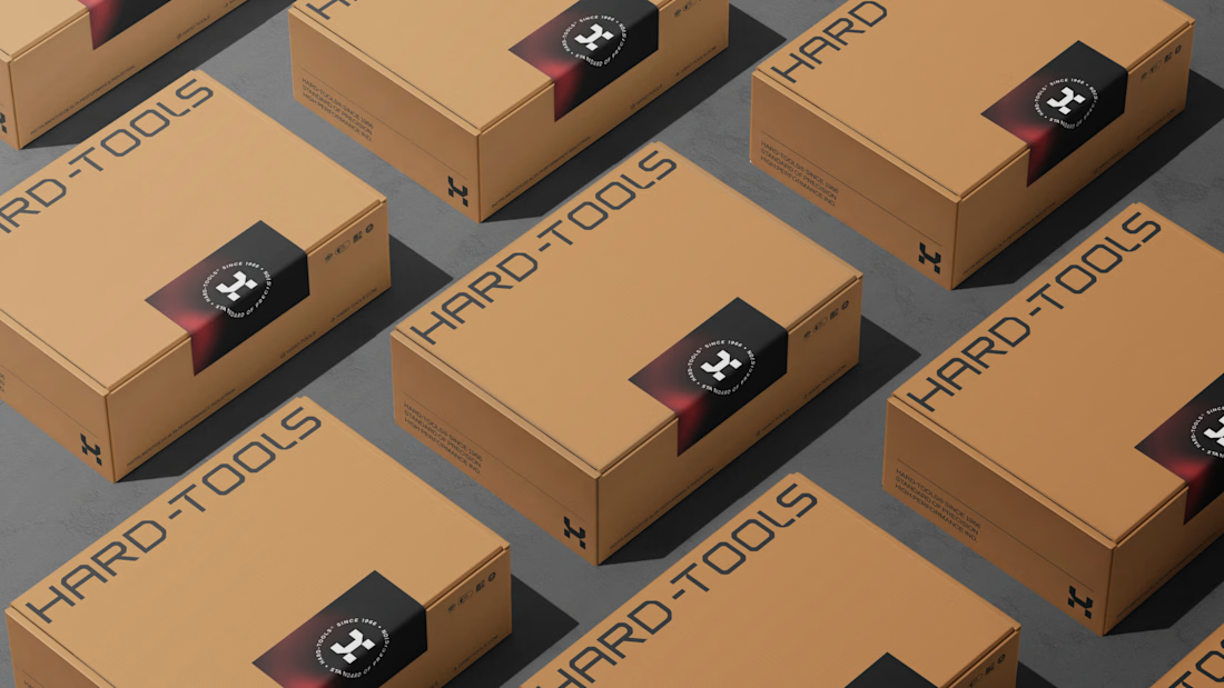
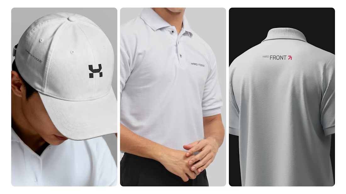
Hard-Tools needed to strengthen its brand presence and turn its communication into a clearer, more consistent, and more professional expression of the business.
The project started with a central question: how can a tools and equipment brand communicate strength, reliability, and expertise without falling into the generic visual language of the category?
The strategy focused on three main objectives:
01 — Strengthen perceived value
Build a visual communication system that conveys solidity, quality, and authority, bringing the brand’s perceived professionalism closer to the level it aims to occupy in the market.
02 — Create consistency across communication
Develop a visual language that could work across different touchpoints — campaigns, commercial materials, social media, and promotional assets — while maintaining recognition and coherence.
03 — Turn products into brand communication
Rather than simply showcasing tools and products, the visual approach was designed to communicate the attributes behind the brand: performance, precision, durability, and reliability.
Based on this strategic direction, I developed the creative and visual direction and designed the communication materials, working across composition, hierarchy, typography, image treatment, identity application, and commercial layouts.

TOP!!

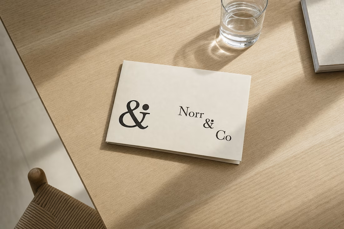
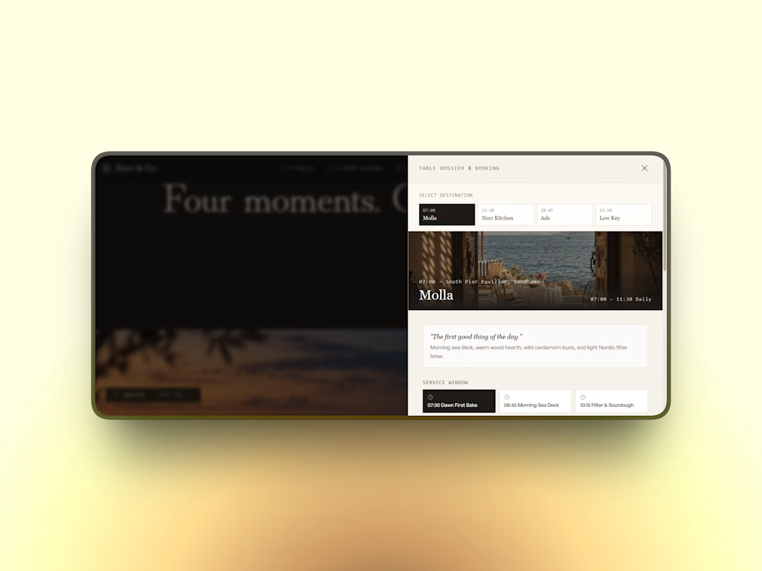
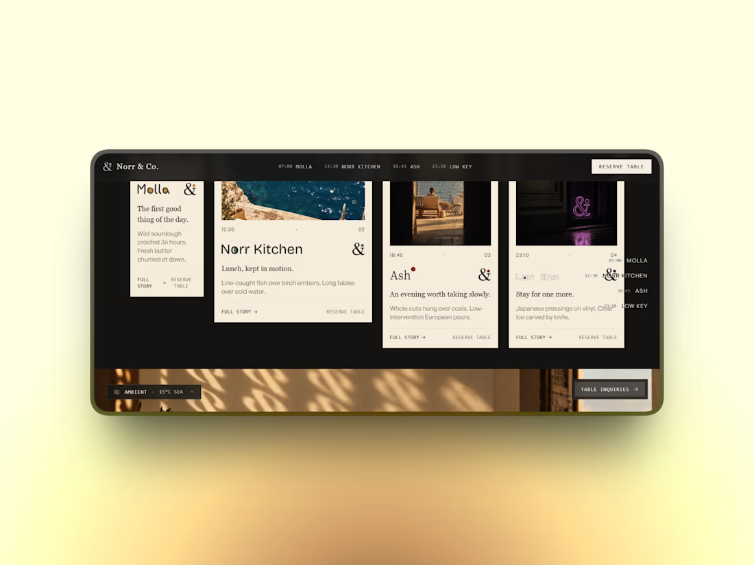
quietly finished a full brand system for a fictional hospitality group — one parent identity, four sub-brands, each tuned to a different hour of the day but sharing the same DNA underneath.
a single dot that changes meaning depending on the moment. a mark that knows when to stay quiet and when to take up space.
case study dropping soon