The network for creativity
Join 1.25M professional creatives like you
Connect with clients, get discovered, and run your business 100% commission-free
Creatives on Contra have earned over $150M and we are just getting started
Back to feedPost
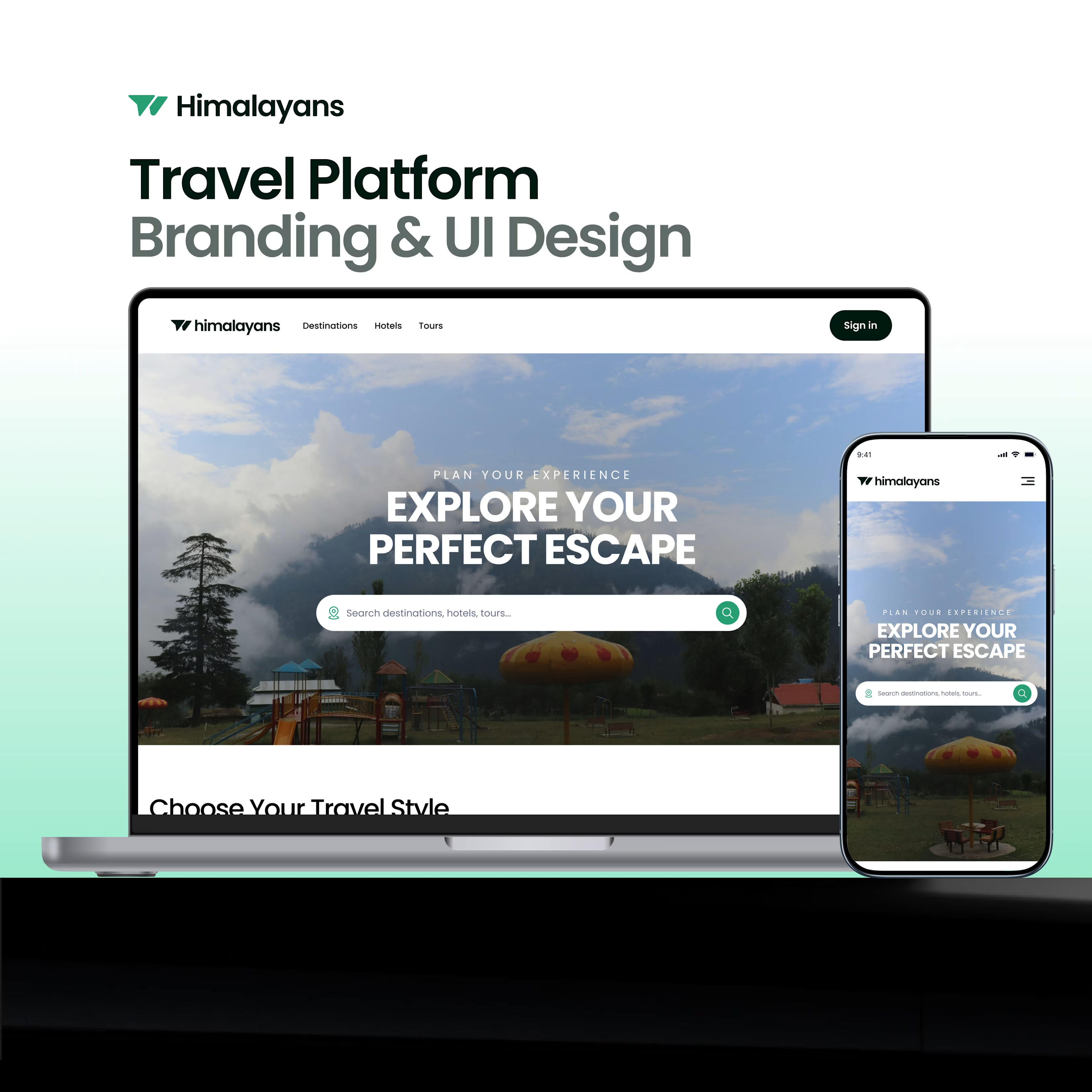
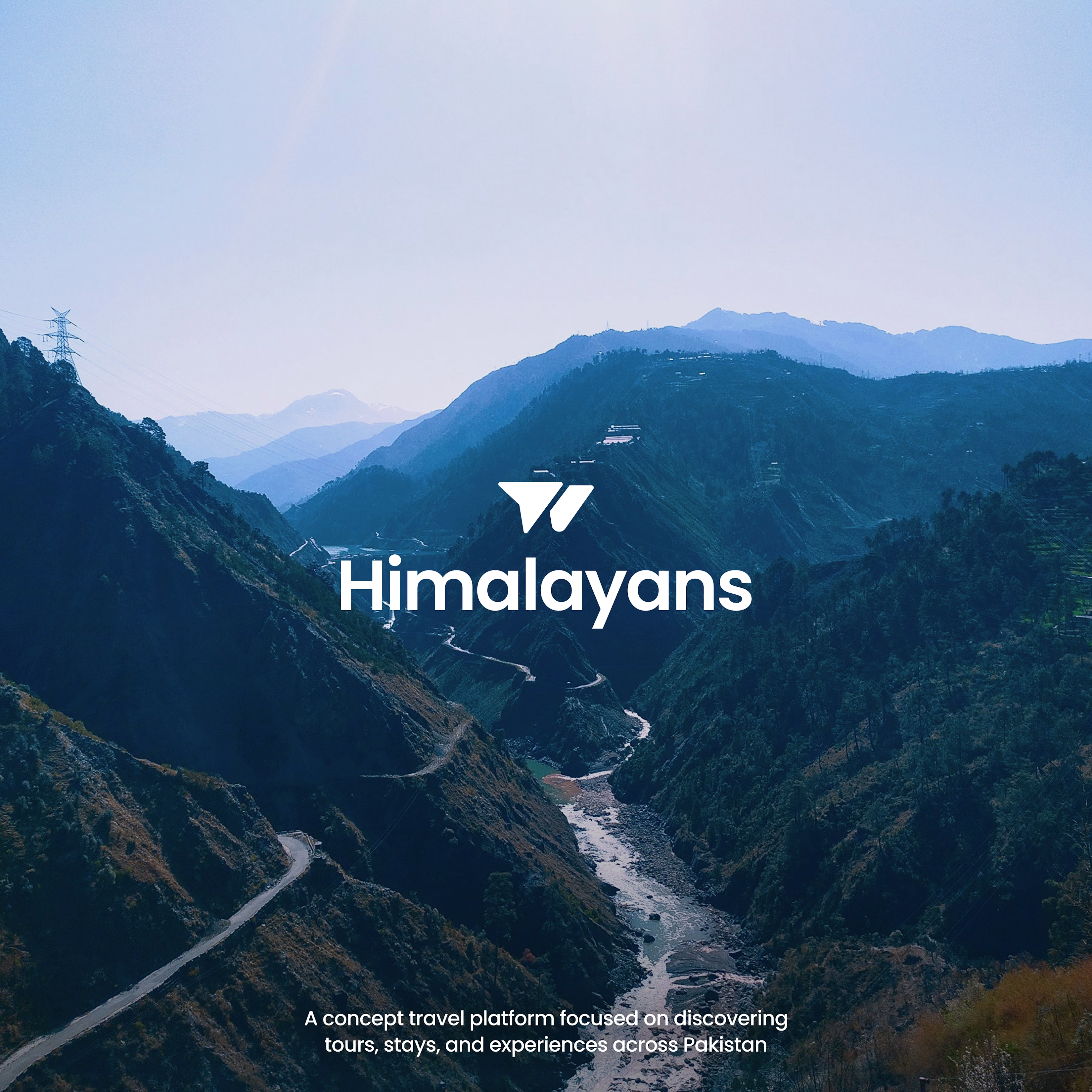
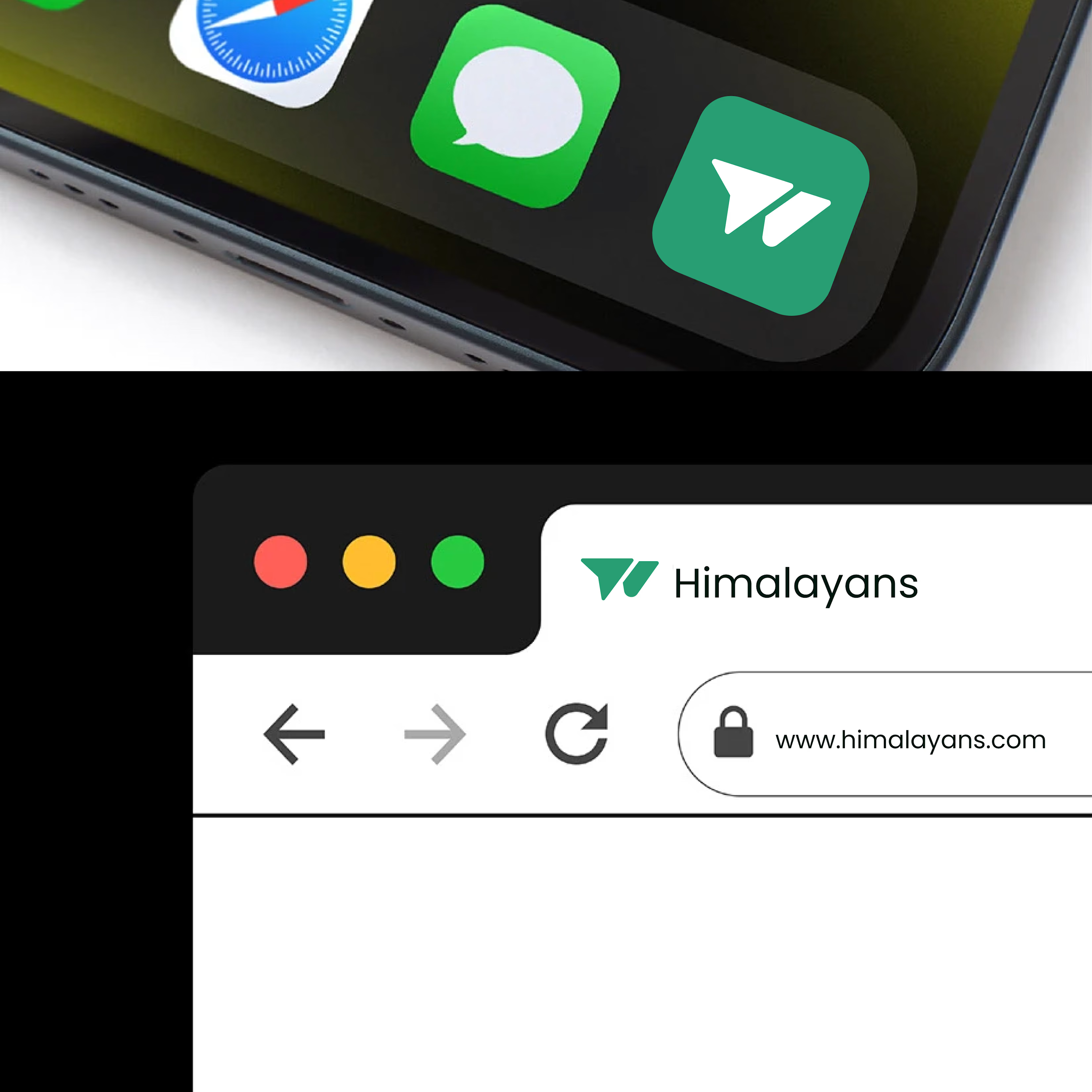
Recently worked on a concept project for a travel platform called Himalayans.
The goal was to create a brand and interface that feels modern, premium, and connected to exploration across Pakistan.
This carousel highlights the branding direction, interface design, and overall visual system.
Open to feedback.


Great job 👌


Thank you Istiak.
The network for creativity
Join 1.25M professional creatives like you
Connect with clients, get discovered, and run your business 100% commission-free
Creatives on Contra have earned over $150M and we are just getting started

Challenges
View all


Related posts

I was handed a logo and a color palette. The client needed everything else — the system that turns a few brand decisions into a working enterprise product.
The project: a from-scratch redesign of an eIDAS-compliant B2B signature platform. Legally binding document workflows, enterprise customers, zero room for ambiguity.
I built the system in a deliberate order: icons → tokens → components → screens. Each layer constrained the one above it. That order is the whole method — by the time the first screen was designed, the system underneath was already stable. Screens demonstrated the system instead of driving it.
The token architecture had three layers: global primitives, alias tokens that describe intent (surface.primary, border.subtle), and component tokens that bind intent to elements. Sounds academic — until the team grew and other designers started building on top of my foundation. Some of my decisions held. Others got changed.
The token architecture absorbed both without breaking. That's the only test that matters.
A system that can't be changed isn't a system — it's a style guide.
Full case study — the setup, the build order, and three surfaces where the system did real work: bozenabulat.com/projects/b2b-signature-platform-redesign
bozenabulat.com
B2B Signature Platform Redesign
A token-based design system for a B2B signature platform built on an enterprise CRM. Turned inherited brand foundations into a scalable architecture.

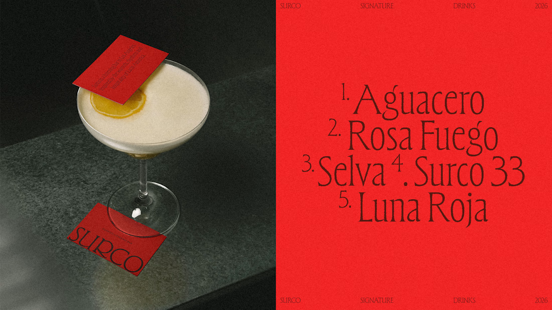
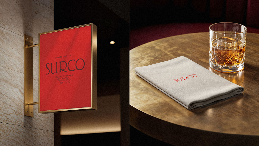
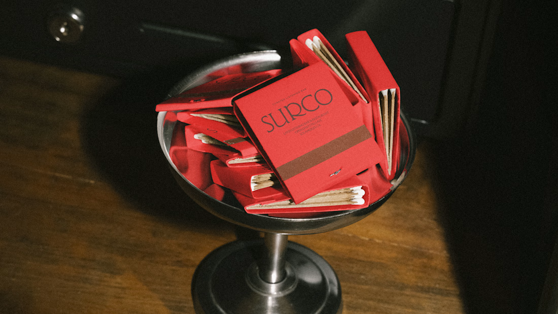
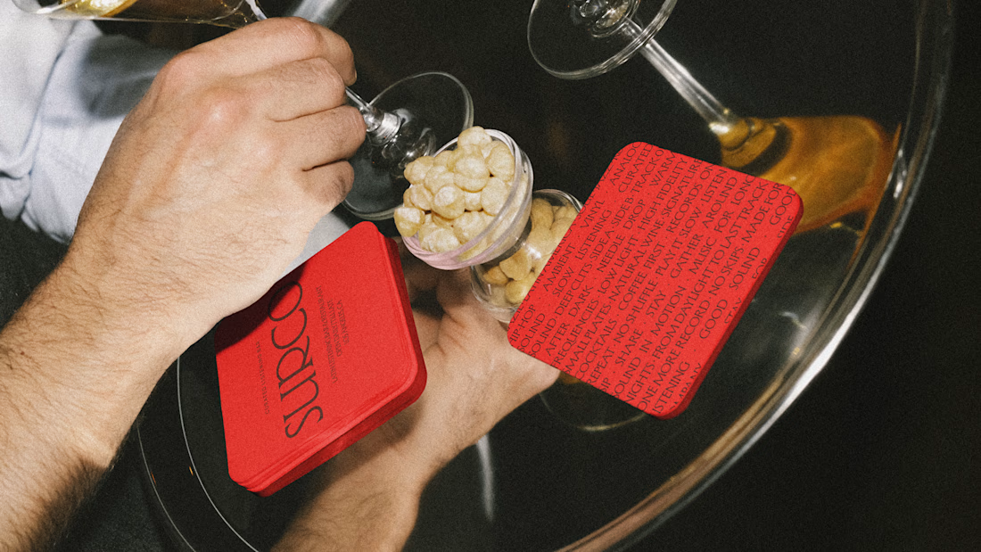
SURCO | Latin Bar & Restaurant Brand Identity
SURCO is a Latin bar and restaurant in Los Angeles where food, cocktails, vinyl and nightlife come together.
I developed a complete visual identity designed to feel warm, energetic and contemporary, without relying on the usual visual clichés associated with Latin restaurants. The system combines bold typography, a rich color palette, and art direction inspired by late nights, shared tables, music and the atmosphere of the bar.
The identity was extended across menus, signage, social media, printed materials and environmental applications, creating a flexible system that feels recognizable across every touchpoint.
Services: Brand Identity, Logo Design, Art Direction, Visual System, Graphic Design
Full project:
https://www.behance.net/gallery/255628447/Surco

Beautiful work!

Premium website redesign with an animated vertical hero carousel that shifts through their breakfast, lunch and dinner service. ✨🍜
Client: a Parisian brasserie right next to the Louvre.


The vertical carousel shifting through breakfast, lunch, and dinner is a smart hook because it matches how someone actually arrives, already thinking about one service. My one nudge would be to auto-select the current service by time of day, so a lunchtime visitor lands on lunch instead of scrolling to find it.


