
Ahtisham Niaz
Senior Product Designer and AI Design Expert


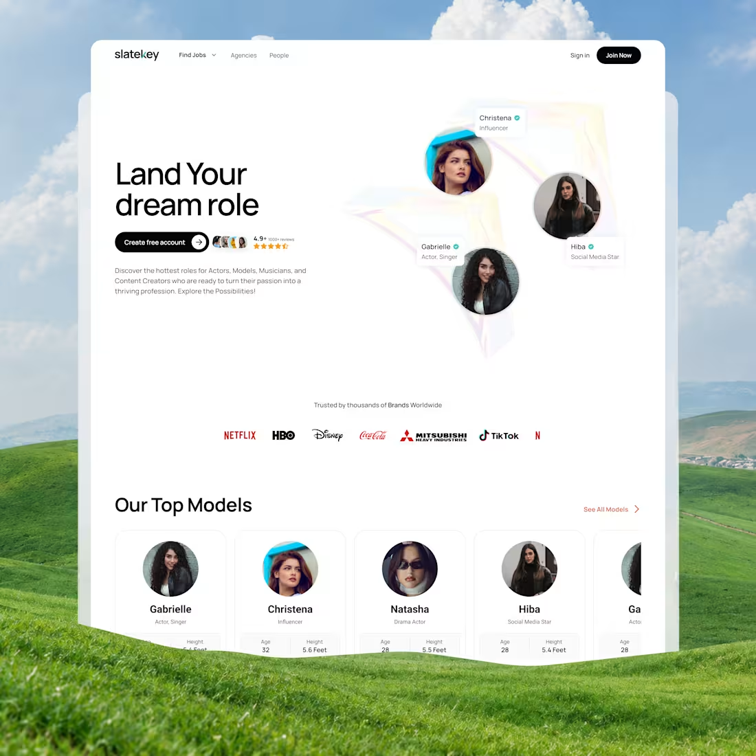
𝗠𝗼𝘀𝘁 𝗺𝗮𝗿𝗸𝗲𝘁𝗽𝗹𝗮𝗰𝗲 𝗽𝗹𝗮𝘁𝗳𝗼𝗿𝗺𝘀 𝗳𝗮𝗶𝗹 𝗳𝗼𝗿 𝗼𝗻𝗲 𝘀𝗶𝗺𝗽𝗹𝗲 𝗿𝗲𝗮𝘀𝗼𝗻: 𝘁𝗵𝗲𝘆 𝘁𝗿𝗲𝗮𝘁 𝘁𝗮𝗹𝗲𝗻𝘁 𝗹𝗶𝗸𝗲 𝗰𝗮𝘁𝗮𝗹𝗼𝗴 𝗽𝗿𝗼𝗱𝘂𝗰𝘁𝘀.
When we designed Slatekey, a platform for discovering talent and casting opportunities, we wanted to do more than create a clean interface. We also wanted to tackle a trust issue affecting both sides:
𝟭. 𝗙𝗼𝗿 𝘁𝗮𝗹𝗲𝗻𝘁: Make onboarding and discovery inspiring and easy to navigate, so the time they put in feels worthwhile.
𝟮. 𝗙𝗼𝗿 𝗰𝗮𝘀𝘁𝗶𝗻𝗴 𝗱𝗶𝗿𝗲𝗰𝘁𝗼𝗿𝘀 𝗮𝗻𝗱 𝗮𝗴𝗲𝗻𝗰𝗶𝗲𝘀: Make talent’s age, height, and key skills easy to spot, without forcing anyone to sift through cluttered profiles.
𝗛𝗲𝗿𝗲 𝗮𝗿𝗲 𝘁𝗵𝗲 𝗺𝗮𝗶𝗻 𝗱𝗲𝘀𝗶𝗴𝗻 𝗱𝗲𝗰𝗶𝘀𝗶𝗼𝗻𝘀 𝘄𝗲 𝗺𝗮𝗱𝗲:
- 𝗛𝗶𝗲𝗿𝗮𝗿𝗰𝗵𝘆 𝗼𝘃𝗲𝗿 𝗰𝗹𝘂𝘁𝘁𝗲𝗿: The hero section brings visual proof, social proof badges, and clear categories, Actors, Models, and Creators to the forefront, making it easier for visitors to find their way around.
- 𝗗𝗮𝘁𝗮-𝗮𝘁-𝗮-𝗴𝗹𝗮𝗻𝗰𝗲 𝗰𝗮𝗿𝗱𝘀: Talent profiles should be quick to scan. Each card highlights age, height, and role, helping casting agents make decisions faster.
- 𝗦𝘁𝗿𝘂𝗰𝘁𝘂𝗿𝗲𝗱 𝗱𝗶𝘀𝗰𝗼𝘃𝗲𝗿𝘆: We kept immediate job applications (“Open Jobs”) separate from agency browsing, so the platform can support both urgent hiring and long-term talent discovery.
Designing a marketplace is about balancing polish with a clear path to conversion. If an interface looks great but slows transactions down, it isn’t doing its job.
𝗗𝗲𝘀𝗶𝗴𝗻 𝗹𝗲𝗮𝗱𝗲𝗿𝘀 𝗮𝗻𝗱 𝗽𝗿𝗼𝗱𝘂𝗰𝘁 𝘁𝗲𝗮𝗺𝘀: How do you decide which details to put up front while keeping discovery cards clean and uncluttered?
We’d love to hear what you think, share your thoughts in the comments. 👇
1
25
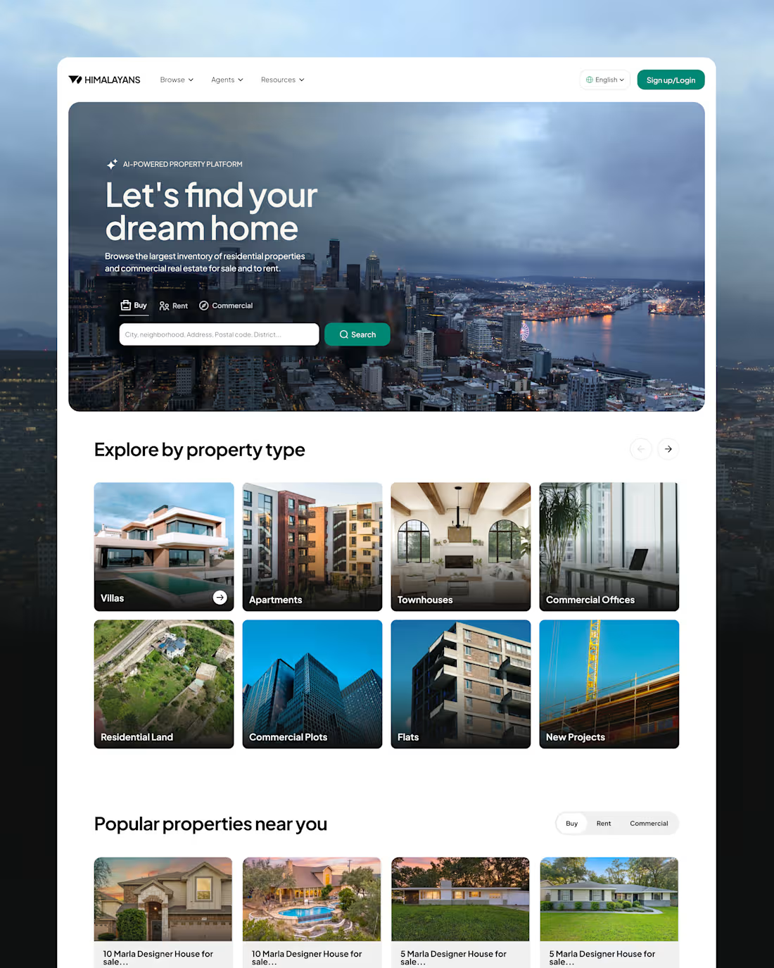
Real estate platforms often see high bounce rates when search results don’t match what people are looking for or when there are too many filters. For the Himalayans web concept, the main goal was to help users find value sooner by making search easier to start, reflecting local inventory, and reducing drop-off between browsing and submitting a lead.
𝗞𝗲𝘆 𝗨𝗫 𝗮𝗻𝗱 𝘀𝘆𝘀𝘁𝗲𝗺 𝗱𝗲𝗰𝗶𝘀𝗶𝗼𝗻𝘀:
𝗦𝗲𝗮𝗿𝗰𝗵 𝗮𝗿𝗰𝗵𝗶𝘁𝗲𝗰𝘁𝘂𝗿𝗲:Added Buy, Rent, and Commercial options directly to the main hero search bar, so users can switch their intent without navigating through extra steps.
𝗧𝗮𝘅𝗼𝗻𝗼𝗺𝘆 𝗿𝗲𝘀𝘁𝗿𝘂𝗰𝘁𝘂𝗿𝗶𝗻𝗴: Kept core property types, like villas and apartments, separate from added services, like home interiors, and financial products, like Pay on Credit. This helps users understand each category at a glance.
𝗟𝗼𝗰𝗮𝗹𝗶𝘇𝗲𝗱 𝘃𝗶𝘀𝘂𝗮𝗹 𝗰𝗼𝗻𝘁𝗶𝗻𝘂𝗶𝘁𝘆: Matched photography to each target market to create a consistent brand experience and build buyer trust.
𝗖𝗼𝗻𝘃𝗲𝗿𝘀𝗶𝗼𝗻 𝗵𝗶𝗲𝗿𝗮𝗿𝗰𝗵𝘆: Used a direct “Request a tour” call to action on listing cards for users ready to act, while keeping actions in casual browsing sections low-friction.
𝗙𝗶𝗹𝘁𝗲𝗿 𝘃𝗶𝘀𝗶𝗯𝗶𝗹𝗶𝘁𝘆: Placed the main filter pills next to the search bar so users can narrow results by price and other parameters without interrupting their browsing.
Instead of adding redundant UI patterns, this layout makes existing search behaviors work better. It brings regional imagery into alignment, cleans up the taxonomy, and puts useful filters front and center, making it easier to move from discovery to inquiry.
1
43
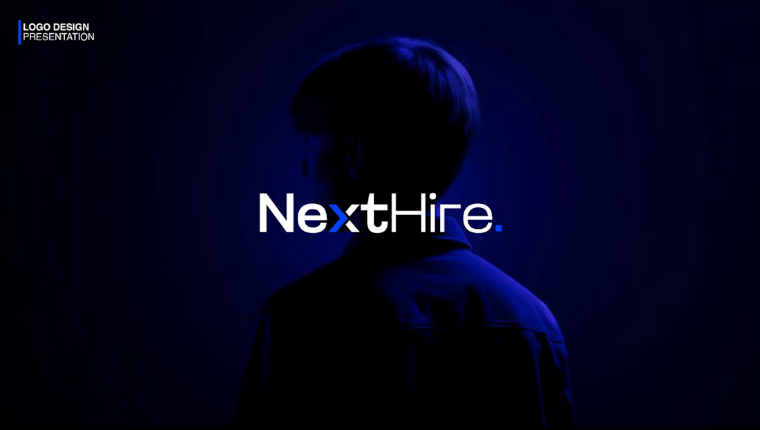
A look at the identity I created for NextHire, centered on one simple idea: moving forward.
NextHire helps businesses find the right people and professionals find their next opportunity. I wanted the brand to feel confident but approachable, with a clear sense of direction.
The blue arrow appears in the wordmark, then works on its own in smaller applications. It’s a small detail, but it gives the rest of the identity a clear foundation.
2
147
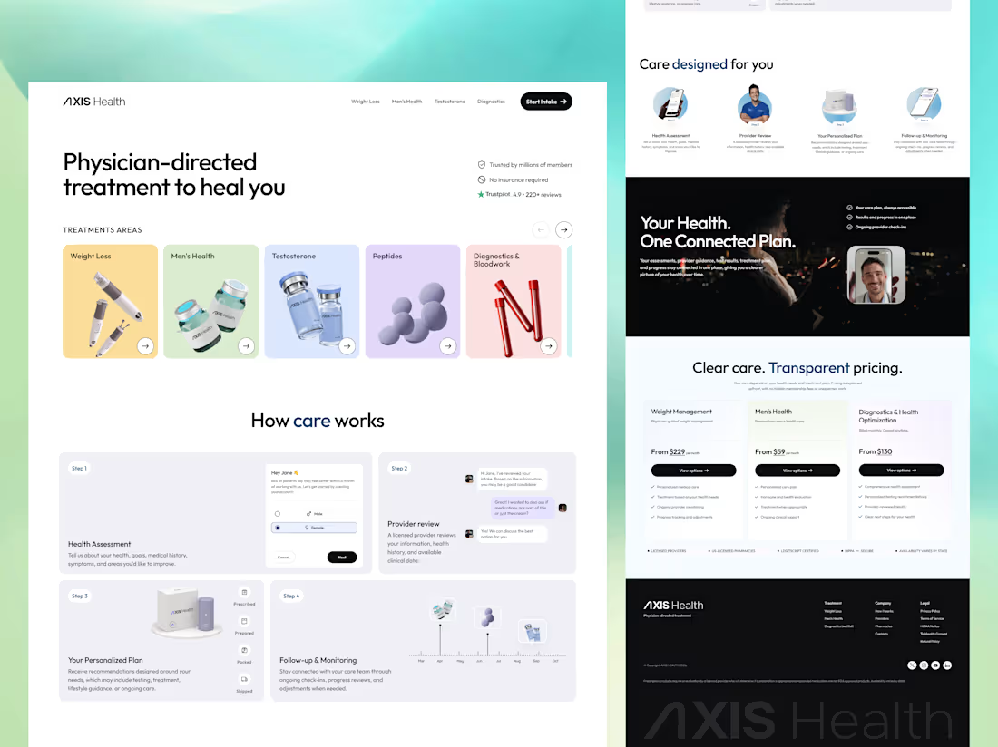
A conversion-focused website designed for a modern telehealth brand. The platform helps attract new patients with transparent tiered pricing, a simple four-step onboarding guide, and treatment discovery available right above the fold. It’s built to turn high-intent visitors into qualified care sign-ups with as little friction as possible.
#telehealth (https://www.linkedin.com/search/results/all/?keywords=%23telehealth&origin=HASH_TAG_FROM_FEED)
1
106