The network for creativity
Join 1.25M professional creatives like you
Connect with clients, get discovered, and run your business 100% commission-free
Creatives on Contra have earned over $150M and we are just getting started
Back to feedPost

In 2025, a colleague reached out to me to help him create a logo for his new platform, Budolist.com
Problem:
Creators and influencers often share their favorite finds through messy, unorganized lists. They lacked a professional "gallery-style" platform that could make their curated collections look as premium as the items they were recommending.
Solution:
I designed a sophisticated visual identity centered around a clean, modular monogram that feels both high-end and functional.
Challenge:
The goal was to make the logo feel like a "luxury container"—distinct enough to be recognized, but neutral enough to never clash with the diverse content (from fashion to tech) that curators share on the platform.
Summary:
The final logo gives Budolist.com a credible, "editorial" aesthetic. It transforms a simple list-making tool into a professional curation platform where users feel proud to showcase their world.


The network for creativity
Join 1.25M professional creatives like you
Connect with clients, get discovered, and run your business 100% commission-free
Creatives on Contra have earned over $150M and we are just getting started

Challenges
View all


Related posts

More visuals from the rejected brand direction I shared earlier.
Really good to see this direction resonating with so many of you. It was one of our favourite explorations to build, from the narrative behind it to the visual world that brought it to life.
Great work doesn’t always make the final cut, and sometimes the reason has little to do with the quality of the direction.
Curious why this one was rejected? I’ve shared the story in the first comment✨

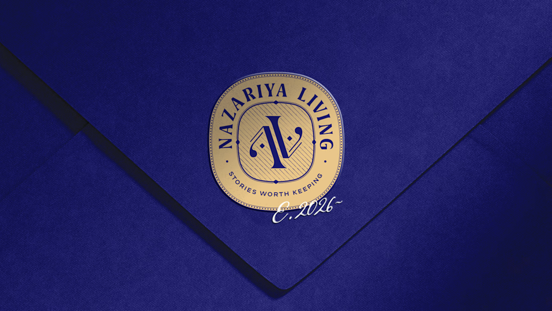
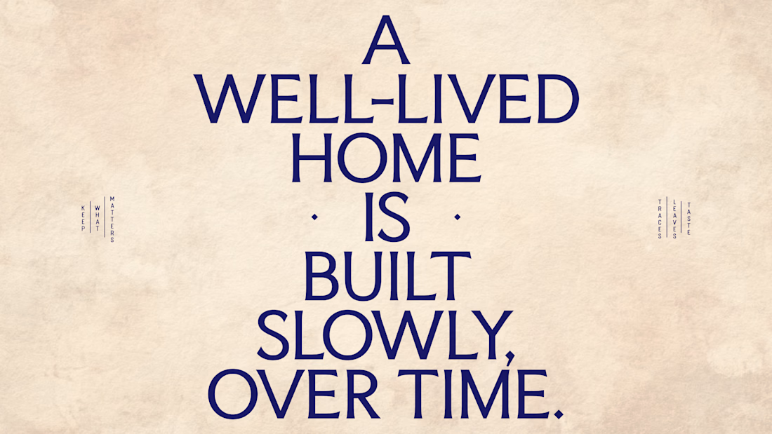
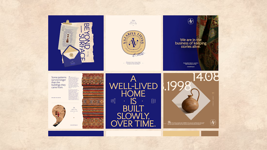
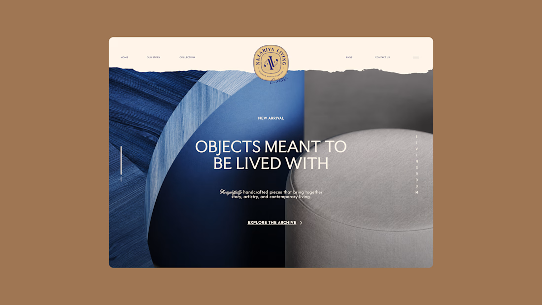
Nazariya Living is a premium carpet and home décor brand shaped by craftsmanship, culture and the stories objects carry into our homes.
This direction brought that idea to life through a seal-inspired logo, archival textures, unexpected colours and editorial typography, creating...

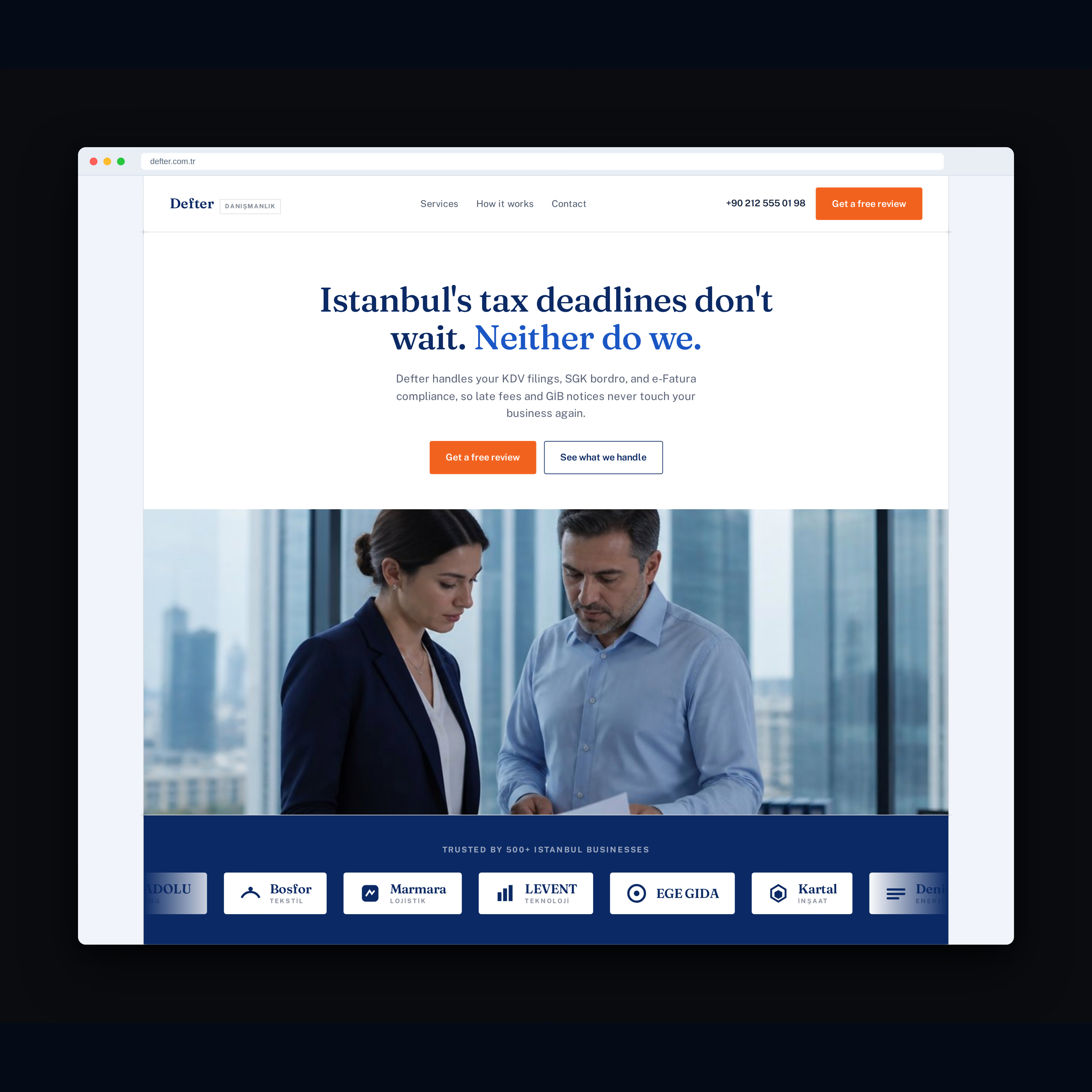
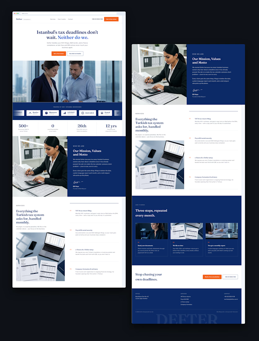
Recent work for Defter, an accounting firm in Istanbul.
The goal was simple: take a traditionally serious industry and create a website that feels modern, trustworthy, and premium.
Clean typography, strong visual hierarchy, and a bold navy + orange identity.
What do you think of the final design?

Looks good!


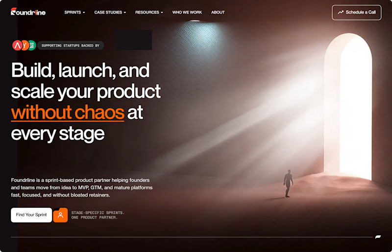

The path someone needs to follow for light to scale. Perfect!