The network for creativity
Join 1.25M professional creatives like you
Connect with clients, get discovered, and run your business 100% commission-free
Creatives on Contra have earned over $150M and we are just getting started
Back to feedPost


Most trucking brands default to navy or red, so the orange and heavy black type stand out immediately and read almost like hazard signage in a good way. Was that association with visibility and safety intentional, or did the color just work best against the black?
The network for creativity
Join 1.25M professional creatives like you
Connect with clients, get discovered, and run your business 100% commission-free
Creatives on Contra have earned over $150M and we are just getting started
Trending
retrofuturism
Share your favorite designs from the past exploring the distant future. Or your own take on the aesthetic 🚀
halftone
Dots. Texture. Grain. Let's see your designs using the halftone technique.

Midjourney
Creatives are showing off what they're making with Midjourney.
colorgrade
Video editors sound off: How do you enhance the mood of your video in color grading?



Related posts

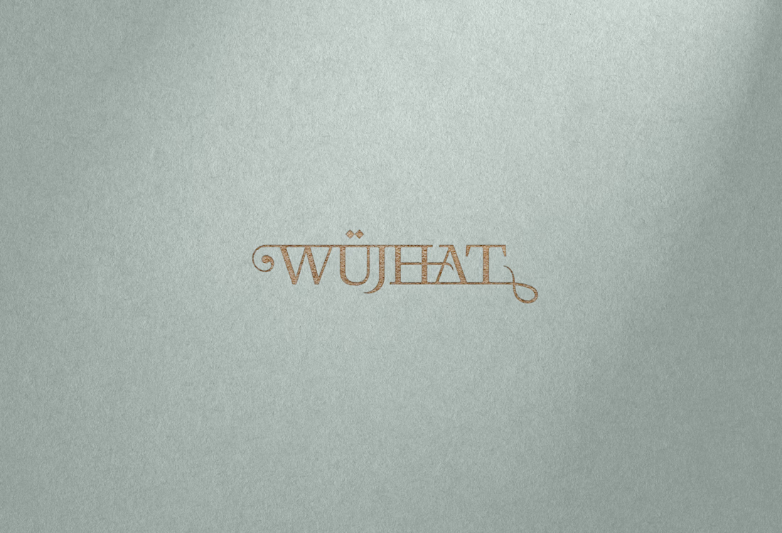
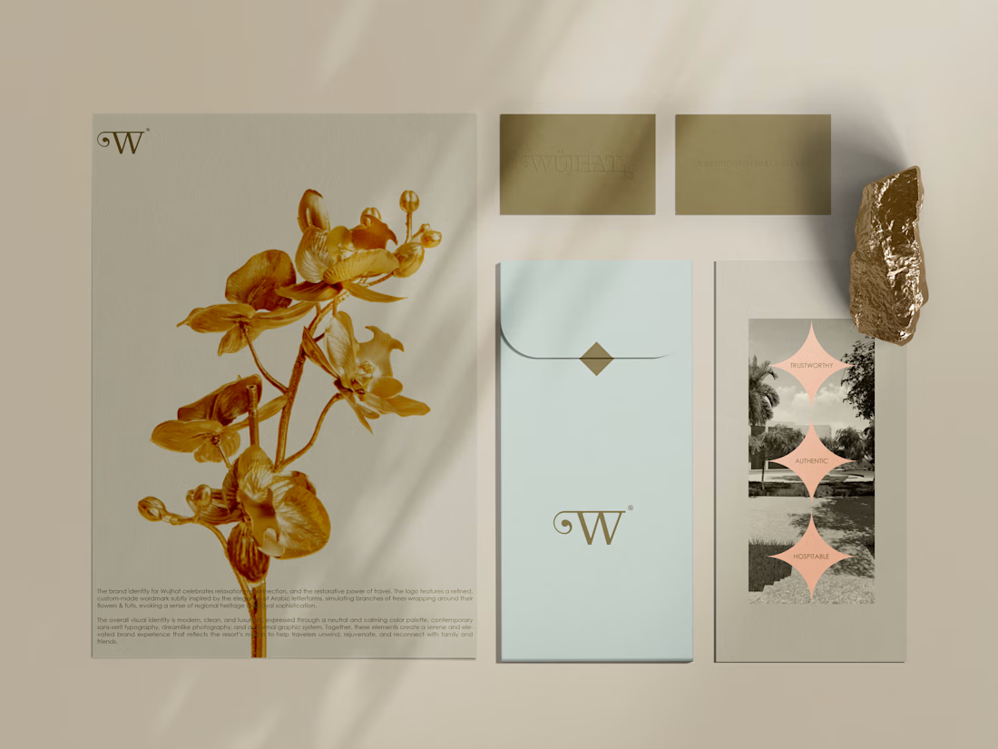
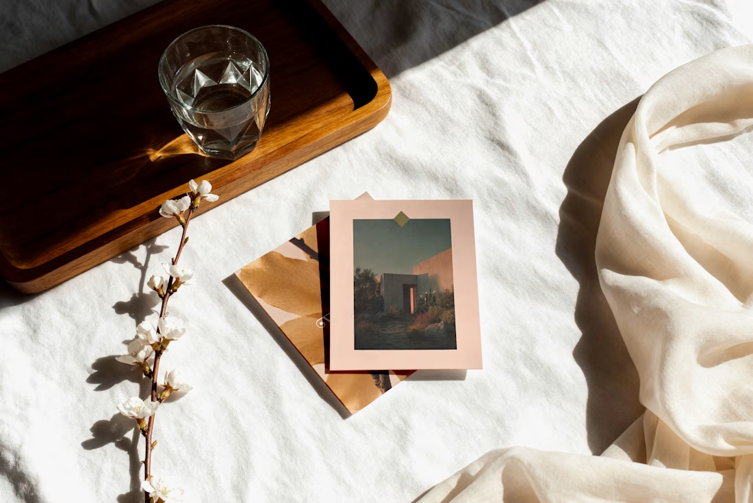
Brand Identity for Wujhat, a tourist resort owning and managing a number of tourist rest stops located on one of the farms in the fertile Wilayat of Barka in Oman.
Brief context, the logo features a refined, custom-made wordmark subtly inspired by the elegance of Arabic letterforms, simulating branches of trees wrapping around their flowers & fuits, evoking a sense of regional heritage and royal sophistication.
Would you take a rest here?
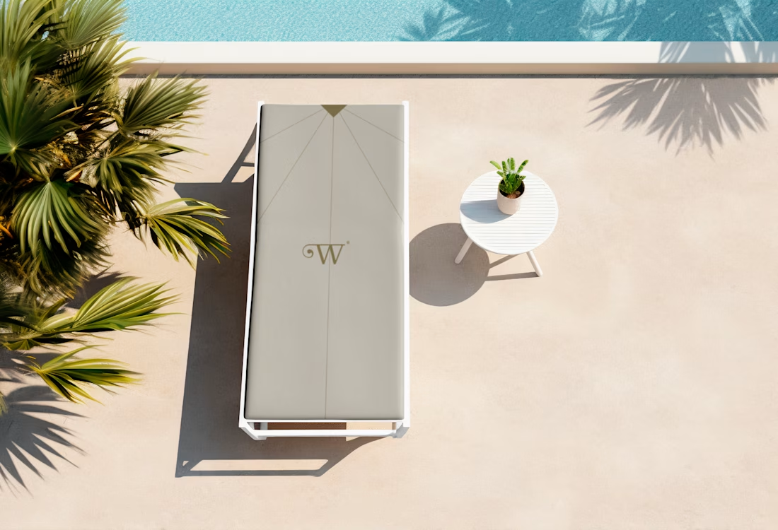


Wow! It's amazing

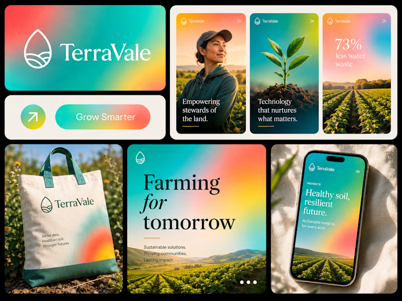
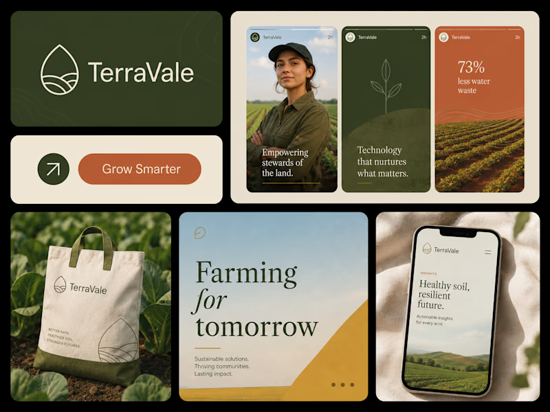
Two directions. One brand. 👀
I explored the same brand in two completely different visual styles — one vibrant & energetic, the other soft, minimal & refined. Now I want your honest opinion:
Which one would you choose?
🟢 Vibrant & Bold
🤍 Soft & Minimal
Curious to see which direction wins. 👇
37 voted
43%
50 voted
57%
87 votes
Closed

Option two feels more organic!