The network for creativity
Join 1.25M professional creatives like you
Connect with clients, get discovered, and run your business 100% commission-free
Creatives on Contra have earned over $150M and we are just getting started
Back to feedPost

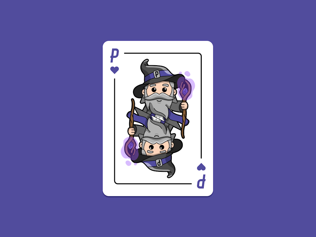
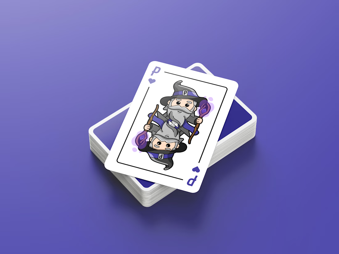
A custom playing card design I created for Pinfinity.
When we release a new product we don't usually have the final physical product to hand. This means we have to try to convey what the final product will look like with digital assets. This playing card helps the customer see the size of the collectible next to an item that we all familiar with.

The network for creativity
Join 1.25M professional creatives like you
Connect with clients, get discovered, and run your business 100% commission-free
Creatives on Contra have earned over $150M and we are just getting started





Related posts

Post
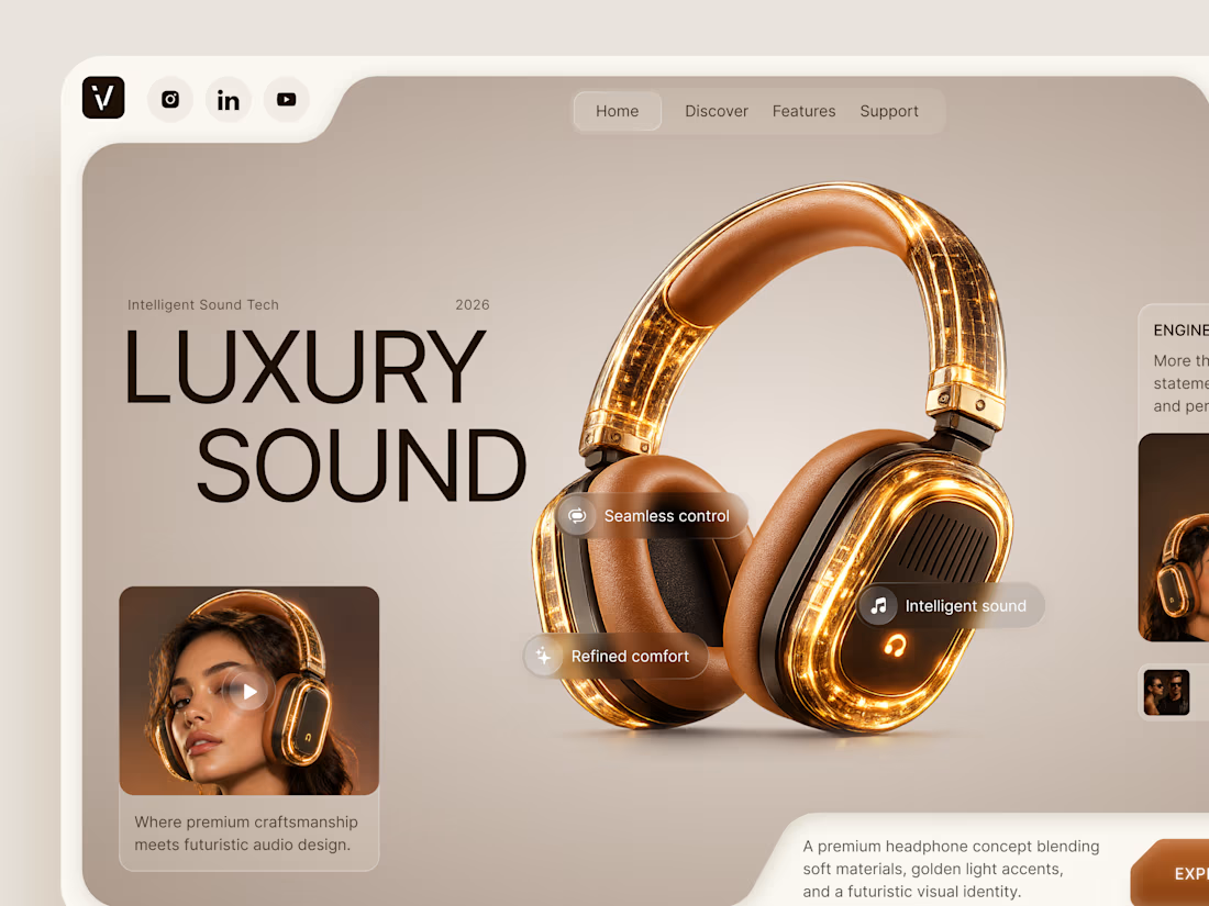
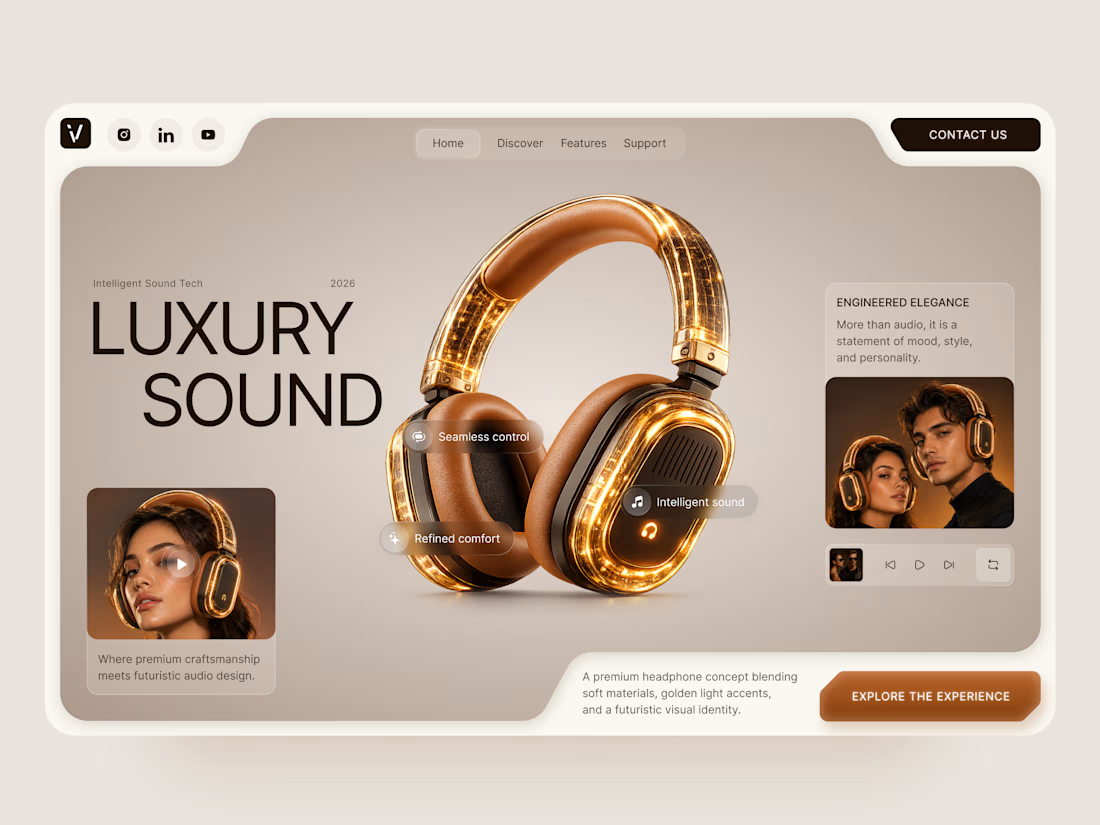
Luxury Sound — Premium Headphones Landing Page 🎧✨
A premium landing page concept for a luxury audio brand, built around a bold headphone design and a refined visual experience
The design combines warm neutral tones, glowing details, oversized product visuals, and minimal typography to create a futuristic yet elegant feel
Special attention was given to:
• Product-first composition
• Premium visual direction
• Feature highlights
• Lifestyle imagery
• Clear CTA placement
• Responsive mobile experience
The result is a clean, immersive product experience that makes the headphones feel like more than tech — they become part of the lifestyle 🔥


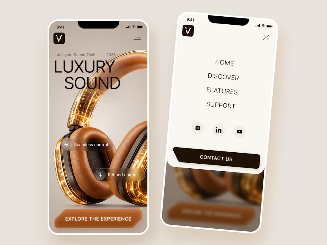

The amber glow on the headphones against that warm beige is lovely. How does the mobile menu handle the product image?


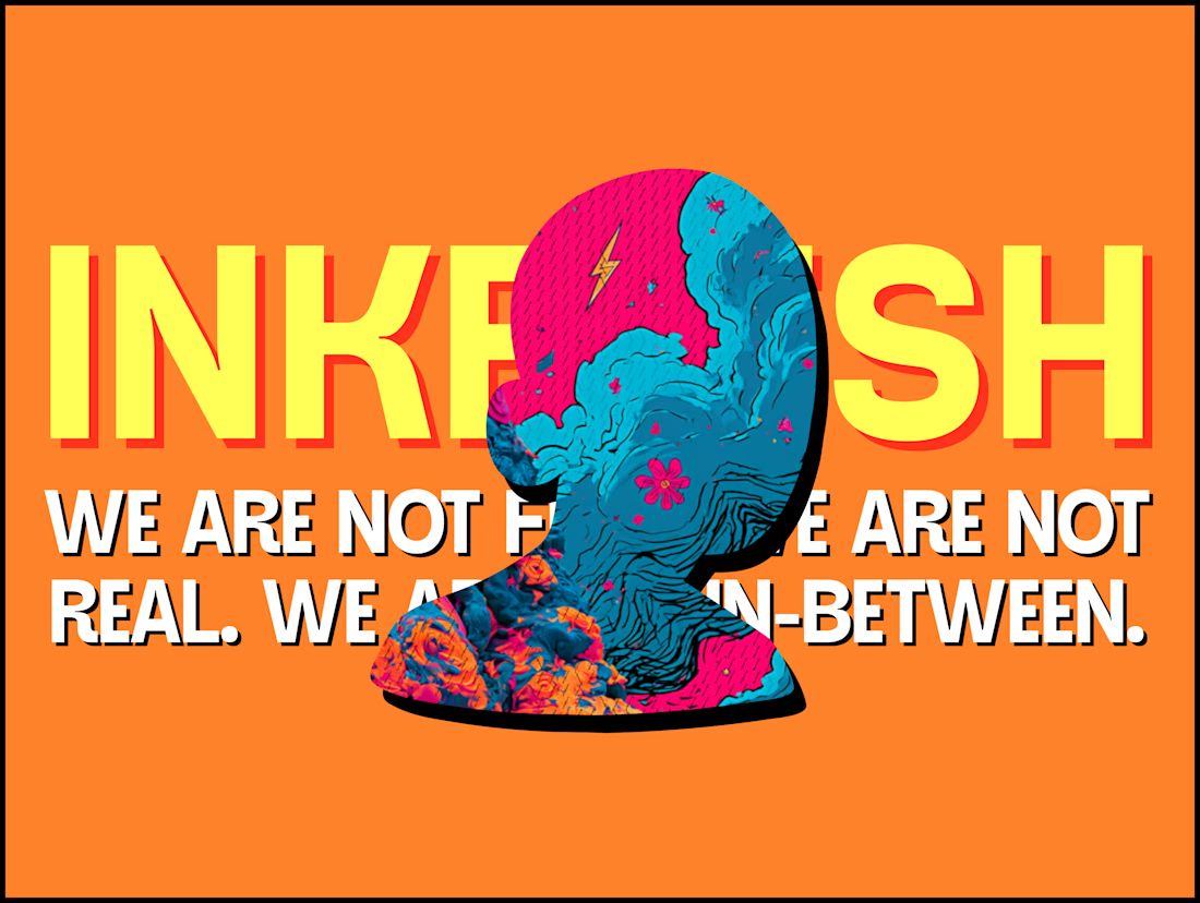
The INKFLESH mark I designed starts with an empty profile avatar. A deliberately plain shape for an identity full of strange characters.
The characters needed room to change. The identity also had to work on a woven label or an app icon, where a detailed illustrated face has very little space to do its job.
I kept the silhouette and palette constant, then let the artwork change around them. The mark can hold an illustration, appear as a solid stamp, or sit on its own at a small size. Each version still has the same shape underneath.
That was the useful constraint: decide what someone should recognise when the most expressive part of the design disappears.
If your identity depends on a detailed illustration, try its smallest application before approving the whole world around it.

Super bold and creative! Love the vibrant colors. 🔥

Our latest case study is live! 🌿
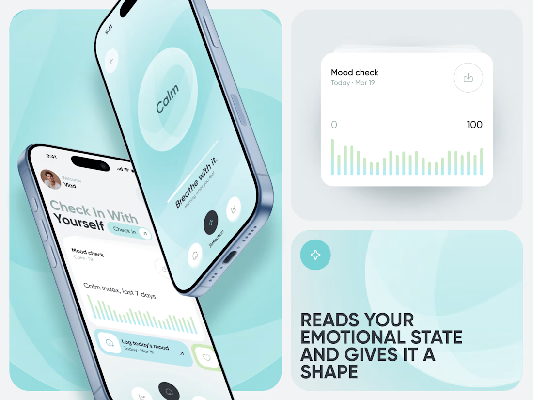
Meet Calm, an AI-powered wellness app designed to make mood tracking, emotional insights, and healthier daily habits feel simple and approachable.

That's great case study that's really a great job 🎉🎉🔥🔥