The network for creativity
Join 1.25M professional creatives like you
Connect with clients, get discovered, and run your business 100% commission-free
Creatives on Contra have earned over $150M and we are just getting started
Back to feedPost
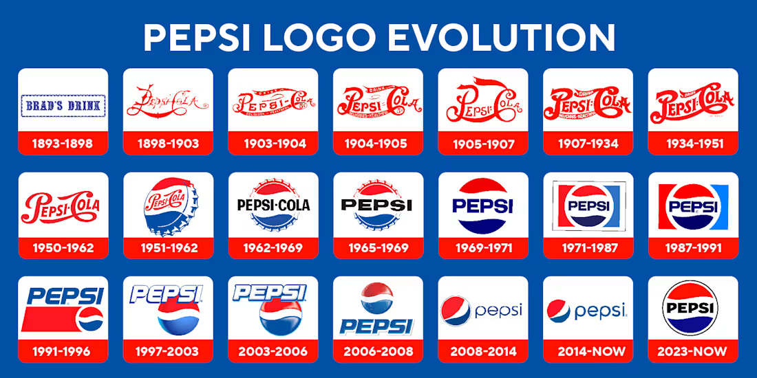
2016 Pepsi wanted to fit in. 2026 Pepsi wants to be remembered.
Back in 2016, Pepsi leaned hard into the clean, minimal look-simple sans-serif type, a softened red-white-blue globe, very digital-friendly, very safe. It worked, but it also kind of blended in. Fast forward to now, and the brand feels way more confident. Stronger contrast, richer electric blues, heavier type, and the Pepsi name finally taking up space again.
My hot take: minimalism was never the issue-blandness was. This shift feels less about trends and more about brands realizing that being distinctive matters more than playing it safe. Pepsi choosing bold color and presence feels like a return to personality instead of comfort.
🥤 Curious what you think-do you prefer the clean, minimal Pepsi of the mid-2010s, or the louder, more confident Pepsi we’re seeing now?

Goated

Here's a look at their past logos compared to the current one 👀

Crazy to see how much their logo has evolved, meanwhile I never even noticed. Their brand power is just through the roof lol
Yep! That’s the sweet spot - subtle evolution with strong recognition ✨

Pepsi’s logo evolution is a great example of how brands balance familiarity with modernity. The core identity stays recognizable, while subtle refinements keep it culturally relevant.

Looks nice Monserrat 🙌🏻
🙌🏻🥤

Pepsi just wants to look cool while sponsoring the IPLs. It's a good case study though
Yep, it’s an interesting case study from a design standpoint! ✨


love the Pepsi of the mid 2010s video vibe!
This is beautifully done. The warmth really comes through, especially in the typography and packaging — it feels approachable without losing that premium touch. Amazing balance
Yes! Love how they made it feel inviting

Love the take—blandness really was the hidden cost of the minimalist era. The new branding feels much more intentional and unapologetic. Its a great example of a brand finding its voice again after trying to 'blend in' for a decade.

When animations flow like this,
the product instantly feels premium .
definitely!!


It’s fun seeing old trends come back with a fresh twist 💫

Yeah! The colorful redesigns really pop, and motion adds so much into it 💫 Poppi is actually one of my favorite brands - love their branding and packaging. I’ve also noticed some of their motion designs they’ve rolled out, which are super fun.
Good vibes

Back to when 201 was all about style and brand personality. and now then brands had to be more confident and bolder to take more shares and trigger more customers.
Definitely!

I like how this new logo feels like a riff on the older variants.
it definitely nods to the older versions while feeling fresh! 🙌🏻


so sick
🙌🏻
The network for creativity
Join 1.25M professional creatives like you
Connect with clients, get discovered, and run your business 100% commission-free
Creatives on Contra have earned over $150M and we are just getting started
Related posts


This is a clear upgrade
Great work, Sabrina
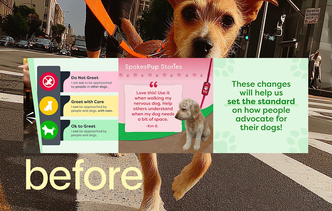
What if consistency isn’t the goal of brand guidelines… just the baseline?
Consistency is usually the focus, but that’s not what actually makes a brand work.
Clarity does, and when a system is clear, consistency happens naturally
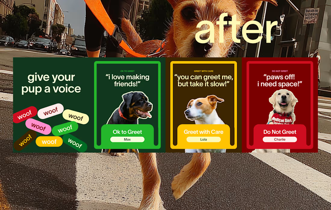
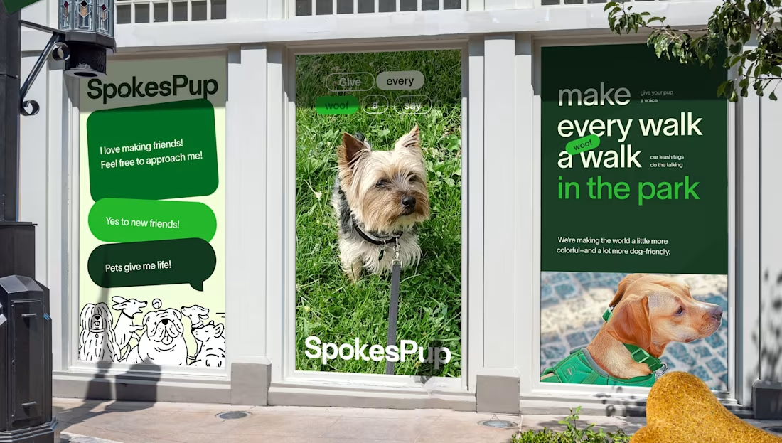
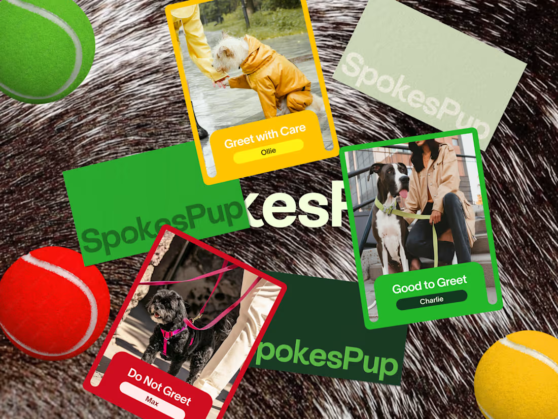
Quick example, SpokesPup 🐶
The product already had a clear logic with the traffic light system, and we expanded it into a brand world people could actually follow.
What makes that work:
• Every element ties back to one idea.
• You don’t have to guess what’s on brand.
• Different executions still feel connected.
Most guidelines try to control outcomes, but the better ones guide decisions.
Consistency is just the side effect.
Would someone new know what to do without asking you?

Okay, this is absolutely amazing!

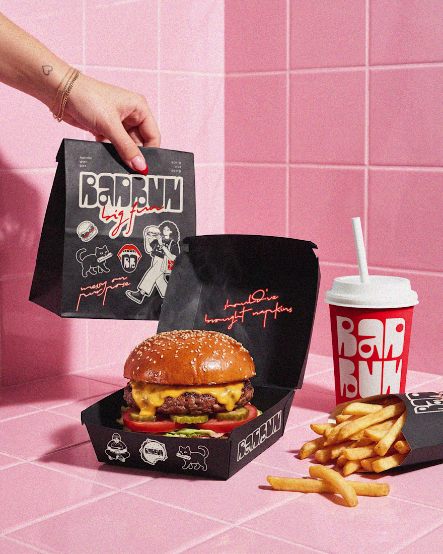
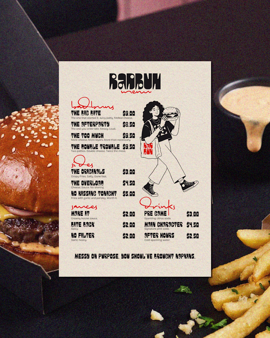
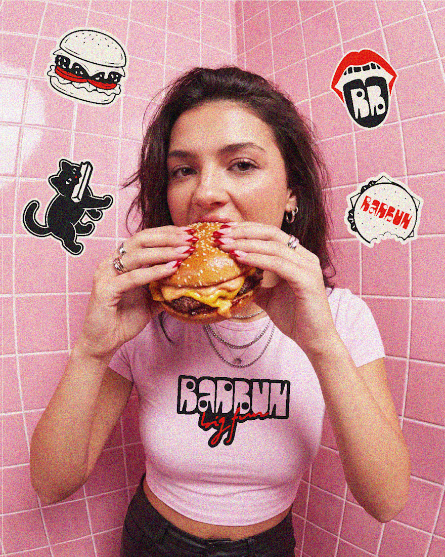
Bad Bun is a burger joint with a rebellious streak. Not your average takeaway — it's the place you go before the party, after the party, and sometimes instead of the party. The ask was to create a brand that felt bold, unapologetic and made to be seen. Something playful and confident, with just enough chaos to feel authentic. The kind of branding people instantly recognise — and want to be part of.
The approach:
I came at it from the culture first. Bad Bun isn't just food — it's a mood, a crowd, a late-night energy. So the brand had to live beyond the logo. I developed a full visual world built around that personality: a tone of voice that's got attitude without trying too hard, a visual system that's deliberately a little unruly, and a character-driven illustration language that shows up consistently across every surface. The packaging talks back. The menu reads like a playlist. The merch is something people actually want to wear. Every touchpoint was designed to feel like it belongs to a place worth talking about.
Deliverables: Brand strategy · Visual identity · Tone of voice · Packaging design · Menu design · Merch · Environmental graphics


Obsessed. I'd eat there every day with graphics like that 🙌


Trending


Notion
Notion isn’t just where you work, it’s starting to work for you. What agents are you building?
portfolioreview
The best portfolios tell a story, not just show a grid. Share yours for feedback.
brandguidelines
Brand guidelines are becoming living systems, not static documents. What are you building for your clients?
aivideo
AI video tools are moving at warp speed. Which ones are you experimenting with?
freelancerlife
Freelancer life is wins, pivots, and everything in between. What’s yours right now?