The network for creativity
Join 1.25M professional creatives like you
Connect with clients, get discovered, and run your business 100% commission-free
Creatives on Contra have earned over $150M and we are just getting started
Back to feedPost

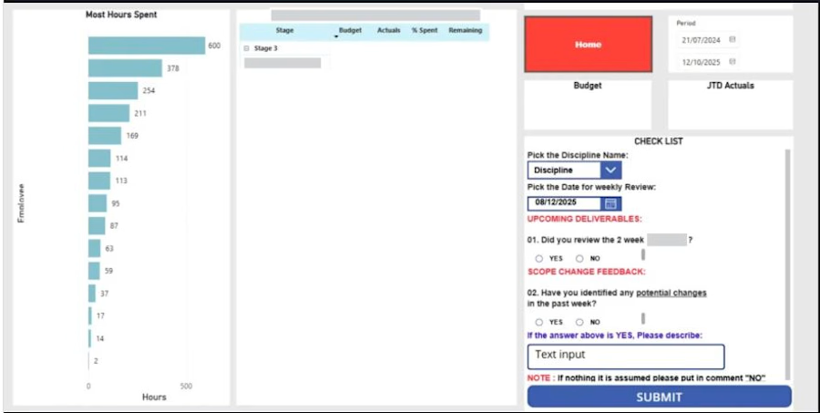
🚀 Interactive Employee Utilization Dashboard: Power BI & Power Apps Integration
Project managers and top stakeholders often struggle with disconnected reporting and feedback loops. To bridge this gap, I built an end-to-end solution combining Power BI for analytics with an embedded Power App that enables real-time feedback and weekly review submissions without ever leaving the dashboard report.
📌 Business Challenge & Overview
Leadership needed a unified platform to track employee utilization (hours spent, budget vs. actuals, stages) and conduct weekly reviews. The goal was to eliminate manual follow-ups by allowing managers to analyze key metrics and immediately submit feedback or scope change notes in a centralized system.
✨ Key Features & Functionality
Real-Time Analytics in Power BI: Displays key utilization metrics, including "Most Hours Spent" by employee, budget performance, actuals, and stage breakdowns.
Embedded Power App Form: Allows project leaders to perform weekly checklists, select disciplines, set review dates, and input qualitative feedback directly within the report canvas.
Write-Back Data Processing (Patch() Function): Utilizes the Power Apps Patch() function to seamlessly submit user responses and comments directly to an Excel database stored in SharePoint.
Weekly Review Workflow: Tracks scope change feedback and upcoming deliverables in real time, ensuring clear accountability across project management teams.
🛠️ Tech Stack & Architecture
Power BI: Embedded analytics, visual reporting, and data modeling.
Power Apps: Embedded canvas app, form controls, and custom canvas UI.
Power Apps Power Formula: Patch() function for writing data back dynamically.
Data Storage / Backend: Excel file stored on SharePoint for centralized weekly tracking.
📈 Business Impact
Eliminated Context-Switching: Stakeholders can view utilization metrics and log feedback in a single interface.
Streamlined Auditing: Ensures all weekly review notes, scope adjustments, and checklist submissions are systematically stored for weekly audits.
Faster Decision-Making: Bridges qualitative leadership feedback with quantitative utilization data.


The network for creativity
Join 1.25M professional creatives like you
Connect with clients, get discovered, and run your business 100% commission-free
Creatives on Contra have earned over $150M and we are just getting started

Challenges
View all


Related posts


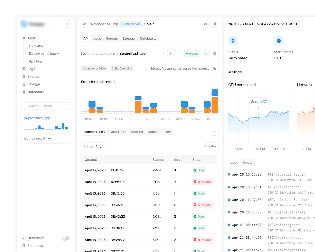
ultra-complex analytics dashboard

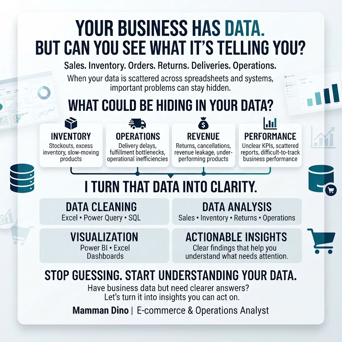
Your business is generating data every day.
But can you quickly answer:
📦 Which products are at risk of stockouts?
🚚 Where are delivery and fulfillment problems happening?
💰 Which products or processes are affecting revenue?
📊 Which numbers actually need your attention?
That’s where I come in.
I help e-commerce and operations businesses clean, analyze, and visualize their data using Excel, Power Query, SQL, and Power BI.
The goal isn't just another dashboard.
It’s clearer answers, better visibility, and insights you can act on.
If your business has data but you're struggling to turn it into decisions, let's talk.
#Ecommerce #Operations #DataAnalytics #PowerBI #SQL #Excel #BusinessIntelligence

BlockLens Website Revamp
I redesigned BlockLens to make blockchain intelligence feel clearer, faster, and more approachable. The revamp introduces a sharper visual identity, simplified navigation, stronger data hierarchy, and a seamless responsive experience.
Streamlined Dashboard
Key information is organized into a clean, focused overview, helping users understand market activity at a glance.
Intuitive Asset Discovery
Improved navigation and search make it easier to explore assets and reach relevant information quickly.
Clear Data Visualizations
Complex blockchain data is presented through accessible charts and visual cues that make trends easier to understand.
Real-Time Insights
Users can monitor changing market activity and make informed decisions using current, clearly presented data.
Responsive Experience
The interface adapts smoothly across desktop, tablet, and mobile without losing clarity or functionality.
Paper Trading
Users can practise trading strategies with simulated funds, explore market movements, and build confidence without risking real money.
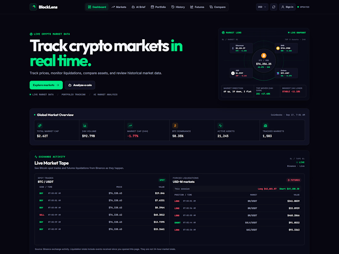
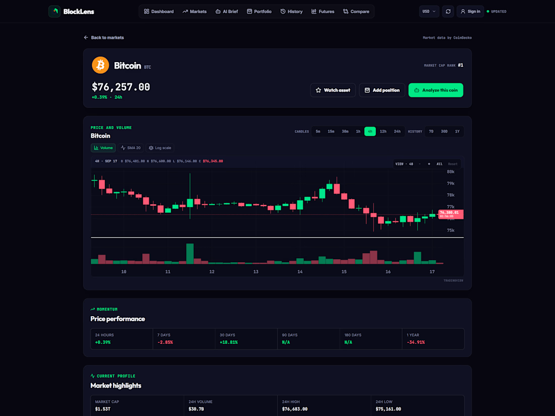
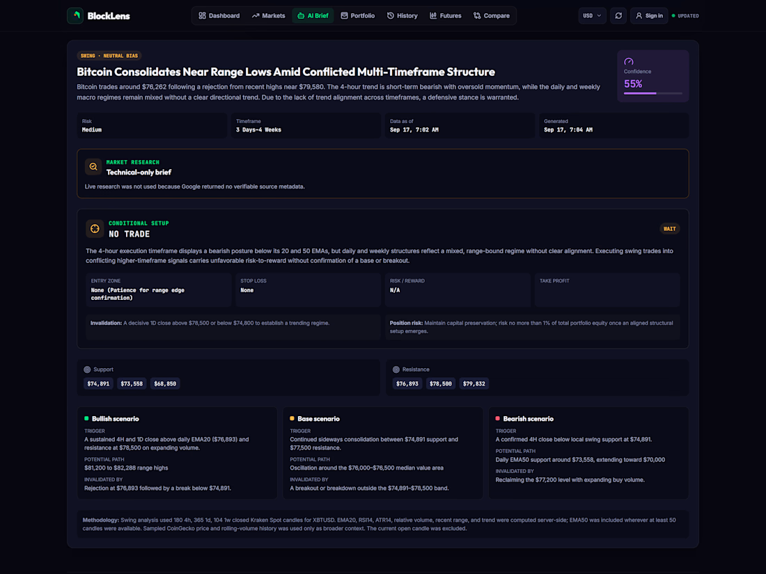
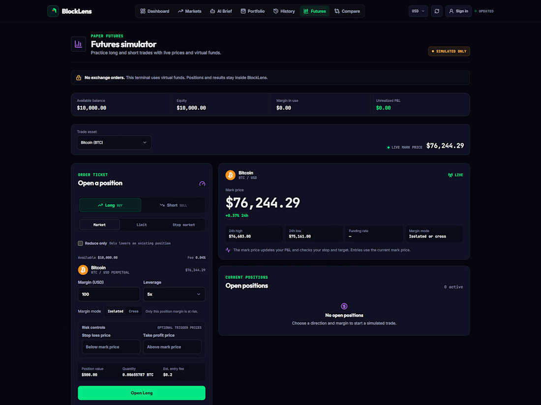

The paper trading mode is the smartest inclusion here, it lowers the stakes enough that new users stick around long enough to trust the data. On a dark dashboard like this, letting one primary number own each card is usually what makes the hierarchy read instantly.