The network for creativity
Join 1.25M professional creatives like you
Connect with clients, get discovered, and run your business 100% commission-free
Creatives on Contra have earned over $150M and we are just getting started
Back to feedPost
BlockLens Website Revamp
I redesigned BlockLens to make blockchain intelligence feel clearer, faster, and more approachable. The revamp introduces a sharper visual identity, simplified navigation, stronger data hierarchy, and a seamless responsive experience.
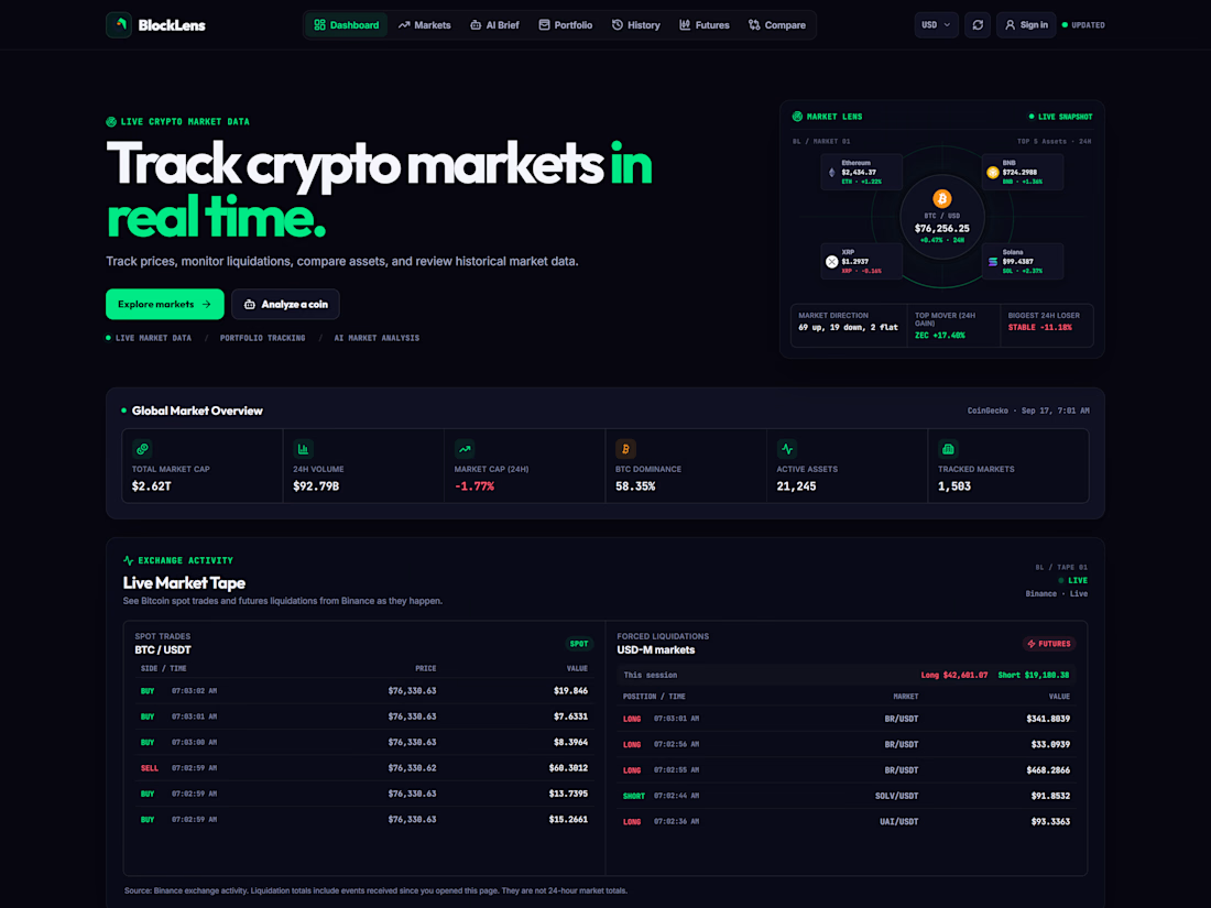
Streamlined Dashboard
Key information is organized into a clean, focused overview, helping users understand market activity at a glance.
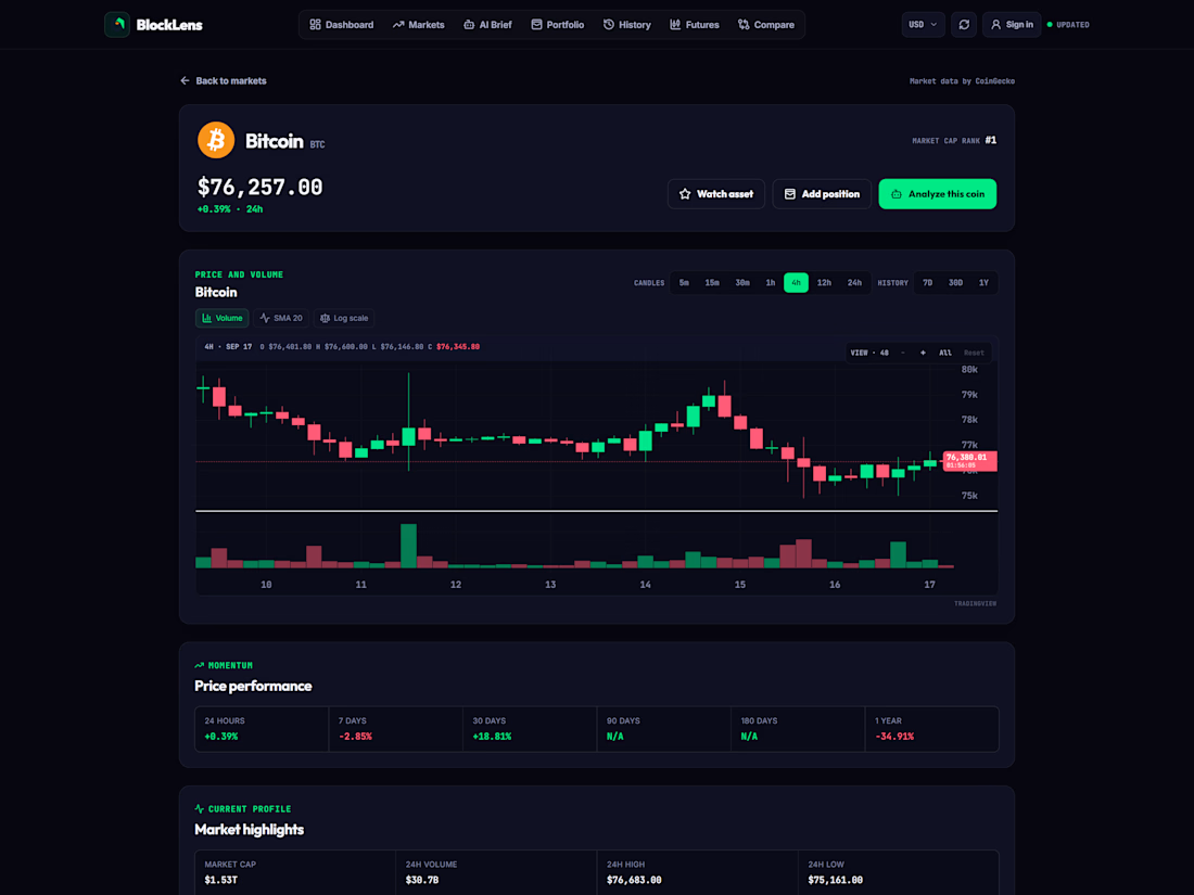
Intuitive Asset Discovery
Improved navigation and search make it easier to explore assets and reach relevant information quickly.
Clear Data Visualizations
Complex blockchain data is presented through accessible charts and visual cues that make trends easier to understand.
Real-Time Insights
Users can monitor changing market activity and make informed decisions using current, clearly presented data.
Responsive Experience
The interface adapts smoothly across desktop, tablet, and mobile without losing clarity or functionality.
Paper Trading
Users can practise trading strategies with simulated funds, explore market movements, and build confidence without risking real money.
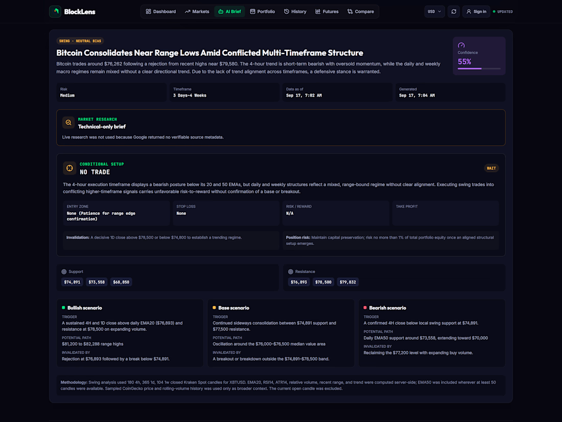
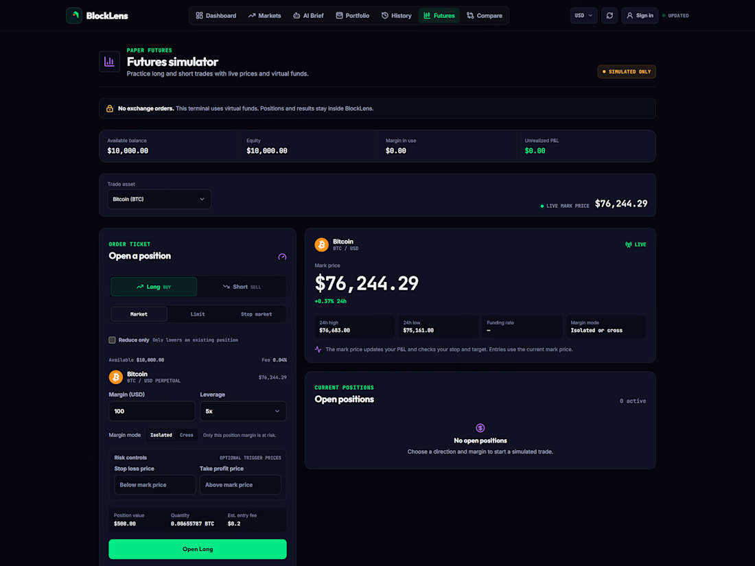

The paper trading mode is the smartest inclusion here, it lowers the stakes enough that new users stick around long enough to trust the data. On a dark dashboard like this, letting one primary number own each card is usually what makes the hierarchy read instantly.

I couldn’t agree more! Thanks for the feedback
The network for creativity
Join 1.25M professional creatives like you
Connect with clients, get discovered, and run your business 100% commission-free
Creatives on Contra have earned over $150M and we are just getting started

Challenges
View all


Related posts

Custom liquid interaction built in Framer.
Turning a static hero into a responsive visual surface through cursor-driven distortion.


How do you adapt the cursor-driven effect for touch screens?

Orion GT — Luxury Automotive Landing Page 🏎️🔥
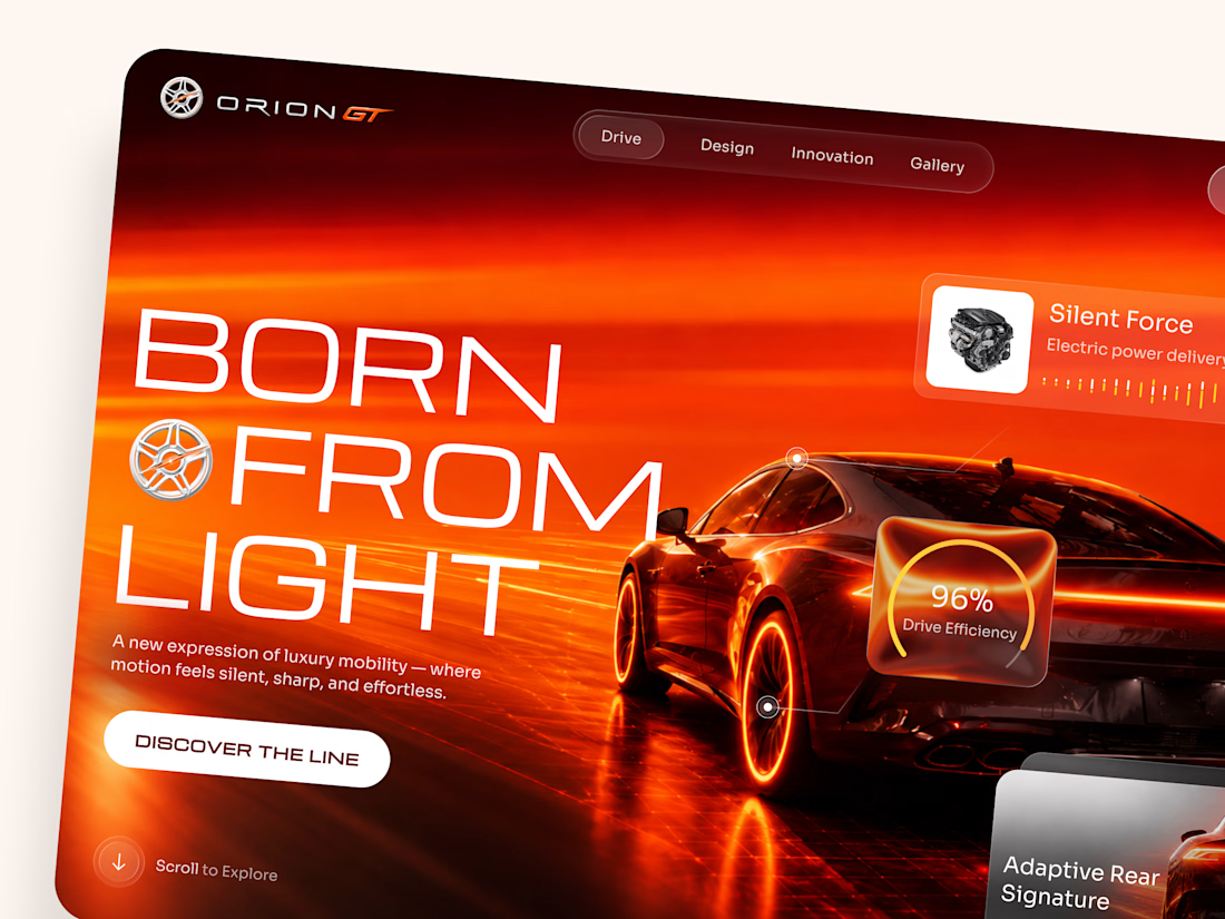
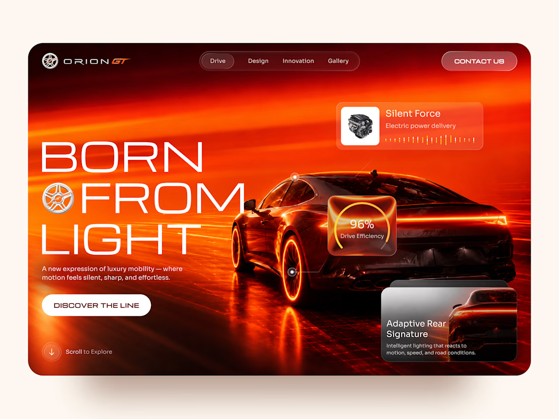
Orion GT is a landing page concept for a premium performance car brand, built around speed, innovation, and a cinematic digital experience.
The goal was to make the vehicle feel like more than a product — creating an immersive introduction where lighting, motion, typography, and interface details reinforce the feeling of performance and exclusivity.
Special attention was given to:
• a cinematic hero composition that makes the vehicle the main visual focus;
• a high-energy red and orange palette inspired by speed, heat, and light 🔥;
• oversized typography that strengthens the premium, futuristic character;
• floating performance UI elements that communicate features without interrupting the visual experience;
• glass-style interface cards for drive efficiency, electric power delivery, and adaptive lighting;
• a clear “Discover the Line” CTA integrated into the storytelling;
• responsive mobile layouts that preserve the atmosphere while simplifying the composition 📱;
• a minimal mobile navigation designed to keep the experience focused and immersive.
The result is a bold automotive experience that combines luxury presentation with a technology-driven interface — turning the landing page into part of the product experience itself.
Looking to create a premium website for your automotive, mobility, or technology brand? Let’s build something that feels as powerful as the product. ⚡




How did you choose this color direction? 🔥