The network for creativity
Join 1.25M professional creatives like you
Connect with clients, get discovered, and run your business 100% commission-free
Creatives on Contra have earned over $150M and we are just getting started
Back to feedPost


This one stopped my scroll, the symmetry and all those small mechanical details reward a second look instead of just being busy for its own sake. Was this made for a specific brand or client, or is it more of a personal exploration piece you made because the concept was stuck in your head?

Hey Maty glad you like it as much as I do. I started my own freelancing business for music production, sound design, and custom plugins. My company is based on me who has always lived a life of duality.
My company name "Technically Creative" follows the same symbolism as the...
The network for creativity
Join 1.25M professional creatives like you
Connect with clients, get discovered, and run your business 100% commission-free
Creatives on Contra have earned over $150M and we are just getting started



Related posts

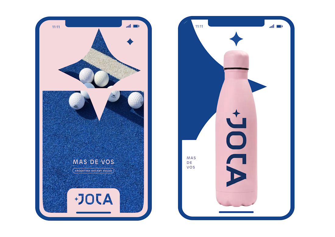
JOTA is an Argentine field hockey brand built for players who play with personality. The founder reached out to rethink how the brand shows up beyond the stick itself.


Wow project

A closer look at the Tindara coffee packaging.
I wanted the colors to feel rich and warm, and to work just as well together as they do separately. Mustard, green, and burgundy give each pack its own character, while the cream details bring the range together.
I’m curious, which color would you pick up first?

Stunning

Most rebrands start with a mood board. This one started with a punctuation mark.
For we make the slash in the name became the logo, the monogram, the layout tool and even the campaign line: "we make you grow."
When one small idea can carry a whole brand, every new touchpoint designs itself.
Founders does your name have a hidden idea like this?
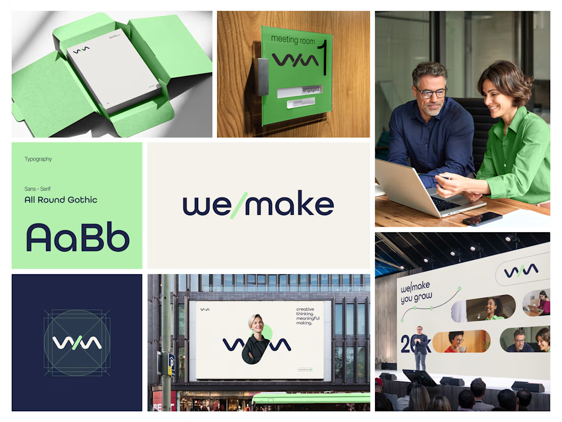

Turning the slash into the logo, monogram and layout device is such a smart move, and it feels wonderfully consistent across the mint-green packaging, signage and stage visuals. The rounded geometric type pairs beautifully with that fresh green and deep navy. Did the slash idea...