The network for creativity
Join 1.25M professional creatives like you
Connect with clients, get discovered, and run your business 100% commission-free
Creatives on Contra have earned over $150M and we are just getting started
Back to feedPost
Taste Test

Which Testimonal section would you choose?
I'd go with Big text, looks aesthetic and modern

3 votes
Ends in 1d


Both looks good btw
Thanks for your feedback

I’d go with Big Text too. It creates a stronger visual hierarchy and makes the testimonial feel more prominent without adding unnecessary elements. As a UI/UX designer, I’d also consider how it performs across mobile and desktop.
The network for creativity
Join 1.25M professional creatives like you
Connect with clients, get discovered, and run your business 100% commission-free
Creatives on Contra have earned over $150M and we are just getting started
Trending
retrofuturism
Share your favorite designs from the past exploring the distant future. Or your own take on the aesthetic 🚀
halftone
Dots. Texture. Grain. Let's see your designs using the halftone technique.

Midjourney
Creatives are showing off what they're making with Midjourney.
colorgrade
Video editors sound off: How do you enhance the mood of your video in color grading?





Related posts

Option 1 — Bold & Editorial
Two directions. One brand. Which one wins? 👀
I explored two different visual approaches for the same coaching website — each with its own personality, typography, color, and visual energy.
A — Bold, dark & editorial
B — Bright, elegant & modern
If you were the client, which direction would you choose?
Cast your vote and tell me what made you pick it. 👇
#UIDesign #WebDesign #Framer #WebDesignInspiration #DesignPoll #Framer

75 voted
72%
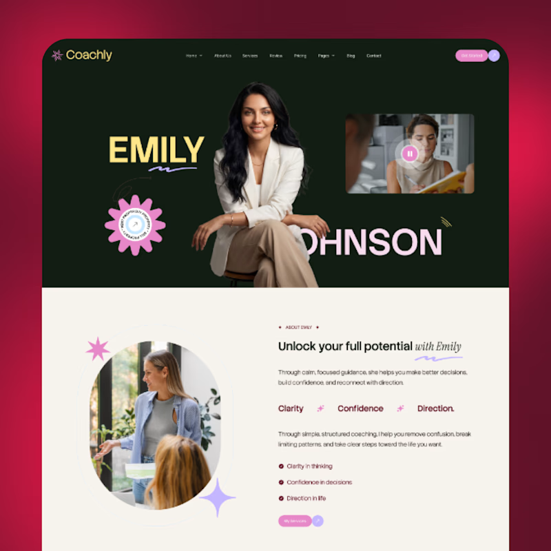
29 voted
28%
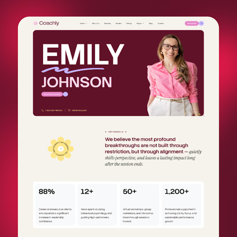
104 votes
Closed

Both directions look strong, but I’m leaning toward A Bold, dark & editorial 👀 It feels more distinctive and has a stronger visual personality. Would love to see where you take it next! 🔥





I’d go with 2. The cinematic image makes the brand feel more established.

Halftone Engine redraws your photo or clip as a grid of dots that pull colour from the footage - rippling, drifting and reacting to your cursor, live.
✨ (Make it yours) - make something different, specially for you :)
Which format would you like?
👇🏻 A or B
29 voted
54%
25 voted
46%
54 votes
Closed

Fantastic execution. ❤