The network for creativity
Join 1.25M professional creatives like you
Connect with clients, get discovered, and run your business 100% commission-free
Creatives on Contra have earned over $150M and we are just getting started
Back to feedPost

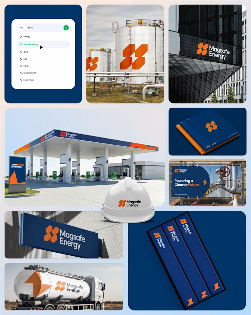
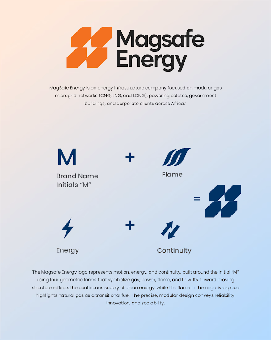
Excited to share the Magsafe Energy project, a brand built to lead Africa’s clean energy transition with clarity, confidence, and purpose.
From the outset, the objective was not simply to design a logo, but to craft a complete visual identity that clearly defines the brand’s personality within the energy sector.
The process began with understanding the industry landscape heavily technical, infrastructure driven, and trust dependent and identifying how Magsafe could stand apart.
The result is a structured, modular identity system inspired by energy flow, continuity, and engineered precision. Every visual element was intentionally developed to communicate reliability, movement, scalability, and long term sustainability.
The brand architecture was designed to feel bold yet refined strong enough for industrial applications, yet modern and minimal enough to resonate in digital spaces.
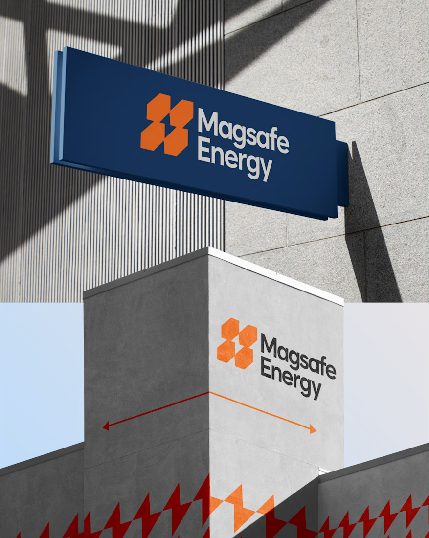
From the logomark geometry to the typography structure and layout system, everything was built to scale seamlessly across fuel stations, corporate documents, site branding, safety equipment, and large infrastructure installations.
This is not just a logo it is a cohesive brand system designed to grow alongside a company committed to powering a cleaner, smarter future


The network for creativity
Join 1.25M professional creatives like you
Connect with clients, get discovered, and run your business 100% commission-free
Creatives on Contra have earned over $150M and we are just getting started
Trending
retrofuturism
Share your favorite designs from the past exploring the distant future. Or your own take on the aesthetic 🚀
halftone
Dots. Texture. Grain. Let's see your designs using the halftone technique.

Midjourney
Creatives are showing off what they're making with Midjourney.
colorgrade
Video editors sound off: How do you enhance the mood of your video in color grading?





Related posts

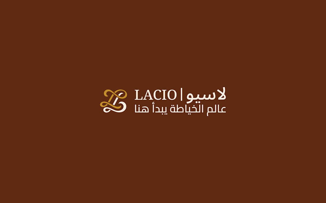
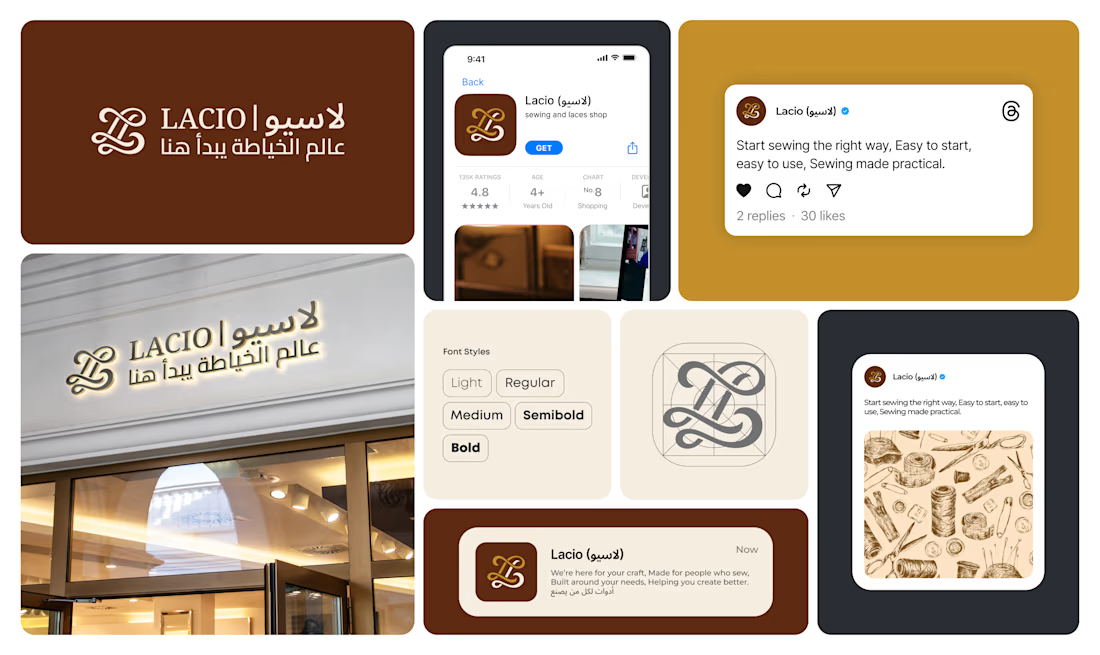
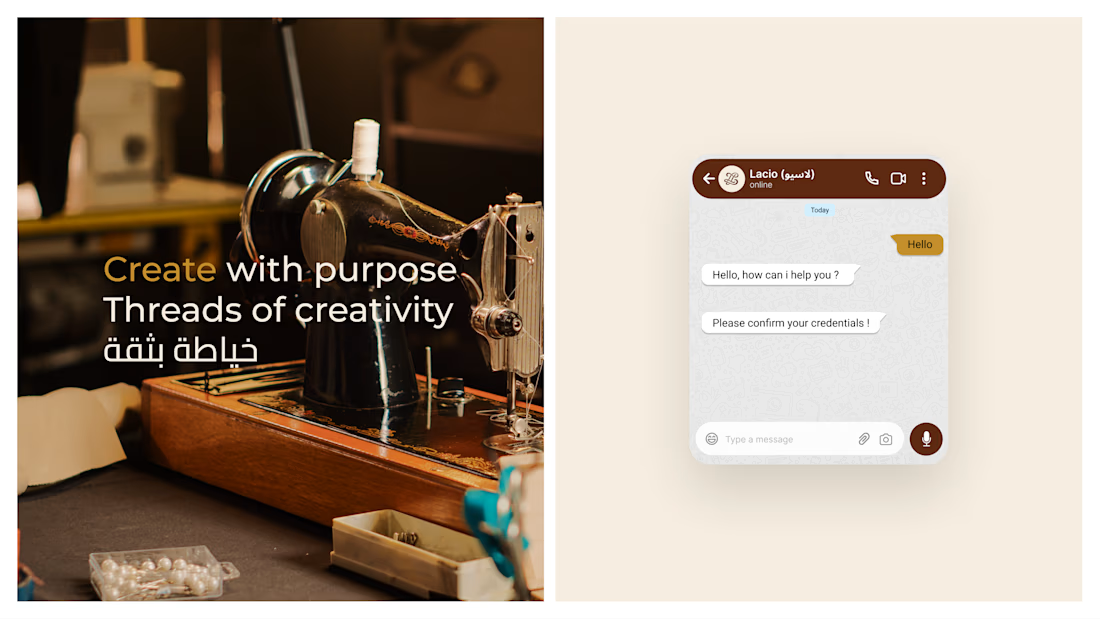
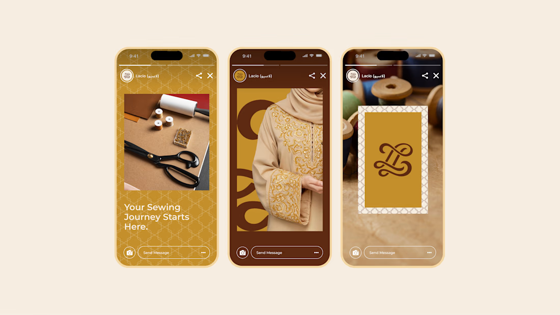
Lacio - a refined brand identity crafted for a modern sewing and tailoring brand.
From the signature monogram and Arabic-English typography to social media templates, storefront signage, and digital touchpoints, every detail was designed to make the brand feel elegant, trustworthy, and memorable.
A visual identity where craftsmanship meets contemporary luxury.
#BrandIdentity #BrandDesign #LogoDesign #VisualIdentity #FashionBranding #LuxuryBranding #ArabicBranding #BilingualBranding #TailoringBrand #SewingBrand #SocialMediaDesign #GraphicDesign #BrandingDesigner


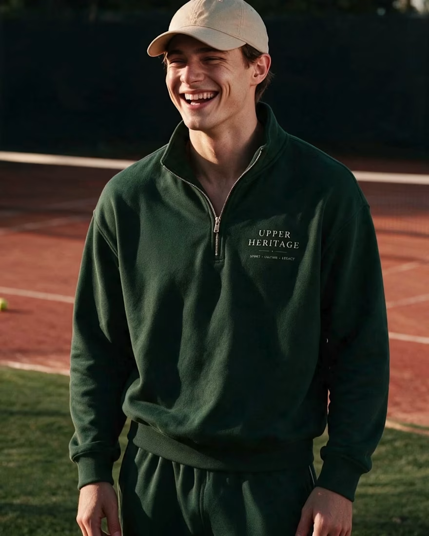
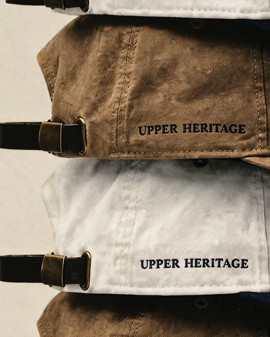
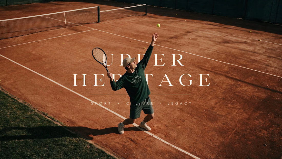
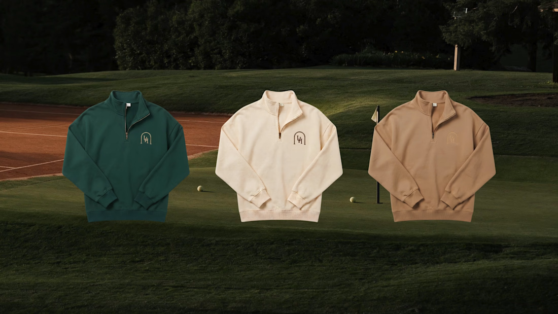
Built to Look Like It Has Always Existed 🎾
Some brands want to look new. This one wanted the opposite.
Upper Heritage borrows the codes of club tennis — crests,
hand-painted signage, court green. Designed to feel founded
in 1934 and simply never advertised.
The hardest part of heritage design isn't adding history.
It's knowing what to leave out.
You can see the full project here.

I love the vibesssss, old money style!! 💯

Here are some slides from an analytics project I've been working on.


Monochrome approach looks amazing!