The network for creativity
Join 1.25M professional creatives like you
Connect with clients, get discovered, and run your business 100% commission-free
Creatives on Contra have earned over $150M and we are just getting started
Back to feedPost

Here are some slides from an analytics project I've been working on.

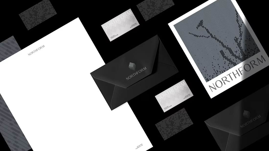
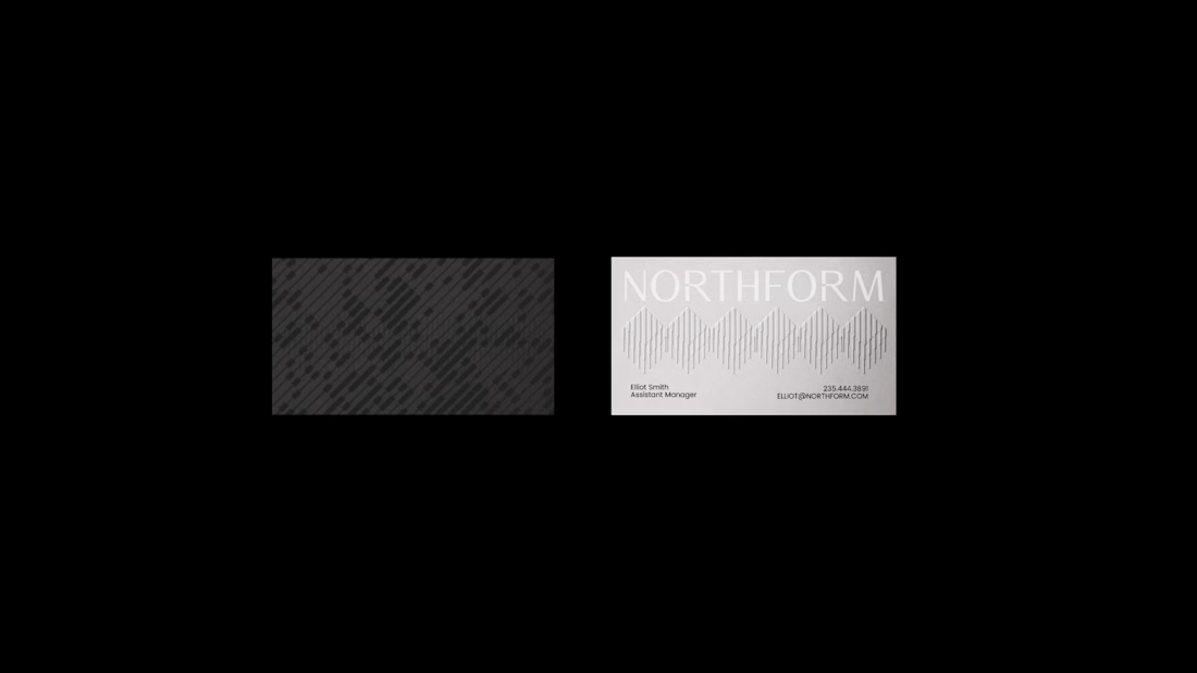
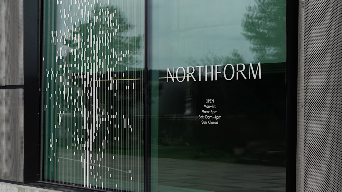
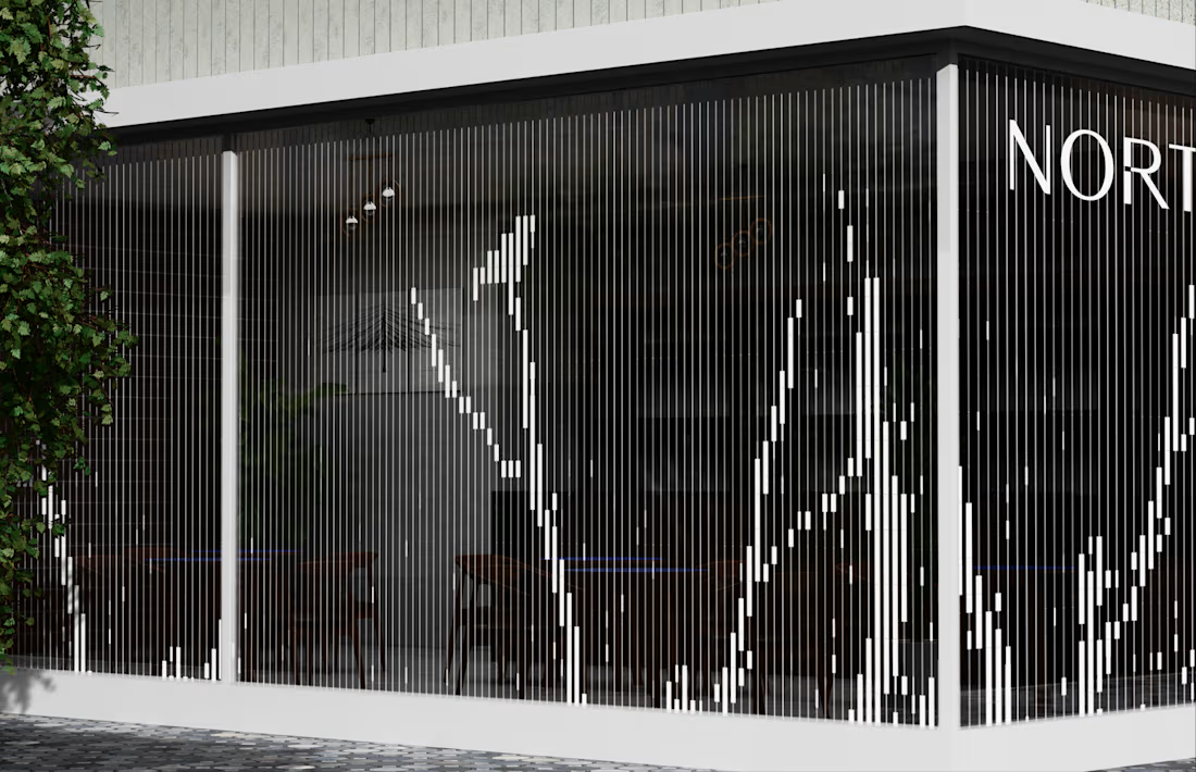

That NORTHFORM branding leans hard into moody, high-contrast architecture photography instead of the usual polished renders, feels deliberate. Was that direction something the client asked for, or did you have to sell them on going darker than they'd originally pictured?


Monochrome approach looks amazing!

The network for creativity
Join 1.25M professional creatives like you
Connect with clients, get discovered, and run your business 100% commission-free
Creatives on Contra have earned over $150M and we are just getting started



Related posts





cool

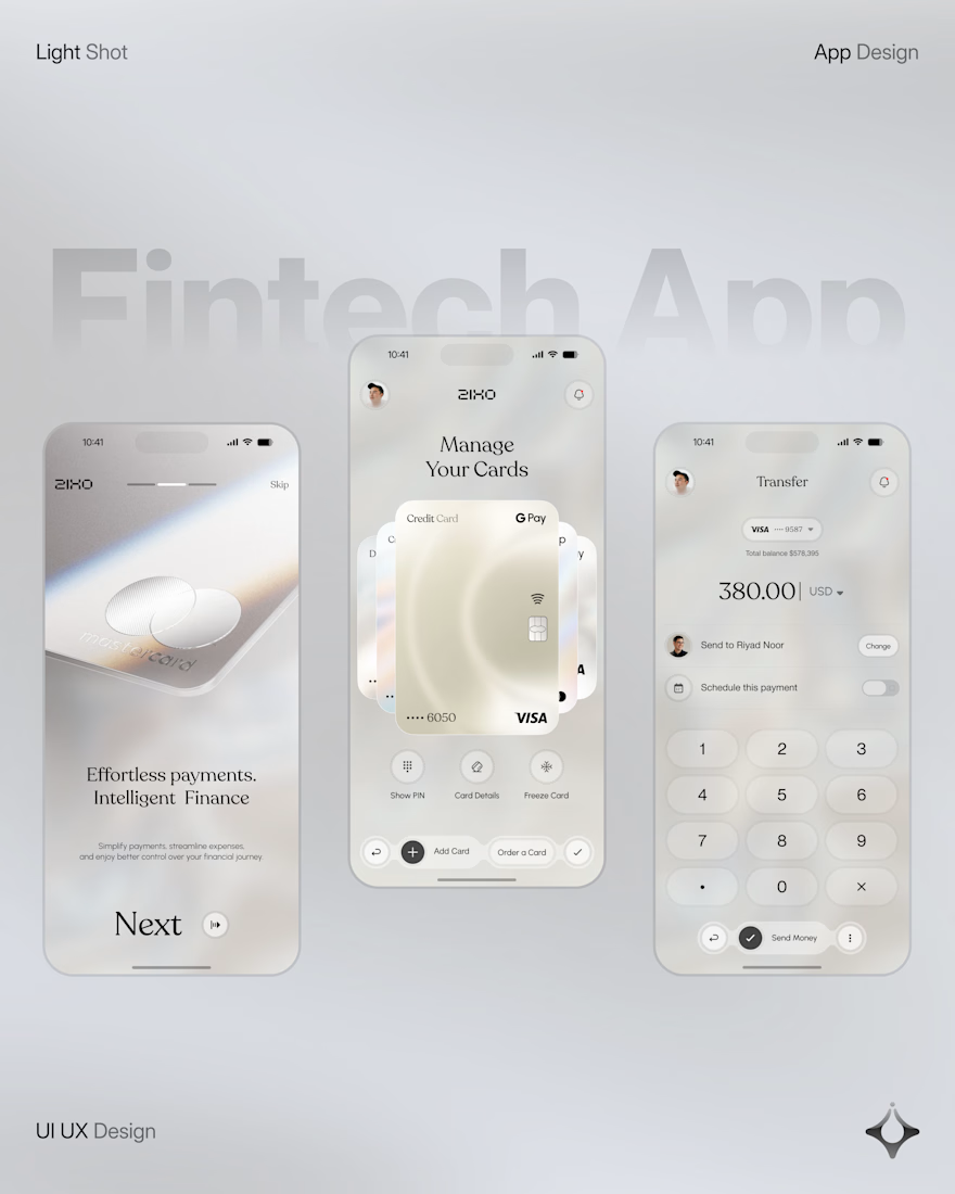
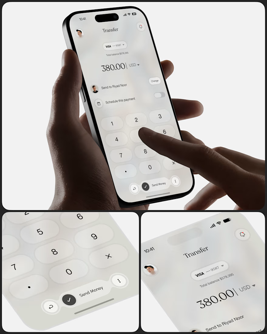
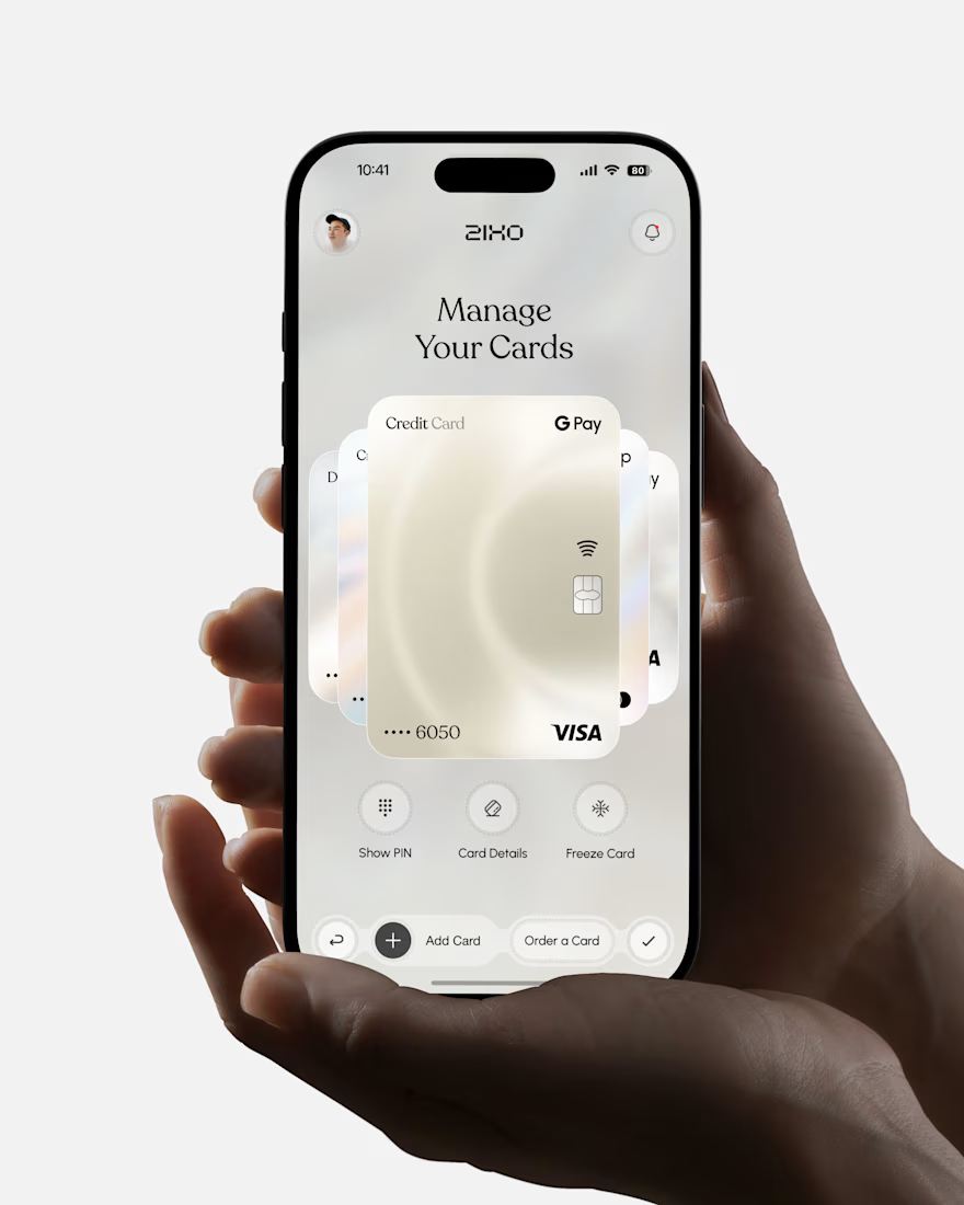
People don’t just want a banking app. They want to feel in control of their money.
Great fintech design doesn’t just look premium. It makes money feel simpler, safer, and easier to control.
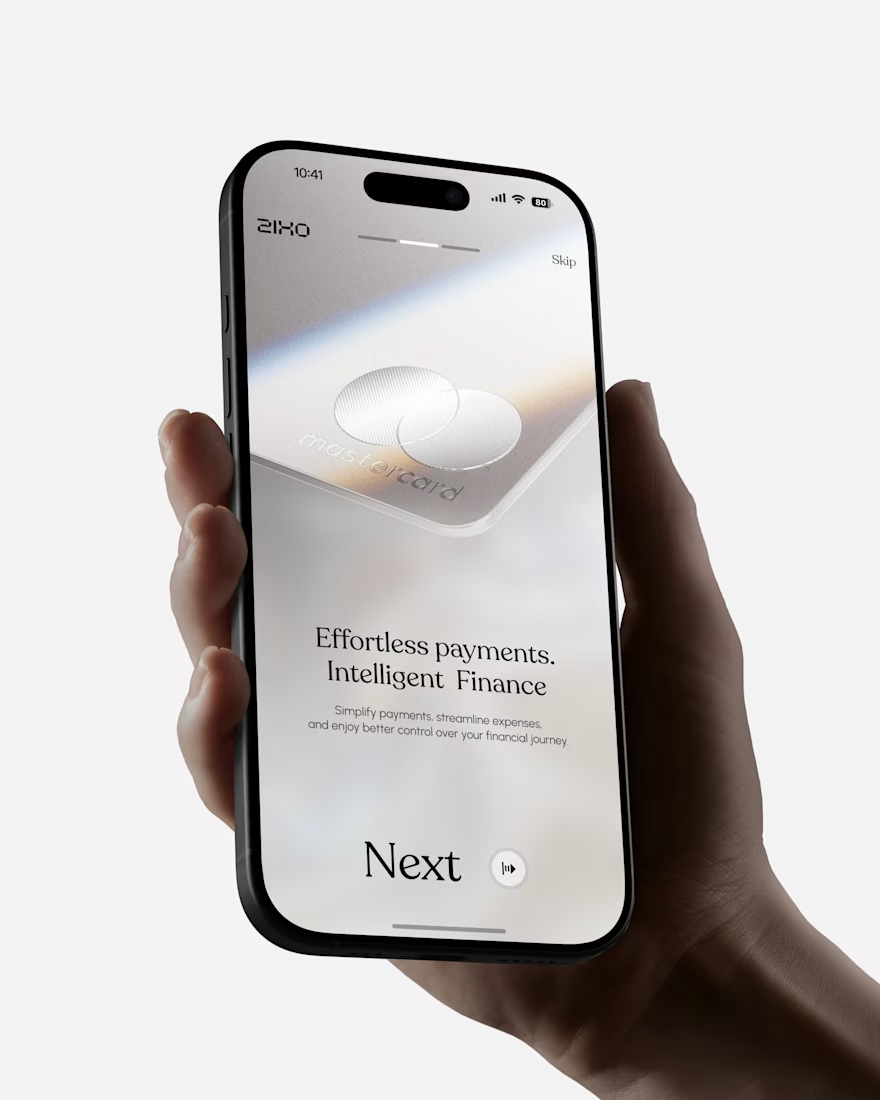
Meet Ziko, a mobile banking concept where every interaction is designed to reduce friction and build trust.
What wins your trust first: 🔒 Security, ✨ Simplicity, or ⚡ Speed?



Stunning