The network for creativity
Join 1.25M professional creatives like you
Connect with clients, get discovered, and run your business 100% commission-free
Creatives on Contra have earned over $150M and we are just getting started
Back to feedPost
Taste Test

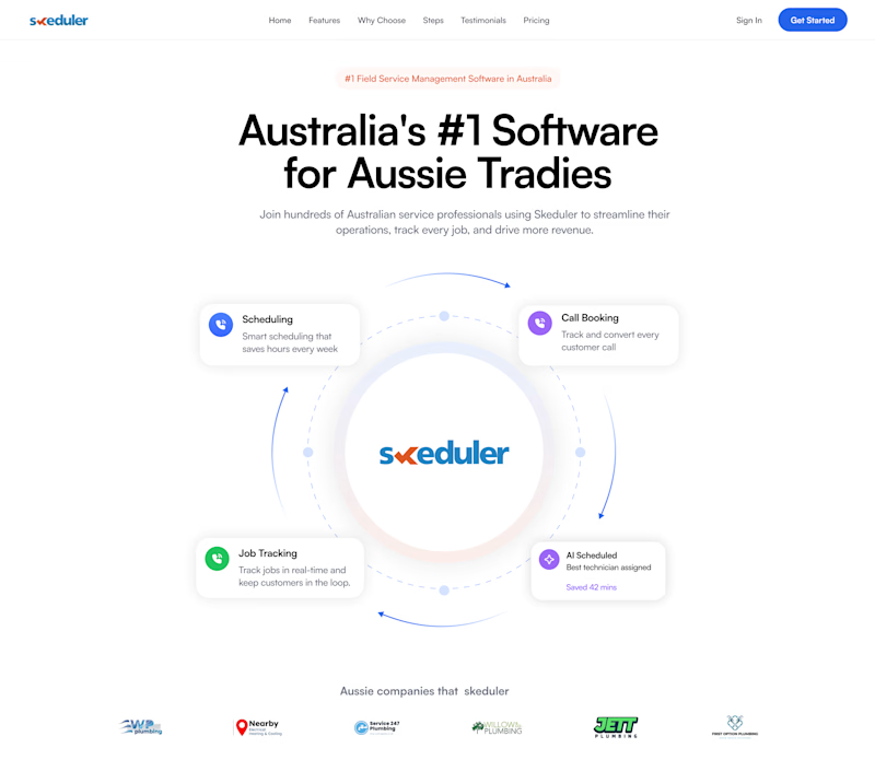
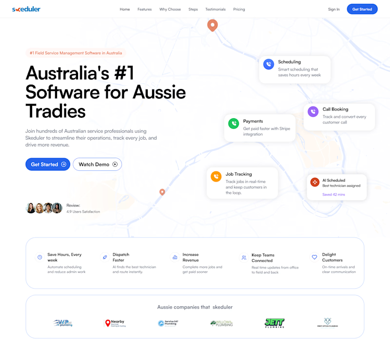
I would love to get your feedback on these two options. Which one do you prefer
1 voted
50%
1 voted
50%
2 votes
Closed
The network for creativity
Join 1.25M professional creatives like you
Connect with clients, get discovered, and run your business 100% commission-free
Creatives on Contra have earned over $150M and we are just getting started



Related posts

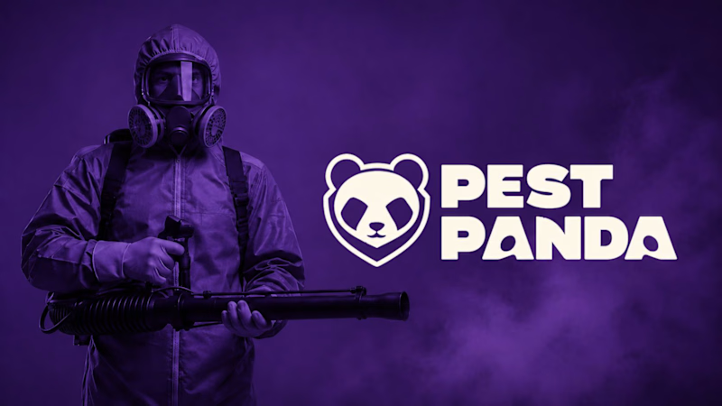
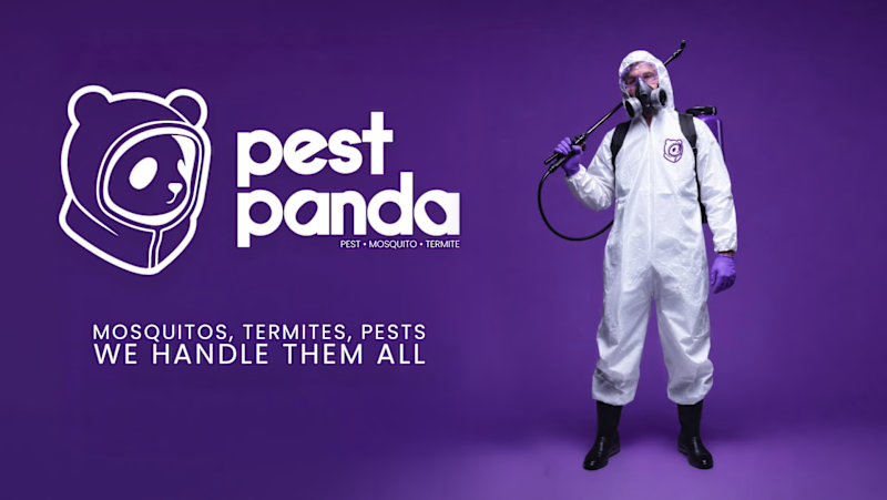
Which logo + Wordmark looks more organic/reliable/premium and why?
5 voted
71%
2 voted
29%
7 votes
Closed

Option 2 for me: the rounded lowercase wordmark and the panda in a hazmat hood feel friendlier and more premium, while the heavy caps next to the gas-mask photo in option 1 read a bit aggressive for a home service. I'd only give the tagline in option 2 more weight, at that size it gets lost on the purple.

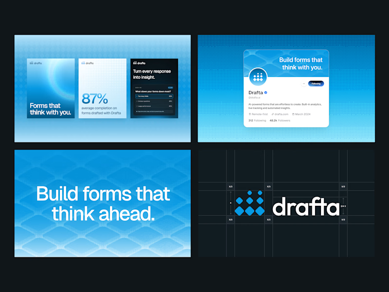
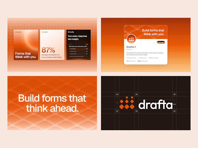
Same brand, two different personalities. 🎨
We explored Drafta’s brand identity in two color directions:
A: Electric Blue 💙 and B: Vibrant Orange 🧡
Color shapes how a brand feels, how people see it, and how easily they remember it, so this choice matters.
Which one would you pick for Drafta? Vote A or B and tell us why in the comments! 👇💬
#BrandIdentity #BrandColor #VisualIdentity #UIDesign #DesignPoll
4 voted
80%
1 voted
20%
5 votes
Closed

Blue looks good !

Working on a Contra project - which one is your go to?
90 voted
52%
82 voted
48%
172 votes
Closed

I will go for A - Spiral