
Ch shahzad
UI/UX Designer | SaaS, Web & Mobile Apps | Framer expert


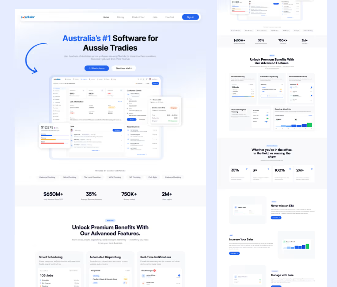
SaaS Landing Page Design for a Field Service Management Platform
Problem
The existing website needed a modern, professional interface that could clearly communicate the platform’s features, benefits, and value to Australian trade businesses without overwhelming users.
Solution
Designed a clean, conversion-focused SaaS landing page with a strong hero section, product UI showcases, key statistics, feature sections, and clear CTAs—creating a polished experience that builds trust and guides users toward starting a free trial.
0
33
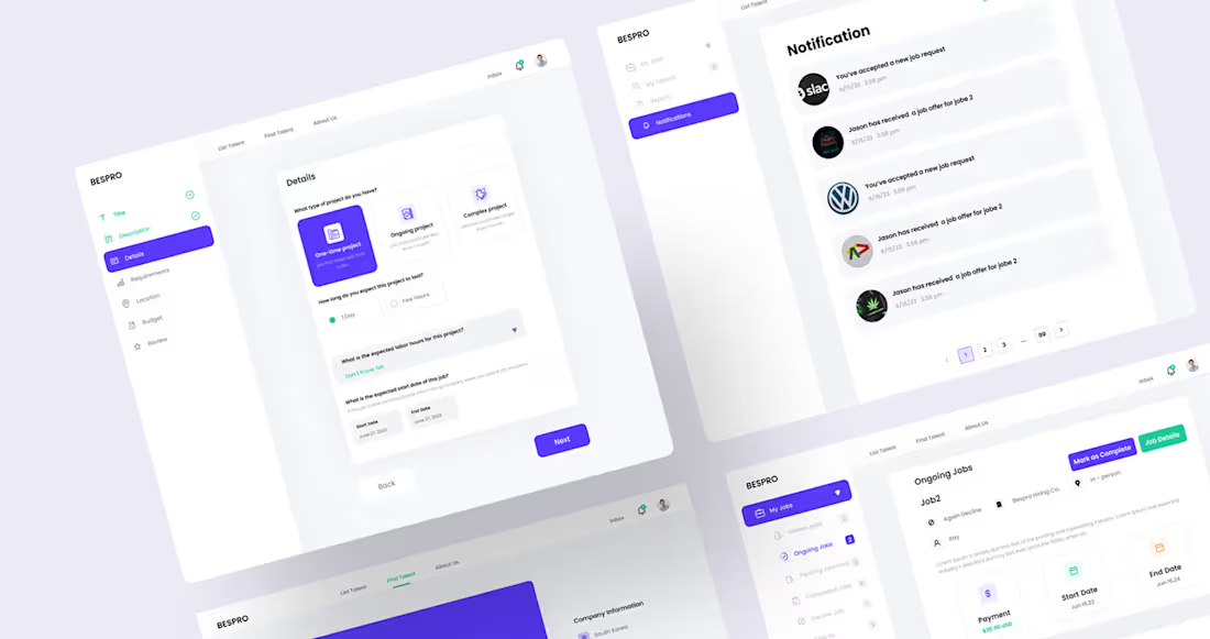
BESPRO – B2B Hiring & Project Management Dashboard
Problem
Companies were struggling to manage hiring, job requests, ongoing projects, and communication from different tools. This caused delays, poor visibility, and an inefficient workflow for both employers and talent
Solution
I designed a modern B2B dashboard that brings the entire hiring and project management process into one platform. The design improves navigation, simplifies complex workflows, and helps users manage jobs, notifications, and project progress with ease. The interface uses a clear visual hierarchy, reusable components, and Auto Layout for scalability and developer handoff.
Tools: Figma • Auto Layout • Components • Design System • Prototyping
1
112
Nothing speaks louder than client feedback. Grateful to work with amazing clients and help bring their ideas to life
1
99
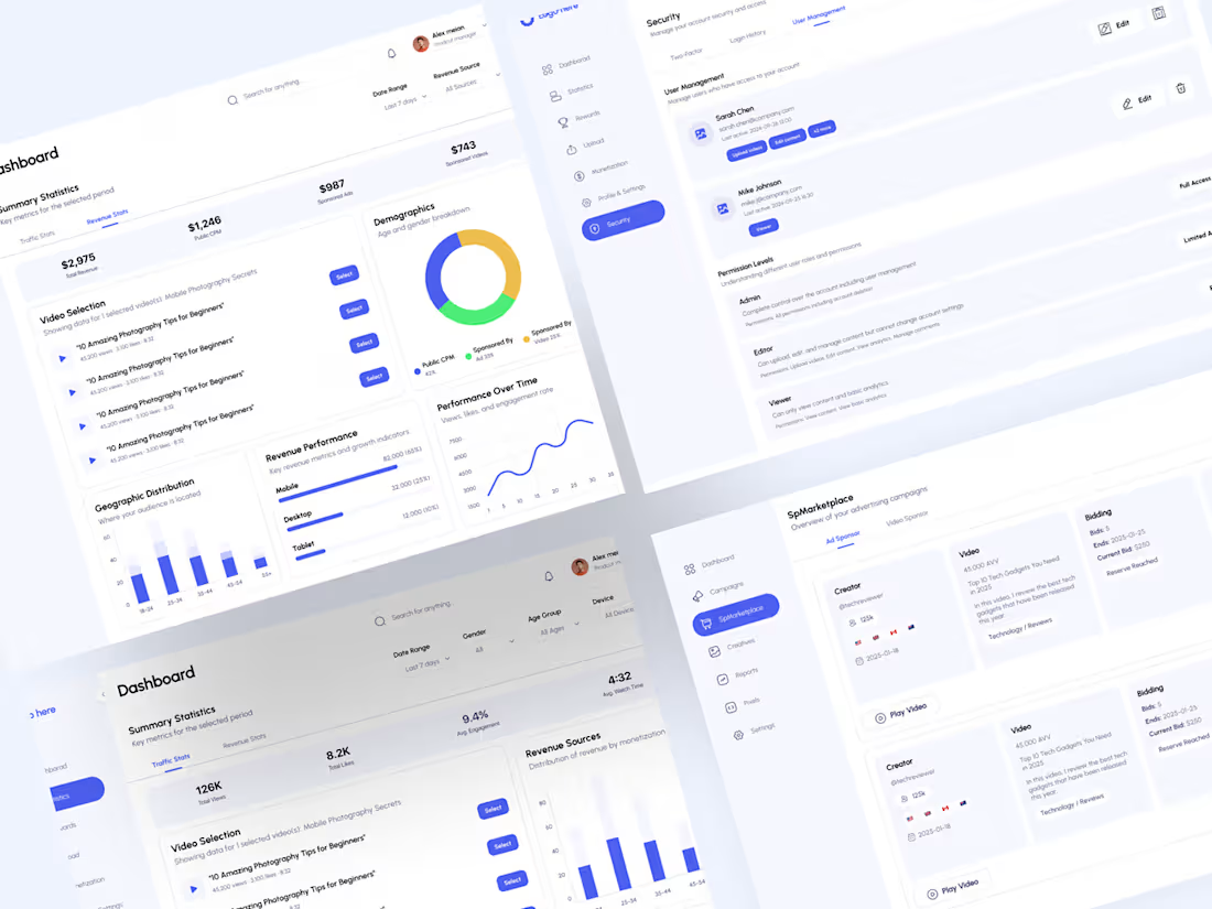
BitScocity Dashboard UI/UX Design
Overview
BitScocity Dashboard is a modern analytics platform designed to help users track performance, manage campaigns, and monitor key metrics efficiently.
Problem
The existing experience was cluttered, with poor data hierarchy, making it difficult for users to quickly understand insights and navigate between sections.
Solution
I created a clean, structured dashboard with improved visual hierarchy, intuitive navigation, and clear data visualization to enhance usability and decision-making.
Process
Research → Wireframing → UI Design → Iteration for better UX
Feel free to reach out and we can start working together.
6
5
243