The network for creativity
Join 1.25M professional creatives like you
Connect with clients, get discovered, and run your business 100% commission-free
Creatives on Contra have earned over $150M and we are just getting started
Back to feedPost
Taste Test

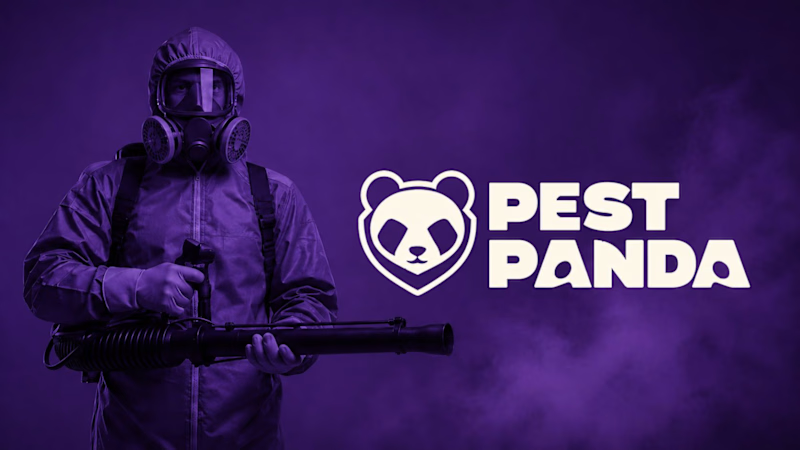
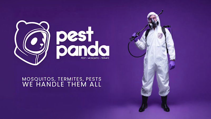
Which logo + Wordmark looks more organic/reliable/premium and why?
1 vote
Ends in 1d

Option 2 for me: the rounded lowercase wordmark and the panda in a hazmat hood feel friendlier and more premium, while the heavy caps next to the gas-mask photo in option 1 read a bit aggressive for a home service. I'd only give the tagline in option 2 more weight, at that size it gets lost on the purple.
The network for creativity
Join 1.25M professional creatives like you
Connect with clients, get discovered, and run your business 100% commission-free
Creatives on Contra have earned over $150M and we are just getting started



Related posts

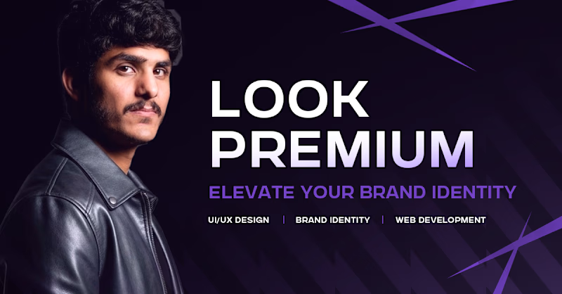
Which one do you think i should put as a FEATURED SECTION cover on linkedin? Help me decide!
1 voted
33%

2 voted
67%
3 votes
Closed


which one matches your headline better? thats usually the tiebreaker for featured covers

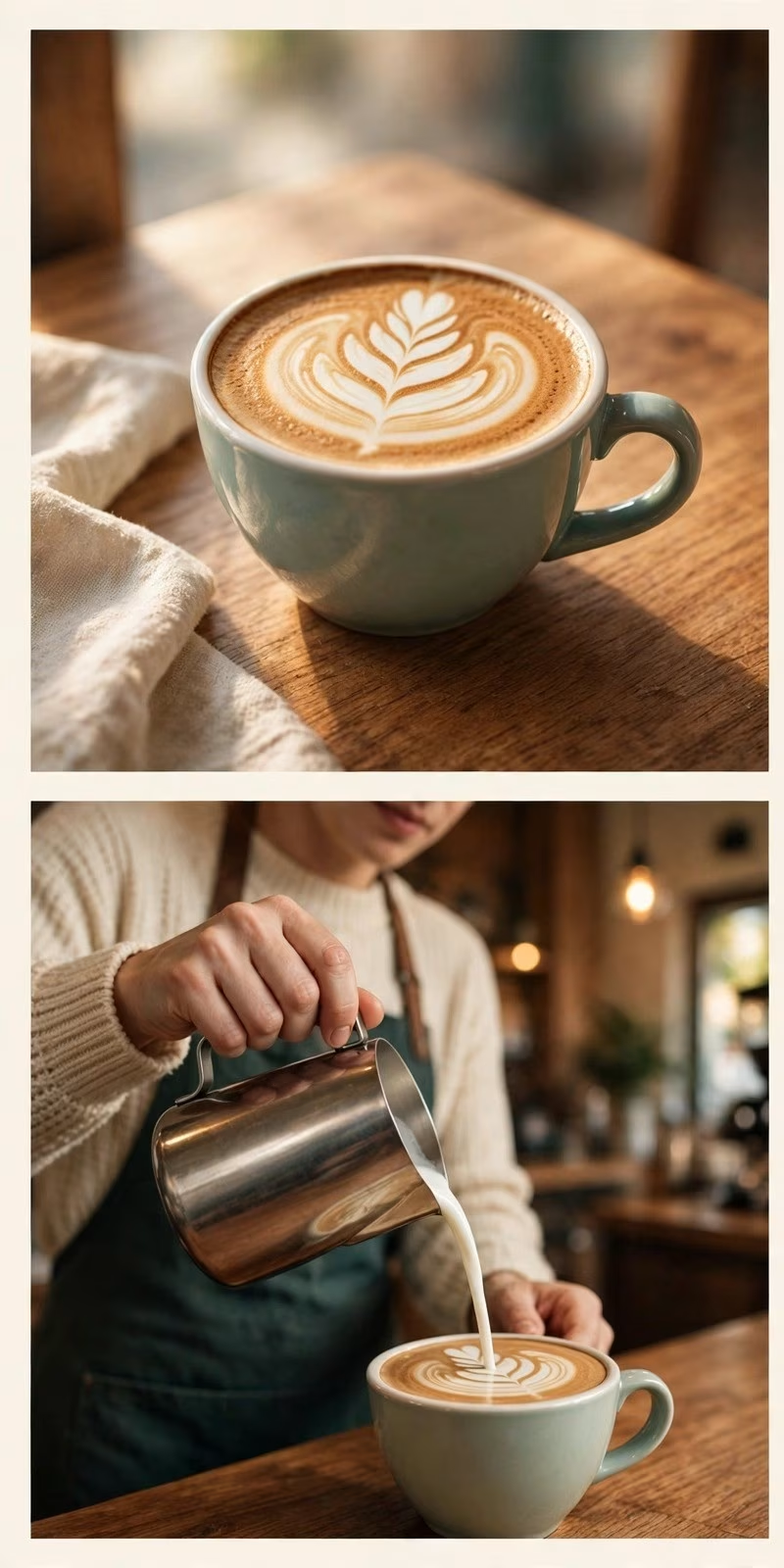
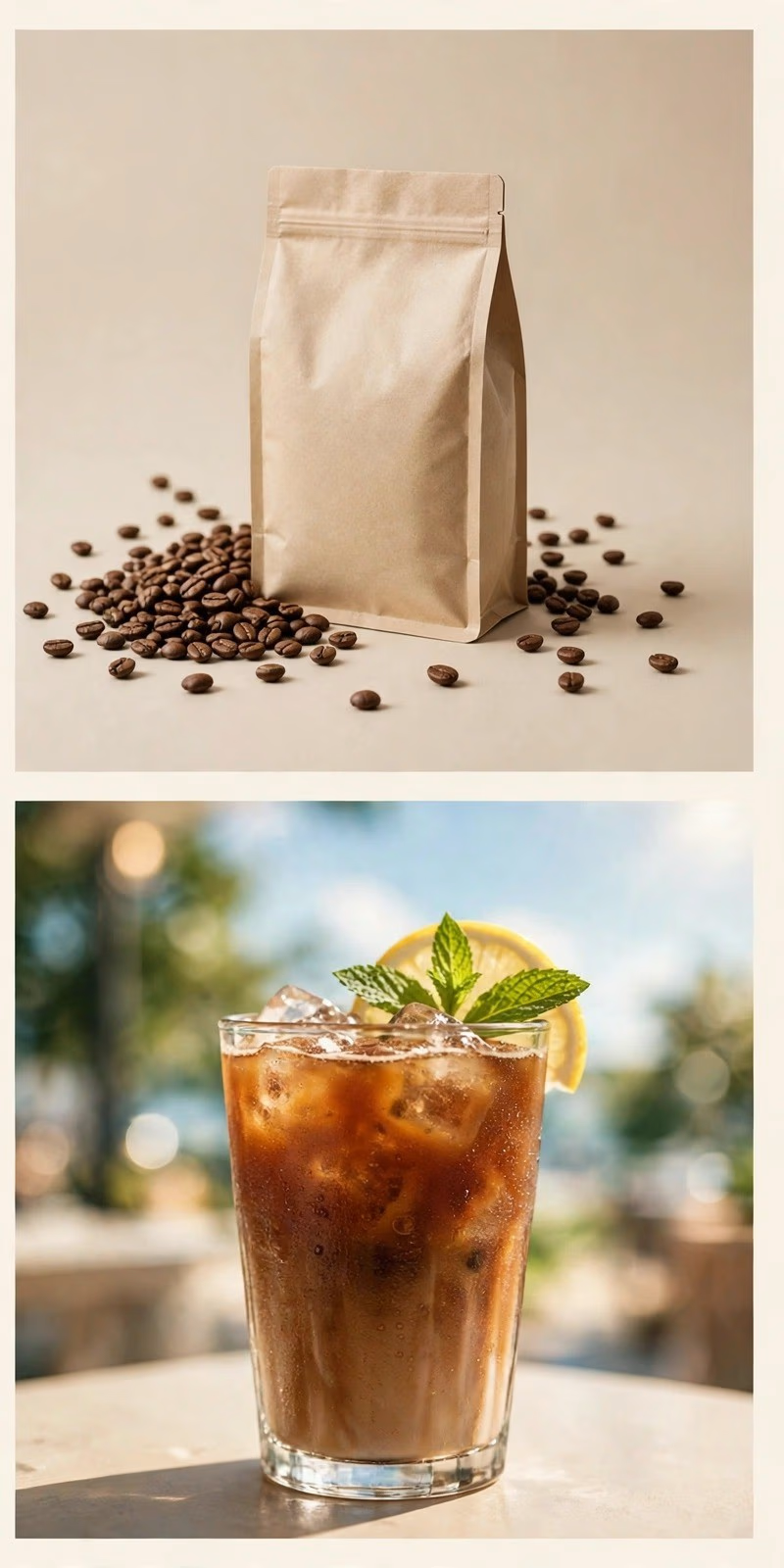
Which direction should a coffee brand ship, A or B?
Taste Test: two image directions for the same coffee brand, made in one AI brand image pack session.
Direction A: warm cafe craft
latte art and a barista pour, wood and morning light, the ritual of the drink
Direction B: clean product
the bag and the beans, one iced coffee against the sky, the product on its own
Vote for A or B below, and tell me why in the comments.
I make brand image packs like this on Contra: 10 images delivered in 24 hours, $49 at launch pricing. The service is on my profile if your brand needs a direction worth testing.

0 voted
0%
2 voted
100%
2 votes
Closed

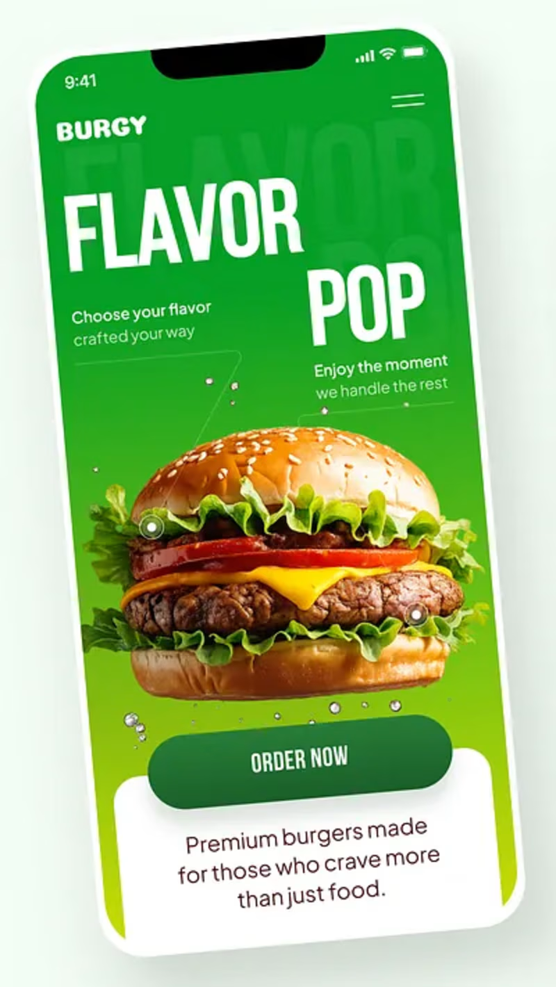
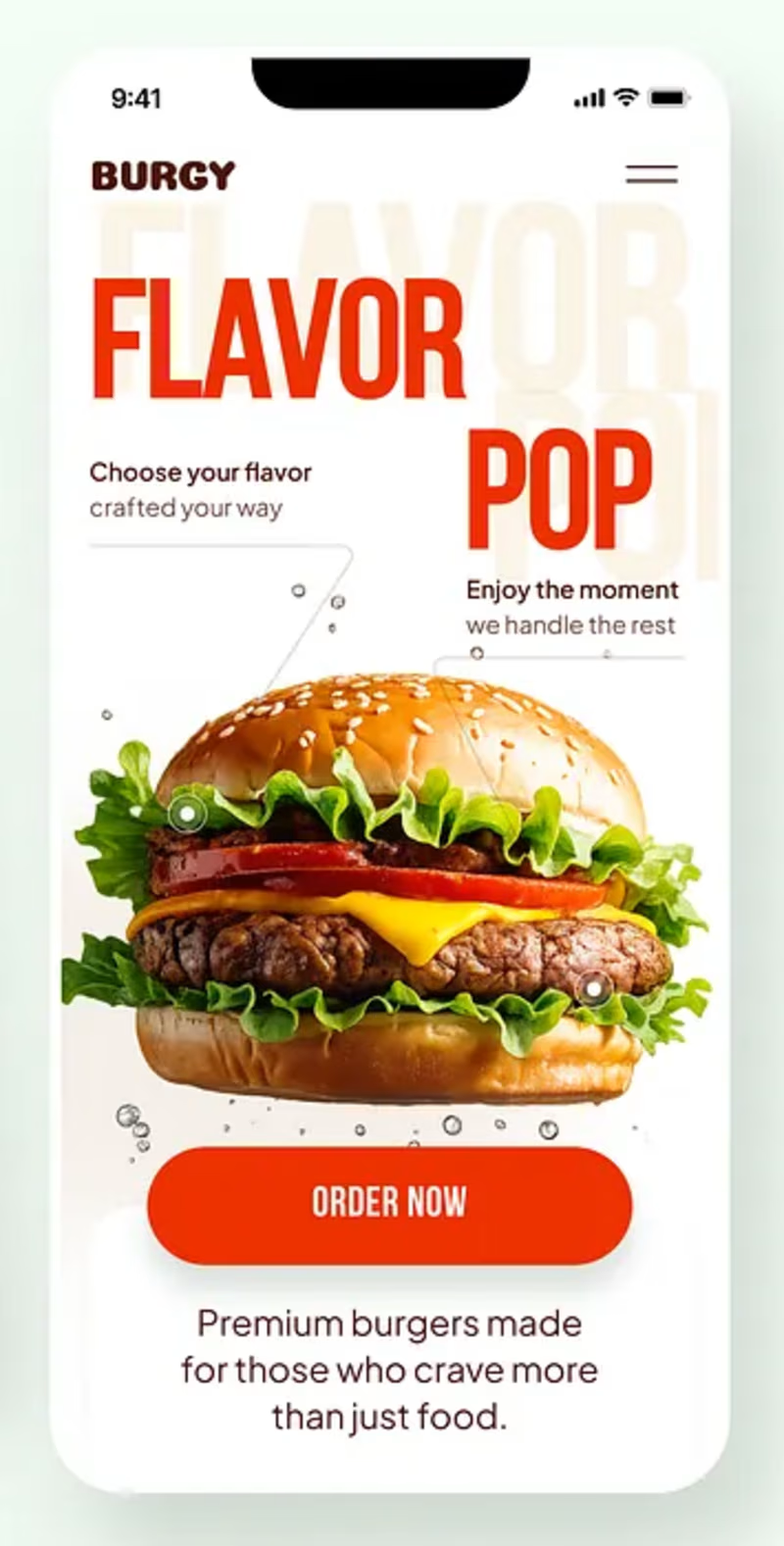
Burgy, a mobile concept for burger ordering. 🍔
Bold type, premium food visuals, and a fast path from craving to checkout.
Two color directions for the hero screen. Which one converts better?
Vote and tell me why 👇
Poll options: 🟢 Green | 🔴 Red
#UIDesign #MobileApp #FoodApp #AppDesign #UX #RestaurantApp


13 voted
43%
17 voted
57%
30 votes
Closed

Green for me, and I'd bet on it converting better too. The red version is loud in the way every food app is loud, while the green makes the burger the hero and the screen instantly recognizable in a feed. The green background also gives the white FLAVOR POP type far more contrast, so the message lands a beat faster.