The network for creativity
Join 1.25M professional creatives like you
Connect with clients, get discovered, and run your business 100% commission-free
Creatives on Contra have earned over $150M and we are just getting started
Back to feedPost

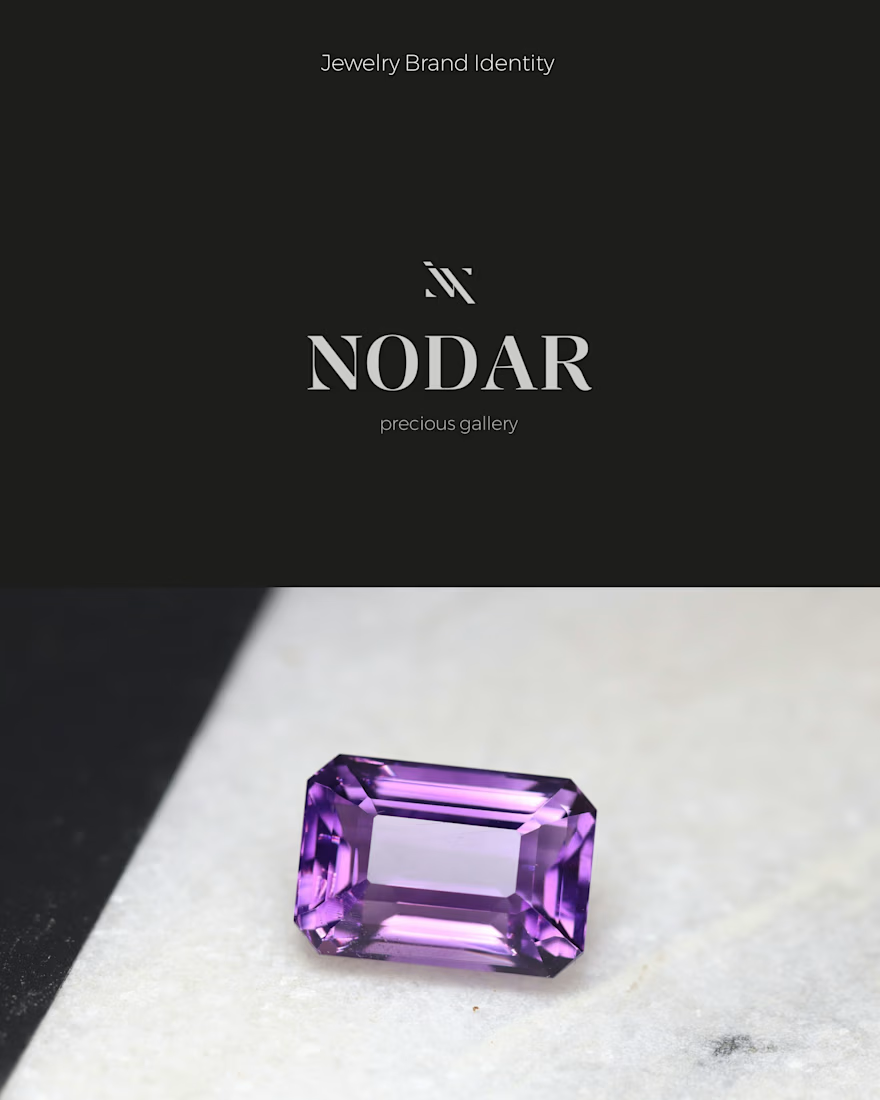
What happens when a jewelry brand works not only with jewelry, but with the stones themselves?
NODAR is a contemporary jewelry brand that works with both fine jewelry and gemstones, bringing the beauty of natural stones into different forms and experiences.
The challenge was to create an identity that could feel luxurious and refined, while being flexible enough to represent both jewelry and gemstones.
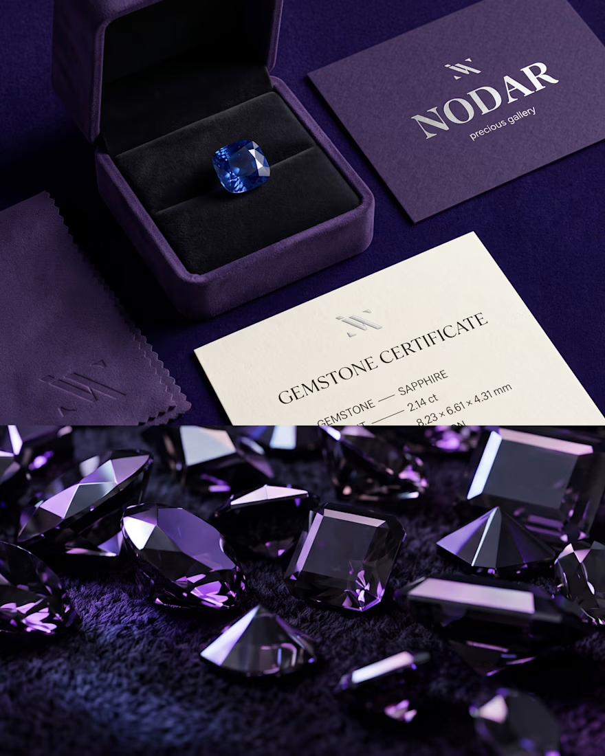
The solution was a visual identity built around simplicity, distinctive typography, and a recognizable monogram inspired by the brand name.
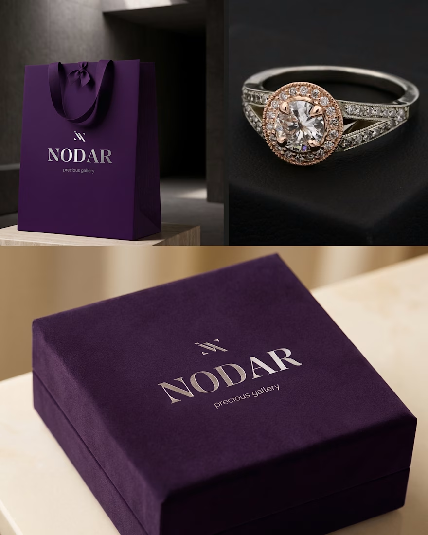
A deep, rich color palette, metallic accents, and tactile applications add a sense of depth and sophistication, while the clean visual system keeps the brand contemporary.
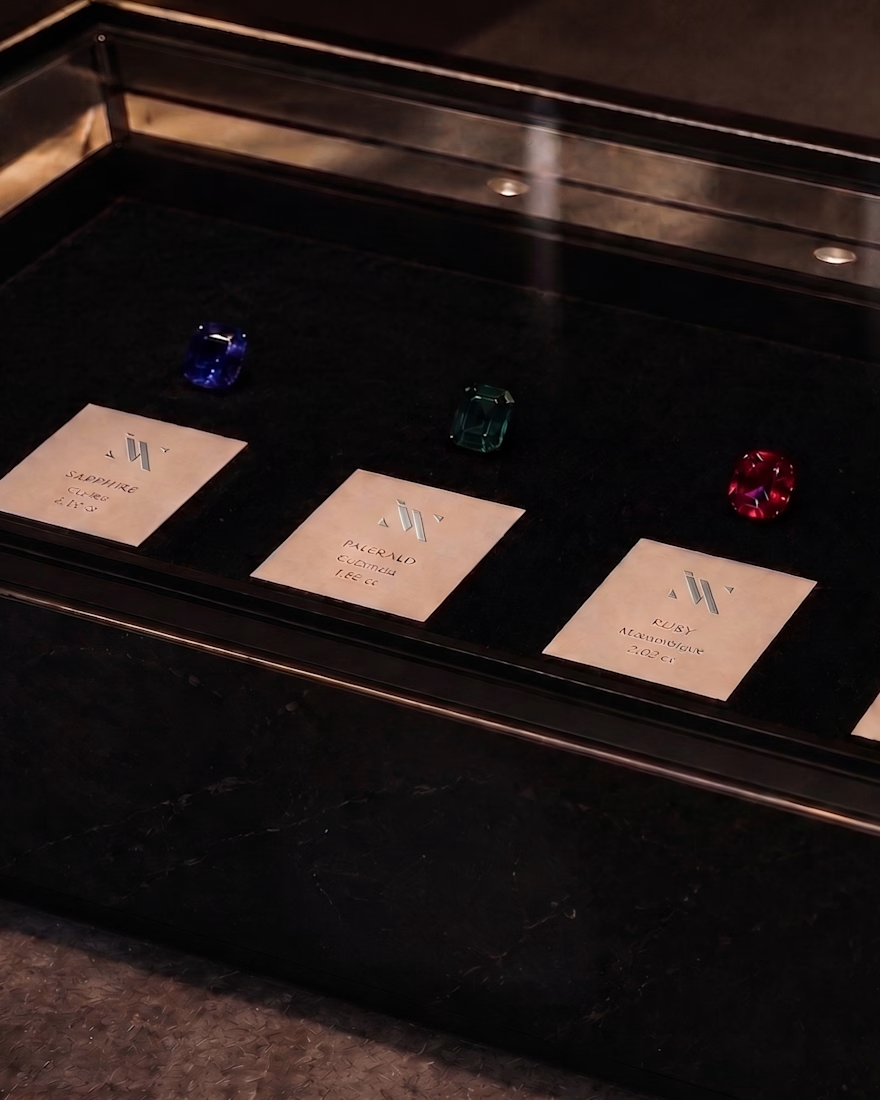
The result is an identity designed to work beyond a jewelry box — from gemstone presentation and packaging to retail spaces and other brand touchpoints.
#BrandIdentity #LuxuryBranding #JewelryBranding #BrandDesign #LogoDesign #PackagingDesign
The network for creativity
Join 1.25M professional creatives like you
Connect with clients, get discovered, and run your business 100% commission-free
Creatives on Contra have earned over $150M and we are just getting started





Related posts

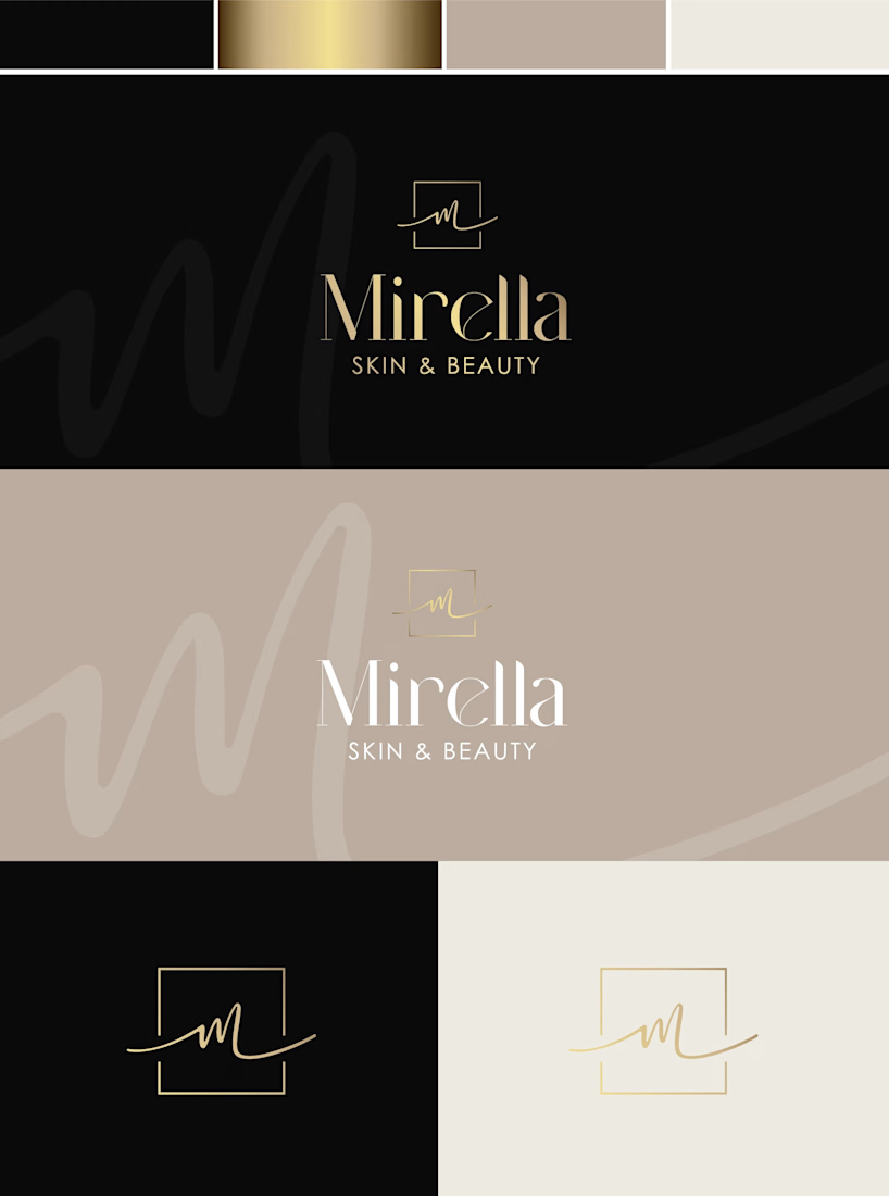
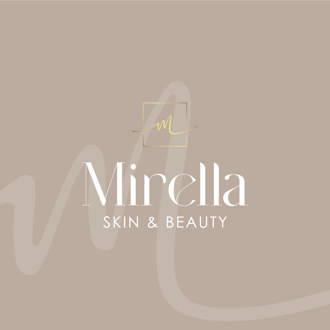
Mirella Skin & Beauty — A Refined Identity for a Modern Beauty Brand
A refined visual identity concept created for a modern beauty brand.
The direction combines soft neutrals, warm gold accents and elegant typography to create a sophisticated yet feminine look. The custom monogram adds a personal touch to the identity, while the subtle handwritten element brings softness and individuality to the brand.
The concept includes:
— Logo design
— Monogram / secondary mark
— Color palette
— Business card design
— Logo variations for different applications
The goal was to create a timeless identity that feels elegant, personal and effortlessly luxurious. ✨
#BrandIdentity #LogoDesign #BeautyBranding #VisualIdentity #BrandDesign #GraphicDesign #BeautyBrand #Branding


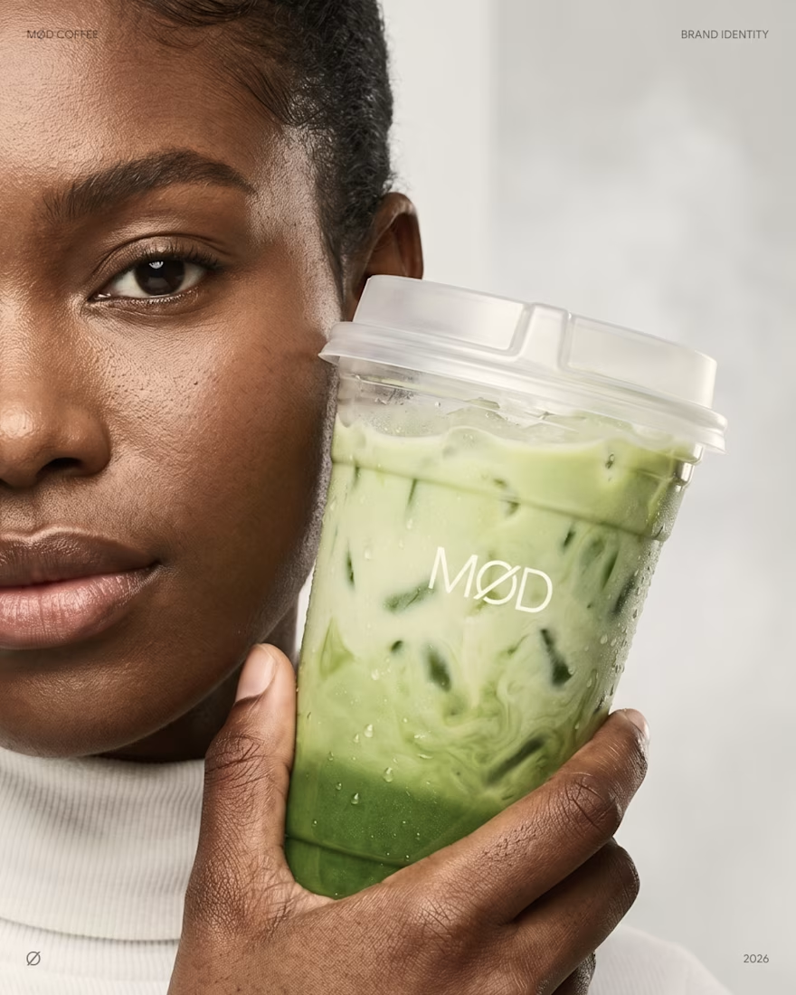
MØD Coffee. Matcha Cafe Brand Identity & Packaging
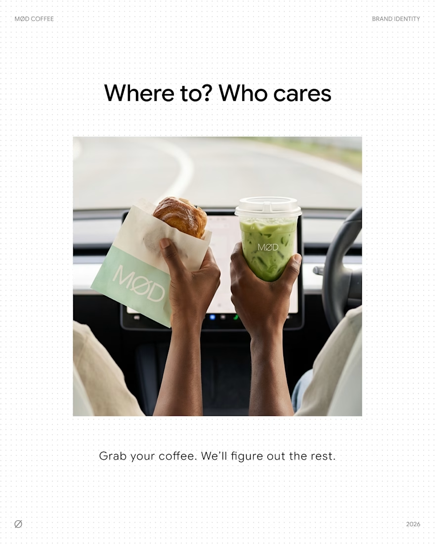
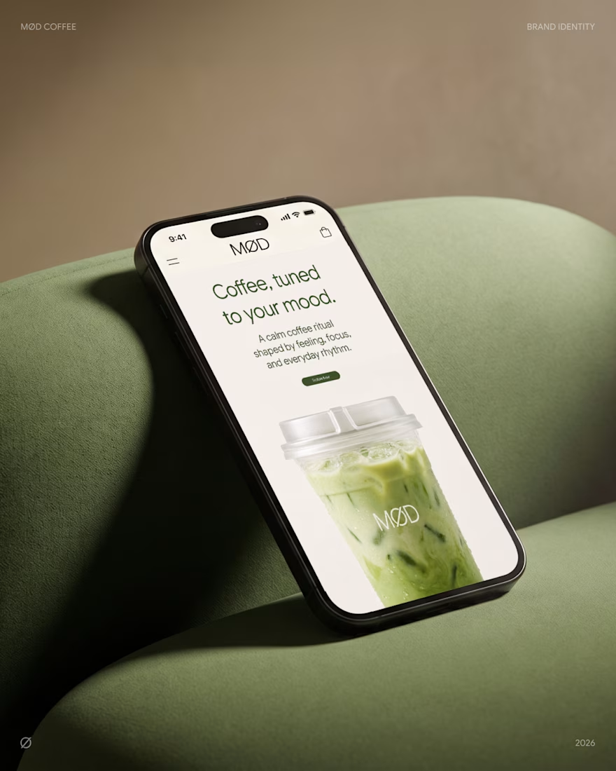
MØD is a matcha cafe brand built on one line: coffee, tuned to your mood.
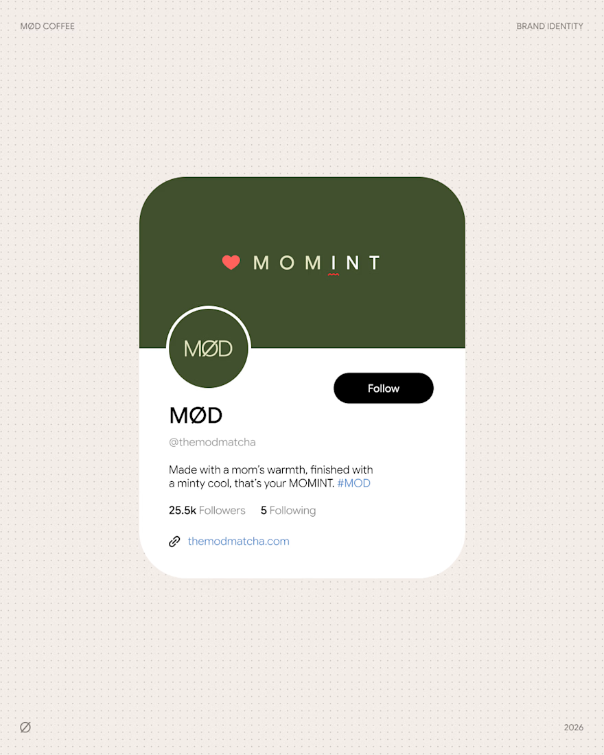
The identity carries an easy, unhurried voice across every touchpoint. "Where to? Who cares" on the go. "Grab your coffee. We'll figure out the rest." on the counter. Signature drinks like MOMINT bring it to the menu: made with a mom's warmth, finished with a minty cool.
Scope: logo, cup and bag packaging, website, social media.
Full case study: MØD Coffee
Which slide would make you order?😊
branddesignpackagingdesignbrandingLogo DesignPackaging DesignBrand DesignAdobe IllustratorAdobe PhotoshopFigma



love the mobile mockup 👍

I noticed clean energy brands were either too crunchy, nobody made renewable power feel simple and exciting.
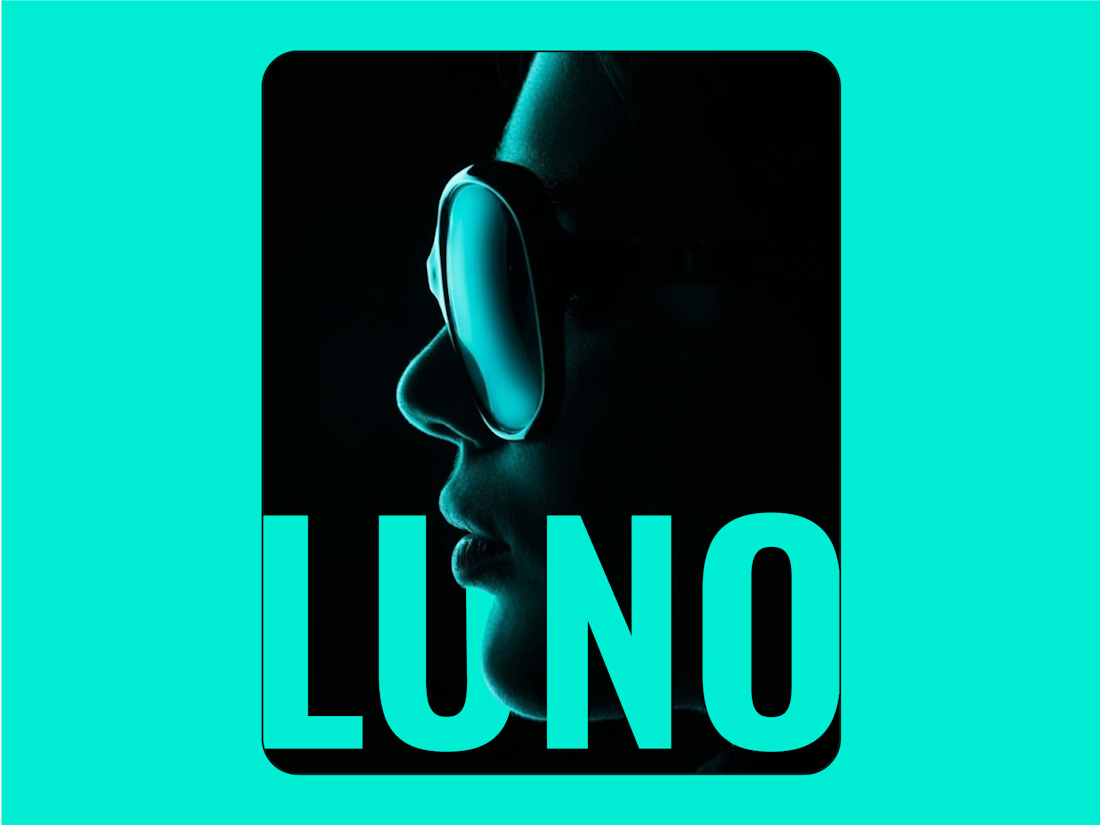
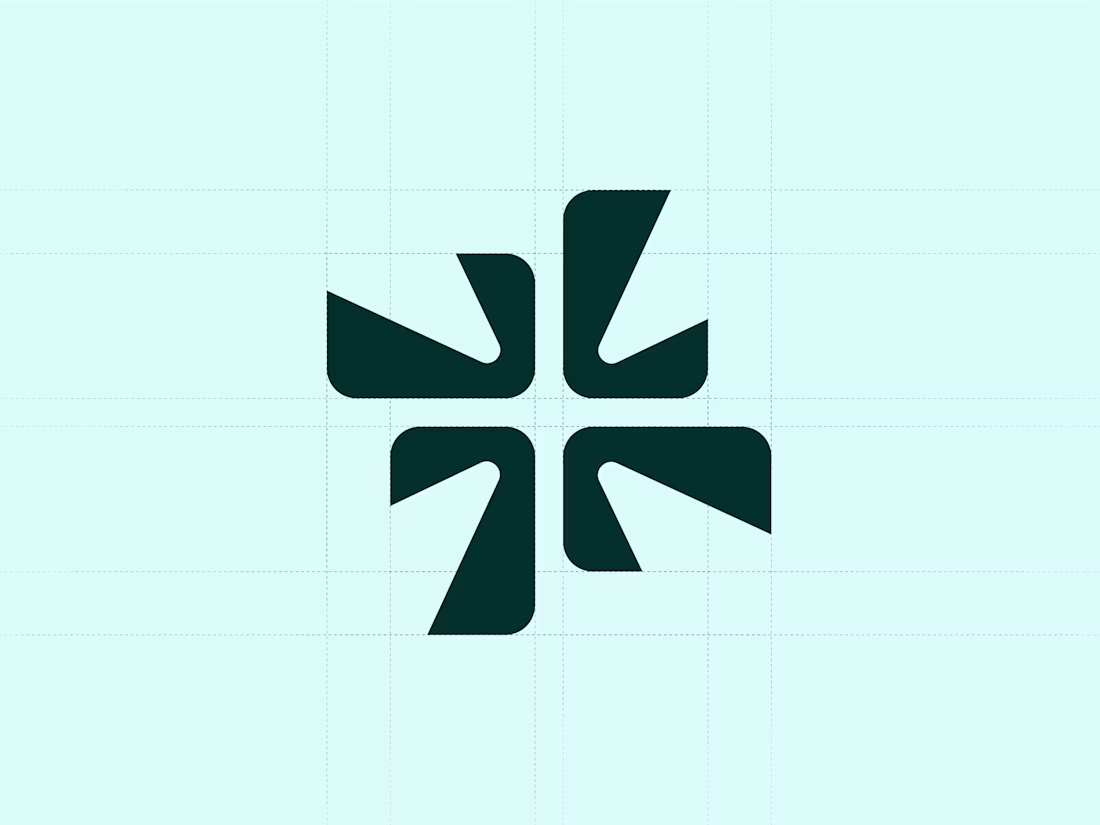
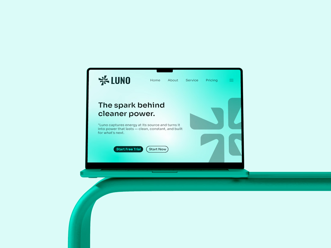
I designed Luno to be the spark that starts something bigger - clean, direct and confident. Energy without the noise.
I merged a spark with the letter "L". Four blades rotating outward energy caught mid motion, being captured and released.
I placed Luno in clean energy - solar, smart grids, storage - as the modern alternative to tired green washed branding.

So cool 🔥