The network for creativity
Join 1.25M professional creatives like you
Connect with clients, get discovered, and run your business 100% commission-free
Creatives on Contra have earned over $150M and we are just getting started
Back to feedPost

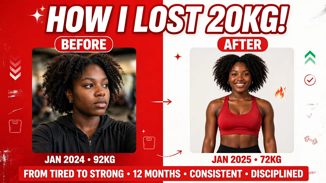
I just cracked the YouTube dark mode thumbnail problem 👇Most thumbnails lose their outer edge in dark mode (90% of viewers use dark mode) and blend into YouTube's UI.My fix:- 3px white outer stroke on export- High-value yellow for Finance niche (pops in both modes)- Dark + neon for Tech niche (premium contrast)Tested on my latest 3 thumbnails - CTR up 32%.Before/after in comments. What thumbnail strategy is working for you right now?#ThumbnailDesign #YouTubeGrowth #CTR


The network for creativity
Join 1.25M professional creatives like you
Connect with clients, get discovered, and run your business 100% commission-free
Creatives on Contra have earned over $150M and we are just getting started







Related posts

So, what is ROSI?
A few cans.
Five colours.
One very simple fish.
A ridiculously large wordmark.
And hopefully proof that everyday products don’t have to look everyday.


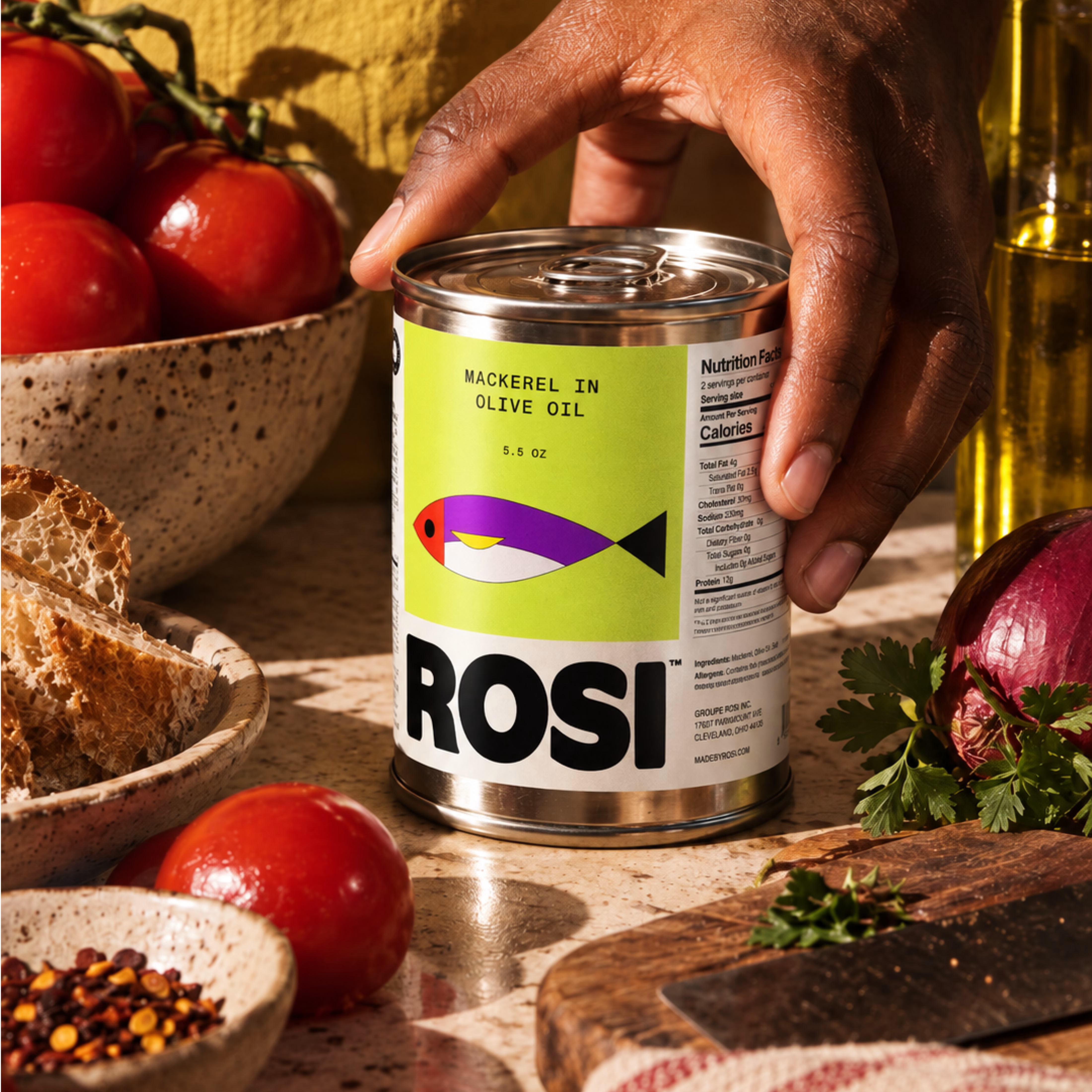
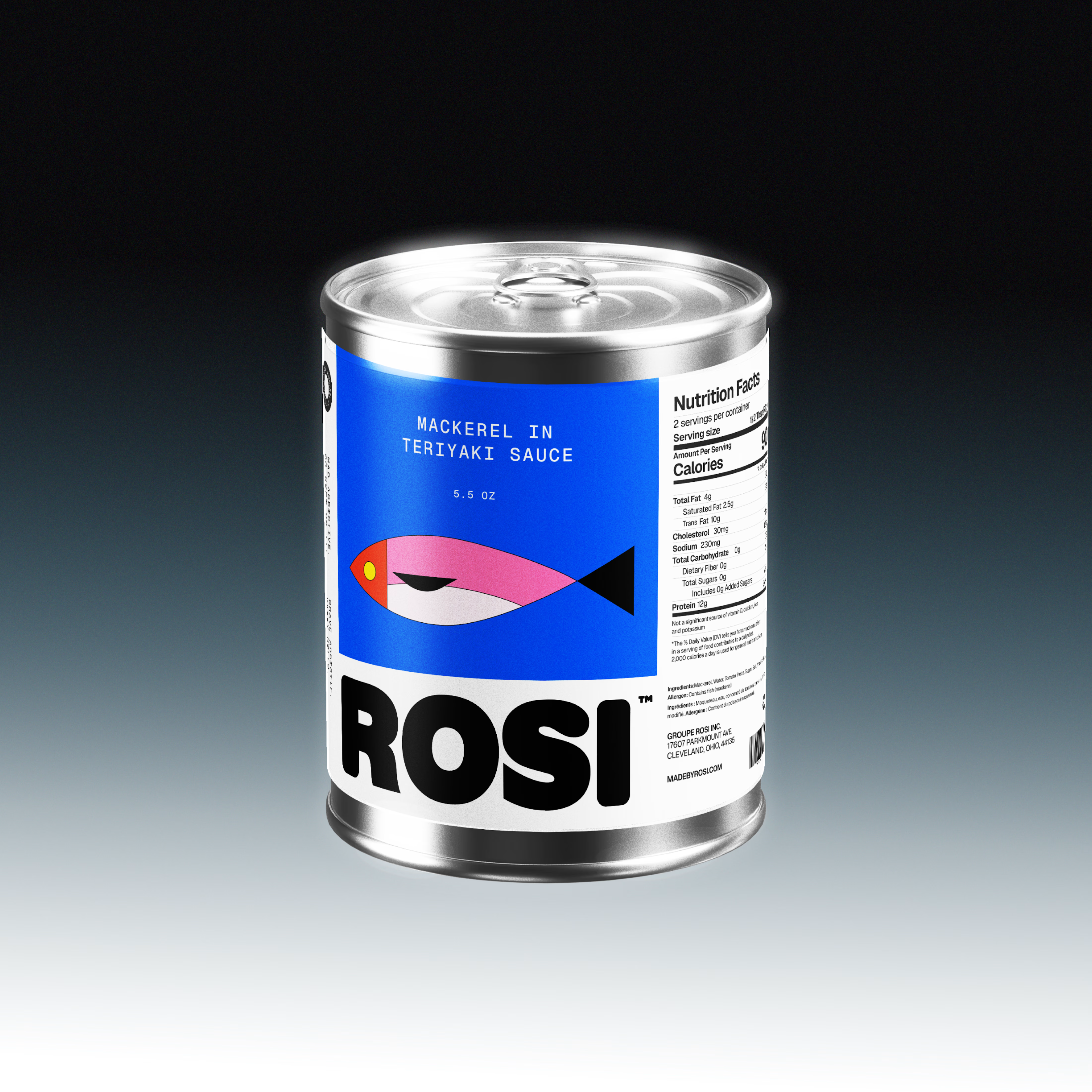
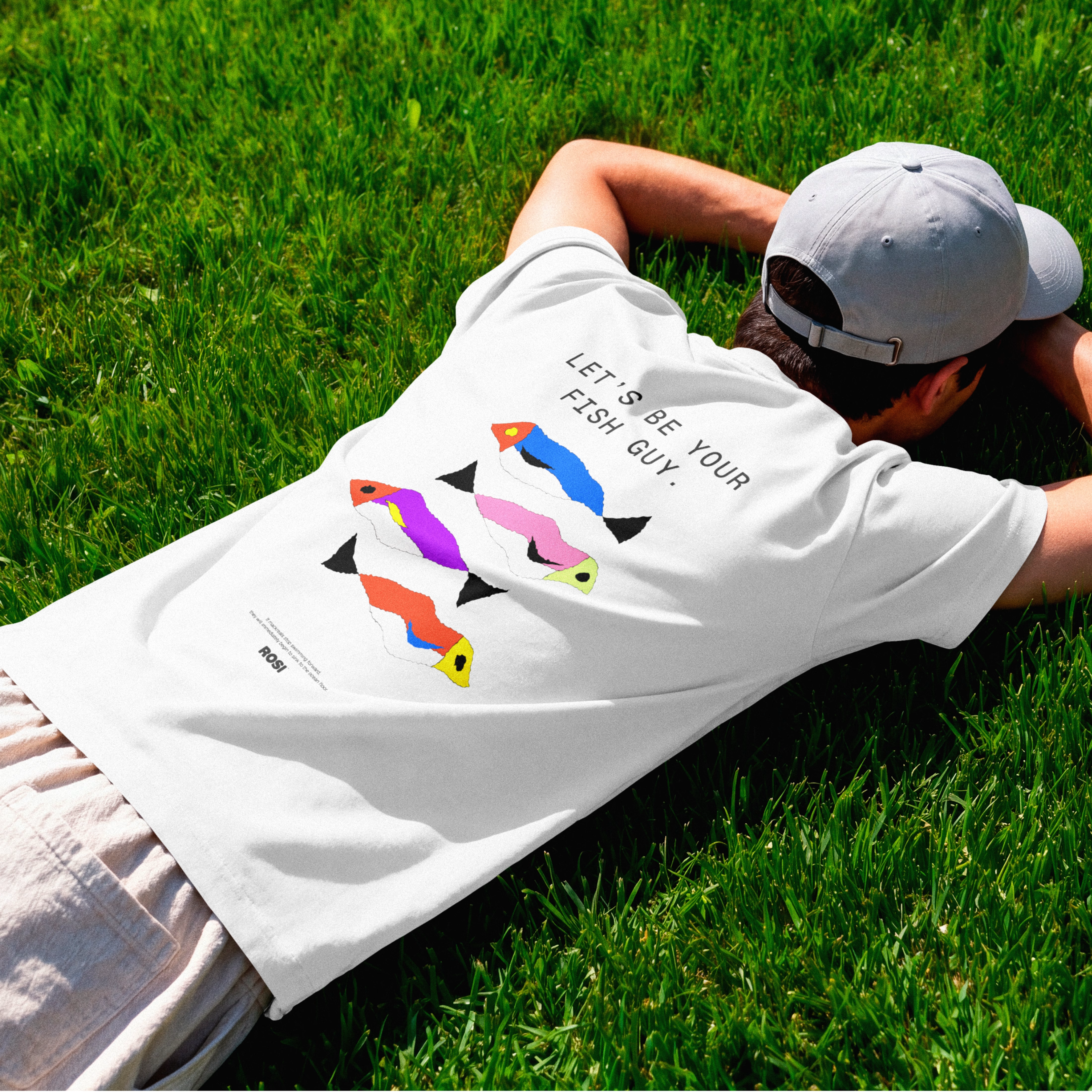

The ridiculously large wordmark is the entire personality, tinned fish has never strutted like this. Proof that confidence is a design decision, not a budget line.

Probably last post of this project!!
Which versions do you like?
Light or dark?
1 voted
17%
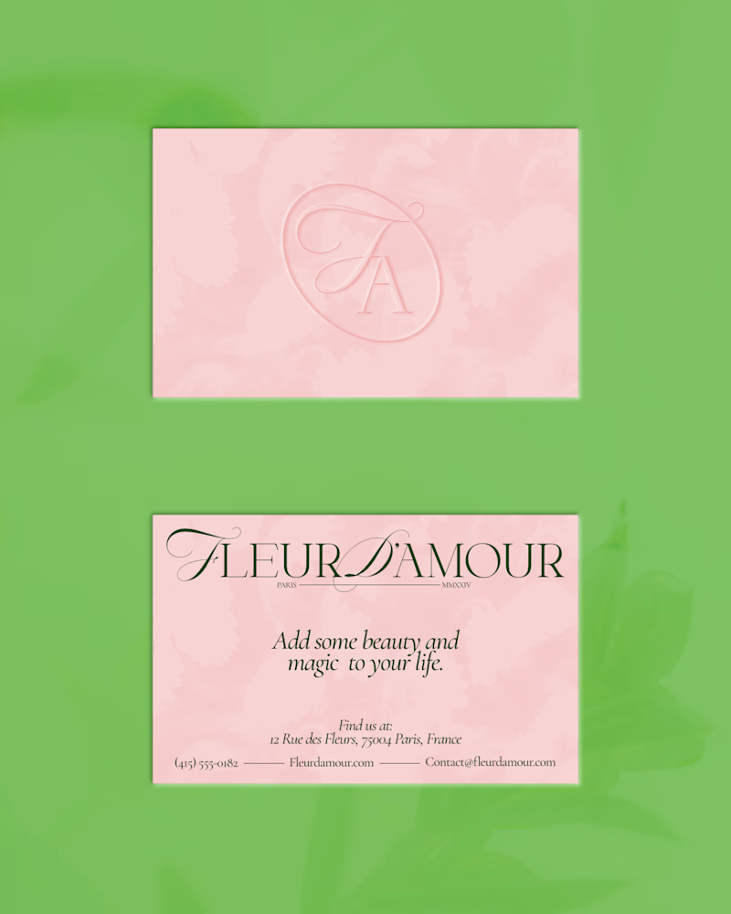
5 voted
83%
6 votes
Closed


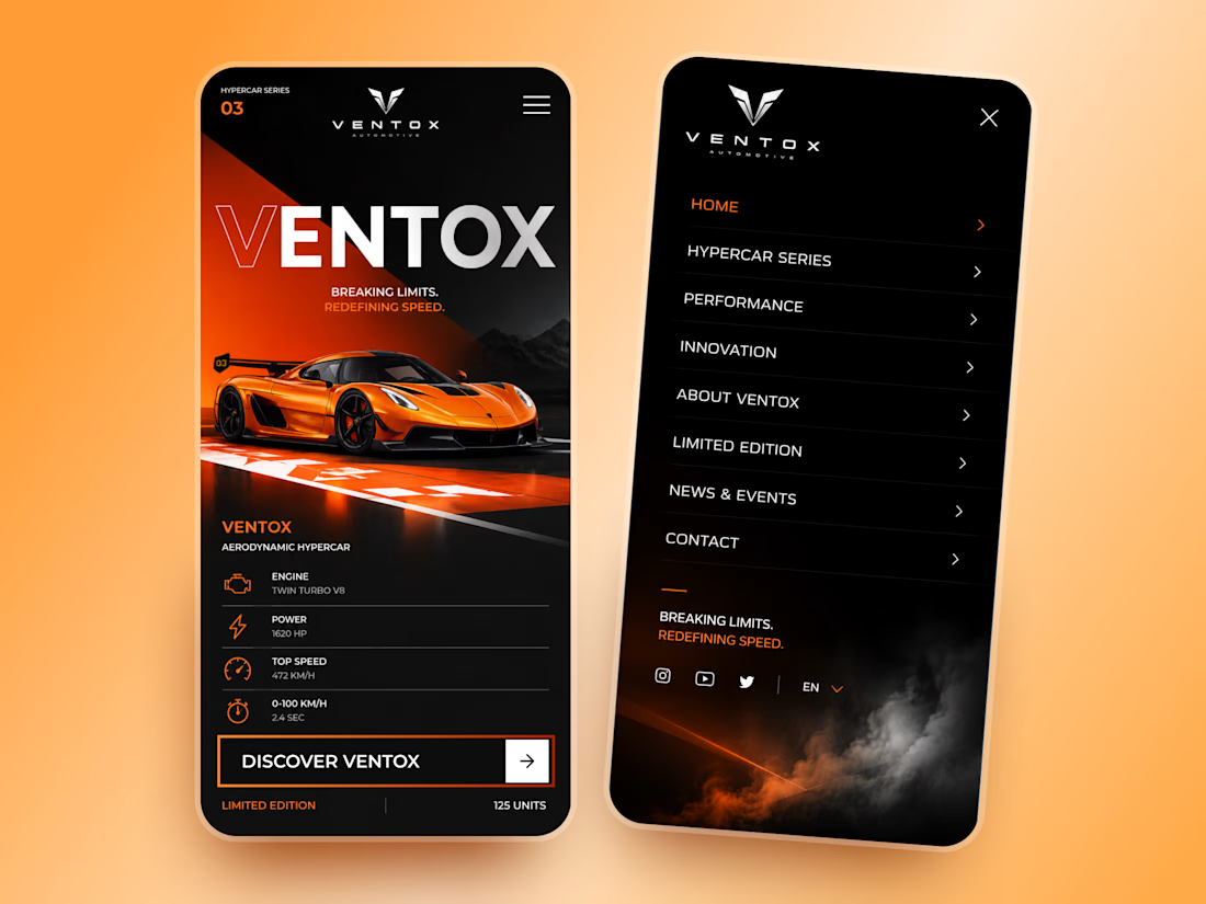
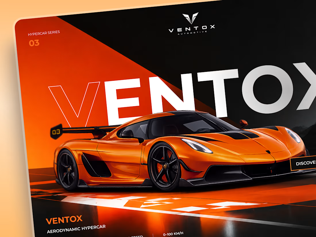
Ventox — Hypercar Landing Page 🏎️🔥
Ventox is a high-performance automotive landing page concept built around speed, exclusivity, and bold visual storytelling.
The design combines a striking orange hypercar, oversized typography, and a dramatic black-and-orange palette to create an immersive digital experience.
Special attention was given to:
A cinematic hero composition that puts the hypercar in the spotlight.
Oversized typography that reinforces the brand's identity.
Sharp geometric shapes and high-contrast colors inspired by speed.
Performance specifications presented in a clean, structured layout.
A prominent CTA that directs attention to the vehicle.
Responsive mobile layouts with simplified content and intuitive navigation.
The result is a bold automotive experience that brings together premium aesthetics, performance-focused storytelling, and clear navigation.
Looking to create a distinctive website for your automotive or luxury brand? Let's build something extraordinary. ⚡