The network for creativity
Join 1.25M professional creatives like you
Connect with clients, get discovered, and run your business 100% commission-free
Creatives on Contra have earned over $150M and we are just getting started
Back to feedPost

Primora Valley Interactive Real Estate Experience


Good Layout
The network for creativity
Join 1.25M professional creatives like you
Connect with clients, get discovered, and run your business 100% commission-free
Creatives on Contra have earned over $150M and we are just getting started



Related posts

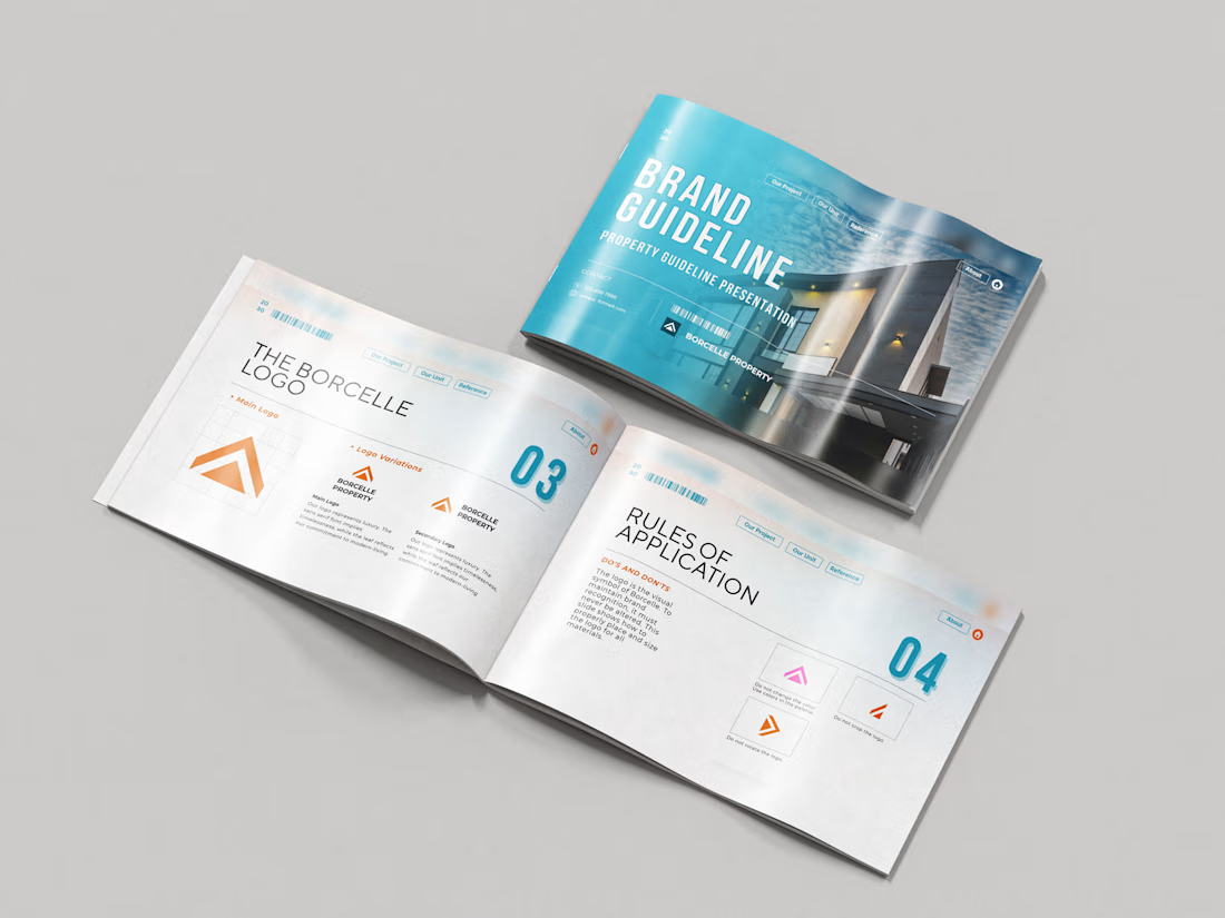
Just wrapped a brand identity concept for Haven Ridge Properties, a real estate developer selling to first-time buyers and investors.
The challenge: feel premium without feeling cold.
The answer was two ideas shelter and growth.
The mark is a roofline that doubles as an upward arrow: home and long term value in one symbol.
What's inside the guidelines:
• Primary and secondary logo lockups
• Logo usage rules
• Typography system
• Colour palette with clear roles
• Imagery direction
• Digital and print applications
Which detail stands out most to you?
#branding #brandidentity #logodesign #brandguidelines #realestate

Realtors, what is the one admin task you wish was already done before your first call of the day?
The quiet work before the day starts is what keeps a deal moving. Updating a listing, logging the last call in the CRM, chasing a missing document, checking a deadline that is closer than it looks. None of it is glamorous. All of it matters when a buyer or seller is waiting on an answer.
I am curious what eats your mornings. Is it follow-up calls? Paperwork? Keeping the CRM honest? Or something else entirely?
Tell me in the comments. I read every reply.
If the admin side of your deals needs a steady hand, here is the service I offer: https://contra.com/s/eWgRgRUg-transaction-coordination-for-us-realtors-contract-to-close
contra.com
Transaction Coordination for US Realtors, Contract to Close by Takreem Ahmad Zain
Read more about Transaction Coordination for US Realtors, Contract to Close by Takreem Ahmad Zain on Contra.

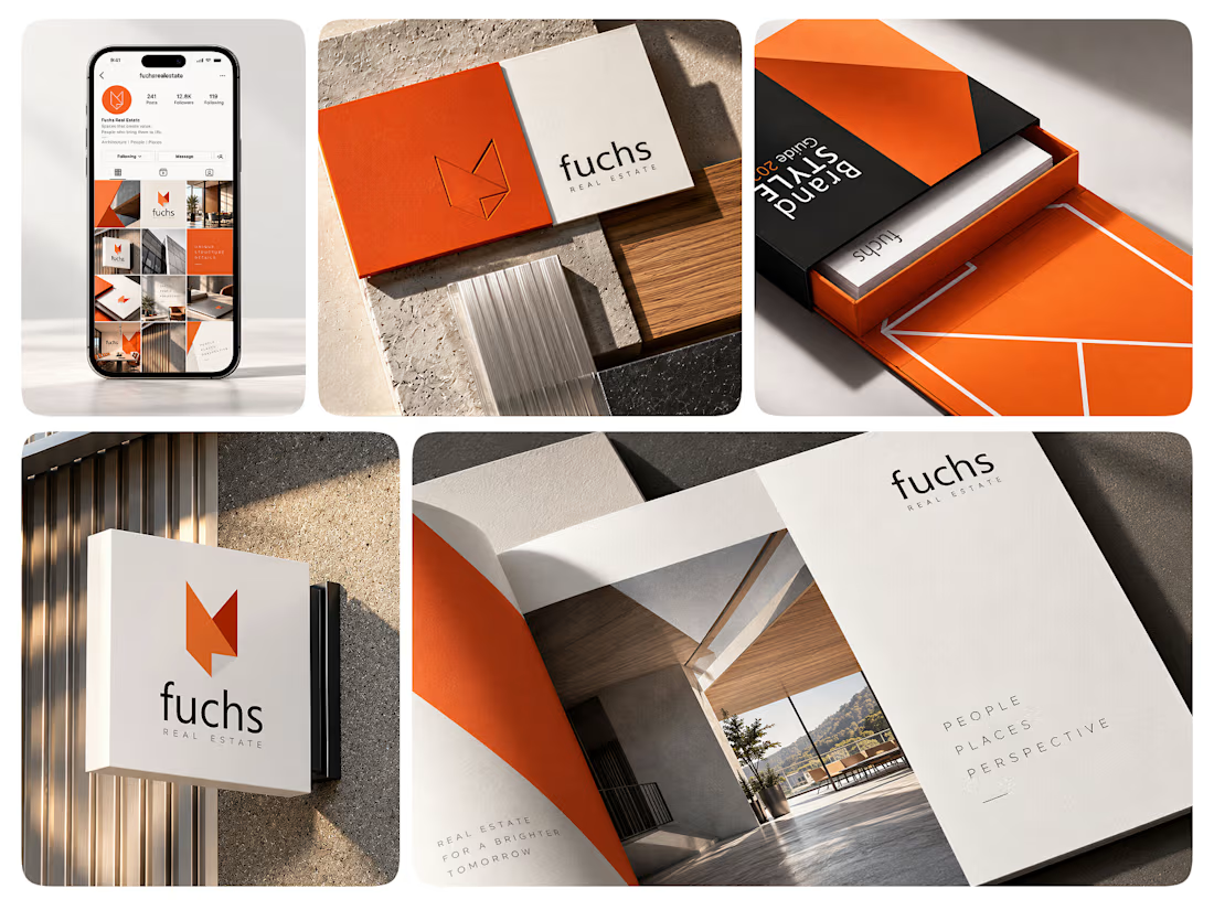
Fuchs Real Estate - Switzerland. Still no house-shaped logo. 🦊
For Fuchs, I wanted an identity that feels confident and approachable. The name gave me the fox and its angular shapes gave me a connection to architecture.
Orange brings warmth and a bit of boldness, balanced by cream, charcoal and simple typography. Those same shapes and colours run through the whole identity, so the brand feels familiar even when the logo takes a back seat.