The network for creativity
Join 1.25M professional creatives like you
Connect with clients, get discovered, and run your business 100% commission-free
Creatives on Contra have earned over $150M and we are just getting started
Back to feedPost

The biggest mistake I see in cosmetics retail isn’t the product selection.
It’s trying to fit 900+ SKUs into a store without thinking about customer behavior first.
Recently, I worked on a cosmetics store merchandising project where the challenge wasn’t “adding more product.” The challenge was making the store easier to shop, easier to navigate, and easier for products to actually get noticed.
Instead of treating every shelf equally, I focused on:
Customer traffic flow
High-visibility hero zones
Category zoning
Product adjacency
Display hierarchy
Shelf visibility from key walking paths
Balancing SKU density without overwhelming shoppers
One of the biggest realities in retail is this:
If customers can’t quickly understand what they’re looking at, more inventory can actually reduce conversion.
A crowded shelf doesn’t always create more sales.
Sometimes it creates hesitation.
Strong merchandising is about guiding attention intentionally — not just filling fixtures.
That’s why store layout, planograms, and visibility strategy matter far more than many retailers realize.
Retail isn’t only about what products you carry.
It’s about what customers notice first.
If your store layout or merchandising strategy isn’t converting traffic effectively, feel free to reach out.
Templates & resources: https://payhip.com/ChristianDiBuonoRetailMerchandisingConsultant
Website/blog: dibuonoretailconsulting.com
#Retail #Merchandising #RetailConsulting #Planograms #StoreLayout #VisualMerchandising #RetailStrategy #CosmeticsRetail


The network for creativity
Join 1.25M professional creatives like you
Connect with clients, get discovered, and run your business 100% commission-free
Creatives on Contra have earned over $150M and we are just getting started


Related posts

Interior Design Website
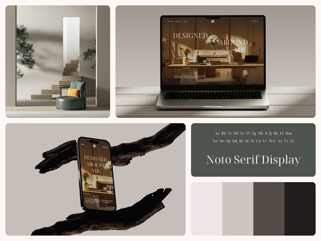
The white flowers on the mantel overlap the headline.
Thin Noto Serif Display capitals step down across one warm photo of a paneled room, so the space stays in view between the words. On the phone, the three words stack in a centered column, with Menu and Contact on either side of the monogram.
The palette runs from soft white to near black, which leaves the color to the photo: orange tulips and warm light on the walls.
The headline reads "Designed Around You", and the hero takes it literally, with the wall behind the type and the flowers in front of it.
Designed by the Hue & Machine team.
#InteriorDesign #InteriorStudio #WebsiteDesign #HomepageDesign #WebDesign #ResponsiveDesign #Typography #EditorialDesign #UIDesign #FigmaDesign


Nice!


When you forget that it's not 2005 and you don't work for 2Advanced... 😅
Designed and animated in Figma.
(it's about time to finally discover these new animation features).

That looks like an underwater design😊 Great Work!

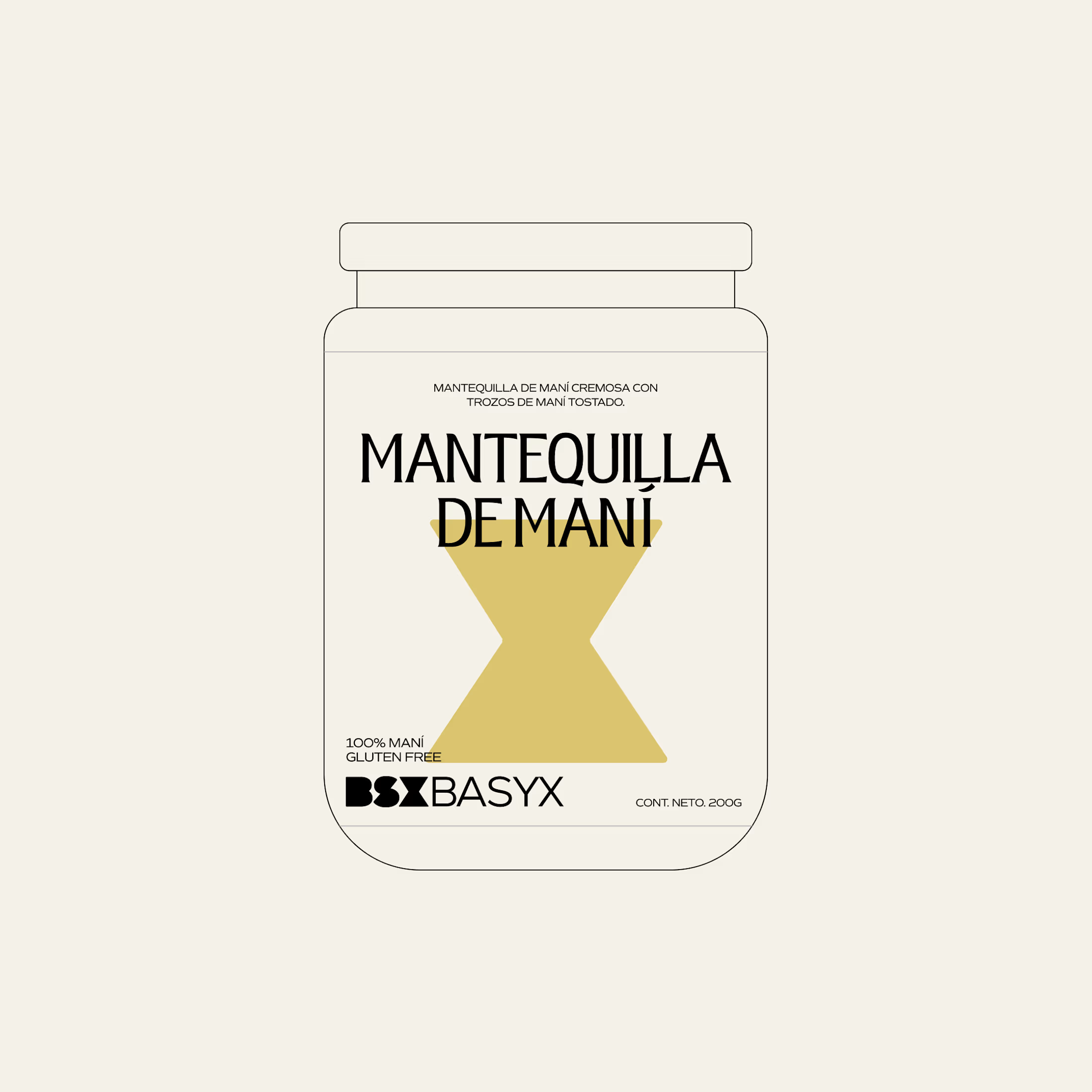
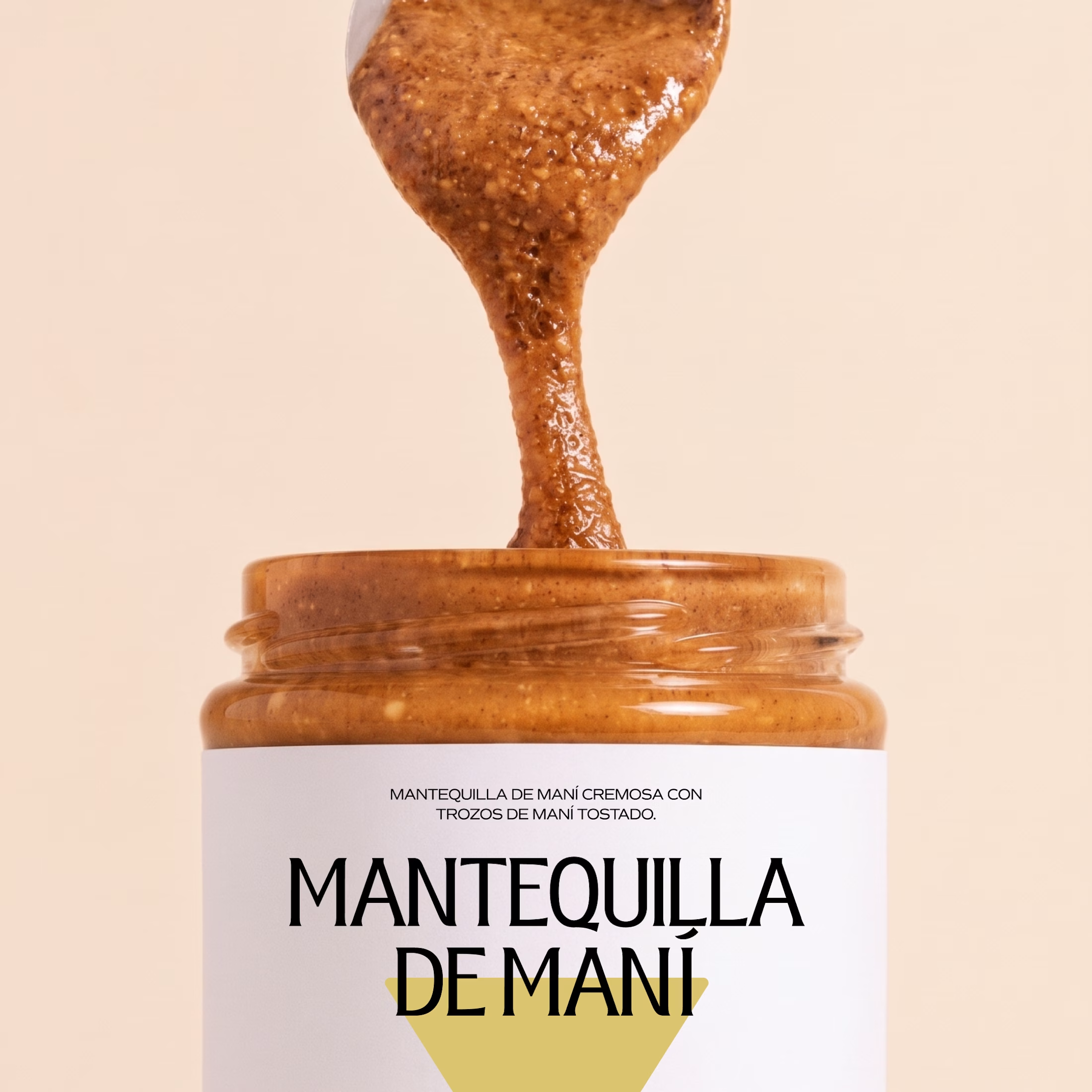
Minimal packaging is not less work. It’s MORE decisions 🤍
On a recent project, I spent a whole day on one thing: the spacing between two phrases in a label. Nobody will ever notice it. But everyone will feel it.
When there is nothing else on the label, every small adjustment has to carry the brand.
Do you also lose hours on details no client will ever mention? 😅

So true. A whole day on the spacing between two phrases sounds about right, and it's exactly why good packaging just feels right.