The network for creativity
Join 1.25M professional creatives like you
Connect with clients, get discovered, and run your business 100% commission-free
Creatives on Contra have earned over $150M and we are just getting started
Back to feedPost


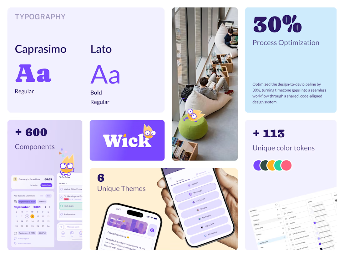
The biggest bottleneck for most startups isn’t designing the screens, it’s the handoff. Without a shared language, "pixel perfection" becomes an endless back-and-forth between design and engineering.
I focus on building design systems that act as a bridge, not a barrier.
Using a structured approach, like the foundation I built for the Wickapp project, I help teams replace guesswork with a single source of truth.
What this delivers for your business:
- 100% visual integrity across every screen.
- Reusable components that let you ship features in days, not weeks.
- Clean, logical systems that grow with your product.
Looking to sharpen your product’s consistency? Let's build your product with a design system that scales.

The network for creativity
Join 1.25M professional creatives like you
Connect with clients, get discovered, and run your business 100% commission-free
Creatives on Contra have earned over $150M and we are just getting started




Related posts

Hot take: Interaction isn't just decoration. It is the brand
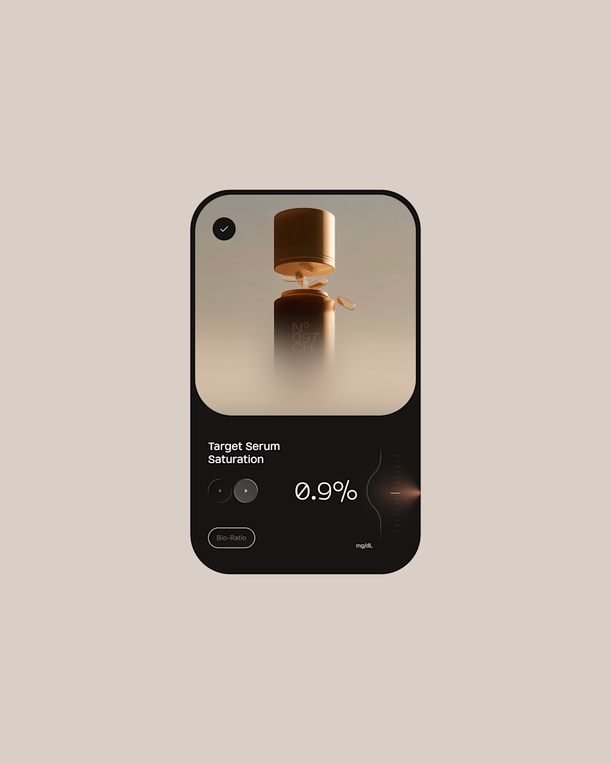
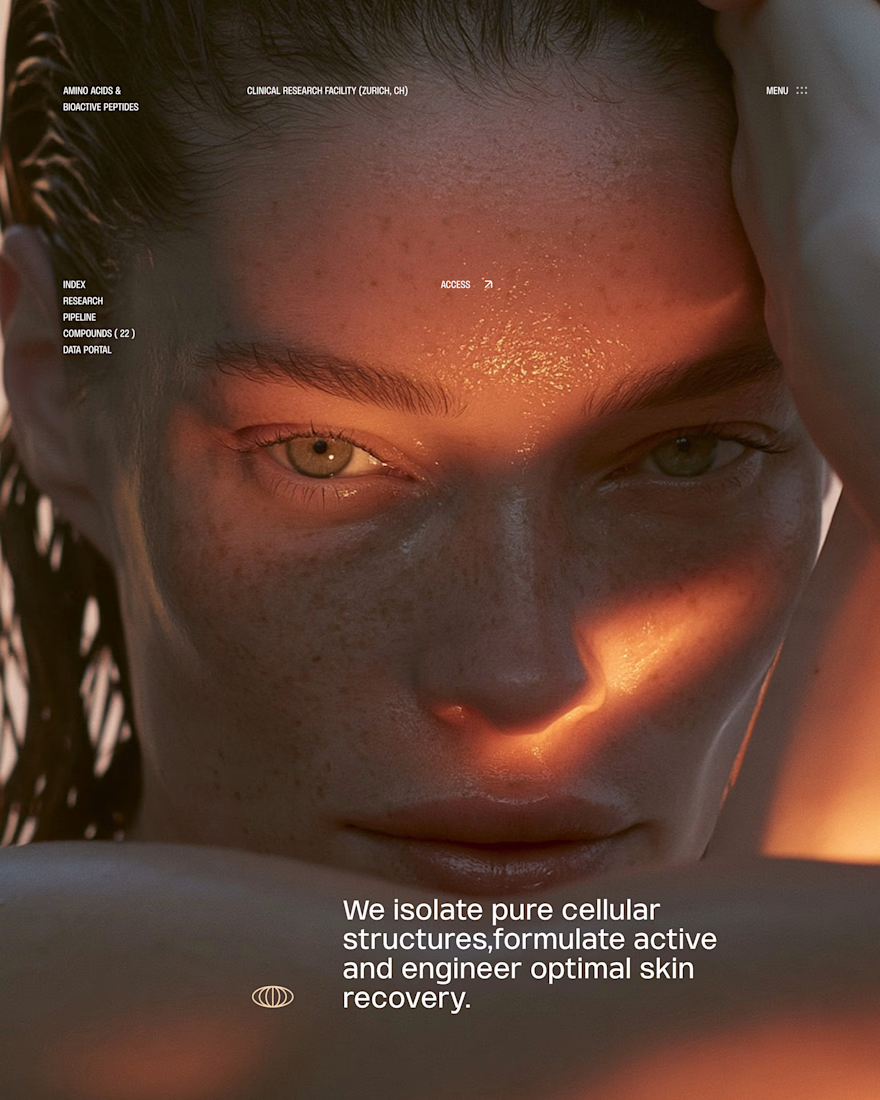
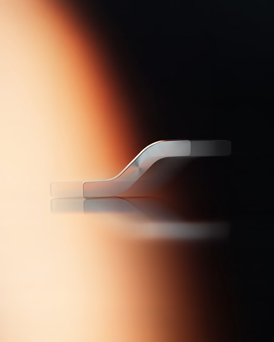
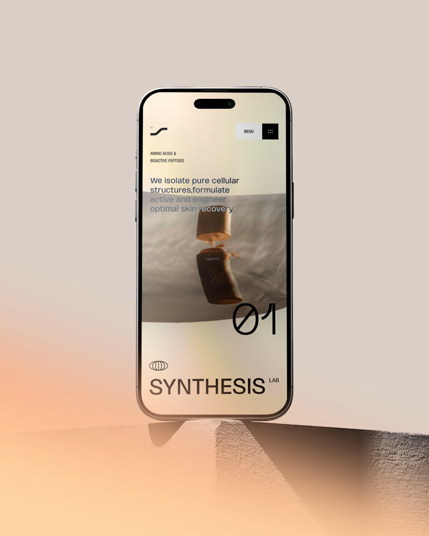
I built this visual concept for a Peptides brand using WebGL and fabric physics. The fluid motion isn’t a gimmick it’s the core identity.


GOATED


Fantastic execution man, what is the billboard for?

What should a creative agency website actually feel like?
For Orvika, we didn't want another agency site built around the same safe layouts and predictable sections.
We pushed the visual direction further with oversized typography, editorial layouts, bold imagery, and stronger contrast, while keeping the experience structured enough to communicate the agency's work and capabilities clearly.
The goal wasn't just to make it look different.
It was to make the agency feel different.
Designed in Figma and built in Framer.
We're sharing more of the websites and digital experiences we've been working on here over the next few weeks.


Very neat man