The network for creativity
Join 1.25M professional creatives like you
Connect with clients, get discovered, and run your business 100% commission-free
Creatives on Contra have earned over $150M and we are just getting started
Back to feedPost

The Draconids peak this week, one of the only meteor showers where the moon actually cooperates and the radiant sits high enough to watch properly. Astronomers are calling it a good year for it.
Most people in a city still won't see a single one. Not because the meteors aren't there. Because streetlights, car headlights, a porch light two houses down all add up to a sky bright enough to erase anything dimmer than itself.
I think about that every time a client says their CTA "isn't working." Nine times out of ten the button is fine. It's sitting next to four other elements fighting for the same attention: a banner, an autoplay video, three nav items in bold. The button was never invisible. The page around it was just too bright.
What's the one thing on your site you'd actually see clearly if you turned everything else off?

Draconids vs porch-light CTA clutter is a great parallel — the button isn’t weak, the competing brightness around it is. Turning “everything else off” is a useful audit.
The network for creativity
Join 1.25M professional creatives like you
Connect with clients, get discovered, and run your business 100% commission-free
Creatives on Contra have earned over $150M and we are just getting started





Related posts

Experiment: what if a weather app showed you the sky instead of icons?
I've been playing with WebGL lately and built a small concept called Nimbo, an AI weather dashboard where the background is a live sky.
The clouds are made in real time with shaders, not videos or stock footage. In 10 seconds the scene goes through a full day, bright morning, golden sunset, then a starry night with the moon rising over misty mountains.
The UI changes with it. The temperature curve, UV, humidity, wind, rain radar and city temps all update as the hours pass, and an AI note types out the forecast for the night.
What I was exploring:
- Glass cards that pick up the sky's colors
- Data that feels alive instead of static numbers
- Keeping a busy dashboard calm and easy to read
It's still an experiment, so I'd love your honest thoughts:
Would you use a "sky view" like this in a real app, or is it too much? And what should I try next? storm mode, rain, or snow?


i create a 3D cube component for a Framer website to add creativity. which one is better dark or light? Check the live preview here
14 votes
Ends in 1d

Great job


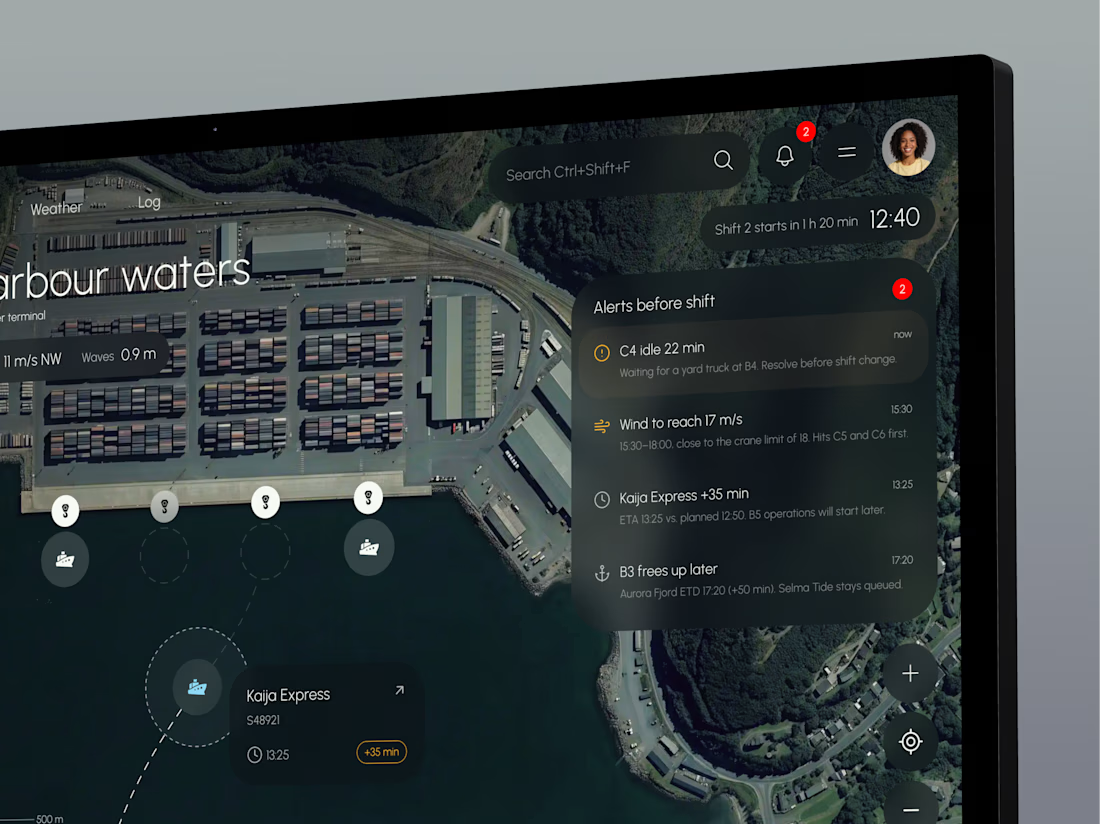
TideGrid – one view of the whole port
Port teams track berths, cranes, vessel ETAs and weather in separate systems, so delays and idle time are often spotted too late.
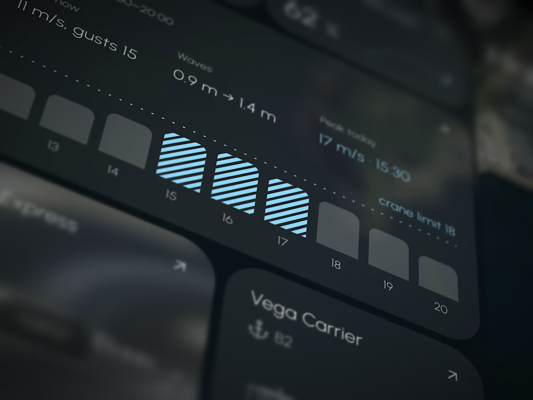
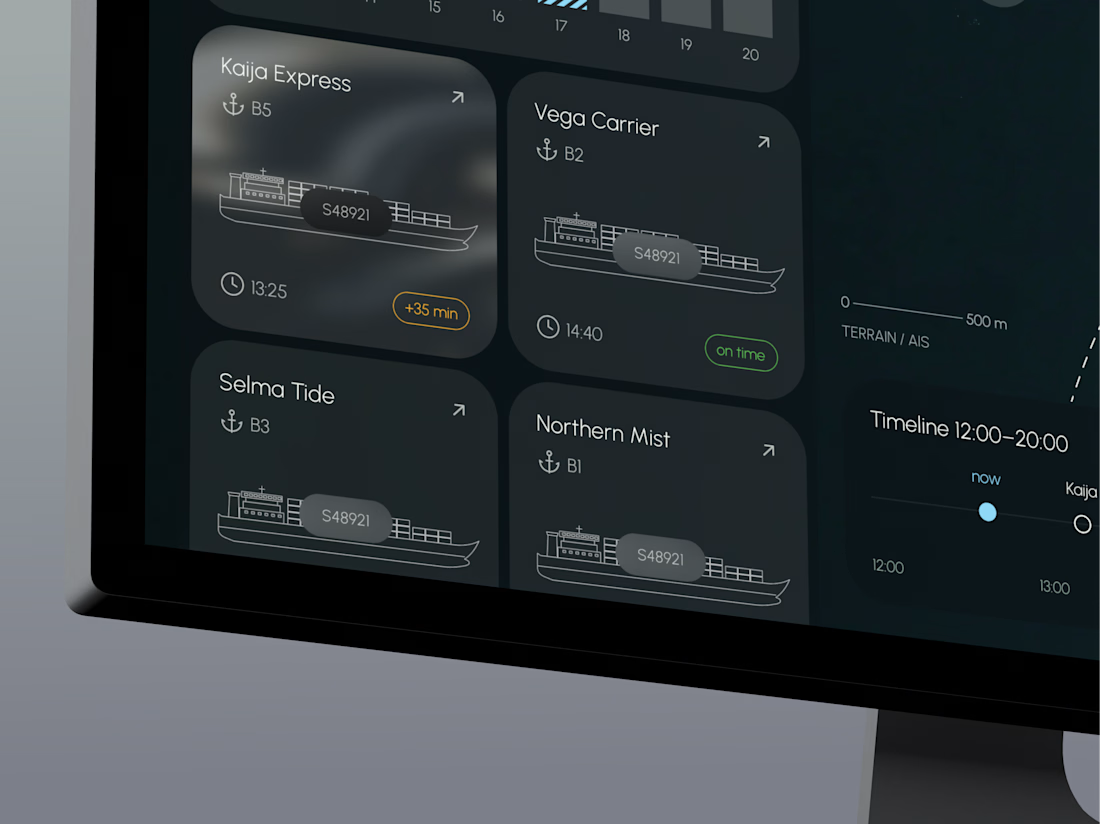
TideGrid brings everything onto one map. Each vessel shows its ETA, each crane its load, and each berth its occupancy, with wind and waves right beside them. Alerts appear before the shift starts. It runs on existing AIS, crane and sensor data, with a desktop console for operators and a mobile app for foremen on the quay.