The network for creativity
Join 1.25M professional creatives like you
Connect with clients, get discovered, and run your business 100% commission-free
Creatives on Contra have earned over $150M and we are just getting started
Back to feedPost

Experiment: what if a weather app showed you the sky instead of icons?
I've been playing with WebGL lately and built a small concept called Nimbo, an AI weather dashboard where the background is a live sky.
The clouds are made in real time with shaders, not videos or stock footage. In 10 seconds the scene goes through a full day, bright morning, golden sunset, then a starry night with the moon rising over misty mountains.
The UI changes with it. The temperature curve, UV, humidity, wind, rain radar and city temps all update as the hours pass, and an AI note types out the forecast for the night.
What I was exploring:
- Glass cards that pick up the sky's colors
- Data that feels alive instead of static numbers
- Keeping a busy dashboard calm and easy to read
It's still an experiment, so I'd love your honest thoughts:
Would you use a "sky view" like this in a real app, or is it too much? And what should I try next? storm mode, rain, or snow?


The network for creativity
Join 1.25M professional creatives like you
Connect with clients, get discovered, and run your business 100% commission-free
Creatives on Contra have earned over $150M and we are just getting started





Related posts

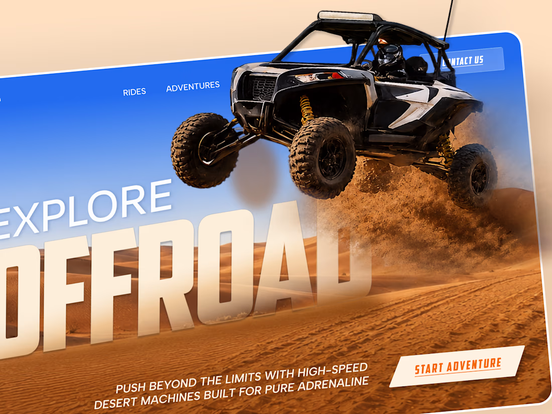
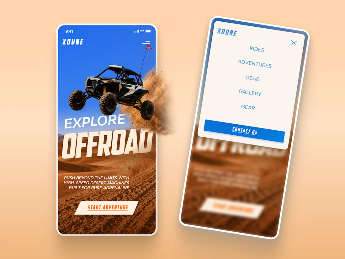
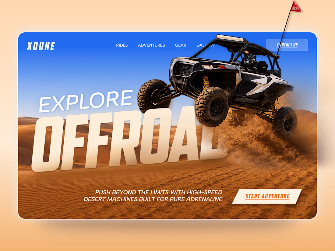
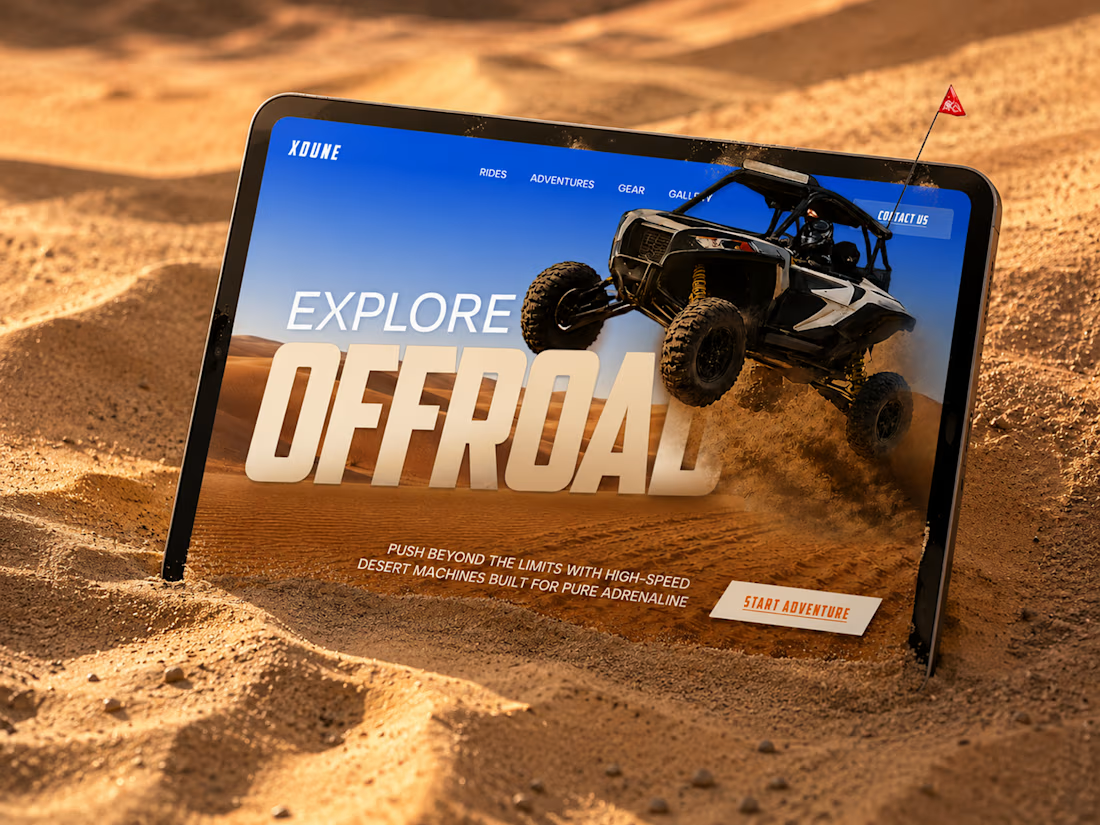
XDUNE — Off-Road Adventure Landing Page
A bold landing page concept built around speed, freedom, and off-road adventure 🔥
The visual direction combines desert landscapes, oversized typography, and a dynamic vehicle composition to make the experience feel energetic from the first screen
Special attention was given to:
• Strong action-focused hero composition
• Bold typography and clear hierarchy
• Desert-inspired visual atmosphere
• Adventure-focused CTA
• Responsive mobile experience
• Simple and clean navigation
The result is a high-energy landing page that feels fast, adventurous, and made for people who want to get off the road
Looking to create a bold website for an automotive, outdoor, or adventure brand? Let’s connect 🚀


love the vibe


Bringing 200+ integrations, workflows and AI agents together in one clean, animated experience. We'd love to hear your thoughts!


Sharing a few recent projects 👋
It has been an exciting few months! A good mix of industries in this one, from an arcade and a mini golf hire company to car inspections and hospitality.
Excited to see what the rest of the year brings!


I should try adding blur also when slide goes back or a 0.1 delay in upcoming one,
the mid transition phase is bothering me


