The network for creativity
Join 1.25M professional creatives like you
Connect with clients, get discovered, and run your business 100% commission-free
Creatives on Contra have earned over $150M and we are just getting started
Back to feedPost

Smart Secured Systems — Unofficial Brand Concept
3S Egypt has been around since 2006. 200+ experts, 500+ projects, clients like the Central Bank of Egypt, EgyptAir, the Ministry of Interior, and the Suez Canal Authority. One of Egypt's most serious tech and security companies.
The brand never matched that weight.
So I redesigned it — without being asked.
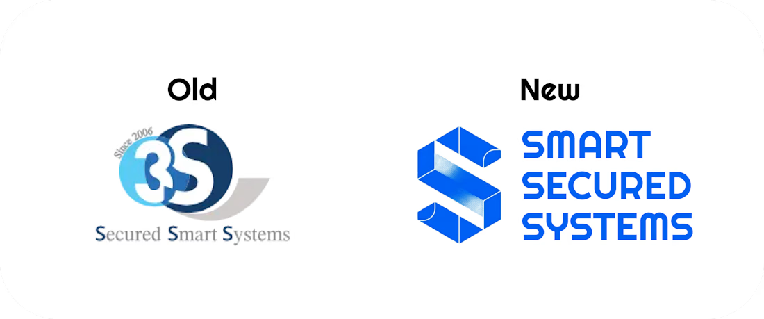
The old identity: a dated circular emblem, flat corporate blue, "Since 2006" stamped on top. Safe. Forgettable. Could be any company.
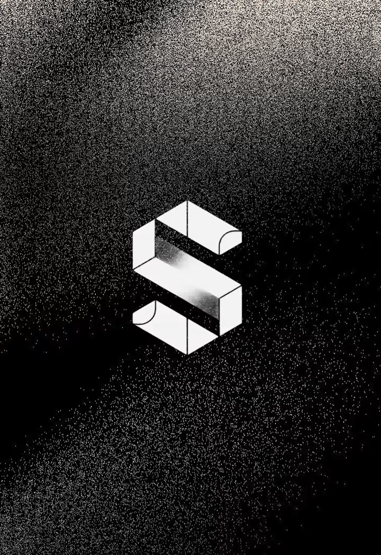
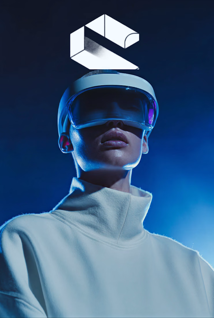
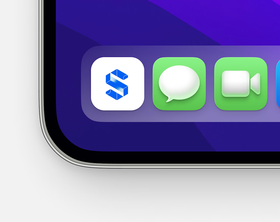
The new direction: an isometric 3D S-mark with structural depth and a grain texture — built to feel like infrastructure. Like something that protects things. Two modes: raw black for brand presence, clean blue on white for product and digital.
Nothing is final. I haven't pitched it to the owner yet. This is a concept I believe in and I'm putting it out there.
What would you change? What would you push further? Drop it below — I'm genuinely taking notes.


The network for creativity
Join 1.25M professional creatives like you
Connect with clients, get discovered, and run your business 100% commission-free
Creatives on Contra have earned over $150M and we are just getting started

Challenges
View all


Related posts


A look at the identity we designed for Vetti, a dog health monitoring brand.
There’s a lot of data behind a product like this but the person using it just wants to know their dog is okay.
That’s the balance in the design with a connected dot system that feels precise and warm colors and photography that keep it close to what people care about.
Also, an excellent excuse to spend far too long choosing dog photos.


Wonder -- Visual Expressions

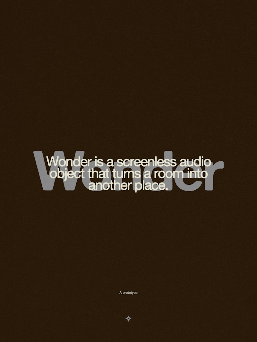
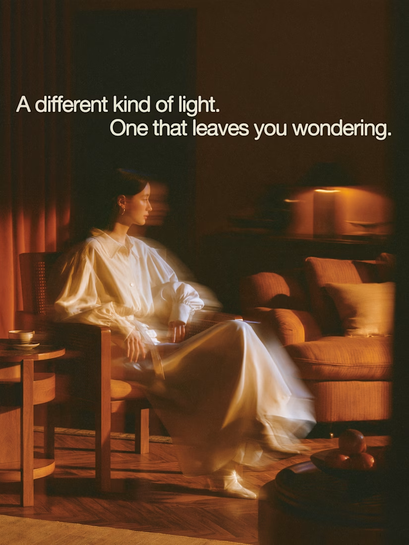


The restraint in the warm palette really lets the sound-object concept breathe—especially that shift from readable type to atmosphere.

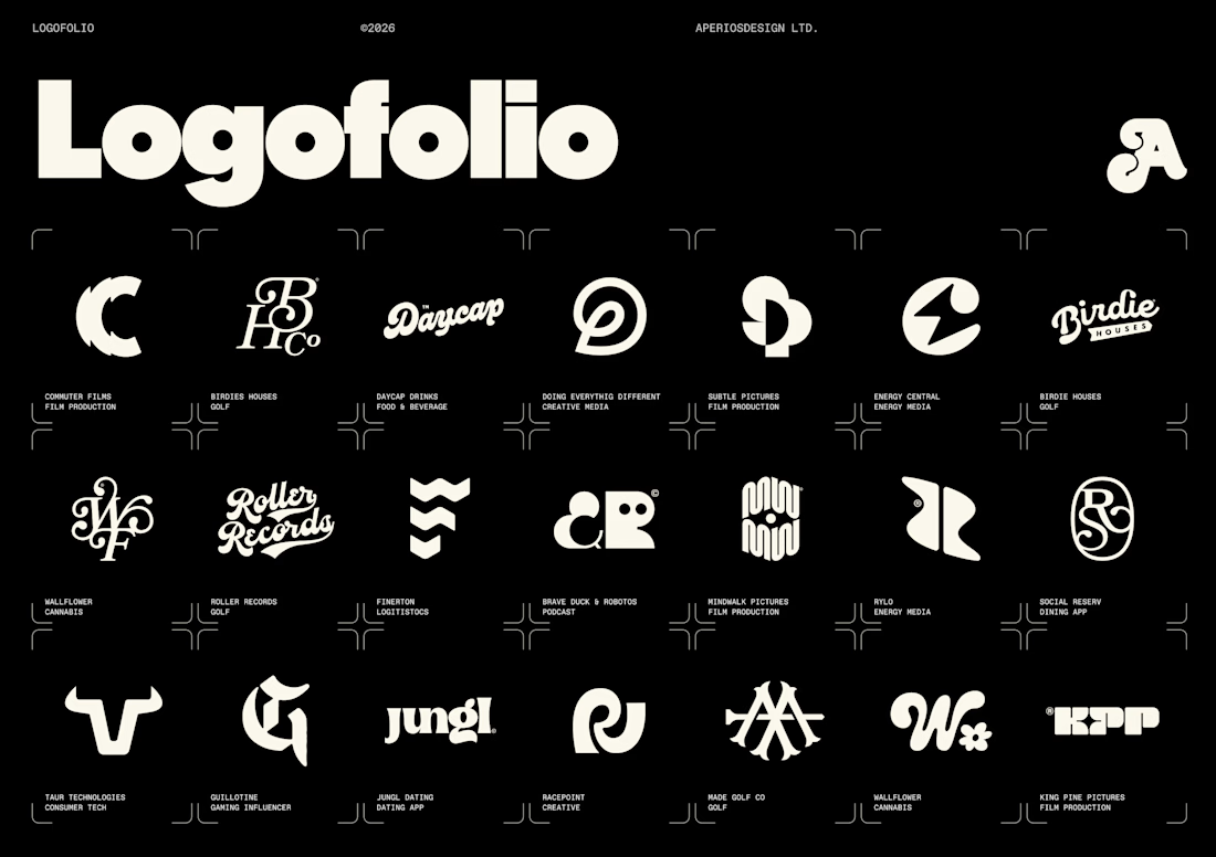
I’ve been slowly updating all of our project imagery across a new website update and and our internal decks.
Logos are only a small fraction of what we do for clients now, but I still love starting there. They often set the tone for the wider identity, the visual language, and the story we’re trying to tell.
Also, pretty satisfying seeing some of my favourites all together on one page.

Nice