The network for creativity
Join 1.25M professional creatives like you
Connect with clients, get discovered, and run your business 100% commission-free
Creatives on Contra have earned over $150M and we are just getting started
Back to feedPost
Taste Test
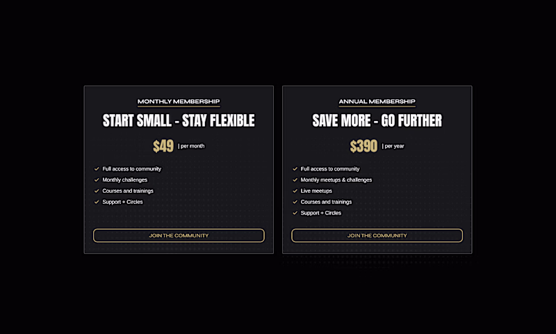
That dynamic make a lot of sense
Side by side is more user friendly, go with that. Less cognitive load, easier decision.
Visually they both look good.
Side-by-Side. Pricing is fundamentally a comparison task, so showing plans together reduces cognitive effort and helps users evaluate tradeoffs quickly. The toggle version feels cleaner, but it hides information that users will likely want to compare anyway. I'd reserve the...
Side by side has always been the most effective
I'd go for the 2nd one
Side-by-Side, because it's familiar to users and its easy to understand as well.
Dynamic Toggle
2nd one will be more effective I think
The network for creativity
Join 1.25M professional creatives like you
Connect with clients, get discovered, and run your business 100% commission-free
Creatives on Contra have earned over $150M and we are just getting started
Related posts
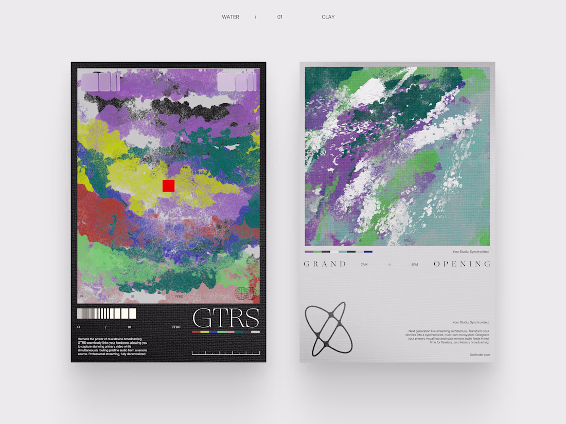
Working on branding for a Live streaming Infrastructure provider.
Great work
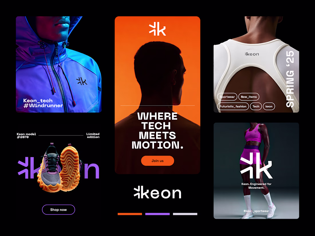
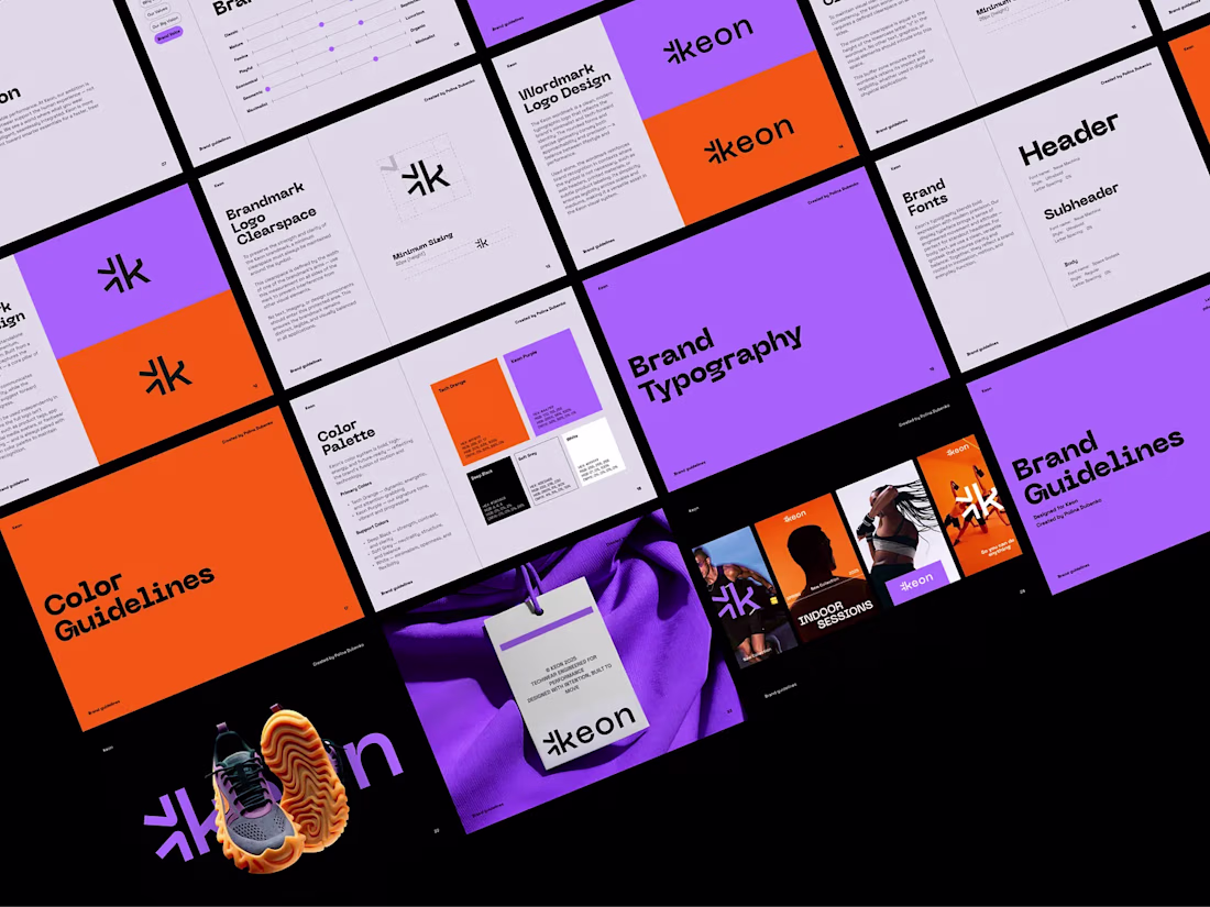
Keon Branding 🔥
Keon is a modern sportswear brand concept focused on performance, movement, and clean futuristic aesthetics.
I created a sharp visual identity with bold typography, minimal brand elements, and a sleek digital-first direction designed to work across apparel, footwear, product visuals, and online presentation.
#branding #apparel #logo #fashion #guidelines #graphic_designer
Awesome!
Presenting - Silver Line 🌥️
https://silverlinespace.figma.site
My Config Makeathon Submission!
A helpline for hearts that can't quite see the bright side today.
🌥️ The Problem
We all carry small struggles around with us. A rejection email, a plan that fell through, a rough day at work, a friend who didn't text back. None of them are the end of the world, but they pile up. And on the wrong day, even the little things feel heavy. Most of us weather them alone and in silence, scrolling past everyone else's highlight reel while quietly having a hard time.
There are apps for big crises and apps for vanity metrics, but very little for the everyday, low-grade cloud that just needs a kind word from a stranger.
☀️ The Solution
Silver Line is a communal sky where strangers help strangers spot their silver lining.
Share your cloud. Sign in, step into the sky, and post the little problem weighing you down. Set how heavy it feels, then send it up.
Be someone's silver line. Open any cloud and leave a message of encouragement, a kind word, or a bit of perspective.
Loved someone's comment? Send a ray of sun to show you appreciate it.
Watch clouds turn happy. When you can finally see the bright side, tap "I see the silver lining" and watch your cloud become a happy cloud.
The goal is simple: make every cloud in the sky a happy one!
Because no one should face their problems alone.
Safety rails (community flagging + admin moderation) keep the sky a kind place.
🛠️ The Process & Figma Tools Used
The whole thing was built predominantly in Figma, powered by Figma Make.
Planning: Mapped the idea and concept with an AI agent before touching design.
Figma MCP: Built the entire design system and variables directly in Figma, fast and clean.
Figma Design Agent: Spun up the major screens in minutes.
Figma Weave + Figma Draw: Generated the cloud assets and visuals; Draw was a joy for the finishing touches.
Figma Make: The heart of it. Prompted my vision and watched it come to life, iterating across versions. Used Figma Make's Select Edits for precise manual tweaks (images, text, padding) to save AI credits.
Supabase:Connected for persistence, so clouds, messages, and rays of sun are saved between visits.
A real end-to-end Figma workflow, from design system to a live, interactive product.
🔗 Link - Try it out yourself!
🚀 Live Working Prototype: https://silverlinespace.figma.site
*** Cannot provide figma community link as this project is connected to Supabase! ***
👤 Built by
Arjun Haridas, Product Designer, Bangalore, India.
Originally designed and built during the Config Makeathon period.
Huge thanks to Figma for the makeathon and to Contra for hosting. And to everyone who's ever been the silver line to someone else's cloud you're the reason this exists. 😊🌤️
#FigmaMakeathon #ConfigMakeathon
Trending
Claude
Claude has entered the design space. How are you using Claude Design?
Contra University
Learn from expert creatives how to earn more using next-gen AI tools.
MagicPath
The canvas is infinite, and exploration is becoming the workflow. How are you using MagicPath?
creativeaiflow
Creative AI workflows are evolving. What tools do you use, and what are their strengths and weaknesses?
freelancerlife
Freelancer life is wins, pivots, and everything in between. What’s yours right now?