The network for creativity
Join 1.25M professional creatives like you
Connect with clients, get discovered, and run your business 100% commission-free
Creatives on Contra have earned over $150M and we are just getting started
Back to feedPost


Working on branding for a Live streaming Infrastructure provider.

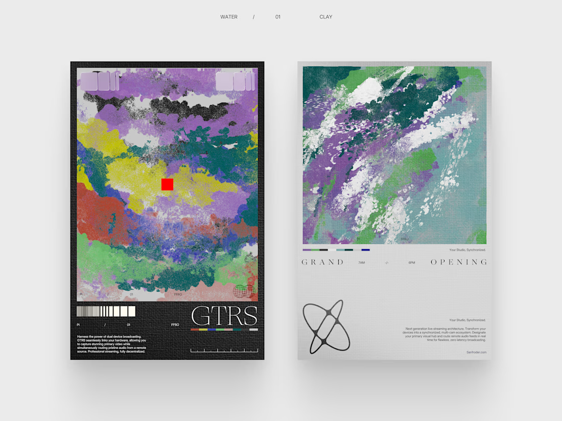

The choice to lead with abstract paint textures for a live streaming infrastructure brand is a bold call. It creates a lot of tension between the raw visual and the tech context, which weirdly works. Curious what direction the typography system is heading.

Interesting concepts

Wow, nice job

Great work

Fantastic

Wow, bookmarking this !
The network for creativity
Join 1.25M professional creatives like you
Connect with clients, get discovered, and run your business 100% commission-free
Creatives on Contra have earned over $150M and we are just getting started

Challenges
View all


Related posts


Color palette exploration for an Australian company, rooted in calmness, warmth, mental health and professionalism
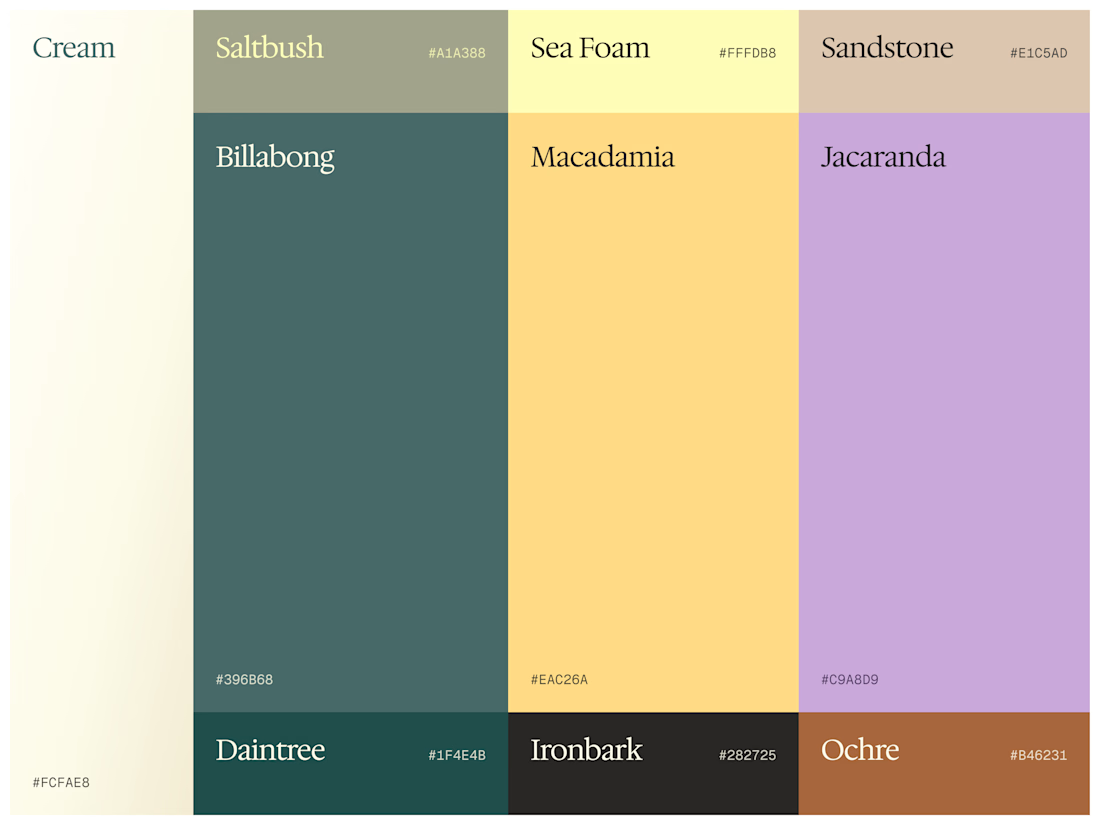

These tones are stunning. I can instantly picture this color system translating beautifully into soft, flowing motion graphics for a brand reveal video. Great exploration!

Logo design for StocksWithJosh, a prominent online trading mentor with 195K YouTube subscribers.
The concept was simple: blend the initials SWJ with a subtle nod to his status as the "GOAT" (Greatest Of All Time), a moniker earned from his community.
The result is a bold, recognizable brand mark that fits his business perfectly.
What do you think of the end result?




The mark reads instantly at thumbnail size, and the framed SWJ lockup gives it a strong YouTube-avatar presence. The subtle crown/GOAT cue is a nice detail without overpowering the initials.


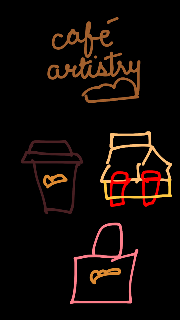
I gave ChatGPT the worst café branding brief imaginable.
Just a bunch of rough sketches and a very loose idea.
Then I asked it to turn the whole thing into a real-life café brand.
And somehow, in under 30 seconds, it managed to keep the little details I liked while turning them into something that actually felt cohesive.
Now I’m wondering how far you can push a terrible brief before it stops being terrible.

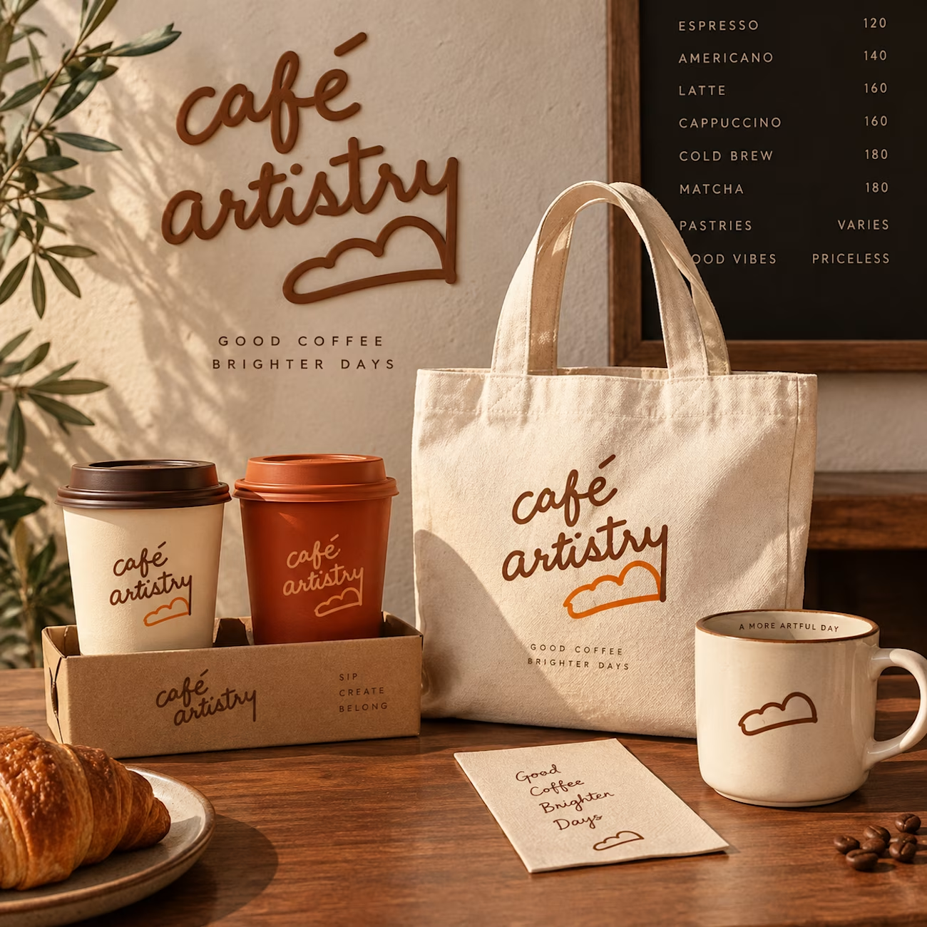
The jump from loose sketches to a cohesive café world is so satisfying—those little cup and bag marks carry through beautifully. I especially like how the roughness survived the polish instead of getting flattened.