The network for creativity
Join 1.25M professional creatives like you
Connect with clients, get discovered, and run your business 100% commission-free
Creatives on Contra have earned over $150M and we are just getting started
Back to feedPost

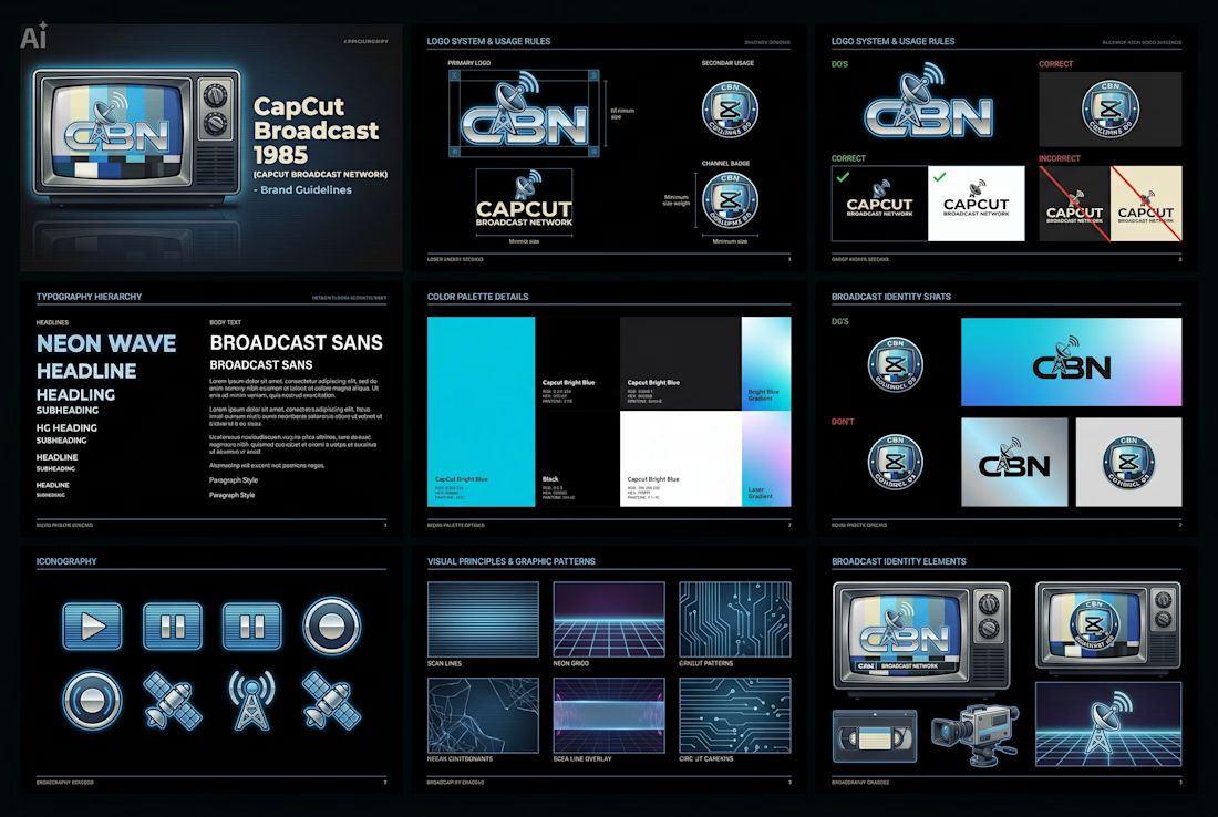
Imagine turning on your TV in 1985 and discovering... CapCut.
For the CapCut Design Studio Challenge, I chose Direction C: CapCut in a Different Era.
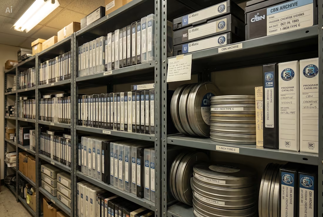
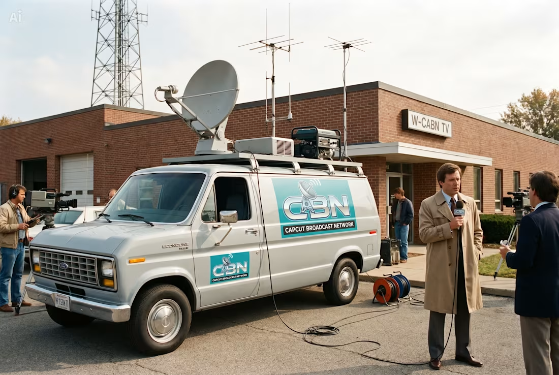
I turned CapCut into CapCut Broadcast Network (CBN) — a fictional television network built around the same creative spirit that powers creators today.
From VHS archives and news helicopters to TV studios and broadcast graphics, I obsessed over making every detail feel like it genuinely came from 80s.
This project was an opportunity to explore how a modern creative brand could be translated into a completely different era while still preserving its core identity.

The network for creativity
Join 1.25M professional creatives like you
Connect with clients, get discovered, and run your business 100% commission-free
Creatives on Contra have earned over $150M and we are just getting started





Related posts

Awesome dude

One-take cinematic AI film production
This is an FPV drone flight through a city during a solar eclipse.
The camera moves from a crowded square to a football stadium without any cuts or transitions. I wanted to show how people react when something unusual happens, and routine...


I’m so excited to finally share this one and hear what you all think.
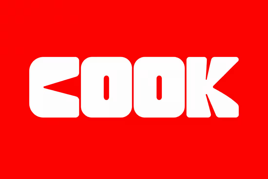
When Team Cook approached me to create their branding and logo, I knew I wanted to really push the concept and build something that felt bold, playful, and instantly recognisable.
What do you think?
P.s. their badges and tags have all my 🫶


Published https://parket.co.za this week. Happy to say the team is excited as we continue to roll out the latest prop.
@Parket New B2b website.


Congrats on shipping Parket. The aerial city lights behind that headline are a great hook.