The network for creativity
Join 1.25M professional creatives like you
Connect with clients, get discovered, and run your business 100% commission-free
Creatives on Contra have earned over $150M and we are just getting started
Back to feedPost

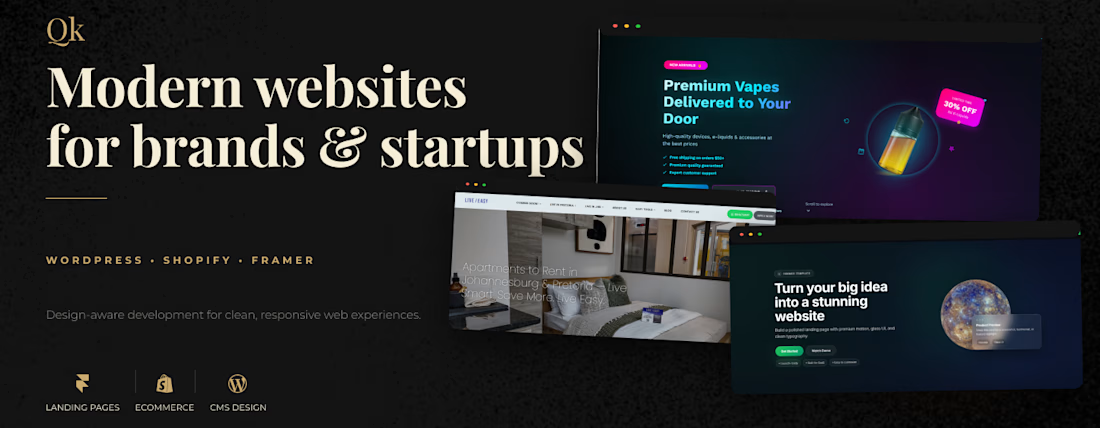
Improving my creative developer brand identity and portfolio presentation.
Working on a darker editorial inspired visual direction for my Contra profile, while featuring WordPress, Shopify and Framer projects in a more cohesive way.

The network for creativity
Join 1.25M professional creatives like you
Connect with clients, get discovered, and run your business 100% commission-free
Creatives on Contra have earned over $150M and we are just getting started








Related posts

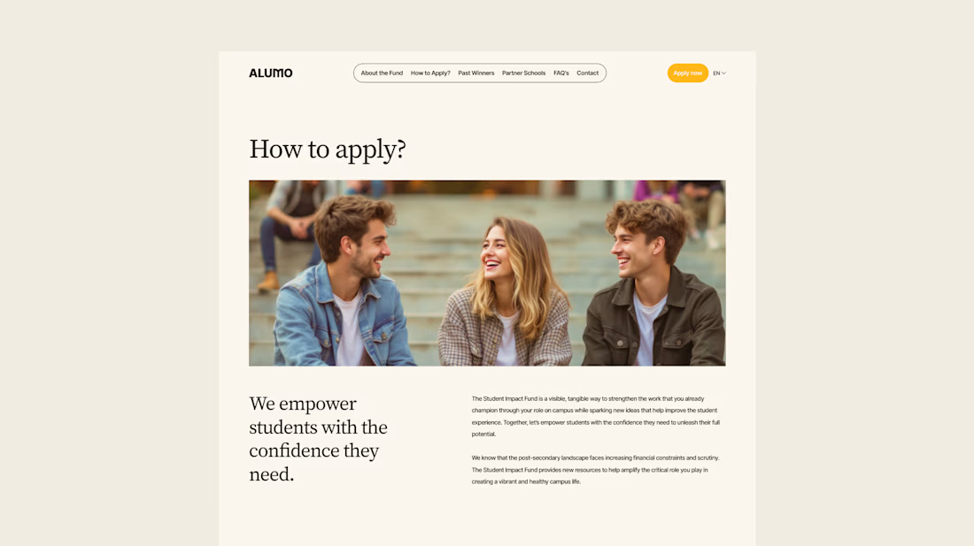
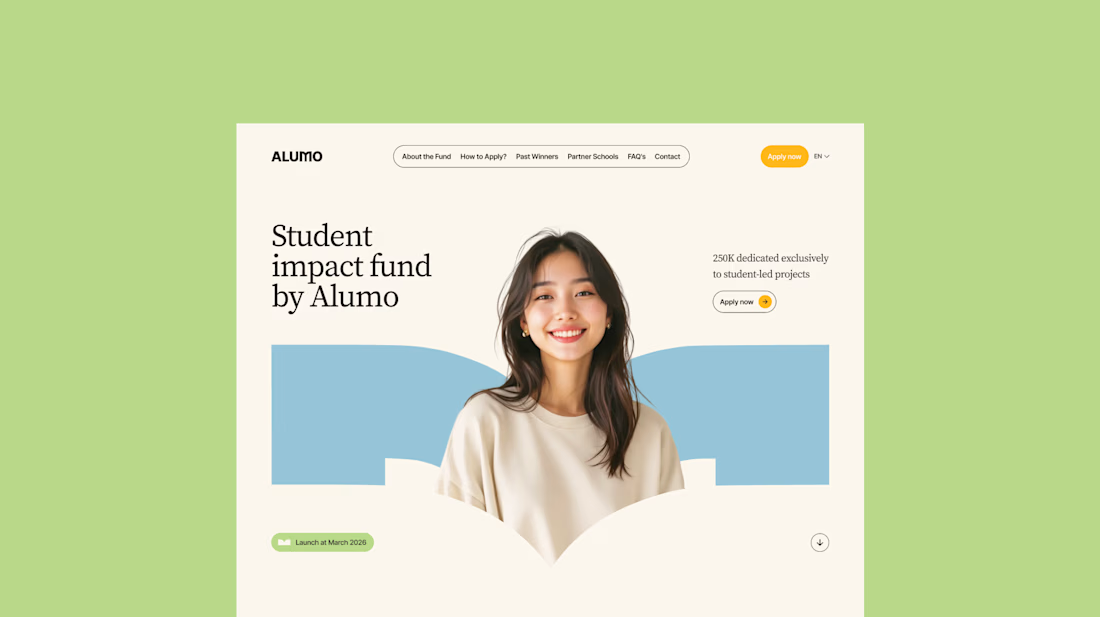
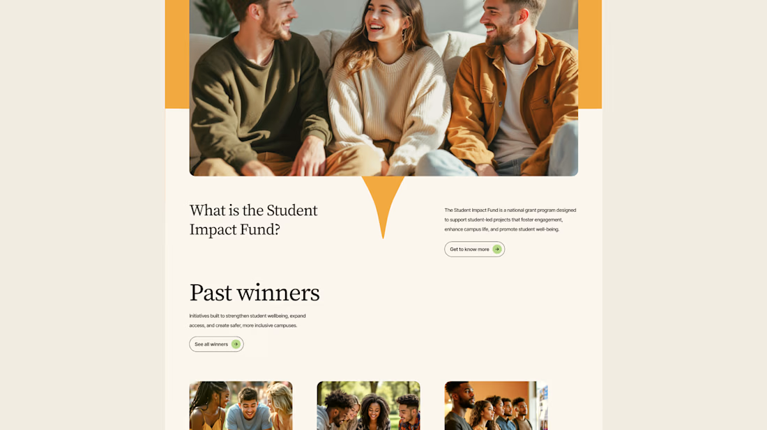
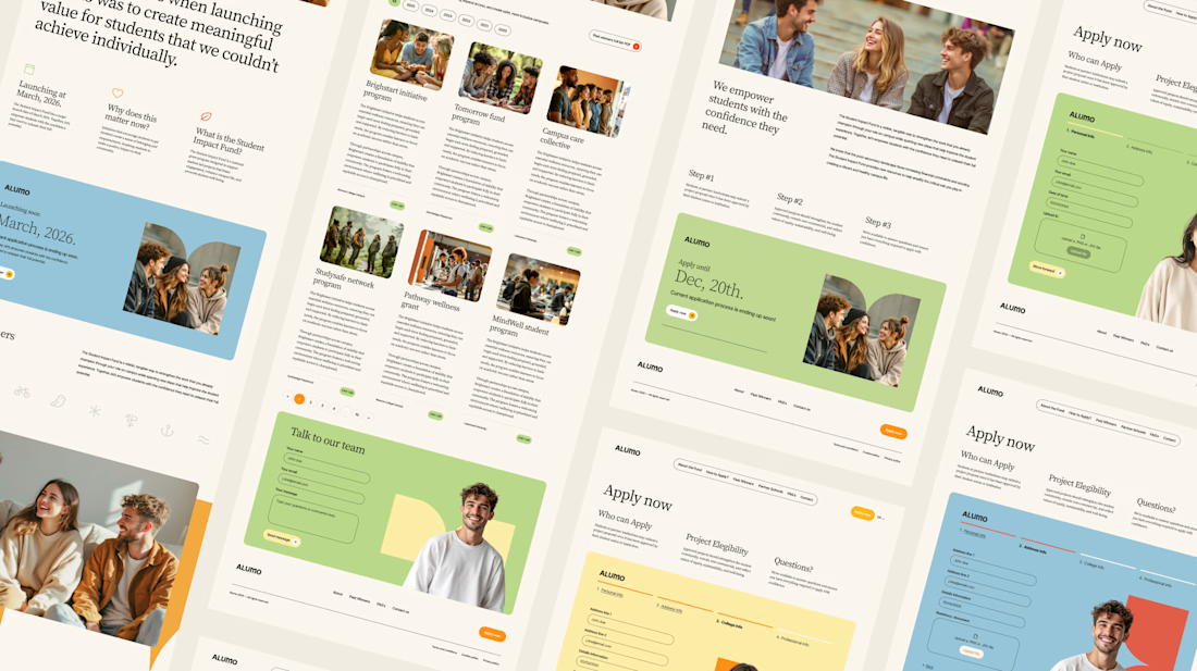
The Client: Alumo is a student impact fund that pools collective influence from influencers and partner schools to deliver a $250,000 annual grant program for student-led projects across Canada.
The Issue: The fund needed a website that could communicate trust and purpose to two very different audiences — students applying for grants and partner schools or influencers considering joining — while also showcasing past winners and guiding applicants through the process clearly.
The Solution: A multi-page website was designed with a warm, approachable visual identity using earthy tones, generous imagery, and clear information hierarchy. Each section — About, Past Winners, and How to Apply — was structured to reduce friction and build confidence, making it easy for students to understand eligibility and take action before the deadline.


Love how you're tackling trust + purpose for a $250K fund - that's a tough balance with two audiences. Communicating credibility for a student-led initiative across Canada is huge. Would love to see how you solved it!

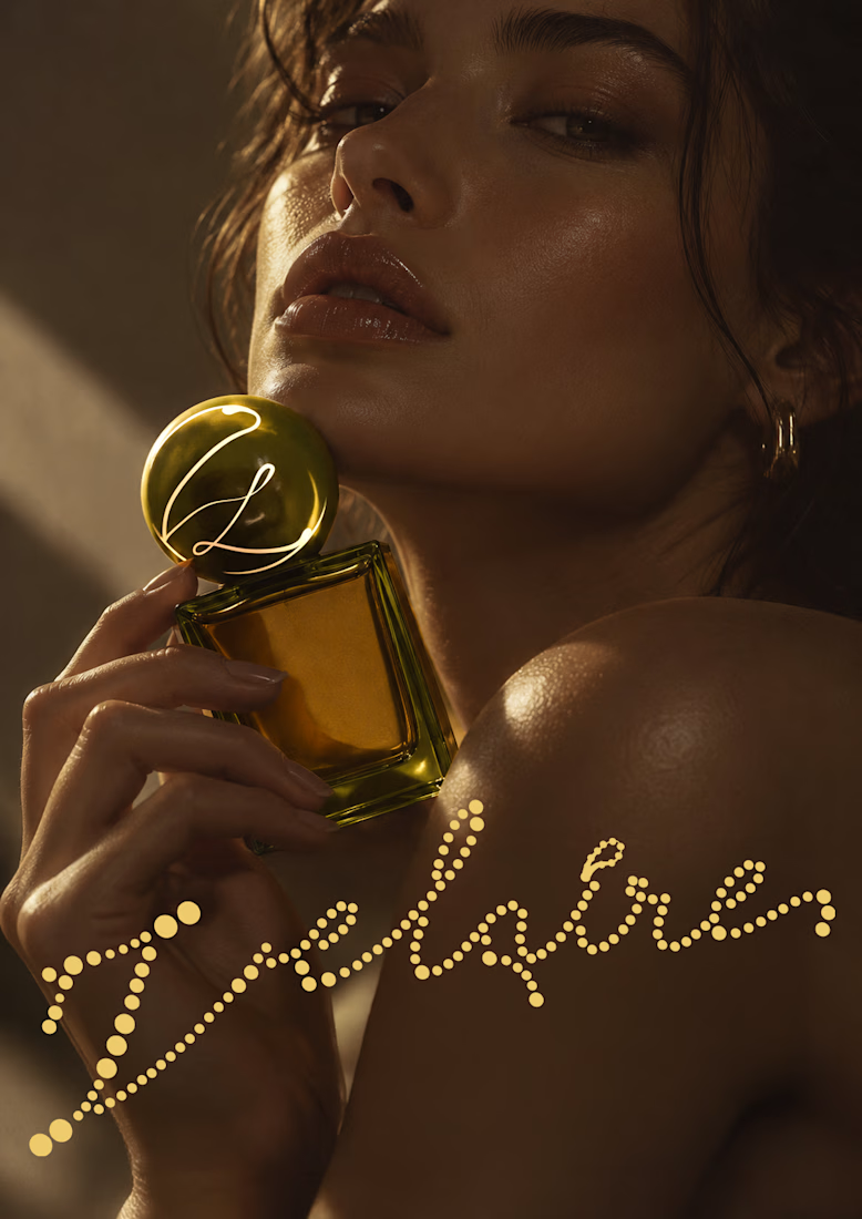
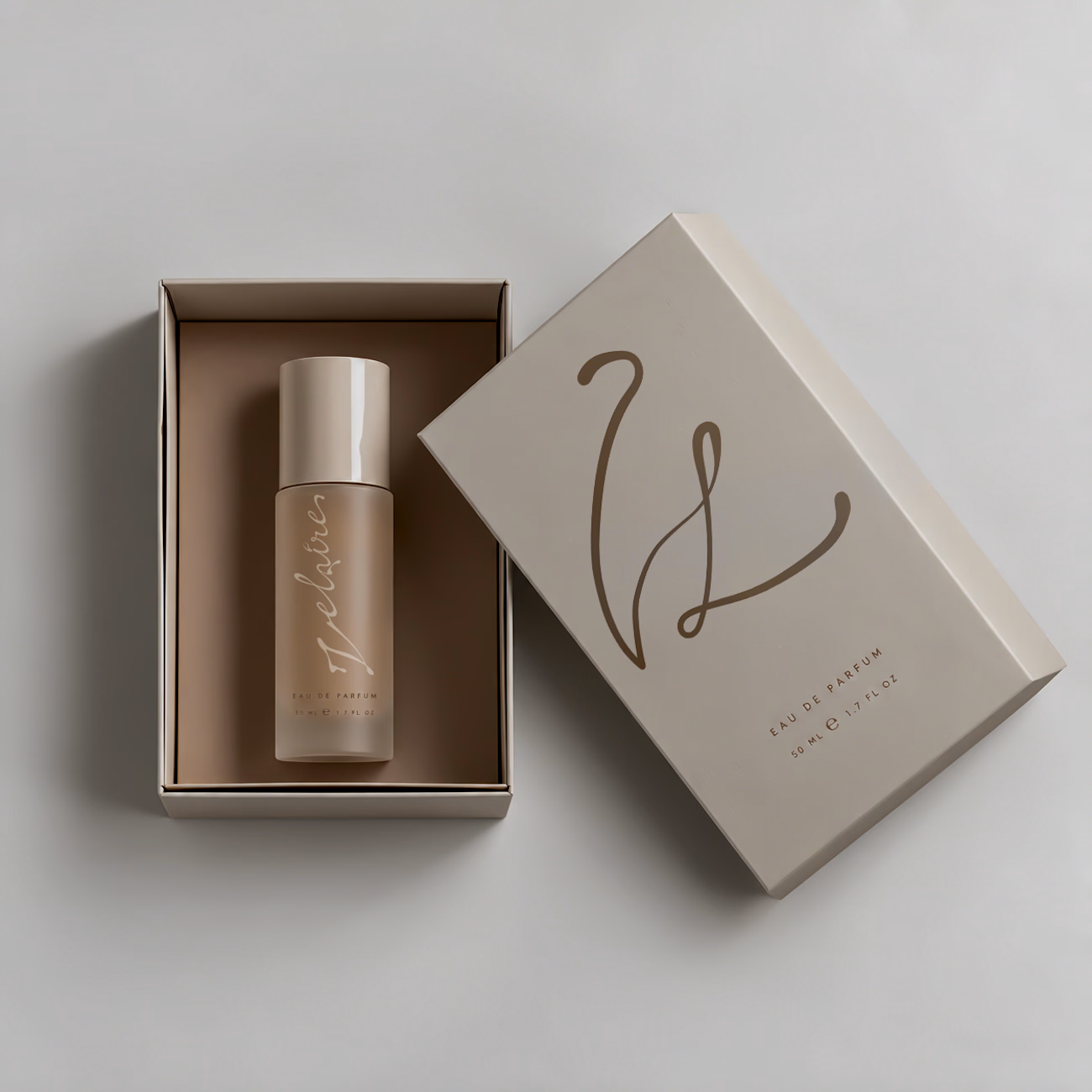
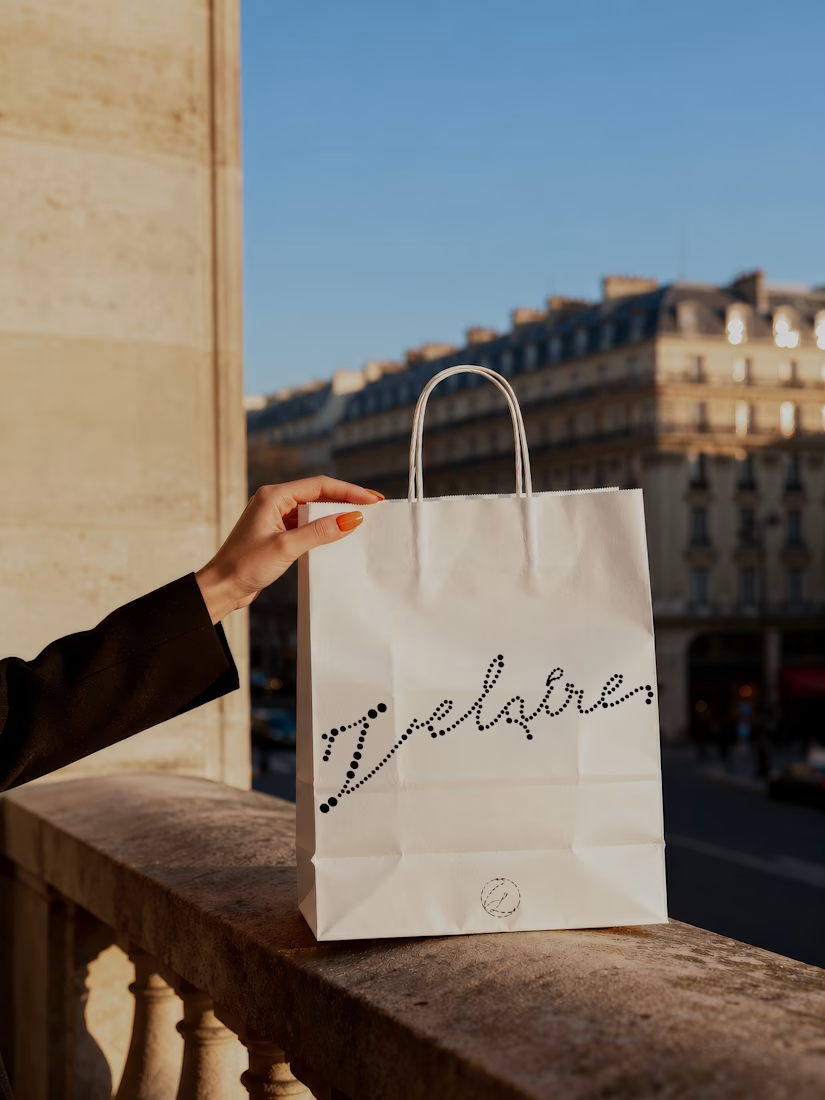
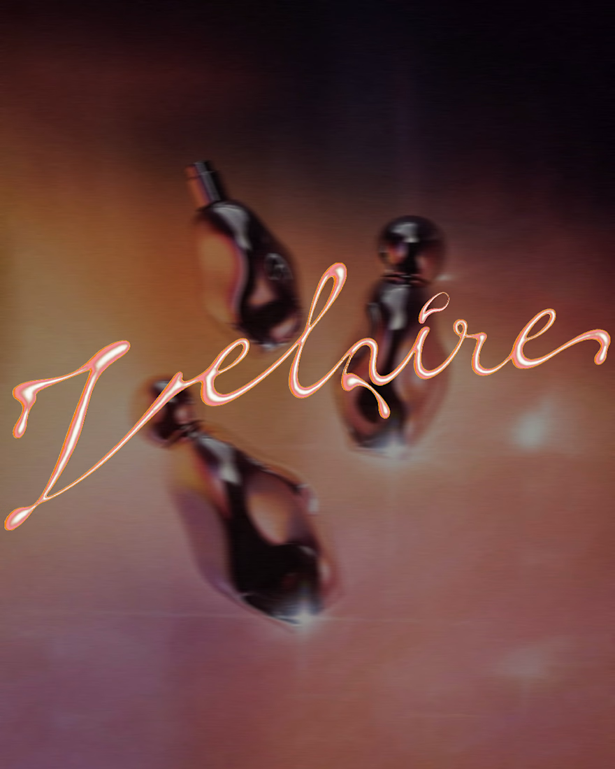
VELAIRE — Beauty & Fragrance Visual Identity
A self-initiated identity exploring custom lettering, sensual art direction and a refined visual system across packaging, editorial and digital applications.
Currently open to freelance and remote collaborations in branding, music, fashion and culture.
Visual Identity · Art Direction · Logo Design · Campaign Design
#VisualIdentity #ArtDirection #BrandDesign #LogoDesign #GraphicDesign



Great brand identity Yaren that's really luxury 🔥🔥


my entry for the SVGator × Contra challenge
unseal the inspiration, a template to share moodboards and brand assets in a more organic, visual way, inspired by architectural folders
swap the images, logo, text and colors, keep the motion ✨
hope you like it!
(two versions in the same video below)

Love it!