The network for creativity
Join 1.25M professional creatives like you
Connect with clients, get discovered, and run your business 100% commission-free
Creatives on Contra have earned over $150M and we are just getting started
Back to feedPost
Put ByteDance's Seedance 2.5 through its paces on a spec, period-specific extreme doc style concept. A solo mountaineer in a harsh alpine environment. Honest read on where the 30-second single-take spec actually holds up, and the pre-production work that goes into making it land.
#Seedance #AIVideo #MotionDesign #CreativeWorkflow


looks lovely


Great job

Looks really cool


Incredible prompt engineering
Will be learning from you 😄 😜
Cant wait to create something exhilarating as well

love to hear it!

Great Work

Nice work 👍

congrats

In your opinion, can this AI generator already compete with real shooting or is it still weak?

Amazing ....

Thirty seconds is a real stress test for a single take. Continuity usually cracks before image quality does. Where did it start fighting you first, subject motion or camera movement?
The network for creativity
Join 1.25M professional creatives like you
Connect with clients, get discovered, and run your business 100% commission-free
Creatives on Contra have earned over $150M and we are just getting started
Related posts

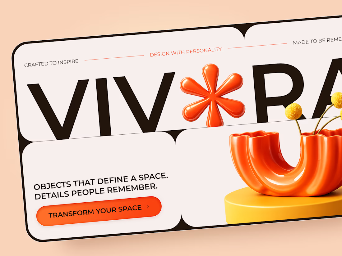
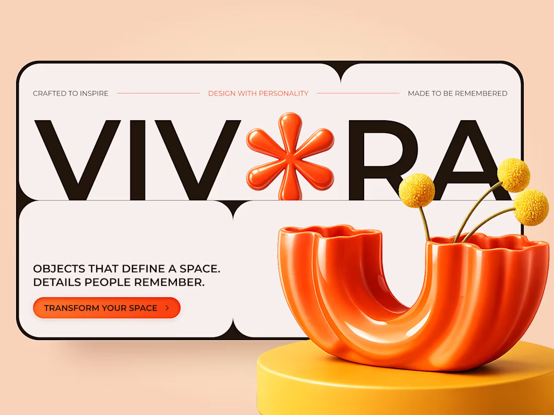
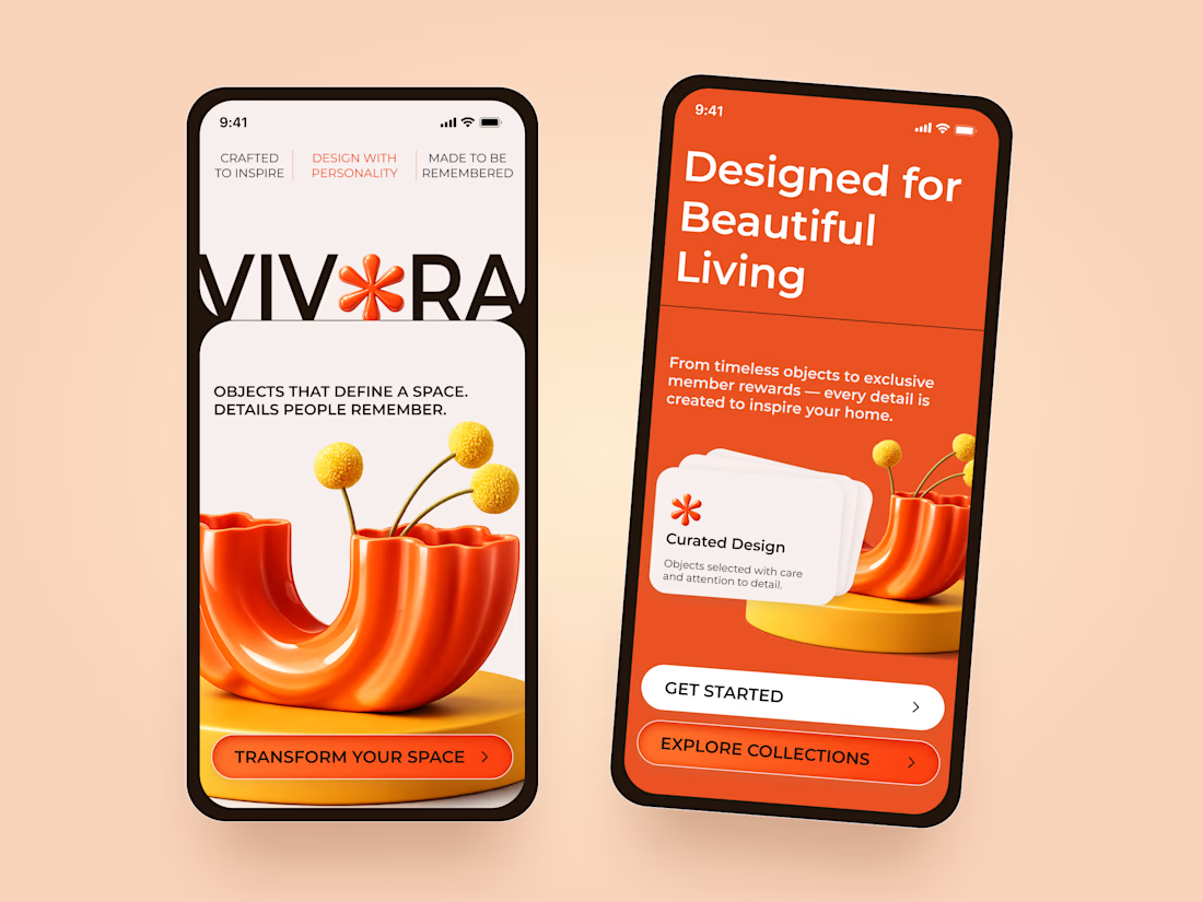
VIVORA — Creative Home Decor & Furniture Landing Page
A bold and playful landing page concept for VIVORA, a home decor brand focused on expressive objects and design with personality.
The visual direction combines vibrant orange tones, oversized typography, and sculptural 3D elements to create a memorable shopping experience.
Special attention was given to:
• Bold typography and expressive brand identity
• Vibrant orange and warm neutral color palette
• Sculptural 3D product visuals and playful compositions
• Rounded layouts with strong visual hierarchy
• Clear CTAs and engaging product presentation
• Responsive desktop and mobile layouts
• Mobile-friendly navigation and collection discovery
The result is a distinctive website concept that brings personality to home decor and makes everyday objects feel like statement pieces.
Looking to create a standout website for your furniture or lifestyle brand? Let's connect 🚀


AREA — Minimal Brand Identity
AREA’s identity began with a simple idea: structure can make a brand more distinctive.
We explored it through bold typography, geometric forms, and a restrained monochromatic palette, bringing clarity and consistency to every touchpoint.
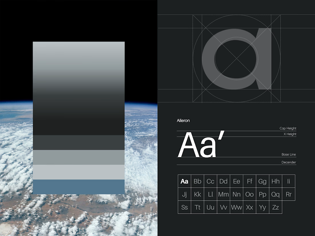
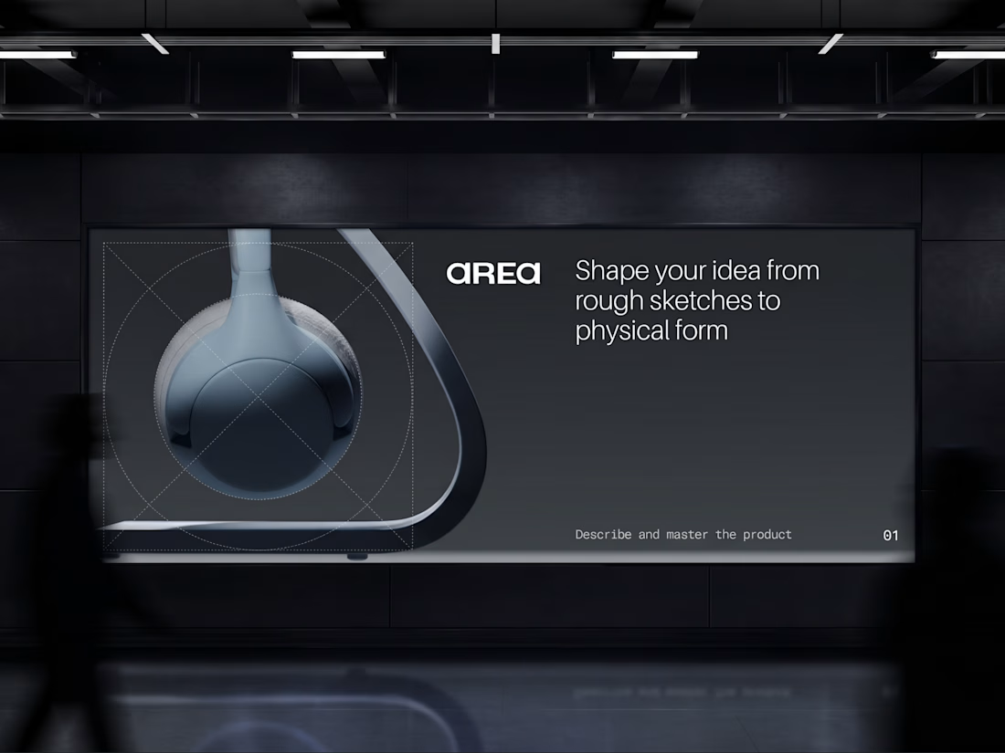

Monochrome can feel cold, but the big type keeps this sharp. Did you start with the type or the shapes?

Testing two hero illustration directions for Syncora, an all-in-one team collaboration platform.
Which one fits a collaboration tool better? 👇

3 voted
43%
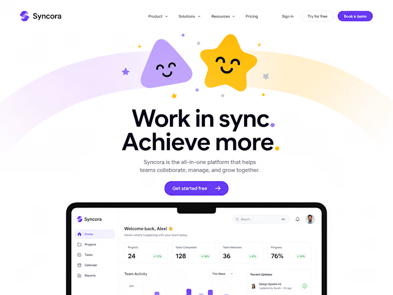
4 voted
57%
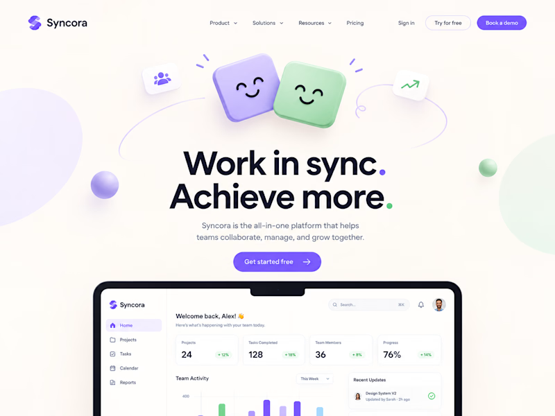
7 votes
Closed

Definitely Soft Sync. It looks clean, friendly and professional for work. The first one with the star and rainbow feels a little too much like a kids' app for a team business tool.