The network for creativity
Join 1.25M professional creatives like you
Connect with clients, get discovered, and run your business 100% commission-free
Creatives on Contra have earned over $150M and we are just getting started
Back to feedPost
Taste Test

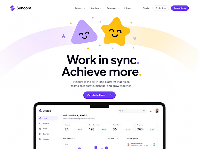
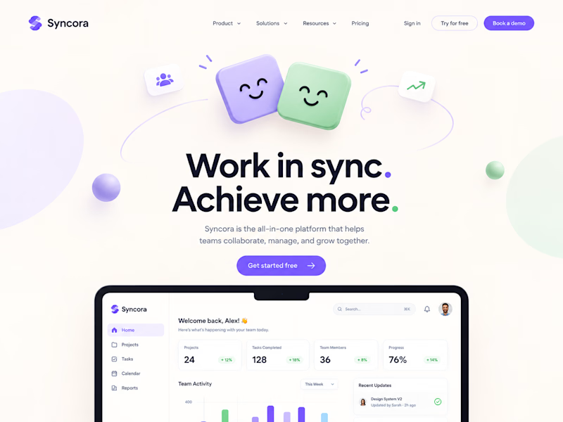
Testing two hero illustration directions for Syncora, an all-in-one team collaboration platform.
Which one fits a collaboration tool better? 👇


6 votes
Ends in 1d

For an all-in-one collab tool, I'd lean Soft Sync — collaboration tools need to feel calm and trustworthy, not loud. Playful Pop is eye-catching but might compete with the UI itself.
Soft Sync feels like "we make teamwork feel easy" vs Playful Pop feels like "look at us". For...

Soft sync looks more fun and interactive then playful pop

Definitely Soft Sync. It looks clean, friendly and professional for work. The first one with the star and rainbow feels a little too much like a kids' app for a team business tool.
The network for creativity
Join 1.25M professional creatives like you
Connect with clients, get discovered, and run your business 100% commission-free
Creatives on Contra have earned over $150M and we are just getting started



Related posts

If your members pay premium. Your website should look like it.
Animation really changes the way you look at a website.
The premium is in the details. 🤌
Hero section with animation for a Tennis Sports Club Membership Platform.
Full landing page WIP; gonna share it very soon.


The animation adds a lot to the premium feel for a tennis club membership platform. Looking forward to seeing the full landing page.

We're currently working on this animation for a mobile app. We're debating whether to use fall colors, like seasonal ones or stick with the app's current color scheme.
Community, which color scheme would you vote for?

8 voted
38%
13 voted
62%
21 votes
Closed

Option 2 was stunning🔥🔥🔥🔥


🧪 TASTY TEST: WHICH ONE MAKES NEXT WEEK FEEL SORTED?
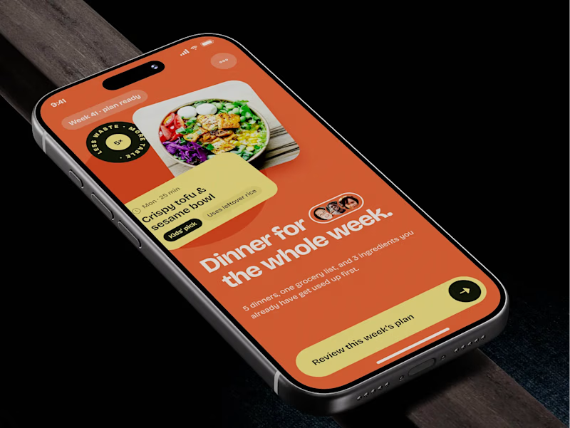
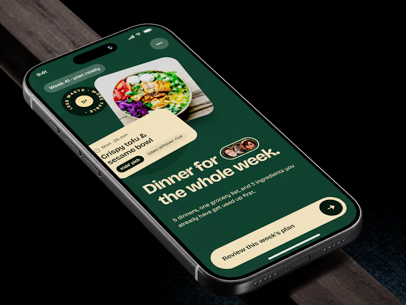
Meal planner mobile app design. Same UX, two palettes.
🍊 A · Citrus Energy
Orange + buttery yellow. Appetite first.
🌿 B · Forest Calm
Deep green + cream. A calmer weekly ritual.
💡 GROWTH THINKING
Users want dinner handled, not another planning task.
My hypothesis: orange could win the first tap; green could signal less effort. I’d test plan-open rate AND grocery-list completion. More taps mean little if people abandon the next step.
🗳️ A OR B — WHICH WOULD YOU TRUST WITH NEXT WEEK’S DINNERS?
Vote and tell me why.
📩 BUILDING A MOBILE APP? LET’S FIND WHAT’S HOLDING GROWTH BACK.
https://calendly.com/asol_design/demo
#MobileAppDesign #AsolDesign
15 voted
68%
7 voted
32%
22 votes
Closed