The network for creativity
Join 1.25M professional creatives like you
Connect with clients, get discovered, and run your business 100% commission-free
Creatives on Contra have earned over $150M and we are just getting started
Back to feedPost

FICTIONAL COPY AUDIT
The homepage asked an exhausted mother to “optimize her wellness.”
That was the problem.
BEFORE:
“Unlock your highest potential with personalized, holistic wellness solutions.”
Polished? Yes.
Memorable? No.
And it asks too much of the woman reading it.
She may be on her phone at 11:47 p.m., after packing lunches, answering one last email, and promising herself—again—that tomorrow she will take better care of herself.
She is not trying to unlock her highest potential.
She wants to stop running on fumes.
A clearer direction:
“Feel like yourself again—even when everyone needs something from you.”
Gentle, realistic nutrition support for overwhelmed mothers who want steadier energy, simpler meals, and care that fits inside real family life.
CTA: Show me the first small step.
WHY THIS WORKS:
• It enters the conversation already happening in her mind.
• It replaces an abstract promise with relief she can recognize.
• It respects her reality instead of handing her another impossible standard.
• The call to action feels safe, specific, and manageable.
Good copy does not merely describe the offer.
It lets the right person exhale and think, “Finally. This was made with someone like me in mind.”
Specificity is empathy made visible.
What sentence on your homepage sounds polished—but not quite human?
The network for creativity
Join 1.25M professional creatives like you
Connect with clients, get discovered, and run your business 100% commission-free
Creatives on Contra have earned over $150M and we are just getting started











Related posts

sentences
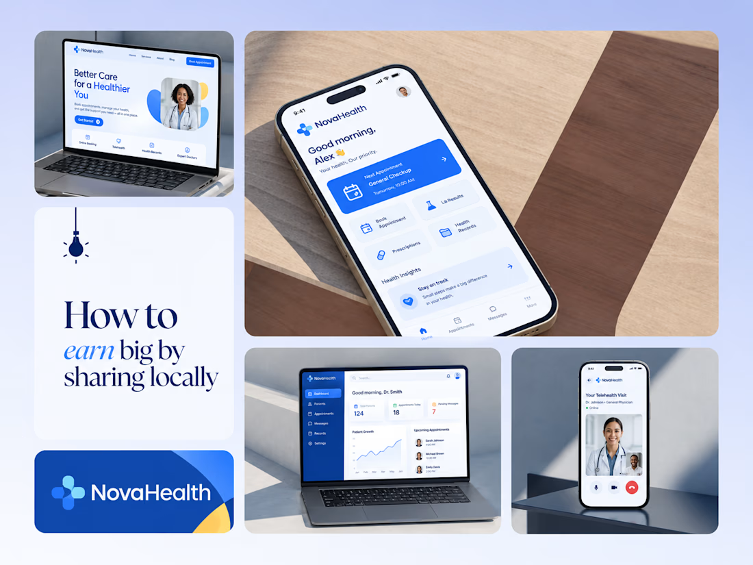
One brand, three screens: patient, doctor, and the video call between them.
NovaHealth is a healthcare brand and product system I designed from logo to apps. Healthcare software tends to feel either cold and clinical or too cluttered to open. I wanted something calm for a worried patient and quick for a doctor between appointments.
The logo breaks the classic medical cross into soft, rounded blocks in two blues, so it reads as “health” without feeling sterile.
The patient app opens with one thing: a solid blue card showing your next appointment. It’s the only fully saturated block on the screen, so nothing competes with it.
The doctor dashboard is built for a glance. Total patients, today’s appointments, and pending messages come first, in the same blue and rounded style as the patient app.
The telehealth screen has almost no UI. The doctor’s face fills the screen, with just three controls: mic, camera, and a red end-call button, the only red in the whole system.
One rule ties it together: blue means action, white space means calm, and yellow is a small spark of warmth.
Which screen should I break down next? 👇



Great medical brand design specially the phone app UI and top left laptop dashboard 🔥🔥🔥
great job Joshua ❤️🎉

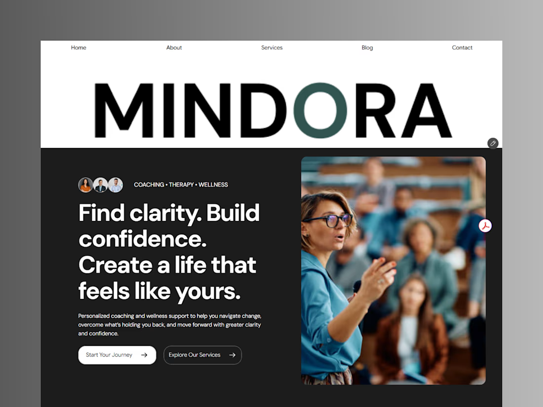
Introducing Mindora — a Life Coaching & Wellness Framer Template.
I designed Mindora for life coaches, wellness professionals, and personal growth brands looking for a calm, modern, and welcoming online presence.
Inspired by clarity, confidence, and meaningful growth, Mindora features a thoughtful layout, dedicated service sections, a blog for sharing valuable insights, and a clean visual style designed to help brands connect with their audience.
Built with Framer, it's a customizable starting point for creating a professional coaching or wellness website.
Explore Mindora and bring your next website idea to life.
Kindly check it out the template: https://www.framer.com/marketplace/templates/mindora-life-coach/



Great work

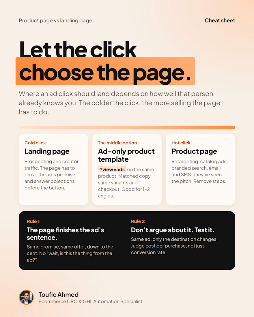
Product page or landing page for your ads?
Neither by default. It depends on how warm the click is.
Cold traffic needs a page that does the selling. Warm and hot traffic need fewer steps.
Either way, the page should finish the ad's sentence. Then test it.


finish the ad's sentence is a good way to put it. cold clicks landing on a bare product page bounce so fast cause nothing tells them why they clicked