The network for creativity
Join 1.25M professional creatives like you
Connect with clients, get discovered, and run your business 100% commission-free
Creatives on Contra have earned over $150M and we are just getting started
Back to feedPost

Somewhere between final.mp4 and final-really.mp4, “approved” starts to need a more precise definition.
Which file was approved? Did the requested change make it into that version? Does the comment about the title still point to the title, or has the whole opening moved?
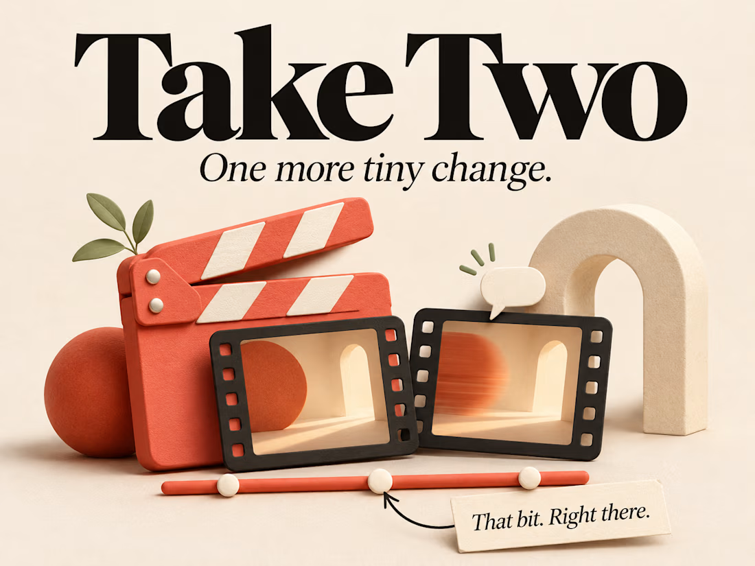
Take Two is my take on that problem: a small video review app with timestamped feedback, visual annotations, version comparison and approval tied to a specific cut.
It is a fun personal project with a fairly particular set of rules underneath the friendly interface. A video player and a comments panel give you plenty to think about once the second version arrives.
Ten seconds into which video?
Imagine leaving a comment at ten seconds: the title is difficult to read.
The editor adds a longer opening and sends another cut. Ten seconds now shows something else. Copying the comment to the same timestamp would preserve the number while losing what you were talking about.
In Take Two, feedback stays attached to its original version. A comment can refer to a single moment, a range of time, or a particular part of the picture. Pins and rectangles let the reviewer point directly at the detail.
Required changes carry into the next review with that original evidence intact. The editor can then attach a proposed fix in the revised cut.
That gives the reviewer two useful places to visit: here is the problem, and here is what changed. Nobody has to reconstruct the conversation from a filename and a vague memory.
“I fixed it” and “I checked it”
Those are two separate actions in Take Two.
The editor marks a required change as addressed. That records the proposed fix. The reviewer checks it and decides whether the requirement is resolved.
Both open and addressed requirements continue to block approval. A requirement can also be withdrawn, because deciding that a change is unnecessary is a different outcome from completing it.
Once the reviewer approves, the decision identifies the exact submitted version. Reopening the review adds another event while preserving the earlier approval.
It sounds like a small distinction. In practice, it gives each button a clear meaning. “Addressed” tells you there is something ready to check. “Approved” tells you which cut passed that check.
Two players are easy to understand. Their timing needs care.
The comparison view puts two cuts beside each other. You can play them independently or link their playback, and choose which player supplies the audio.
The important detail is what “linked” means.
Take Two links elapsed time. It does not identify matching scenes or work out where an editor moved a shot. If the opening gets longer, the later scenes still happen at different timestamps.
Original feedback and proposed fixes therefore retain their own positions. You can inspect the old problem, jump to the proposed solution, and compare the surrounding footage without pretending that the edits line up perfectly.
I wanted the comparison screen to help someone make a decision while keeping those differences visible.
The work you cannot see in a cover image
Comment drafts are not particularly exciting to look at. Losing one halfway through writing it is quite exciting, in the wrong way.
Take Two preserves drafts for comments, replies and edits. It also handles conflicting changes across browser tabs and keeps pending work visible when a local save fails.
Recovery gives you a way to reconcile changes or preserve a separate copy. An attempted save should not be treated as proof that the work was stored successfully.
That matters because this demo keeps its projects and imported videos in IndexedDB, inside the current browser profile. There is no remote account service holding another copy.
You can print a review report or export the review information as JSON. Those exports include the discussion and decisions, but exclude the video files. Exporting the review and backing up the footage are different things.
These details take up very little space in the finished interface. They account for a much more interesting part of the implementation.
Giving the video some room
I kept the visual design warm and fairly quiet: neutral surfaces, charcoal text and coral accents.
The player gets a prominent place, with feedback close enough that you can move between watching and commenting without losing your bearings. The interface needs to explain the review state while leaving room for the thing being reviewed.
Mobile gets its own arrangement. The video comes first, with the review controls and discussion below it. You can still follow the relationship between the cut, its required changes and the conversation on a narrow screen.
The demo includes two original motion-graphic cuts, so there is something to review immediately. You can also create a project and import a supported local video.
A complete little review loop
Take Two uses React, TypeScript, Vite and IndexedDB.
It is an independent portfolio demo with fictional sample projects. One visitor switches between Editor and Reviewer to try both sides of the process; it does not provide remote collaboration.
You can leave feedback, request a change, deliver a revision, compare the cuts, verify the fix and approve the result.
That complete loop is the part I wanted people to be able to explore. Each step has to make sense in the context of what happened before it.
There may still be one more tiny change. At least we know which version we are talking about.


The network for creativity
Join 1.25M professional creatives like you
Connect with clients, get discovered, and run your business 100% commission-free
Creatives on Contra have earned over $150M and we are just getting started


Related posts


All looks so clean!

A logo reveal is easy. Explaining why the logo changed is the fun part.
OPTYO had spent a decade telling the stories of sports and fitness brands, and their old mark was a single ring for one unified team. The new identity breaks that ring into tiles, one for each channel they now cover. I created the brand story and logo animation that walks through that shift, from fast cuts of athletes to the tiles spinning into the new mark.
Check it out. How do you usually start a logo animation?


A masterpiece!


We’re choosing the motion for an AI analytics product demo, and I can’t decide.
Both clips show the same flow. Someone asks a question in plain English. The agent checks permissions, plans the query, runs it past guardrails and builds the dashboard.
1. A walks you through each step as it happens.
2. B skips the steps and drops you straight onto the result.
A shows the work. B shows the speed. For a landing page I keep going back and forth.
Which one would make you trust the product more? Comment A or B, and tell me why.
3 voted
100%
0 voted
0%
3 votes
Closed

I think according to your query the output should consist on a list of clients with late invoices rather then showing charts etc,


