The network for creativity
Join 1.25M professional creatives like you
Connect with clients, get discovered, and run your business 100% commission-free
Creatives on Contra have earned over $150M and we are just getting started
Back to feedPost

Luxury Organic Soap Packaging Design | Premium Box Packaging, Branding & 3D Product Mockup
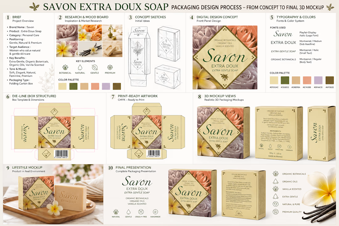
This project showcases a premium packaging design created for an organic luxury soap brand, combining elegant branding with functional packaging to create a memorable customer experience. The objective was to design a sophisticated soap box that communicates the product's natural ingredients, gentle skincare benefits, and premium quality while helping the brand stand out in both retail stores and online marketplaces.
The design is inspired by botanical beauty, featuring a harmonious blend of floral imagery, warm neutral tones, and refined typography to reflect purity, softness, and luxury. Every visual element was carefully selected to create an inviting and trustworthy appearance that appeals to customers looking for natural, handcrafted, and high-quality skincare products. The balanced layout ensures that the product name, key benefits, ingredients, barcode, and brand information remain clear, readable, and visually engaging.
The creative process began with market research, competitor analysis, and mood board development to establish the overall design direction. Color palettes, typography, and floral graphics were then explored to create a timeless visual identity. After concept development, the box layout was designed using a production-ready dieline, ensuring accurate panel alignment, bleed, and print specifications for seamless manufacturing. The project concluded with realistic 3D mockups that present the finished packaging from multiple angles, demonstrating how the product would appear on retail shelves, e-commerce platforms, and promotional materials.
This project highlights my expertise in packaging design, product branding, box packaging, label design, print-ready artwork, dieline creation, and realistic 3D product mockups. The final result is a visually compelling packaging solution that combines creativity, functionality, and strategic branding to enhance product value, strengthen brand recognition, and create a lasting impression for consumers in the competitive beauty and personal care industry.
Packaging Design, Soap Packaging, Soap Box Design, Product Packaging, Luxury Packaging, Organic Soap, Cosmetic Packaging, Skincare Packaging, Brand Identity, Branding, Package Design, Dieline, Print Design, 3D Mockup, Graphic Design.


The network for creativity
Join 1.25M professional creatives like you
Connect with clients, get discovered, and run your business 100% commission-free
Creatives on Contra have earned over $150M and we are just getting started

Challenges
View all


Related posts


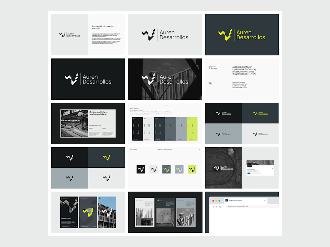
Not every direction makes it to the final brand.. this was one of the directions we explored for Auren Desarrollos, a new construction and development company we’re currently working with on its branding and website.
I’ll be sharing the final result soon, and I think the difference will be interesting to see.
What do you think?


Great!

MAE — Art Direction & Brand Visual Identity
A visual identity concept developed for MAE, built around the idea of “Controlled Energy — Movement in Contrast.” The direction explores the tension between individuality and constant movement, using a sharp central subject surrounded by blurred figures to create a strong visual narrative.
The Challenge
The goal was to create a visual language that felt distinctive, contemporary, and emotionally engaging without relying on excessive graphics or conventional branding. The challenge was to communicate movement and energy while keeping the brand feeling refined, minimal, and controlled.
The Solution
I developed an art direction centered around contrast — stillness vs. movement, focus vs. distraction, and individuality vs. the crowd.
The orange environment creates a bold visual signature, while the motion-blurred silhouettes represent the constant movement surrounding the individual. The sharply focused central figure becomes the visual anchor, communicating confidence, identity, and control.
The same visual language was then extended into the brand composition through minimal typography, logo placement, graphic symbols, and structured spacing, creating a system that can work across campaigns, social content, editorial layouts, and brand communications.
My Role
Art Direction · Brand Identity · Visual Concept · Graphic Design · Typography · Brand Composition
I was responsible for developing the visual concept, defining the art direction, establishing the graphic language, and translating the concept into a cohesive brand presentation.
Concept → Art Direction → Visual System → Brand Application
Logo DesignProduct DesignAdobe IllustratorAdobe PhotoshopAdobe Premiere ProBrand DesignVisual Designvisualidentity


Using the motion-blurred figures as the system's way of encoding the brand world around the individual is a clean way to carry the concept into every touchpoint — the contrast is doing the narrative work instead of added graphic elements. The orange read as a deliberate move to...


you also need:
- taste
- persistence
- learn how to sell
in our recent episode at UnContrad, Wesley Bancroft, founder of Lunour Studio
gets real about self-doubt, creativity, brand activation, and the work behind growing as an independent designer.
