The network for creativity
Join 1.25M professional creatives like you
Connect with clients, get discovered, and run your business 100% commission-free
Creatives on Contra have earned over $150M and we are just getting started
Back to feedPost
Taste Test
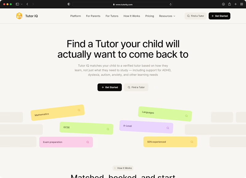
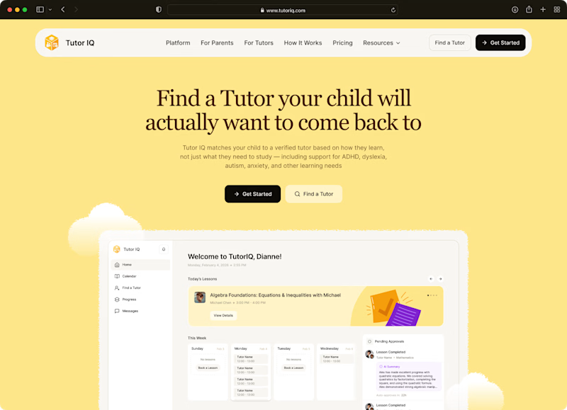
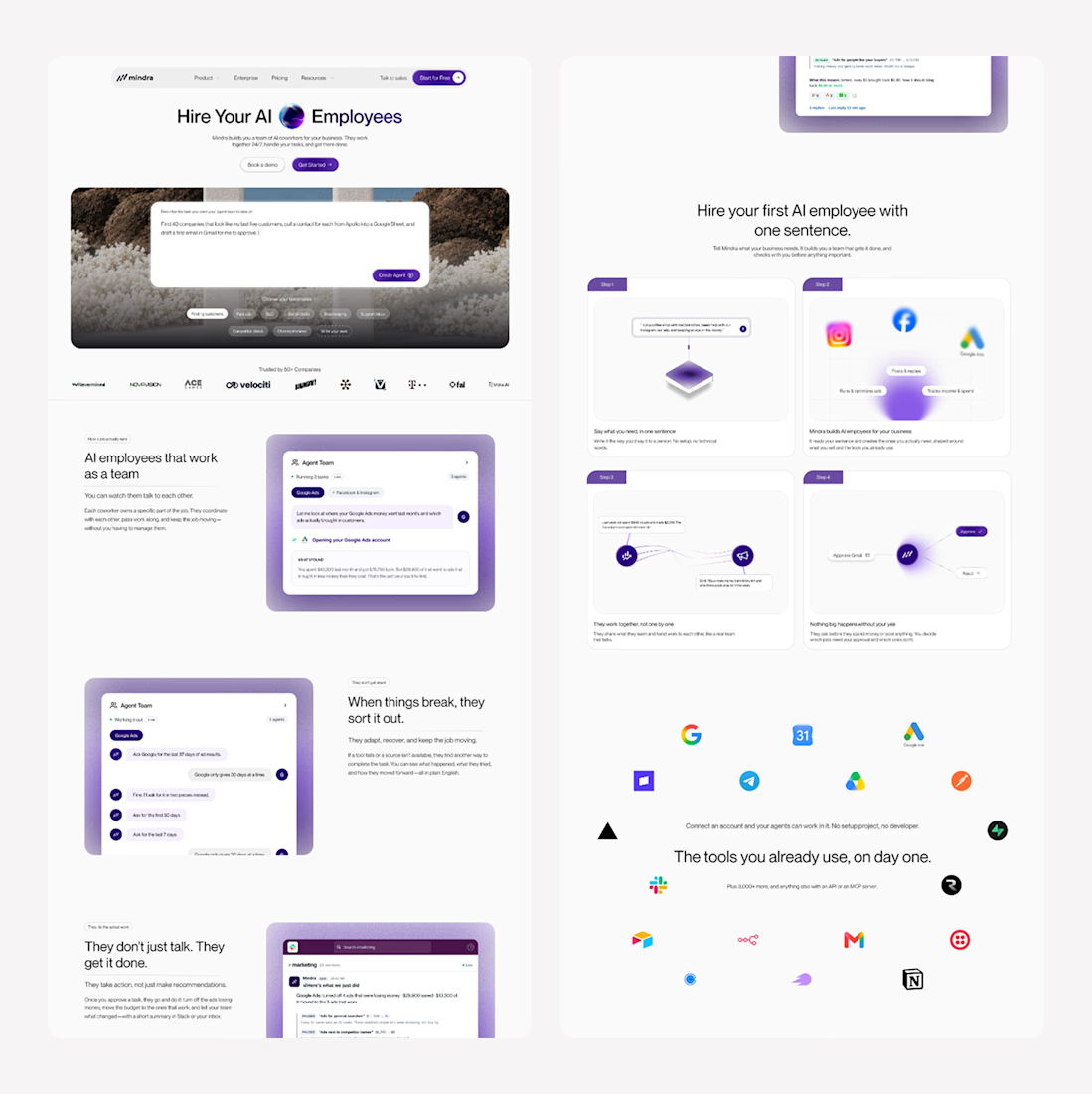
Two moods for one tutoring website🤩 Which would you click?
These were two early website concepts we put together for TutorIQ before choosing the main design.
Tell us in the comments what caught your eye:
🧩 1 — Light and playful
☀️ 2 — Softer and calmer
Mini case study with the final website design is coming here very soon!
11 voted
55%
9 voted
45%
20 votes
Closed

I'm going with Light and playful 🧩

Support your choice 🙌

Option 2 for me, the softer palette reads calmer for a parent who's already anxious about finding the right tutor. Option 1 might land better with the kid though. Who's the primary decision maker you're designing for here, the parent or the student?

Thanks, Maty🔥 For the website, we design for the parent. I like how you looked at it from both sides.


"A tutor your child will actually want to come back to" is a great line, it works in both moods. I'm leaning playful since the kid is half the sale here. Which one did TutorIQ end up going with?
Thanks for the insight, Diego! We're revealing the final choice in our next post☀️

cool work

Option 1 for me.

Option 1 for me the scattered sticky-note layout feels more true to how tutoring actually happen

The 2nd one makes me go this if opened on a big screen.😅



The first one is so clean 🔥

Hi Mark! I really like the impact of the yellow at first glance, as it makes the navigation bar and dashboard stand out more. The black and yellow contrast works really well and makes the three main elements clearly distinguishable: navigation bar, text + CTA and dashboard.
This...

I know that the first one is more eye-catching and is designed to grab kids' attention. However, you could try using colors that aren't quite as bright—remember, these are children, and they might like it so much that they use it at night or get into the habit of pressing their...

I’d go with 1. It feels more playful while still keeping the focus on the tutor search.

I missed the voting again, sorry :D I like the yellow one, it's cheerful, and that is what we all need now, I suppose
I've missed the voting
The network for creativity
Join 1.25M professional creatives like you
Connect with clients, get discovered, and run your business 100% commission-free
Creatives on Contra have earned over $150M and we are just getting started

Related posts


Every element feels perfectly placed! 👏

A compelling value proposition can make users want to know more about your product.
Let's take a look at these two examples.
"We help you manage your finances."
"Know where your money goes and take control of your spending."
Which one grabs your attention more?
The second one works better because it focuses on what the customer actually cares about, not just what the product does.
Here are some questions every value proposition should answer:
Why should customers choose you over your competitors?
What makes your product different?
How does it solve your customers' problems?
You can only answer these questions by understanding your customers' pain points and thinking from their perspective.
If you don't understand your customers, no amount of design or advertising will help you build lasting customer relationships.
Instead of constantly adding more features, startups should focus on what makes their product different.
And communicate that value clearly through their landing pages.

Brilliant execution!

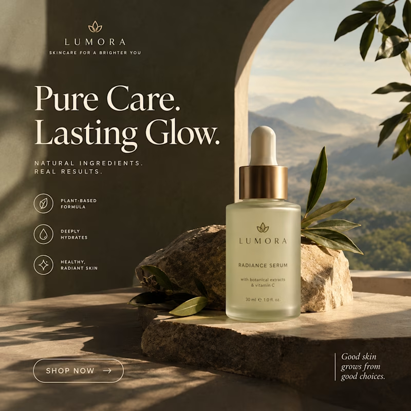
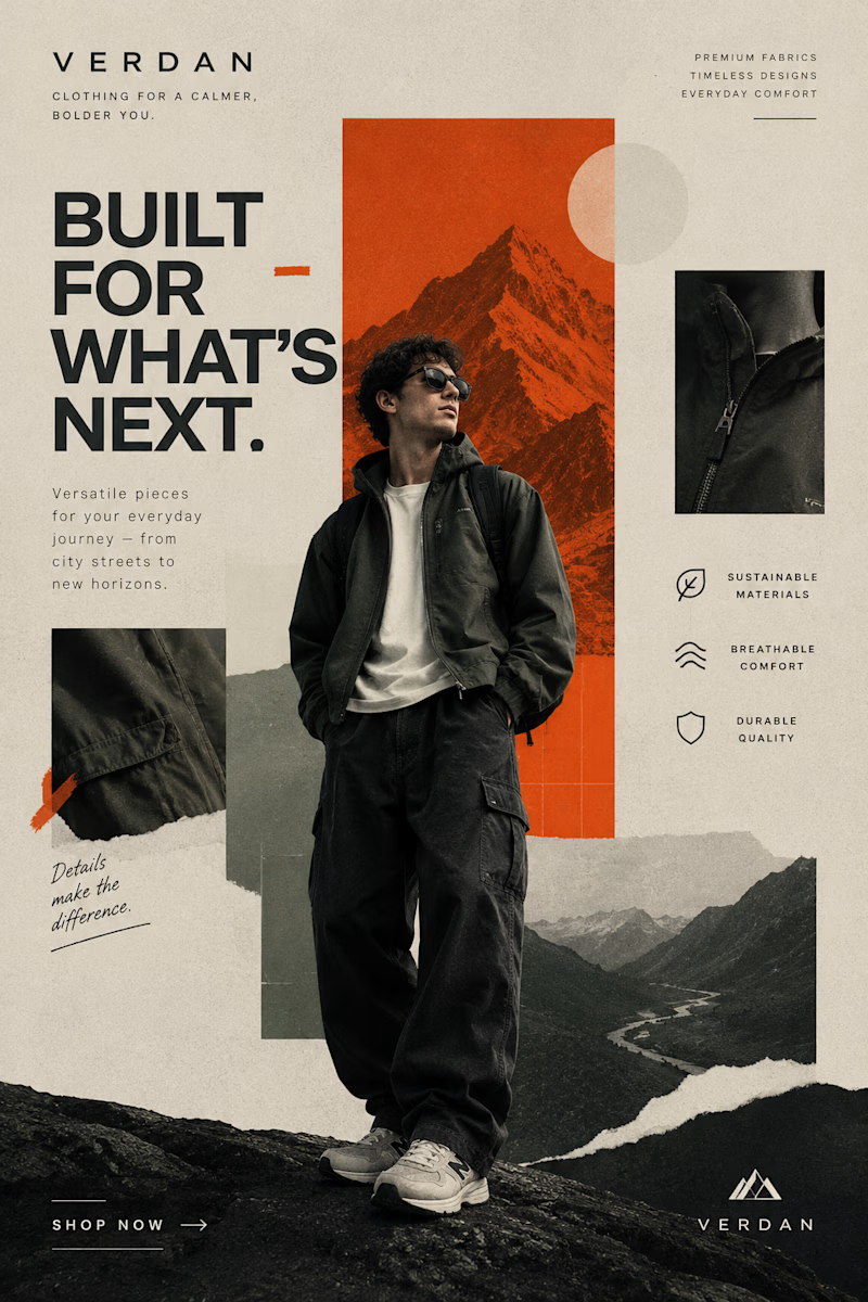
Two Brands. Two Completely Different Creative Directions. 🎨
A brand’s visual identity can change everything about how its products are perceived.
✨ Option A: Cinematic Minimalism — elegant, refined, and luxurious.
🔥 Option B: Modern Editorial Collage — bold, expressive, and adventurous.
Both styles tell a different story, but which one captures your attention?
Vote A or B in the poll and tell me what makes your choice stand out!
Need eye-catching advertisement designs for your brand, product, or social media campaign? I create custom ad creatives tailored to your brand’s identity, audience, and goals.
Have a project in mind? Explore my services on Contra and let's bring your ideas to life.
1 voted
14%
6 voted
86%
7 votes
Closed

Modern Collage is tough 💪🏽






