The network for creativity
Join 1.25M professional creatives like you
Connect with clients, get discovered, and run your business 100% commission-free
Creatives on Contra have earned over $150M and we are just getting started
Back to feedPost

Two Rings, flat — the screens the way a couple actually moves through the product.
Brand → layout grids → the core flow: picking venues and services,
the booking summary, one tracked budget → mobile app.
An MVP built to test how people plan and buy a wedding.
The hypotheses didn't hold; the interface is here as it shipped:


The way a couple actually moves through the product is the right lens for this, Denis. Publishing an MVP whose hypotheses did not hold takes real honesty. The tracked budget running through the booking flow is smart wedding UX.
The network for creativity
Join 1.25M professional creatives like you
Connect with clients, get discovered, and run your business 100% commission-free
Creatives on Contra have earned over $150M and we are just getting started








Related posts


Fresh case study 🚀🚀🚀
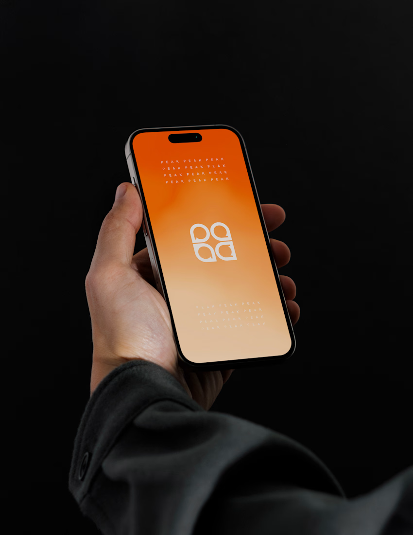
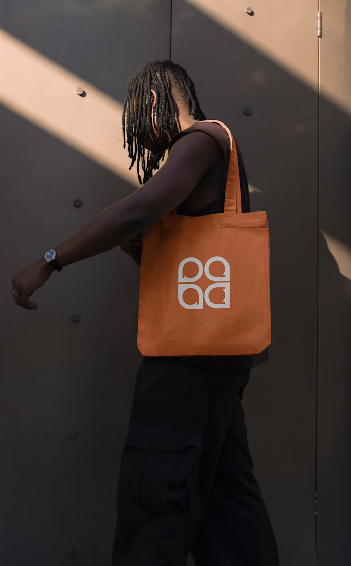
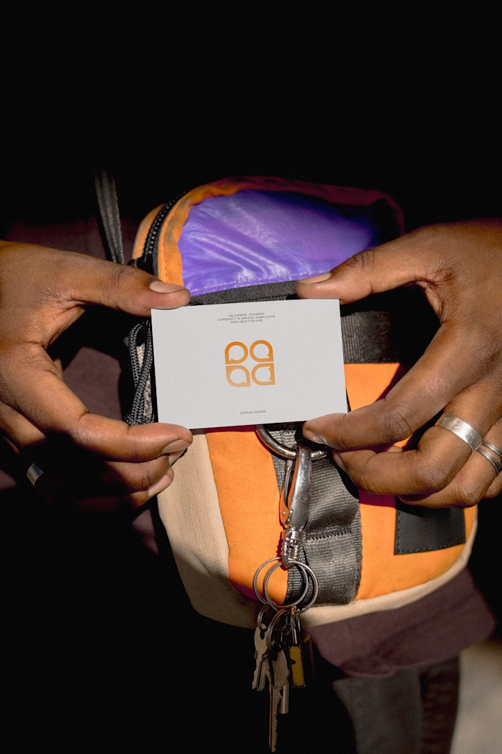
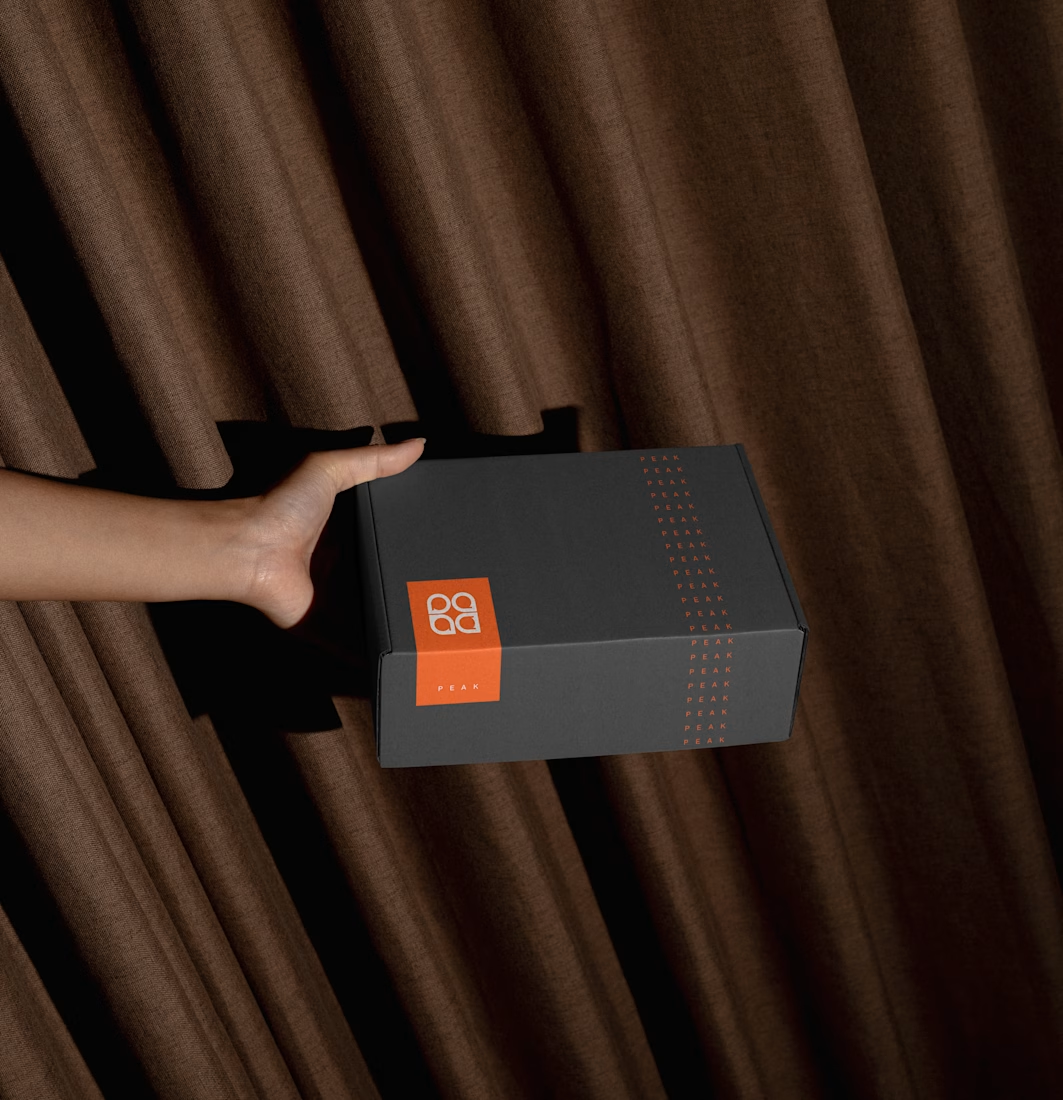
Brand identity for Peak, an all-in-one website builder for WordPress that I design and build. A four-letter mark, a warm paper-and-ember palette and one system that runs from the favicon to the packaging.

A four-letter mark that has to hold from favicon to packaging is a tough constraint. Did you draw one letterform first and build the other three from it, or design them together as a set from the start?

A SaaS interface can look cinematic. That first impression can make people want to explore the product.
These style frames were designed for Rivet Health’s product video, using light, scale and 3D depth to build emotion around the real UI.


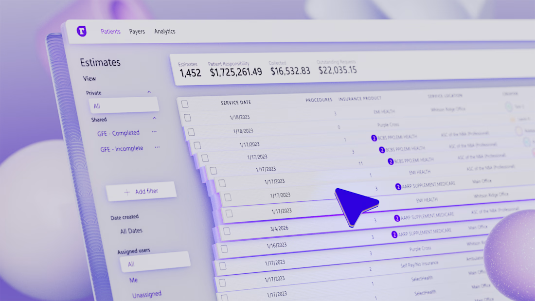
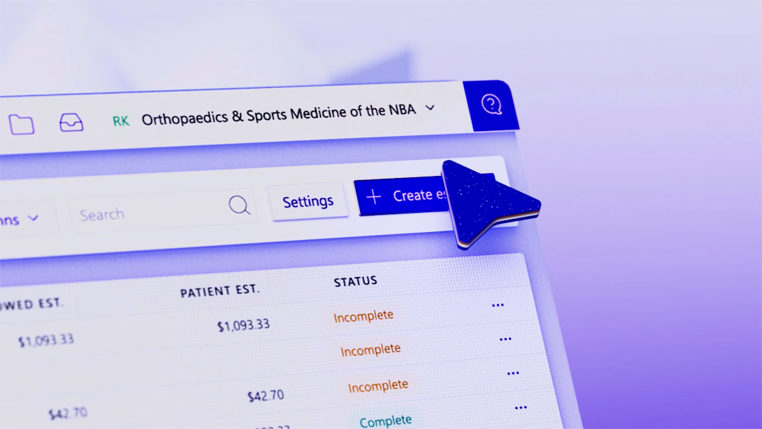
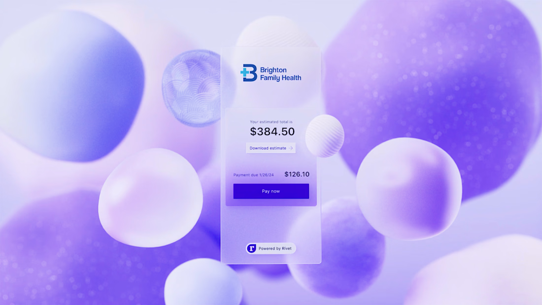
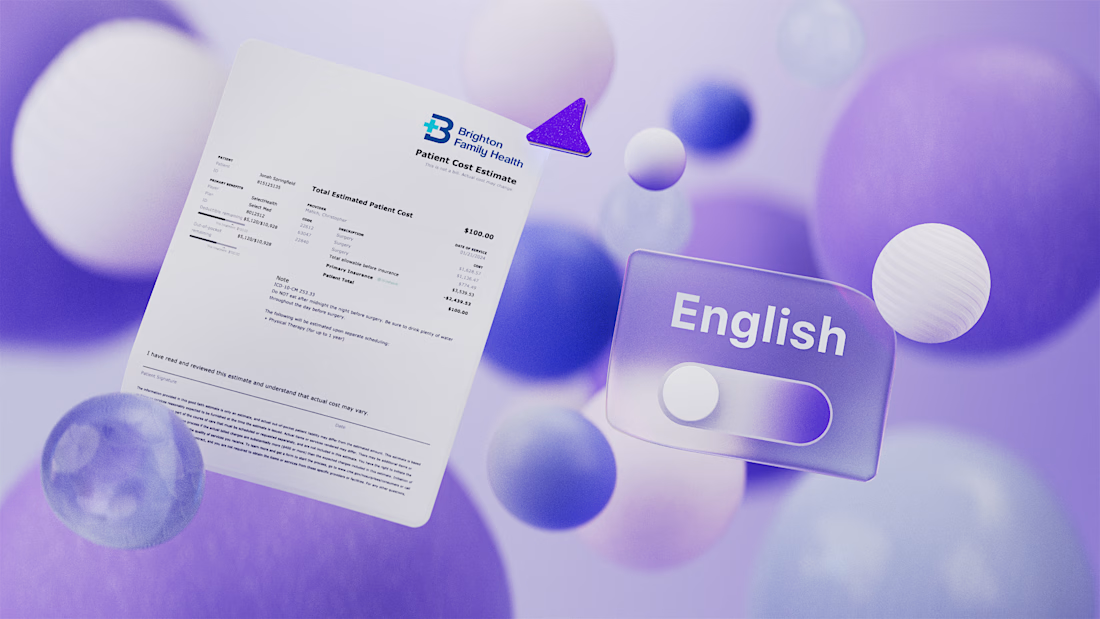


Love how the 3D depth makes the real UI feel cinematic without losing focus on the product.

Beautyy


