The network for creativity
Join 1.25M professional creatives like you
Connect with clients, get discovered, and run your business 100% commission-free
Creatives on Contra have earned over $150M and we are just getting started
Back to feedPost
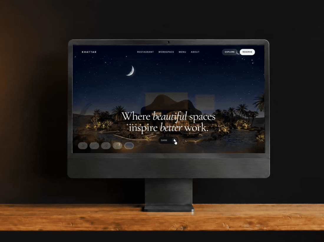
I gave myself one goal: build a hospitality website I hadn't seen 50 times before.
This became Khattar.
A dark, atmospheric sanctuary experience built around one idea: the interface should get out of the way and let the place create the emotion.
So I experimented with oversized imagery, restrained typography, dark/light modes and a responsive system that carries the same feeling from desktop → tablet → mobile.
And yes — I built the actual thing too.
I'm going to be doing a lot more of these: original websites, experiments and redesigns of websites I think could be much better.
Khattar case study


what was the hardest part of making the space feel atmospheric?

Probably knowing when to stop 😅 I kept realizing that the more effects I added, the less atmospheric it felt. Most of the mood ended up coming from the imagery, dark palette, spacing and keeping the interactions pretty restrained. The challenge was making it immersive without overdesigning it.
The network for creativity
Join 1.25M professional creatives like you
Connect with clients, get discovered, and run your business 100% commission-free
Creatives on Contra have earned over $150M and we are just getting started





Related posts

For Ranch University, I designed and built a custom Kajabi website and course platform + community around ranch ownership and life on the land.
Earthy colors, ranch photography, and spacious layouts carry through the site, membership pages, and course presentation. I also handled the course structure and offer setup behind the scenes.


What should a beekeeping website explain before asking someone to choose a hive?
For Bee Girl, I designed and built a complete Shopify website around a clear journey: meet the colony, understand what’s inside a nucleus hive, compare the options, and connect with the beekeeper.
Honey yellow, hive black, warm cream, and bold typography bring the same visual language across desktop and mobile layouts.
One design decision that ties it together: the page explains the colony and its five frames before introducing the hive-quantity choices. Education gives the product selection context.
I handled the complete website project for the client through Fiverr, using Shopify. This video walks through the homepage.
Which would you explore first—the hive options, field classes, or the beekeeper’s story?
Explore the full Bee Girl case study: https://contra.com/p/WqNFR67b-bee-girl-shopify-website-design-for-beekeeping
If you’re building a Shopify website for a specialist business, I’m available for website design and development projects.


I'd open the hive options first, but only because the colony section already told me what I'm buying. Explaining the five frames before the quantity choice is a smart order. Teaching before asking someone to choose is so underrated in Shopify stores.

We kept zooming in on a planet until it didn't fit on the phone.
A ringed gas giant grows until it fills the whole screen and lands on a deep boom. It's drawn in text characters, one per cell, against black space.
It's 11 seconds, and the sound is ours too.
What should we fly past next?
The whole code garden: https://contra.com/p/oRob3r7o
https://givemeprompts.com/lab/


